The Entrepreneur Forum | Financial Freedom | Starting a Business | Motivation | Money | Success

Welcome to the only entrepreneur forum dedicated to building life-changing wealth.

Build a Fastlane business. Earn real financial freedom. Join free.

Join over 80,000 entrepreneurs who have rejected the paradigm of mediocrity and said "NO!" to underpaid jobs, ascetic frugality, and suffocating savings rituals— learn how to build a Fastlane business that pays both freedom and lifestyle affluence.

Free registration at the forum removes this block.

Lex DeVille

Sweeping Shadows From Dreams
FASTLANE INSIDER
EPIC CONTRIBUTOR
Read Fastlane!
Read Unscripted!
Speedway Pass
User Power
Value/Post Ratio
597%
Jan 14, 2013
5,351
31,935
Utah
27006

There are a lot of places to learn brand building. You can spend a lot of time and money on it if you're not careful. I spent five figures having brand materials created that I never used. My most successful branding attempts were created 100% by me for free.

You can create effective brands, even as a newbie. It's very simple, although nobody will tell you that. Graphic designers and other brand "experts" always suggest it's super hard and that you should just pay an expert (preferably them). But you can save your money. Just do this instead...

1. Pick a theme
2. Pick a name
3. Pick up to 5 colors
4. Be Consistent


1. Pick A Theme
By theme I'm talking about the identity behind your brand. Is it western? Biker gang? Tactical? Cyberpunk? Goth? Hippie? Rainforest? Coastal? Fishing? 1950's? Rockstar? Holistic? Nerd? Action hero? Wedding? Just pick some theme to set the context for your brand (and also all the feelings you want people to have).

Once you have your basic theme idea, then you have the fundamentals of all of the things that will and will not form your brand identity. For instance, a western brand will not show images of futuristic cities or use biker gang language such as talking about "Hell's Angels."
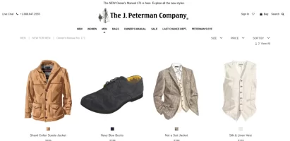
Screenshot 2019-08-29 at 5.24.54 AM.png
J. Peterman = Western/Cowboy/Explorer Theme


Screenshot 2019-08-29 at 5.25.48 AM.png
5.11 Tactical = Police/Military/Tactical Theme


2. Pick A Name
Brands can form around any name. But the goal is to take that experience deeper for your audience. The closer your name is to the theme and identity you want people to form for you brand, the easier it will be to create those associations. So while a western brand can definitely be formed around the word "Spoon," it will be easier to anchor the theme and identity in the viewer's mind if it is called "Dust" or "Herban Cowboy" or "True Grit" or "Eastwood's Urban Wear"

J. Peterman = Example of how a brand can form around ANY name.

5.11 Tactical = Closely associated with the brand theme.


3. Pick Up To 5 Colors
After you pick your theme, you want to narrow down your brand colors. Most people use white and gray or black on their website pages so that's 2 colors already. They also usually have a primary color and a secondary color (which is used for hover links or other things). Sometimes there is a 5th color that ties in with these other colors, but not always. All colors should transition into one another fairly easily.
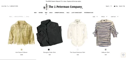
Screenshot 2019-08-29 at 5.41.55 AM.png
J. Peterman = Dark Tan, Light Tan, White, Black (sometimes brown)
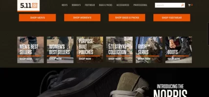

Screenshot 2019-08-29 at 5.40.07 AM.png
5.11 Tactical = Black, White, Orange, Tan (sometimes shades of Brown/Green)

Once you have your colors, do not deviate from them. A western brand might use light brown for a button and dark brown on the hover. NOT bright red. NOT neon green. NOT sunflower yellow. Those colors don't fit and won't make sense to the viewer. They will feel scattered.


4. Be Consistent
You've got your theme. You've got your colors. You have an idea in your mind of how your brand looks, sounds, thinks, smells, tastes, and feels. All that is left to do is make sure that every communication going forward fits this model.

If your brand is western, and you post a meme on instagram, it should use western language like "pardner" or "howdy" or whatever fits the fantasy. It should show cowboys or other western imagery (like saloon doors). It should have browns and tans and the colors of dust, dirt, grit.
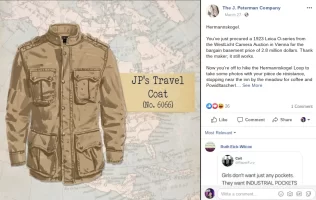
Screenshot 2019-08-29 at 5.49.15 AM.png
J. Peterman on Facebook = Light Tan, Dark Tan, Black | Imagery fits explorer theme / uses brand name in social media.


Screenshot 2019-08-29 at 5.46.51 AM.png
5.11 Tactical on Instagram = White, Black, Orange, Tan (and some green/brown) / Imagery fits tactical lifestyle / uses brand name in post.

Anything you say should fit this model. Anything you post. And as you do this, your brand will begin to form over time. You do not need to spend money on this. You do not need an expensive logo. You only need to get started. Set the theme. Pick a name and colors. Be consistent.


Brands Are A Product Of Conditioning
Pavlov conditioned dogs to salivate when they hear a bell. The bell rings and the dog knows food follows. The first time the bell rings, the dog does not know that food follows, so he does not salivate at the sight of the bell. But when the dog receives food, then a concept forms in his mind for that experience. So the next time the dog sees the bell or the bell rings, the dog's brain triggers the concept to re-create the experience from before, and then predicts what is likely to happen next. Since the prediction is that food follows, and since expectations of food trigger salivation, the dog salivates at the bell. If food indeed follows the bell, then the concept is reinforced, and the association between the bell, or the bell ringing and food is more deeply anchored in the dog's mind.

Brands work this way too. You start with a theme. Pick a name. Set your colors. A person encounters your brand. At first they've never experienced you. So the first experience is where they form a concept. If your brand is inconsistent (too many colors, no clear theme, mismatched images, words, fonts, name etc.) then the experience is a scattered mess and the brand identity that forms is "a mess" and can't be easily categorized or anchored in the mind.

If the theme and colors are pulled together (even if they don't look amazing) then the concept that forms is compartmentalized into the appropriate themed identity. So a website called "Dust" that sells cowboy clothes and shows images of horses, saddles and cowboys wearing denim jeans, boots and 10 gallon hats, forms a "western" concept in the mind. Later, when the viewer tells their spouse about this "cool clothing brand" they saw earlier, they'll describe it as "this cool western brand called, Dust."

When the viewer encounters the brand again, they will expect more of this experience. If they follow you on social media, they will expect more of what they got the first time from your posts. If you are consistent, and you use themed images, attach your name to your posts, and use your selected colors, then you will reinforce the association of western with your brand and you will deepen the brand identity and experience for your viewer.

If the viewer is someone who enjoys the experience of your brand, then they will feel good each new time they encounter you and get more of the experience. With each new, consistent experience (post, page, video etc.) the addiction grows stronger and stronger until it becomes irresistible. Finally, at some point, the brand's identity merges with the individual's identity and they become one. They are inseparable. The brand and the individual are now one entity and because of this bond, you have a customer for life.

usa-flag-america.jpg

Bonus Tip - Seal The Deal With A Symbol
A name is enough to remember a brand. If you combine a good name with a symbol (in your logo) then it creates a much more powerful anchor for the experience in the viewer's mind. That's because symbols are like storage boxes. They give form to everything contained within the brand fantasy (the box - the symbol - stores the fantasy and identity inside).

It does not matter how simple or complex the symbol is. What's important is that it has some unique quality that can form a mental association between the brand name and the theme in the mind. It needs to be unique so it can always be easily identified and triggers the brand experience when encountered.

This is why every country's flag is a little different. Whatever country you are from, your country's flag is a symbol of your citizenship and everything it entails. You can more easily see and identify your country's flag than the flag of any other country in your imagination. For me it is the United States flag. I can draw it from memory. Don't ask me to draw the U.K.'s flag. Although I have an idea of what it looks like, almost guaranteed I'll draw it incorrectly. Also, if someone steps on the U.K. flag, I might think it is poor behavior from the stepper, and I might be angry about the individual's choice to offend people, but I WON'T be angry that the U.K.'s flag is being stepped on because it isn't my country's symbol and therefore isn't an extension of me.


Screenshot 2019-08-29 at 6.02.54 AM.png
J. Peterman Symbol = Cowboy Horseman


Screenshot 2019-08-29 at 6.02.32 AM.png
5.11 Symbol = Orange Target / Sight Picture

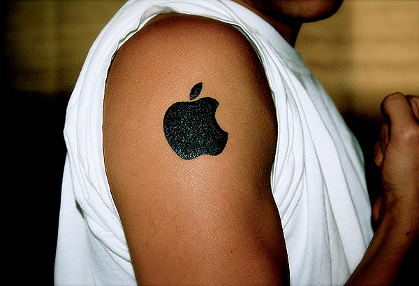
After the first time you come into contact with the brand and its theme, name, colors and symbol, then a concept forms. The symbol, in particular, can then stand out in the mind and trigger all of the other associations. As the viewer merges more and more with the brand, (especially once they become a customer) the symbol serves to reinforce everything that the brand (and by extension the customer) represents. Then just seeing the symbol triggers all of the good feelings associated with the brand. With some people the symbol triggers such powerful experiences, identities, fantasies and associations that the customer will even mark their own body, solidifying a bond for life.
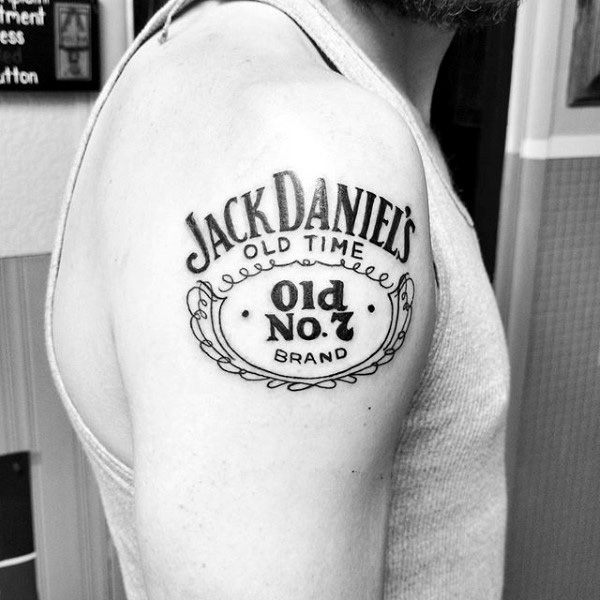
mens-jack-daniels-logo-upper-arm-tattoos.jpg
Apple-Logo-Tattoo.jpg


Free Branding 101. The end.
 
Dislike ads? Remove them and support the forum: Subscribe to Fastlane Insiders.
Last edited:

100k

Gold Contributor
Read Fastlane!
Speedway Pass
User Power
Value/Post Ratio
149%
Oct 20, 2012
1,529
2,284
Nice post. Very insightful indeed.

What about choosing the theme should you just randomly choose one (like zombies): https://www.adzombies.com/

or is there more to it than that (i.e doing research on your target market and finding out what they already like/love and choosing that as your theme).

Here's a video that shows how coca-cola took watered sugar, themed it around the emotion "happiness/love" and built a juggernaut of a brand:

View: https://www.youtube.com/watch?v=XhMVWzVXNNk
 
Dislike ads? Remove them and support the forum: Subscribe to Fastlane Insiders.

Lex DeVille

Sweeping Shadows From Dreams
FASTLANE INSIDER
EPIC CONTRIBUTOR
Read Fastlane!
Read Unscripted!
Speedway Pass
User Power
Value/Post Ratio
597%
Jan 14, 2013
5,351
31,935
Utah
Nice post. Very insightful indeed.

What about choosing the theme should you just randomly choose one (like zombies): https://www.adzombies.com/

or is there more to it than that (i.e doing research on your target market and finding out what they already like/love and choosing that as your theme).

Here's a video that shows how coca-cola took watered sugar, themed it around the emotion "happiness/love" and built a juggernaut of a brand:

View: https://www.youtube.com/watch?v=XhMVWzVXNNk

Technically, you can do it either way as long as you are consistent over time. Most freelance websites use green colors. I use purple and pink in my colors. People who want the green style gravitate toward the green brand. People who like my style come to me.

The theme should fit the fantasy you hope to create. If you want to create a fantasy that a specific market segment wants to fulfill, then you would do more research, find out more about how they see themselves (or how they want to be seen), and then apply a theme, name, colors and symbol that fits that identity.

Alternatively, if you take my approach and create something you personally enjoy, you may target a smaller niche, but the brand forms all the same over time. And just like I enjoy my brand, others who are like me will enjoy it also. Some people won't identify with my brand as much and that is okay, because they can still appreciate it as long as they get value from it (and some will begin to identify over time).

Long story short, pick a theme that makes sense for the fantasy you hope to create.
 

100k

Gold Contributor
Read Fastlane!
Speedway Pass
User Power
Value/Post Ratio
149%
Oct 20, 2012
1,529
2,284
Technically, you can do it either way as long as you are consistent over time. Most freelance websites use green colors. I use purple and pink in my colors. People who want the green style gravitate toward the green brand. People who like my style come to me.

The theme should fit the fantasy you hope to create. If you want to create a fantasy that a specific market segment wants to fulfill, then you would do more research, find out more about how they see themselves (or how they want to be seen), and then apply a theme, name, colors and symbol that fits that identity.

Alternatively, if you take my approach and create something you personally enjoy, you may target a smaller niche, but the brand forms all the same over time. And just like I enjoy my brand, others who are like me will enjoy it also. Some people won't identify with my brand as much and that is okay, because they can still appreciate it as long as they get value from it (and some will begin to identify over time).

Long story short, pick a theme that makes sense for the fantasy you hope to create.

I hear that. Will choose one that is "authentic" to me (since I like to like to scratch my own itch anyways when it comes to setting up businesses).

Thanks again for the share. Have a nice 1
 

Charnell

Block me if you're a quack
FASTLANE INSIDER
Read Fastlane!
Read Unscripted!
Speedway Pass
User Power
Value/Post Ratio
276%
Oct 12, 2014
1,091
3,009
Kansas City
Step 3: Pick up to 5 colors

Use a site like Coolors to help you out so you don't have to spend more than 5 minutes on your color scheme. As Lex said, you'll probably be using black & white. Then pick your main color, lock those 1st 3 in, then randomly generate until you find something you like.
 
Dislike ads? Remove them and support the forum: Subscribe to Fastlane Insiders.

Lex DeVille

Sweeping Shadows From Dreams
FASTLANE INSIDER
EPIC CONTRIBUTOR
Read Fastlane!
Read Unscripted!
Speedway Pass
User Power
Value/Post Ratio
597%
Jan 14, 2013
5,351
31,935
Utah
I hope your post is aimed towards unserious projects and hobbies.

If not...

1. Saying: "Graphic designers and other brand "experts" always suggest it's super hard and that you should just pay an expert (preferably them). " is extremely rude and childish!

This isn't rude or childish. It is based on my experience creating brands and also hiring brand designers. You've interpreted it as rude and childish (which are both problems for you, not me).

2. Mentioning consistency and then saying that is OK to have a complex logo design is a clear sign you don't know what you're talking about.

My nearly 4,000 students and 4,000 YouTube subscribers, and hundreds of thousands of forum views would suggest I do know what I'm talking about.

You think almost all of successful companies have or decided to get a simpler logo just because they were lazy and bored? Complex logo will cause you huge inconsistency because you won't be able to use it everywhere you want!

It's called "mind reading" when you claim to know what I think. Also, you're making generalizations about my thoughts. I didn't say any of those things, so stop putting words in my mouth. I said you can have a complex or simple logo as long as you are consistent.

3. You said, just use logotype or text+icon. Ok, that's fair enough, but who will make it? Who will make it look good? Who will check it it's not already taken? Do you know ''experts'' often have to hire lawyers for that?

Make it yourself with Inkscape for free and free downloadable fonts. You don't need a designer to check and see if a logo is already taken. That part can be done on your own.

Saying "experts" often have to hire lawyers is another generalization. I can just as easily say that "experts" often do not hire lawyers...

Do you know why famous logos look good in people's eyes? Because it's not just a quick design, golden ration, dimension consistency and similar things are used.

Yes, I do know and I explained it above, much better than you have here. What you said in this quote is what you believe to be the reason famous logos look good, but has nothing to do with why they are recognized or remembered. A bad logo can be just as famous as "well designed" logo.

Why not have just a free font as a logo? Because then anybody can download it and pretend it's part of your brand. Instagram had to solve this issue in the past.

This isn't important because only your brand can hold the first position in someone's mind. If a brand copies you, then it isn't the same brand, even if they use the same font. If your brand can be copied and confused with another brand, then you probably haven't developed a brand.

I could write all day and link you 1000 videos to prove you wrong.
I'll be surprised if even a single video you "write" (videos are recorded by the way, not written) has any factual data to support your claims.

Buddy, I see you're an ''expert'' on this forum, but that doesn't give you rights to disrespect other industries you don't know nothing about.

...You've literally and quite directly described the exact reason I'm an expert in branding. You know I'm an expert on this forum because that is the brand I have formed here over time. And again, you are describing your own perceived disrespect. This is your problem not mine. I hope you didn't expect I would feel bad.

There's no such thing as "rights to disrespect other industries you know nothing about." I already did it according to you, so I guess "rights" don't actually matter.

By disrespecting an industry, you disrespect so many people who spent (and still spending ) a lot of time learning their craft.

No, I'm just helping new people who waste a lot of money on branding to realize they don't have to. They don't need to hire designers or lawyers when they are trying to get started. They can form a brand, just like thousands of other companies have done and take action and make money and build a business and improve their brand over time if they so choose.

Can we see those successful brands you have created?
I think readers would appreciate an example from a forum friend.

You already have, and you already described it in your post. That fact you haven't recognized the branding right in front of your face says everything anyone reading this post would need to know about you (I hope you aren't a brand designer!).

I just wanted politely explain a few things.

You wanted to prove your superiority. I get it. You are probably a designer. You think like a designer. It's not the most effective way to generate sales or build a brand, but it's how you think, and as long as you think that way, nothing in this thread can help you.
 

Devampre

Bronze Contributor
Read Fastlane!
Read Unscripted!
Speedway Pass
User Power
Value/Post Ratio
119%
Jan 6, 2016
251
298
29
Canada
Awesome! This applies well to the website I just built. I feel like I unconsciously followed some of these steps, but I will use this as a guide for some of the revisions I wish to make.
 

MJ DeMarco

I followed the science; all I found was money.
Staff member
FASTLANE INSIDER
EPIC CONTRIBUTOR
Read Rat-Race Escape!
Read Fastlane!
Read Unscripted!
Summit Attendee
Speedway Pass
User Power
Value/Post Ratio
445%
Jul 23, 2007
38,083
169,509
Utah
I hope your post is aimed towards unserious projects and hobbies.

If not...

1. Saying: "Graphic designers and other brand "experts" always suggest it's super hard and that you should just pay an expert (preferably them). " is extremely rude and childish!

2. Mentioning consistency and then saying that is OK to have a complex logo design is a clear sign you don't know what you're talking about.

@Lex DeVille - sorry you got roped into it with this tool -- he has already been banned from the forum and once again he is here trying to dispense his holier than thou advice.

He peacocks as an expert when based on his work, he clearly isn't. His work is subpar and not much better than something you'd find on Fiverr or 99Designs.
 
Dislike ads? Remove them and support the forum: Subscribe to Fastlane Insiders.

Lex DeVille

Sweeping Shadows From Dreams
FASTLANE INSIDER
EPIC CONTRIBUTOR
Read Fastlane!
Read Unscripted!
Speedway Pass
User Power
Value/Post Ratio
597%
Jan 14, 2013
5,351
31,935
Utah
@Lex DeVille - sorry you got roped into it with this tool -- he has already been banned from the forum and once again he is here trying to dispense his holier than thou advice.

He peacocks as an expert when based on his work, he clearly isn't. His work is subpar and not much better than something you'd find on Fiverr or 99Designs.

haha no worries. I always get roped into it, even when it's obvious. I'm used to it at this point. :somber:
 

Bertram

Silver Contributor
Read Fastlane!
Speedway Pass
User Power
Value/Post Ratio
147%
Oct 25, 2015
573
842
Virginia
Thanks, great post! Great lesson.
What about the colorblind consumer?
One out of 12 male consumers have low to zero red-green perception.
I was just thinking about how your brand colors probably grab more male viewers compared to the green websites.
What would you think about testing out a brand design in black and white to evaluate the colorblindness factor?
 
Last edited:

Lex DeVille

Sweeping Shadows From Dreams
FASTLANE INSIDER
EPIC CONTRIBUTOR
Read Fastlane!
Read Unscripted!
Speedway Pass
User Power
Value/Post Ratio
597%
Jan 14, 2013
5,351
31,935
Utah
Thanks, great post!
What about the colorblind consumer?
One out of 12 male consumers have low to zero no red-green perception.
I was just thinking about how your brand colors probably grab more male viewers compared to the green websites.
What would you think about testing your brand designs in black and white to evaluate the colorblindness factor?

To be honest, the colorblind issue never occurred to me. Didn't realize so many people deal with that. However, I wouldn't consider it a big deal since there are plenty of other ways to tap into the emotions, experiences and fantasies that the brand is meant to encapsulate.

If my brand colors were black and white and shades of grey instead of pink and purple and black and white, I could still capture most of the fantasy since the brand is designed around a sinister theme rather than around colors. My logo has a frowning face in it and even if you change the color of the logo, it doesn't change what it represents.

If you see my logo in any color you will know who it belongs to and if you've had good experiences with my brand, then good memories will come to mind when you see that face. Same thing with the Nike swish. You don't need to see it in any particular color to know what it means and to drum up memories based on experiences you've had with that brand.

Testing is always a worthwhile pursuit if you want to improve conversions. It's the only way!
 
Dislike ads? Remove them and support the forum: Subscribe to Fastlane Insiders.

Bertram

Silver Contributor
Read Fastlane!
Speedway Pass
User Power
Value/Post Ratio
147%
Oct 25, 2015
573
842
Virginia
To be honest, the colorblind issue never occurred to me. Didn't realize so many people deal with that. However, I wouldn't consider it a big deal since there are plenty of other ways to tap into the emotions, experiences and fantasies that the brand is meant to encapsulate.

If my brand colors were black and white and shades of grey instead of pink and purple and black and white, I could still capture most of the fantasy since the brand is designed around a sinister theme rather than around colors. My logo has a frowning face in it and even if you change the color of the logo, it doesn't change what it represents.

If you see my logo in any color you will know who it belongs to and if you've had good experiences with my brand, then good memories will come to mind when you see that face. Same thing with the Nike swish. You don't need to see it in any particular color to know what it means and to drum up memories based on experiences you've had with that brand.

Testing is always a worthwhile pursuit if you want to improve conversions. It's the only way!
Thanks I didn't mean to suggest at all that you should rethink your own color brand. The point you're making is to pay attention to symbolism and experiental ties to establish a strong vibe. I was just pointing out that many viewers won't get anything out of green or red.
 

MattL

Bronze Contributor
Read Fastlane!
Speedway Pass
User Power
Value/Post Ratio
211%
Jan 31, 2014
83
175
32
Finland
I'm colorblind. I don't think it really matters. It's not like colorblind people see yellow as blue and red as black. It's just a tad harder to distinguish the colors.

But when it comes to branding I doubt it's that big of a deal that you'd have to keep that in mind when creating the base colors of your brand.

Unless you're an optician or something lol
 

Hopeful

Bronze Contributor
Read Fastlane!
Speedway Pass
User Power
Value/Post Ratio
160%
Jun 8, 2019
70
112
Thank you so much for this valuable, simple guide. I was struggling with the branding for a fashion-related business I'm working on. I had name, I had a logo... but I had too many colors and no identifiable theme. I've now narrowed my colors down from six to four (including black and white). Theme had me stumped for a while. I thought about it too abstractly at first, using terms like "fresh feminine." But then I thought of flowers. The concept behind my brand is that every woman has a different kind of beauty, which is a concept that flowers illustrate perfectly: nobody thinks forget-me-nots are less pretty than zinnias, right? I think that a floral theme will tie all my materials together nicely. (But if you see a problem with that, please tell me. lol)

Thanks again.
 
Dislike ads? Remove them and support the forum: Subscribe to Fastlane Insiders.

ChrisV

Legendary Contributor
EPIC CONTRIBUTOR
Read Fastlane!
Read Unscripted!
Speedway Pass
User Power
Value/Post Ratio
225%
May 10, 2015
3,141
7,055
Islands of Calleja
Here's a video that shows how coca-cola took watered sugar, themed it around the emotion "happiness/love" and built a juggernaut of a brand:
And a pinch of coca leaves ;)

Great thread. Definitely the nuts and bolts of great branding. I'll link this to anyone who's asking.

This isn't rude or childish. It is based on my experience creating brands and also hiring brand designers. You've interpreted it as rude and childish (which are both problems for you, not me).
Well to be fair, it does appear you have some know-how working photoshop and illustrator. Some people don't, and end up doing their logos in MS paint. In the cases that don't they should come up with a concept for the designer to emulate. But honestly, I think that photoshop is a valuable skill that most everyone should learn. Art is very personal and it won't generally have the right energy if someone else does it for you. Unless you're really careful about choosing a designer that matches your style.
 

Lex DeVille

Sweeping Shadows From Dreams
FASTLANE INSIDER
EPIC CONTRIBUTOR
Read Fastlane!
Read Unscripted!
Speedway Pass
User Power
Value/Post Ratio
597%
Jan 14, 2013
5,351
31,935
Utah
And a pinch of coca leaves ;)

Great thread. Definitely the nuts and bolts of great branding. I'll link this to anyone who's asking.


Well to be fair, it does appear you have some know-how working photoshop and illustrator. Some people don't, and end up doing their logos in MS paint. In the cases that don't they should come up with a concept for the designer to emulate. But honestly, I think that photoshop is a valuable skill that most everyone should learn. Art is very personal and it won't generally have the right energy if someone else does it for you. Unless you're really careful about choosing a designer that matches your style.

I don't use Photoshop or Illustrator. Only a free vector editing program called Inkscape. Even MS Paint is enough to get the ball rolling with a brand.

I definitely agree with art being personal (and for those who go that route, there must be the understanding that not everyone will appreciate your art!).

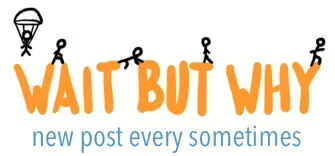
Wait But Why is a good example of a logo that could've been done in MS Paint.

Screenshot 2019-09-02 at 2.46.33 AM.png

I don't think this was their original logo, and this may have been created by a designer, but the concept could've been carried out in paint.

The key is consistency.

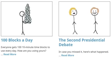
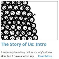
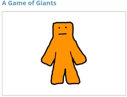
Wait But Why uses the same orange and blues across all of their brand communications. They use Paint style characters in all of their articles, pages and marketing materials.

Screenshot 2019-09-02 at 2.49.56 AM.png

Screenshot 2019-09-02 at 2.49.46 AM.png

Screenshot 2019-09-02 at 2.49.39 AM.png

Screenshot 2019-09-02 at 2.50.07 AM.png

If we took their brand materials out of context, then most of it looks like it was drawn by a five year old!

But because they are consistent and because they've associated themselves with high-value content, the brand formed more tightly over time.

Even a first-timer can form a brand even if they suck and use MS Paint haha. They just need to be consistent and follow the other points in the OP (and have good content!).

The logo is an indicator of the brand but isn't the brand itself. It's just a container for the story and a trigger for the experience. With consistency even a sh*t logo can trigger the brand experience (plus you can always hire a designer once you start making money!!!).
 

ChrisV

Legendary Contributor
EPIC CONTRIBUTOR
Read Fastlane!
Read Unscripted!
Speedway Pass
User Power
Value/Post Ratio
225%
May 10, 2015
3,141
7,055
Islands of Calleja
I don't use Photoshop or Illustrator. Only a free vector editing program called Inkscape. Even MS Paint is enough to get the ball rolling with a brand.

I definitely agree with art being personal (and for those who go that route, there must be the understanding that not everyone will appreciate your art!).

Wait But Why is a good example of a logo that could've been done in MS Paint.

View attachment 27099

I don't think this was their original logo, and this may have been created by a designer, but the concept could've been carried out in paint.

The key is consistency.

Wait But Why uses the same orange and blues across all of their brand communications. They use Paint style characters in all of their articles, pages and marketing materials.

View attachment 27101

View attachment 27102

View attachment 27103

View attachment 27100

If we took their brand materials out of context, then most of it looks like it was drawn by a five year old!

But because they are consistent and because they've associated themselves with high-value content, the brand formed more tightly over time.

Even a first-timer can form a brand even if they suck and use MS Paint haha. They just need to be consistent and follow the other points in the OP (and have good content!).

The logo is an indicator of the brand but isn't the brand itself. It's just a container for the story and a trigger for the experience. With consistency even a sh*t logo can trigger the brand experience (plus you can always hire a designer once you start making money!!!).
Yea, a business that's just starting out usually shouldn't waste money on graphic design stuff. That's action-faking.

And I actually hate Adobes design suite. I use a combination of Affinity and Inkskape. If you haven't seen Affinity: $45 for life and the software is way better than Photoshop or Illustrator


Another example of the type of branding was Hyberbole and a Half (popular in the early 2010's) that I think was literally done in paint.

27104

 
Dislike ads? Remove them and support the forum: Subscribe to Fastlane Insiders.

Jinnah1947

Contributor
User Power
Value/Post Ratio
133%
Jun 18, 2019
15
20
Thanks for this valuable thread.

It is the most concise and clear info I have ever seen on branding.

Recently I was giving the oppurtuinty to do all offline and online marketing for my friends real estate company.

Yesterday I told him all about importance of branding and how can we do it, all info from this thread.

He was very impressed and now precieves me as some kind of marketing expert.

My question is that, does having a consistent brand image gives you an competitive advantage?
 

Lex DeVille

Sweeping Shadows From Dreams
FASTLANE INSIDER
EPIC CONTRIBUTOR
Read Fastlane!
Read Unscripted!
Speedway Pass
User Power
Value/Post Ratio
597%
Jan 14, 2013
5,351
31,935
Utah
Thanks for this valuable thread.

It is the most concise and clear info I have ever seen on branding.

Recently I was giving the oppurtuinty to do all offline and online marketing for my friends real estate company.

Yesterday I told him all about importance of branding and how can we do it, all info from this thread.

He was very impressed and now precieves me as some kind of marketing expert.

My question is that, does having a consistent brand image gives you an competitive advantage?

Branding creates competitive advantages, sure. When you create a consistent brand image, you attract people who align with that image. Those people will not buy from competitors unless there is a severe failure with your product.

Branding isn't necessarily a competitive approach. The goal isn't to steal customers from competition. The goal is to say, "Hey! This is us. This is what we're about. This is how we do things. If you like all of that, join us. If not, go somewhere else."

Through branding you make clear statements about your company's position. It's like saying, "We're Republican!" Democrats will hate you. They won't buy from you. But Republicans will love you. They won't buy from anyone else, especially not a company that doesn't take a clear stance.

By creating a consistent brand image you gain the following advantages:

- Attract customers who are very loyal
- Attract customers who jump at the chance to buy
- Avoid potential problem customers
- Create a recognizable, repeatable experience
- Easily satisfy customer expectations
- Take a memorable position in customer minds
 

MJ DeMarco

I followed the science; all I found was money.
Staff member
FASTLANE INSIDER
EPIC CONTRIBUTOR
Read Rat-Race Escape!
Read Fastlane!
Read Unscripted!
Summit Attendee
Speedway Pass
User Power
Value/Post Ratio
445%
Jul 23, 2007
38,083
169,509
Utah
I think this is Gold or Notable worthy. What do you think @MJ

Agreed.

Branding isn't necessarily a competitive approach. The goal isn't to steal customers from competition. The goal is to say, "Hey! This is us. This is what we're about. This is how we do things. If you like all of that, join us. If not, go somewhere else."

Definitely, branding is giving a personality to your corporation, the art of making it feel like a person who one (your customer) wants to be friends with.
 

ChrisV

Legendary Contributor
EPIC CONTRIBUTOR
Read Fastlane!
Read Unscripted!
Speedway Pass
User Power
Value/Post Ratio
225%
May 10, 2015
3,141
7,055
Islands of Calleja
I think that's a big takeaway here is that everything should match. The reason Wait But Why and Hyperbole and a Half's branding works is becasue it fits the vibe of the content. They're both humorous sites, so they use humorous branding. Everything should match (unless you're intentionally trying to mismatch.) Everything should have an overarching 'vibe.'

Nothing is worse that watching a serious academic conference and their next slide uses a comic sans font.

1*tHP3ShkB1vcmVJMLx2ukdw.png

Bad branding right there.

Lex's stuff has a 'vibe.' Even his forum presence. Nothing goes to chance. From the sig, to the logos, to the username. No feature is wasted. You can call it a "Villian Theme"... you go to the YouTube? The theme is consistent. The taglines, the quotes, the video titles, the thumbnails. Everything fits the theme.

It would be out of place to have a thumbnail of a cute kitten on a video.

One project we were messing around with:

Screen Shot 2019-09-03 at 11.03.04 AM.png

The project was mainly an experiment that never went anywhere but regardless notice everything matches. The videos aren't random thumbnails. They're specifically designed and chosen based off what we wanted to convey.

If anyone does decide to go the "hire someone" route, here's my personal suggestion:

Keep an eye out all over the web for designs you really like. Keep a 'rolodex.'

For example, I really loved this kid's style: Traf


I just shot him an email "hey man, just wanted to give you my compliments on your site design.. if I ever need any work, mind if I hit you up?" He said "sure." Or you can just pick their brains. "Hey man where did you learn to do ______." It's a great way to build a network.

I do design, but there are certain things I just think some people do better. Depending on the budget I may reach out to other people.

But the big thing is that it has to convey the energy you want to convey.

If you don't have the skill to create the brand you want, the next best thing is to reach out to those who can recreate your style. Do not just go on fiverr and pick out a random cheap designer and tell them 'this is what i want.' Art is an expression of the energy of the artist. You can't expect someone who has a rugged style to do a great job designing something that's clean-cut. You can't expect some indian designer with no sense of humor to design a funny logo. They simply don't have the right energy to project into the art.
 
Dislike ads? Remove them and support the forum: Subscribe to Fastlane Insiders.

Lex DeVille

Sweeping Shadows From Dreams
FASTLANE INSIDER
EPIC CONTRIBUTOR
Read Fastlane!
Read Unscripted!
Speedway Pass
User Power
Value/Post Ratio
597%
Jan 14, 2013
5,351
31,935
Utah
Keep an eye out all over the web for designs you really like. Keep a 'rolodex.'

This is how I hired a designer for two of my more elaborate brand ideas. I knew someone with a brand I loved and eventually she shared who her designer was. I contacted them, discussed my concept, and when I felt comfortable that they understood my vision, I hired them.
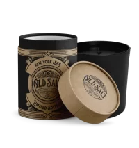
OldSalt_Candle.png

But the big thing is that it has to convey the energy you want to convey.

If you don't have the skill to create the brand you want, the next best thing is to reach out to those who can recreate your style.

Yes, the "energy" and "vibe" are what I hoped to convey by describing the "theme." In the past when I tried to explain the underlying energy and feeling (and also in regards to copywriting too) it was often misunderstood. It's challenging to really get it for those who aren't naturally artistic types.

When I've worked with designers, and also when designing, I try to attribute identities to the energy to give it form.

If it were Halloween and I were in costume as the Joker, then not only would I dress in the proper outfit and colors, I would assume the whole identity, the wicked behavior, the sinister cackle, the unhinged body language, unstable movement, and unnerving villainous jargon.

Sometimes I use songs to represent the underlying feeling of the brand. If the brand were a song (switching from a visual experience to auditory and hopefully later into emotion) what song would it be and how does that song make me feel?

Is it a sad country song? A rock song? Is it hip hop? Retro? Does that song make me feel sad, warm, happy, nostalgic, hopeful, hopeless, angry, dark, dreamy, powerful, excited?

You can go deeper and deeper with branding. It's a rabbit hole once you get into it. There are times to hire a designer and times to do it yourself. Whatever way you do it, just do it! >)
 

Walterbl

Contributor
User Power
Value/Post Ratio
100%
Sep 23, 2018
47
47
Great Thread. How do you pick a theme? Do you pick something related to your product/service or do you go for something will like?

I would add another component to those: related concepts/associations. For example, associating the concept of "energy" with redbull.
 

Lex DeVille

Sweeping Shadows From Dreams
FASTLANE INSIDER
EPIC CONTRIBUTOR
Read Fastlane!
Read Unscripted!
Speedway Pass
User Power
Value/Post Ratio
597%
Jan 14, 2013
5,351
31,935
Utah
How do you pick a theme? Do you pick something related to your product/service or do you go for something will like?

You should pick something that makes sense for your business. If you are selling waiting room chairs to hospitals then you probably wouldn't want a brand themed like The Legend of Zelda (unless you sell kids chairs).

Instead, you would want a professional and clean theme. So your theme is "Medical" or "Doctor" which means it might need a lot of white (for cleanliness and professionalism) and a bit of blue (for trust and cleanliness or clarity). It also might have very straight, thin lines in the design (indicating precision and accuracy like a surgeon).

Ideally, you will consider how you want your customer to see themselves when they encounter your business. Who should they become? How should they imagine others see them when they buy your product? What story should they tell themselves?

If you want your customer to feel like a S.W.A.T. team member even though he's just a security guard, then you might consider a tactical theme. You'd name your products things like "A.T.A.C. Storm Boot" or "A.T.A.C. Shield Boot" both of which trigger mental stories of attacking, shielding, storming, and kicking - things S.W.A.T. does and security guards imagine they do.

When the guard wears your boots around the mall, he's not just another donut-munching, observe and report, minimum wage teenage babysitter . He's an Elite Tactical Security Officer!

- When people buy from my company, who do they become?
- How do they want to be seen by others?
- How do they want to see themselves?
- What stories do they tell themselves AND others about the brand?
- What fantasies do you want to trigger them to imagine, feel and experience?
 
Dislike ads? Remove them and support the forum: Subscribe to Fastlane Insiders.

William Ainslie

Contributor
FASTLANE INSIDER
Read Fastlane!
Read Unscripted!
Speedway Pass
User Power
Value/Post Ratio
109%
Dec 13, 2016
57
62
44
South Africa
I have learned to listen and apply, do not change anything, just do what @Lex DeVille says.

I have wasted a ton of money with nothing to show for it because we don't apply exactly as indicated.

Thank you
 

Karume

New Contributor
User Power
Value/Post Ratio
48%
Aug 14, 2018
31
15

There are a lot of places to learn brand building. You can spend a lot of time and money on it if you're not careful. I spent five figures having brand materials created that I never used. My most successful branding attempts were created 100% by me for free.

You can create effective brands, even as a newbie. It's very simple, although nobody will tell you that. Graphic designers and other brand "experts" always suggest it's super hard and that you should just pay an expert (preferably them). But you can save your money. Just do this instead...

1. Pick a theme
2. Pick a name
3. Pick up to 5 colors
4. Be Consistent


1. Pick A Theme
By theme I'm talking about the identity behind your brand. Is it western? Biker gang? Tactical? Cyberpunk? Goth? Hippie? Rainforest? Coastal? Fishing? 1950's? Rockstar? Holistic? Nerd? Action hero? Wedding? Just pick some theme to set the context for your brand (and also all the feelings you want people to have).

Once you have your basic theme idea, then you have the fundamentals of all of the things that will and will not form your brand identity. For instance, a western brand will not show images of futuristic cities or use biker gang language such as talking about "Hell's Angels."

View attachment 26978
J. Peterman = Western/Cowboy/Explorer Theme


View attachment 26977
5.11 Tactical = Police/Military/Tactical Theme


2. Pick A Name
Brands can form around any name. But the goal is to take that experience deeper for your audience. The closer your name is to the theme and identity you want people to form for you brand, the easier it will be to create those associations. So while a western brand can definitely be formed around the word "Spoon," it will be easier to anchor the theme and identity in the viewer's mind if it is called "Dust" or "Herban Cowboy" or "True Grit" or "Eastwood's Urban Wear"

J. Peterman = Example of how a brand can form around ANY name.

5.11 Tactical = Closely associated with the brand theme.


3. Pick Up To 5 Colors
After you pick your theme, you want to narrow down your brand colors. Most people use white and gray or black on their website pages so that's 2 colors already. They also usually have a primary color and a secondary color (which is used for hover links or other things). Sometimes there is a 5th color that ties in with these other colors, but not always. All colors should transition into one another fairly easily.

View attachment 26975
J. Peterman = Dark Tan, Light Tan, White, Black (sometimes brown)


View attachment 26976
5.11 Tactical = Black, White, Orange, Tan (sometimes shades of Brown/Green)

Once you have your colors, do not deviate from them. A western brand might use light brown for a button and dark brown on the hover. NOT bright red. NOT neon green. NOT sunflower yellow. Those colors don't fit and won't make sense to the viewer. They will feel scattered.


4. Be Consistent
You've got your theme. You've got your colors. You have an idea in your mind of how your brand looks, sounds, thinks, smells, tastes, and feels. All that is left to do is make sure that every communication going forward fits this model.

If your brand is western, and you post a meme on instagram, it should use western language like "pardner" or "howdy" or whatever fits the fantasy. It should show cowboys or other western imagery (like saloon doors). It should have browns and tans and the colors of dust, dirt, grit.

View attachment 26973
J. Peterman on Facebook = Light Tan, Dark Tan, Black | Imagery fits explorer theme / uses brand name in social media.


View attachment 26974
5.11 Tactical on Instagram = White, Black, Orange, Tan (and some green/brown) / Imagery fits tactical lifestyle / uses brand name in post.

Anything you say should fit this model. Anything you post. And as you do this, your brand will begin to form over time. You do not need to spend money on this. You do not need an expensive logo. You only need to get started. Set the theme. Pick a name and colors. Be consistent.


Brands Are A Product Of Conditioning
Pavlov conditioned dogs to salivate when they hear a bell. The bell rings and the dog knows food follows. The first time the bell rings, the dog does not know that food follows, so he does not salivate at the sight of the bell. But when the dog receives food, then a concept forms in his mind for that experience. So the next time the dog sees the bell or the bell rings, the dog's brain triggers the concept to re-create the experience from before, and then predicts what is likely to happen next. Since the prediction is that food follows, and since expectations of food trigger salivation, the dog salivates at the bell. If food indeed follows the bell, then the concept is reinforced, and the association between the bell, or the bell ringing and food is more deeply anchored in the dog's mind.

Brands work this way too. You start with a theme. Pick a name. Set your colors. A person encounters your brand. At first they've never experienced you. So the first experience is where they form a concept. If your brand is inconsistent (too many colors, no clear theme, mismatched images, words, fonts, name etc.) then the experience is a scattered mess and the brand identity that forms is "a mess" and can't be easily categorized or anchored in the mind.

If the theme and colors are pulled together (even if they don't look amazing) then the concept that forms is compartmentalized into the appropriate themed identity. So a website called "Dust" that sells cowboy clothes and shows images of horses, saddles and cowboys wearing denim jeans, boots and 10 gallon hats, forms a "western" concept in the mind. Later, when the viewer tells their spouse about this "cool clothing brand" they saw earlier, they'll describe it as "this cool western brand called, Dust."

When the viewer encounters the brand again, they will expect more of this experience. If they follow you on social media, they will expect more of what they got the first time from your posts. If you are consistent, and you use themed images, attach your name to your posts, and use your selected colors, then you will reinforce the association of western with your brand and you will deepen the brand identity and experience for your viewer.

If the viewer is someone who enjoys the experience of your brand, then they will feel good each new time they encounter you and get more of the experience. With each new, consistent experience (post, page, video etc.) the addiction grows stronger and stronger until it becomes irresistible. Finally, at some point, the brand's identity merges with the individual's identity and they become one. They are inseparable. The brand and the individual are now one entity and because of this bond, you have a customer for life.

usa-flag-america.jpg

Bonus Tip - Seal The Deal With A Symbol
A name is enough to remember a brand. If you combine a good name with a symbol (in your logo) then it creates a much more powerful anchor for the experience in the viewer's mind. That's because symbols are like storage boxes. They give form to everything contained within the brand fantasy (the box - the symbol - stores the fantasy and identity inside).

It does not matter how simple or complex the symbol is. What's important is that it has some unique quality that can form a mental association between the brand name and the theme in the mind. It needs to be unique so it can always be easily identified and triggers the brand experience when encountered.

This is why every country's flag is a little different. Whatever country you are from, your country's flag is a symbol of your citizenship and everything it entails. You can more easily see and identify your country's flag than the flag of any other country in your imagination. For me it is the United States flag. I can draw it from memory. Don't ask me to draw the U.K.'s flag. Although I have an idea of what it looks like, almost guaranteed I'll draw it incorrectly. Also, if someone steps on the U.K. flag, I might think it is poor behavior from the stepper, and I might be angry about the individual's choice to offend people, but I WON'T be angry that the U.K.'s flag is being stepped on because it isn't my country's symbol and therefore isn't an extension of me.


View attachment 26971
J. Peterman Symbol = Cowboy Horseman


View attachment 26972
5.11 Symbol = Orange Target / Sight Picture

After the first time you come into contact with the brand and its theme, name, colors and symbol, then a concept forms. The symbol, in particular, can then stand out in the mind and trigger all of the other associations. As the viewer merges more and more with the brand, (especially once they become a customer) the symbol serves to reinforce everything that the brand (and by extension the customer) represents. Then just seeing the symbol triggers all of the good feelings associated with the brand. With some people the symbol triggers such powerful experiences, identities, fantasies and associations that the customer will even mark their own body, solidifying a bond for life.

mens-jack-daniels-logo-upper-arm-tattoos.jpg
Apple-Logo-Tattoo.jpg


Free Branding 101. The end.

Thank you so much for this inspiring and full of insights post. Worth to note!!!
 

Post New Topic

Please SEARCH before posting.
Please select the BEST category.

Post new topic

Guest post submissions offered HERE.

Latest Posts

New Topics

Fastlane Insiders

View the forum AD FREE.
Private, unindexed content
Detailed process/execution threads
Ideas needing execution, more!

Join Fastlane Insiders.

Top