The Entrepreneur Forum | Financial Freedom | Starting a Business | Motivation | Money | Success

Welcome to the only entrepreneur forum dedicated to building life-changing wealth.

Build a Fastlane business. Earn real financial freedom. Join free.

Join over 80,000 entrepreneurs who have rejected the paradigm of mediocrity and said "NO!" to underpaid jobs, ascetic frugality, and suffocating savings rituals— learn how to build a Fastlane business that pays both freedom and lifestyle affluence.

Free registration at the forum removes this block.

I will review your website and tell you how to improve it

DonCorleone

New Contributor
Read Fastlane!
Read Unscripted!
User Power
Value/Post Ratio
70%
Feb 22, 2019
10
7
Hi! I've been here for a while but I haven't posted much. Yesterday I was reading this thread and thought of leaving a review on the website, along with some tips and advices on how to improve it. I then thought that it may be helpful for other people, so here I'm starting this thread. If it's not the right subforum, I guess MJ or someone else can move it.

Who am I to review your website? I'm not an expert but I have 6+ years of experience working as a full-time web developer in a few different companies. Mainly front-end, and I also really like UI/UX design.

So, what do I need from you? Leave your website link and explain in a few sentences what's your business and what you're trying to accomplish with your website.

If you don't have a website or have more general questions, you can leave them as well, I'll try to reply if I know about the topic you're asking. If not, I'm sure someone else will be able to help.

Thanks for the space and I hope this helps someone :)
 
Dislike ads? Remove them and support the forum: Subscribe to Fastlane Insiders.

mauamolat

Contributor
Read Fastlane!
User Power
Value/Post Ratio
56%
Feb 3, 2020
39
22
Philippines
Hi! I've been here for a while but I haven't posted much. Yesterday I was reading this thread and thought of leaving a review on the website, along with some tips and advices on how to improve it. I then thought that it may be helpful for other people, so here I'm starting this thread. If it's not the right subforum, I guess MJ or someone else can move it.

Who am I to review your website? I'm not an expert but I have 6+ years of experience working as a full-time web developer in a few different companies. Mainly front-end, and I also really like UI/UX design.

So, what do I need from you? Leave your website link and explain in a few sentences what's your business and what you're trying to accomplish with your website.

If you don't have a website or have more general questions, you can leave them as well, I'll try to reply if I know about the topic you're asking. If not, I'm sure someone else will be able to help.

Thanks for the space and I hope this helps someone :)
Hi Man. Here's my website Kind TechGroup — Your Web Branding Partner
 

DonCorleone

New Contributor
Read Fastlane!
Read Unscripted!
User Power
Value/Post Ratio
70%
Feb 22, 2019
10
7

Hi! Thanks for your message. Here are my thoughts:

- The yellowish color you're using for your headings (#EDBD00) is not a good choice. It doesn't pass any contrast test for any kind of text. You need to use a darker color with white background. The same applies for buttons with yellow background and white text.
- I personally don't like the main headings font ("Permanent Marker"). But leaving taste aside, letter spacing is not good, and it's hard to read in smaller screens. I would choose another font, because I think it also doesn't get along well with the other fonts you're using. If you totally want to stick to that font, at least try to increase letter spacing (and change the color for contrast)
- I'm not designer/logo expert, but I think your logo can be improved a lot; it looks cheap to me
- I assume that selling hosting is your main goal. If that is the case, having a CTA for that is ok, but right now it's barely visible. Part of the issue is the font/color, but I would also change it to be a button or some other thing that you can come up with instead of an underlined text.
- The images scroll effects are a bit distracting. Also one gets bigger and the other smaller, which looks odd.
- You have too many options in your navbar. Try to reduce the number of options. It's a lot for the user and also in medium screens it goes to a second line (first being the logo) which doesn't look good.
- The "Let's build your business section": people don't want to read. I want to see what you can do for me and why I should choose you over your competitors. I'd replace this with a section where you display your top 3-4 services in columns with a short description and CTAs.
- "Best cheapest reliable..." section: the heading looks bad because you have no padding on the left. Also, you're using different divs with dark/white background and it's not clear at all. Looks like different sections but actually I think they are different plans of the same thing. Research your competitors and don't try to reinvent the wheel here. Use the typical cards for pricing plans, they're used a lot for a reason: they work and they convert well if you do them well. You can go to Dribbble and look for "Pricing plans" or something similar for inspiration, there're lots of great designs.
- I'd move the "Why us" section up. Immediately after the hero, include a shorter text on why you and then showcase your services.
- I think there is a lot going on your home page. It's very overwhelming to be honest. Try to think what is your best product, the thing you do best, etc. and define a clear goal. You don't need to include everything in your home page. Every home page should have a clear goal and be optimized based on that.
- Your cookies banner is over the footer, fix that. Also accepting it makes the page reload, that's not ideal, even more considering the site is pretty slow.
- Footer is fine
- The site is pretty slow. This is a common issue with Wordpress, but maybe try to see if you have any unnecessary plugin you can uninstall

You don't have any additional issues on mobile, the site is responsive and looks ok.

You have a lot of pages, you can tell me if you need a closer look at any particular one, but these are some thoughts I have after looking around:

- Resources page is broken (styles don't work)
- When I clicked to buy one of the hosting plans, it took me to another totally different page (Shopping Cart - Kind TechGroup): white background, blue navbar, etc. This is bad, you need to be consistent, it looks like a totally different website and will be a red flag for most users.
- You're linking a lot to Fiverr. Why would you do that?

It looks like you have a lot going on but everything looks messy. I'd consider removing some products/services and focus on the top 3 you want to sell. Provide a good user experience from beginning to end and optimize your site around them. This way, you're trying to do everything but you're not doing anything perfect.

Hope this all helps!
 

BizyDad

Keep going. Keep growing.
FASTLANE INSIDER
EPIC CONTRIBUTOR
Read Fastlane!
Read Unscripted!
Summit Attendee
Speedway Pass
User Power
Value/Post Ratio
416%
Oct 7, 2019
2,883
11,981
Phoenix AZ
Hi! Thanks for your message. Here are my thoughts:

- The yellowish color you're using for your headings (#EDBD00) is not a good choice. It doesn't pass any contrast test for any kind of text. You need to use a darker color with white background. The same applies for buttons with yellow background and white text.
- I personally don't like the main headings font ("Permanent Marker"). But leaving taste aside, letter spacing is not good, and it's hard to read in smaller screens. I would choose another font, because I think it also doesn't get along well with the other fonts you're using. If you totally want to stick to that font, at least try to increase letter spacing (and change the color for contrast)
- I'm not designer/logo expert, but I think your logo can be improved a lot; it looks cheap to me
- I assume that selling hosting is your main goal. If that is the case, having a CTA for that is ok, but right now it's barely visible. Part of the issue is the font/color, but I would also change it to be a button or some other thing that you can come up with instead of an underlined text.
- The images scroll effects are a bit distracting. Also one gets bigger and the other smaller, which looks odd.
- You have too many options in your navbar. Try to reduce the number of options. It's a lot for the user and also in medium screens it goes to a second line (first being the logo) which doesn't look good.
- The "Let's build your business section": people don't want to read. I want to see what you can do for me and why I should choose you over your competitors. I'd replace this with a section where you display your top 3-4 services in columns with a short description and CTAs.
- "Best cheapest reliable..." section: the heading looks bad because you have no padding on the left. Also, you're using different divs with dark/white background and it's not clear at all. Looks like different sections but actually I think they are different plans of the same thing. Research your competitors and don't try to reinvent the wheel here. Use the typical cards for pricing plans, they're used a lot for a reason: they work and they convert well if you do them well. You can go to Dribbble and look for "Pricing plans" or something similar for inspiration, there're lots of great designs.
- I'd move the "Why us" section up. Immediately after the hero, include a shorter text on why you and then showcase your services.
- I think there is a lot going on your home page. It's very overwhelming to be honest. Try to think what is your best product, the thing you do best, etc. and define a clear goal. You don't need to include everything in your home page. Every home page should have a clear goal and be optimized based on that.
- Your cookies banner is over the footer, fix that. Also accepting it makes the page reload, that's not ideal, even more considering the site is pretty slow.
- Footer is fine
- The site is pretty slow. This is a common issue with Wordpress, but maybe try to see if you have any unnecessary plugin you can uninstall

You don't have any additional issues on mobile, the site is responsive and looks ok.

You have a lot of pages, you can tell me if you need a closer look at any particular one, but these are some thoughts I have after looking around:

- Resources page is broken (styles don't work)
- When I clicked to buy one of the hosting plans, it took me to another totally different page (Shopping Cart - Kind TechGroup): white background, blue navbar, etc. This is bad, you need to be consistent, it looks like a totally different website and will be a red flag for most users.
- You're linking a lot to Fiverr. Why would you do that?

It looks like you have a lot going on but everything looks messy. I'd consider removing some products/services and focus on the top 3 you want to sell. Provide a good user experience from beginning to end and optimize your site around them. This way, you're trying to do everything but you're not doing anything perfect.

Hope this all helps!

Nice write up.

I've noticed you keep critiquing people's website speed. I agree with you. This other Fastlaner @Nick M. took the time to write a pretty comprehensive website speed thread, so you can just link to that instead of telling people to check their plugins.


Hope that helps.
 
Dislike ads? Remove them and support the forum: Subscribe to Fastlane Insiders.

mauamolat

Contributor
Read Fastlane!
User Power
Value/Post Ratio
56%
Feb 3, 2020
39
22
Philippines
Hi! Thanks for your message. Here are my thoughts:

- The yellowish color you're using for your headings (#EDBD00) is not a good choice. It doesn't pass any contrast test for any kind of text. You need to use a darker color with white background. The same applies for buttons with yellow background and white text.
- I personally don't like the main headings font ("Permanent Marker"). But leaving taste aside, letter spacing is not good, and it's hard to read in smaller screens. I would choose another font, because I think it also doesn't get along well with the other fonts you're using. If you totally want to stick to that font, at least try to increase letter spacing (and change the color for contrast)
- I'm not designer/logo expert, but I think your logo can be improved a lot; it looks cheap to me
- I assume that selling hosting is your main goal. If that is the case, having a CTA for that is ok, but right now it's barely visible. Part of the issue is the font/color, but I would also change it to be a button or some other thing that you can come up with instead of an underlined text.
- The images scroll effects are a bit distracting. Also one gets bigger and the other smaller, which looks odd.
- You have too many options in your navbar. Try to reduce the number of options. It's a lot for the user and also in medium screens it goes to a second line (first being the logo) which doesn't look good.
- The "Let's build your business section": people don't want to read. I want to see what you can do for me and why I should choose you over your competitors. I'd replace this with a section where you display your top 3-4 services in columns with a short description and CTAs.
- "Best cheapest reliable..." section: the heading looks bad because you have no padding on the left. Also, you're using different divs with dark/white background and it's not clear at all. Looks like different sections but actually I think they are different plans of the same thing. Research your competitors and don't try to reinvent the wheel here. Use the typical cards for pricing plans, they're used a lot for a reason: they work and they convert well if you do them well. You can go to Dribbble and look for "Pricing plans" or something similar for inspiration, there're lots of great designs.
- I'd move the "Why us" section up. Immediately after the hero, include a shorter text on why you and then showcase your services.
- I think there is a lot going on your home page. It's very overwhelming to be honest. Try to think what is your best product, the thing you do best, etc. and define a clear goal. You don't need to include everything in your home page. Every home page should have a clear goal and be optimized based on that.
- Your cookies banner is over the footer, fix that. Also accepting it makes the page reload, that's not ideal, even more considering the site is pretty slow.
- Footer is fine
- The site is pretty slow. This is a common issue with Wordpress, but maybe try to see if you have any unnecessary plugin you can uninstall

You don't have any additional issues on mobile, the site is responsive and looks ok.

You have a lot of pages, you can tell me if you need a closer look at any particular one, but these are some thoughts I have after looking around:

- Resources page is broken (styles don't work)
- When I clicked to buy one of the hosting plans, it took me to another totally different page (Shopping Cart - Kind TechGroup): white background, blue navbar, etc. This is bad, you need to be consistent, it looks like a totally different website and will be a red flag for most users.
- You're linking a lot to Fiverr. Why would you do that?

It looks like you have a lot going on but everything looks messy. I'd consider removing some products/services and focus on the top 3 you want to sell. Provide a good user experience from beginning to end and optimize your site around them. This way, you're trying to do everything but you're not doing anything perfect.

Hope this all helps!
Thanks, Man. I actually took advantage of this offer to review my site as I am re-designing my website in the next couple of days.

I have a few in mind already in the past month but I just can't execute due to a ton of things going on which is why instead, I hire people to reduce my workload and focus on this aspect of the business too.

For the color, which the Yellow thing, that's exactly what I want to dominate as a theme to my brand. But yes, you're right. I'll consider all these in the next one.

For the Button, I do have that one before but I just tried a new view for testing.

The Shopping Cart is actually my billing system which is for my client area. It is still connected to my own domain and I own it. There is a reason why I didn't design it the same as how it looks to my main as I offer a standard template for this system to my clients and I don't want to offer them something that I do not use myself. But I'm planning though to re-designing its color theme the same as the main one. That will be my next project after the main website.

Thanks and I will get back here after I finished the new one! I appreciate your feedback!!!
 

DonCorleone

New Contributor
Read Fastlane!
Read Unscripted!
User Power
Value/Post Ratio
70%
Feb 22, 2019
10
7
Nice write up.

I've noticed you keep critiquing people's website speed. I agree with you. This other Fastlaner @Nick M. took the time to write a pretty comprehensive website speed thread, so you can just link to that instead of telling people to check their plugins.


Hope that helps.

Thanks for that! I hadn't seen that thread, looks great - I'll try to read it all. It's a broad topic so it's really helpful that someone took the time to do that. I'll totally use it and also try to learn from it.

I recently read this ebook on mobile web speed written by Awwwards and Google which is very good. It talks about the importance of speed and a lot of tips on how to improve it, all focused in mobile web. I just thought of leaving it here because I found it very helpful.
 
D

Deleted70138

Guest
Thanks again for your previous review of my website, did implement all of those suggestions.

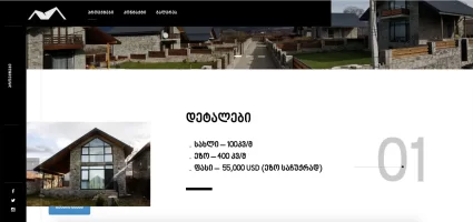
There is a real-estate project I'm working on and this is the website I've developed:
www.stonevillage.ge

It's in Georgian language, but google translate does good job.
 
Dislike ads? Remove them and support the forum: Subscribe to Fastlane Insiders.

DonCorleone

New Contributor
Read Fastlane!
Read Unscripted!
User Power
Value/Post Ratio
70%
Feb 22, 2019
10
7
Thanks again for your previous review of my website, did implement all of those suggestions.

There is a real-estate project I'm working on and this is the website I've developed:
www.stonevillage.ge

It's in Georgian language, but google translate does good job.

Hey! Thanks for your message. Here are my thoughts:

- This site is extremely slow, you need to do something about it ASAP. Users don't like waiting that much. It took a lot to display the loading bar and then a lot to show the page. I'll refer you to this great post that was shared here as it has all you need to know.
- I like the design of the page. I think though that the white headings in the hero need more contrast. The background images have a lot of light colors (specially the second one, the windows of the house are white) and that makes the text barely visible. I understand that you want to showcase the images, but it's very hard to read. I'll increase the size of the text a bit and definitely add an overlay over the images.
- The CTA button for "Projects" is too small. The size combined with the white makes it almost invisible. Again, increase the size and add overlays if you want to use white. Also change the hover effect because the text goes gray and then it's even less visible. I'd still use another color to make it pop and make it obvious that it's a button and your primary CTA (for example, like the blue buttons you use in the projects).
- The arrows for the carrousel are too small, I missed them for a while. Again, increase the size and I'd make the carrousel change images automatically. Also, when you reach the 3rd image, you can press the right arrow but it doesn't return to the first image, try to fix that.
- You have 3 buttons that go to the home page: the logo, the "Projects" label on the horizontal navbar and the "Projects" label on the vertical navbar. I think the vertical navbar on the left is totally useless as it is now. It looks good, but if it doesn't help it shouldn't be there. Also a "Projects" button shouldn't just reload the home page, you already have the logo for that.
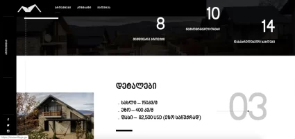
- I don't like having in the projects menu "01", "02", etc. That doesn't tell me anything, looks generic and cheap. Try to come up with fancy names for each projects, that will increase the attention a lot.
- When scrolling down the buttons are covered by the images:

30679

- The carrousels here have the same issue of the last image not returning to the first one.
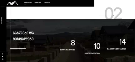
- I don't like this. I'm already seeing the full section and the text still isn't aligned well:
30681
- The same happens when I continue scrolling, it doesn't stay aligned:
30682
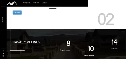
- Also this banner with the numbers, you're showing it twice, because after the 4th project it's shown again.
- About the projects "card", only the blue button is clickable. You can try making the whole area clickable, or maybe the title, photos and number.
- I think that the text is predominant here and shouldn't be like that. I think the photos are the most important thing here. The text and number are taking a lot of space that you could be using to showcase the images. I'd redesign these cards based on that. Also add some padding on the left of the image, it looks bad sticked to the black bar on the left.
- Footer: looks good. I think the text is too small, you have space so I'd make everything bigger. The text "See on the map" doesn't look clickable, it looks just like regular text. Make it obvious that it can be clicked.
- Overall, I think the home page is lacking more information. Who are you? What's your story? How are you different than your competitors? These are important things that you need to tell the user to build trust, specially when trying to sell things this expensive.

Gallery page
- I'd add the ability to make the images go full screen and also give context about them. Now I just see a bunch of images with no information at all.
- It seems that the menu items don't work in this page. When I press "Contact" or "Projects" nothing happens.

Contact page
- Make it simple. Remove the hero, use a simple title and display the form rightaway. Always use labels for your inputs apart from the placeholders, because once you begin writing the placeholders are gone and all of the sudden all the inputs look the same. You're offering email and phone too which is good.
- Is the map necessary? In the contact page, I don't think it is. These are not offices where you can go and talk, this is the location of the houses. I think there's no need for it here. If you want to keep it, make sure it works (it doesn't now).

Hope this all helps!
 

Attachments

  • Screen Shot 2020-02-24 at 13.14.00.png
    Screen Shot 2020-02-24 at 13.14.00.png
    455.7 KB · Views: 1

DonCorleone

New Contributor
Read Fastlane!
Read Unscripted!
User Power
Value/Post Ratio
70%
Feb 22, 2019
10
7
I will take all constructive criticism.
This is my 2nd paid project in wordpress

Hey! Thanks for your message. It's a simple website but I think it does the job and doesn't have major issues. Congrats on getting paid for it!

Some comments:

- Add a favicon
- Clicking on the logo takes me to the Swedish version of the site, without taking into account I'm in the English version.
- You have some issues with translations in some parts. For example, the cookies banner is shown in Swedish even though I'm in the English version of the web. The same happens with the buttons, for example the button right under "Try our home products" in the home page.
- Please include the logo in the footer. If you don't make your navbar sticky, your logo should be in the footer.
- Check your English texts with someone native. For example: "All products come with instructions and manuals what which/that makes mounting...". I'm not a native speaker but I still see some things like that which are wrong.
- I think the section "Hospital or private clinic?" can be improved. The image is not great and doesn't look good. Maybe do a section with a background image? Also change the text or the button. Instead of "Professional products" try something like "See more", "Find out more", "More information", etc.
- Add hover effects for all your buttons.
-Right now the content on the home page is short, and that is because it's lacking some background on the company. Who are you? What's your story? What makes you different than your competitors? These things are important for the customer to build trust.
- I think the about page can be improved a lot. It's just a wall of text which people won't read. Include images, testimonials, logos of companies you've work with in the past, case studies, etc. Take the top 3 or 4 services/products that the company offers and highlight them in columns with icons/images and a short description for each. You've a photo of someone of the company in the contact page and not in the About page, which is weird.
- Overall I think the website is ok and does the job. It's a great first version but I still think the design is very simple. That's not necessarily a bad thing, but if you have the time/money I'd invest in making it better.
- You've 3 issues that will hurt your SEO: no h1 tag, no sitemap and no meta tags. If you don't know what they are, Google them, I won't talk about them here but they are not difficult things to add.

Those are the things I see right now, let me know if you've any question about any particular section
 
Dislike ads? Remove them and support the forum: Subscribe to Fastlane Insiders.
Last edited:

Post New Topic

Please SEARCH before posting.
Please select the BEST category.

Post new topic

Guest post submissions offered HERE.

Latest Posts

New Topics

Fastlane Insiders

View the forum AD FREE.
Private, unindexed content
Detailed process/execution threads
Ideas needing execution, more!

Join Fastlane Insiders.

Top