BizyDad
Keep going. Keep growing.
FASTLANE INSIDER
EPIC CONTRIBUTOR
Read Fastlane!
Read Unscripted!
Summit Attendee
Speedway Pass
Hi! Thanks for your message. Here are my thoughts:
- The yellowish color you're using for your headings (#EDBD00) is not a good choice. It doesn't pass any contrast test for any kind of text. You need to use a darker color with white background. The same applies for buttons with yellow background and white text.
- I personally don't like the main headings font ("Permanent Marker"). But leaving taste aside, letter spacing is not good, and it's hard to read in smaller screens. I would choose another font, because I think it also doesn't get along well with the other fonts you're using. If you totally want to stick to that font, at least try to increase letter spacing (and change the color for contrast)
- I'm not designer/logo expert, but I think your logo can be improved a lot; it looks cheap to me
- I assume that selling hosting is your main goal. If that is the case, having a CTA for that is ok, but right now it's barely visible. Part of the issue is the font/color, but I would also change it to be a button or some other thing that you can come up with instead of an underlined text.
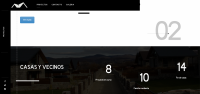
- The images scroll effects are a bit distracting. Also one gets bigger and the other smaller, which looks odd.
- You have too many options in your navbar. Try to reduce the number of options. It's a lot for the user and also in medium screens it goes to a second line (first being the logo) which doesn't look good.
- The "Let's build your business section": people don't want to read. I want to see what you can do for me and why I should choose you over your competitors. I'd replace this with a section where you display your top 3-4 services in columns with a short description and CTAs.
- "Best cheapest reliable..." section: the heading looks bad because you have no padding on the left. Also, you're using different divs with dark/white background and it's not clear at all. Looks like different sections but actually I think they are different plans of the same thing. Research your competitors and don't try to reinvent the wheel here. Use the typical cards for pricing plans, they're used a lot for a reason: they work and they convert well if you do them well. You can go to Dribbble and look for "Pricing plans" or something similar for inspiration, there're lots of great designs.
- I'd move the "Why us" section up. Immediately after the hero, include a shorter text on why you and then showcase your services.
- I think there is a lot going on your home page. It's very overwhelming to be honest. Try to think what is your best product, the thing you do best, etc. and define a clear goal. You don't need to include everything in your home page. Every home page should have a clear goal and be optimized based on that.
- Your cookies banner is over the footer, fix that. Also accepting it makes the page reload, that's not ideal, even more considering the site is pretty slow.
- Footer is fine
- The site is pretty slow. This is a common issue with Wordpress, but maybe try to see if you have any unnecessary plugin you can uninstall
You don't have any additional issues on mobile, the site is responsive and looks ok.
You have a lot of pages, you can tell me if you need a closer look at any particular one, but these are some thoughts I have after looking around:
- Resources page is broken (styles don't work)
- When I clicked to buy one of the hosting plans, it took me to another totally different page (Shopping Cart - Kind TechGroup): white background, blue navbar, etc. This is bad, you need to be consistent, it looks like a totally different website and will be a red flag for most users.
- You're linking a lot to Fiverr. Why would you do that?
It looks like you have a lot going on but everything looks messy. I'd consider removing some products/services and focus on the top 3 you want to sell. Provide a good user experience from beginning to end and optimize your site around them. This way, you're trying to do everything but you're not doing anything perfect.
Hope this all helps!
Nice write up.
I've noticed you keep critiquing people's website speed. I agree with you. This other Fastlaner @Nick M. took the time to write a pretty comprehensive website speed thread, so you can just link to that instead of telling people to check their plugins.

GOLD! - HOT! - SIDE HUSTLE - WordPress Site Speed, Perfected—Ask Me Anything
Let's Make Your Site Perform At It's Peak Ok, so many of you probably bring in business through your website. So obviously, you want to make your site as effective and efficient as possible. After all, a better website means a better business. One of the easiest and most effective ways to...
 www.thefastlaneforum.com
Hope that helps.
Dislike ads? Remove them and support the forum:
Subscribe to Fastlane Insiders.
")