The Entrepreneur Forum | Financial Freedom | Starting a Business | Motivation | Money | Success

Welcome to the only entrepreneur forum dedicated to building life-changing wealth.

Build a Fastlane business. Earn real financial freedom. Join free.

Join over 80,000 entrepreneurs who have rejected the paradigm of mediocrity and said "NO!" to underpaid jobs, ascetic frugality, and suffocating savings rituals— learn how to build a Fastlane business that pays both freedom and lifestyle affluence.

Free registration at the forum removes this block.

[Progress] Sanctus Nutrition - Supplement Company (and first real entrepreneurial pursuit)

Scot

Salad Dressing Empire
EPIC CONTRIBUTOR
Read Fastlane!
Read Unscripted!
Summit Attendee
Speedway Pass
User Power
Value/Post Ratio
472%
Jul 10, 2016
2,975
14,055
Florida
My experience comes from being a personal trainer for 10+ years. I don't know much about Facebook ads, but I've interacted with your target audience on a daily basis for a long time. I can tell you that the women I've interacted with at fitness centers are interested in being lean and toned. Of the 1000s of women I've interacted with during my time working in gyms, this is what they have told me. If something has "Force" on it, they tend to shy away because it indicates bigger, stronger muscles. The women I've interacted with are terrified of developing big muscles (again, their goal is to be tone and lean), and will question and/or avoid anything that sounds like it might lead to being bigger and bulkier.

The guys, on the other hand, want to be big and muscular. Not even strong, truthfully. I can't tell you how many times I've heard this statement from guys at the gym: "I don't even care if I'm strong, I just want to look strong." In other words, they want to look big, so they appear strong, but they don't care if they actually are strong.

With those things in mind, my suggestion would be to have one supplement that has a name associated with being lean and toned for women, and another with a name associated with looking big and muscular for men. My thought is that it could be the same supplement, with two differences:
1. Different name: One for women, one for men
2. Different dosage: Lower dosage for women, higher dosage for men


+1 to everything you said.

That’s not a bad idea, making two different sku’s to target women and men.

Side note, everytime I hear a woman say she doesn’t want to bulk up, I facepalm. If “bulking” were as easy as your clients thinks it is, I’d be a 3 time Arnold Classic winner.
 
Dislike ads? Remove them and support the forum: Subscribe to Fastlane Insiders.

Greg R

Act, Assess, Adjust
Read Fastlane!
Read Unscripted!
Summit Attendee
Speedway Pass
User Power
Value/Post Ratio
465%
Oct 28, 2015
1,060
4,933
Puerto Vallarta, Mexico
Thank you for taking the time to write a detailed response. I'll reply to each point:


Thank you for not holding back and being honest -> this is why I get so much value from this forum.

Our target is health-conscious 29-34 YO men, high income, weightlifters -> is this narrow enough? We've had sales from people outside that demographic but that's who I picture when I think "target customer".


Would you turn it off completely? Set to exit intent?

Since running, it has 1,411 views, 78 email sign ups (5.5% conversion). Not saying these are good results, just giving stats. Do you think I'd have better results turning it off completely?


Noted. This is an attempt to play into the "social proof" mentioned in #5 below, since, as you mentioned, we currently only offer one product. It shows the image associated with the product - hence, the product image for samples (girl holding a sample) pops up for male names.

Would you turn this off completely? Change its appearance? Change how often it appears?


She's my fiancee and costs $0 to schedule a photoshoot with ;) we had demand for samples and I wanted to get the product listing up in Shopify ASAP. I gave her a sample pack, her phone, and said I needed a product shot within an hour. Haven't taken the time to make a better image.

Seriously - my photos are shit. Most are stock, those that aren't stock aren't high quality. I'll be honest and won't make excuses - it's on me to make time to get a photographer, get a model, and get some good shots. I haven't done that, and it is costing me money.


What would you recommend re: social proof?

I've attempted the IG/social media influencer route and got absolutely no where, just gave out a bunch of product for free with zero return. Also attempted the "so and so just bought" pop-ups.


Do you care about taste? Should I remove any mention of taste/flavor?


My takeaway here: ignore any BB'ing-type marketing, and go the self-improvement route. Find influencers in this realm. Promote via these channels instead of trying to compete against other pre-workouts in the bodybuilding sphere.


They cost $13.78 to make & ship from manufacturer. $5.75 to ship to consumer. So $19.53 total. I won't bullshit you, I didn't do anything fancy - just rounded up to $25.

Would you price differently? I'll run at $24.99 and see how it performs.


This is a big reason I made this product. The next version will be NO caffeine - 90 mg is essentially pointless and I made a mistake here, because I could be marketing it as "caffeine free", "no caffeine", and hitting a large market there, vs. trying to toe the line and appeal to everyone - which is what I did with the 90 mg. Rookie mistake. I learned my lesson for next time.


Thanks again for your detailed response. I agree that the website needs vast improvement. I take responsibility for shitty pics. Social proof, I'm unsure what to do, to be honest. Mainstream availability...down the future, when we have the sales to be taken seriously there.

Let me know if I missed the mark on anything. Thanks again - I really appreciate it!
Just out of curiosity, why do you think the influencer campaign failed?
 

Blaise84

Bronze Contributor
Read Fastlane!
Read Unscripted!
Speedway Pass
User Power
Value/Post Ratio
154%
Jul 8, 2017
150
231
39
Northeast Ohio
+1 to everything you said.

That’s not a bad idea, making two different sku’s to target women and men.

Side note, everytime I hear a woman say she doesn’t want to bulk up, I facepalm. If “bulking” were as easy as your clients thinks it is, I’d be a 3 time Arnold Classic winner.

Thank you!

Lol, and yep, it can be a difficult topic to explain
 

Brewer07

Bronze Contributor
Speedway Pass
User Power
Value/Post Ratio
401%
Jun 24, 2017
90
361
33
Kentucky
Just out of curiosity, why do you think the influencer campaign failed?

  1. We aren't an established brand, don't have an established product.
  2. Many fitness accounts with high followings are already sponsored
  3. Many fitness accounts with high followings that are not sponsored, are not looking to be sponsored. They think it compromises their integrity with their audience.
  4. People, especially with large followings, ignore DM's.
  5. We only have one product at the moment, instead of several products, which makes it harder for an influencer to promote (eventually the posts would get repetitive) and limits their earning potential (more products = higher chance for referral sales).
 
Dislike ads? Remove them and support the forum: Subscribe to Fastlane Insiders.

Brewer07

Bronze Contributor
Speedway Pass
User Power
Value/Post Ratio
401%
Jun 24, 2017
90
361
33
Kentucky
Seeking feedback on website:

Alright, I had today off from my day job. So I spent it re-constructing the website in six different Shopify themes, in addition to the theme we are currently using. I made a screen recording of each. Please let me know your thoughts. Keeping in mind certain things - like pictures and copy - can be edited, changed, etc. I'm looking for feedback on the design, layout, etc. That said, if you like the look of a certain theme but think a different picture should be used, let me know.

These are in no particular order:
Brooklyn Theme
Debut Theme
Minimal Theme
Narrative Theme
Simple Theme
Supply Theme
Venture Theme

Let me know if you need more info, or more screen grabs.
 

MJ DeMarco

I followed the science; all I found was money.
Staff member
FASTLANE INSIDER
EPIC CONTRIBUTOR
Read Rat-Race Escape!
Read Fastlane!
Read Unscripted!
Summit Attendee
Speedway Pass
User Power
Value/Post Ratio
445%
Jul 23, 2007
38,083
169,506
Utah
I'm looking for feedback on the design, layout, etc.

Have you looked at the most successful brands and simply try to model that style/presentation?

For instance,

http://jymsupplementscience.com/

I mentioned him before on this thread, but I wanted to share the group. Dr Jim Stoppani’s brand, Jym, has a die hard cult like following. Anyone starting a supplement company should strive to emulate what he’s built.

Actually his brand has gone through some tribulations, supposedly with some agreement with Bodybuilding.com that went south. But yea, I was a big fan until I stopped using stuff with artificial colors/sweeteners.
 

Scot

Salad Dressing Empire
EPIC CONTRIBUTOR
Read Fastlane!
Read Unscripted!
Summit Attendee
Speedway Pass
User Power
Value/Post Ratio
472%
Jul 10, 2016
2,975
14,055
Florida
Have you looked at the most successful brands and simply try to model that style/presentation?

For instance,

http://jymsupplementscience.com/


Actually his brand has gone through some tribulations, supposedly with some agreement with Bodybuilding.com that went south. But yea, I was a big fan until I stopped using stuff with artificial colors/sweeteners.


Yeah that’s a whole long story. They actually made up. But what’s interesting is watching how fanatical his followers are on the group. People will routinely go off on gnc reps who try to dissuade them from buying Jym products. Regardless of if they’re good or not, you want a business where people will fight to defend your business
 
Dislike ads? Remove them and support the forum: Subscribe to Fastlane Insiders.

DVU

In Progress
Read Fastlane!
Speedway Pass
User Power
Value/Post Ratio
236%
Sep 24, 2016
256
603
25
Croatia
For the business? No. We do use IG's story feature.


Appreciate the insight! I've trained a few family members on the side - getting past the "I don't want to be big, I just want to tone" and getting them to realize adding muscle = getting "toned" is a pain in the a$$.
You need to use it. Big % of your audience is there.
 

DVU

In Progress
Read Fastlane!
Speedway Pass
User Power
Value/Post Ratio
236%
Sep 24, 2016
256
603
25
Croatia
2 things on the new website.

Add a CTA at the bottom of the homepage.

I saw that you put a cta on the hero image. That's good but the learn more should enable the user to learn more not take him directly to the product page.

What you can do here is make a page where you "sell" the product. List the features and benefits and then put a buy button on the bottom of that page.
 

Brewer07

Bronze Contributor
Speedway Pass
User Power
Value/Post Ratio
401%
Jun 24, 2017
90
361
33
Kentucky
Have you looked at the most successful brands and simply try to model that style/presentation?

For instance,

http://jymsupplementscience.com/


Actually his brand has gone through some tribulations, supposedly with some agreement with Bodybuilding.com that went south. But yea, I was a big fan until I stopped using stuff with artificial colors/sweeteners.

I really appreciate you stopping in and giving your feedback!

I've studied JYM, Progenex, 1st Phorm, Cellucor, Optimum Nutrition, Onnit, to name a few.

A few things I noted:
  1. They all sell multiple products, have an apparel line, and prominently feature their products on the front page. Example: having a "Shop by your goal" feature, where you are led to different products based on your goal (weight loss, muscle building, etc.)
  2. Most have contact info - phone number, address - located in the footer. I am working to figure out how to do this in my current theme, as there doesn't appear to be an option to show that information.
  3. Some have a video.
They have more products and more content, and better images/3D renders for their products.

For product pages:
  1. Onnit has beautiful product pages. Holy shit.
  2. 1st Phorm and MusclePharm have very short descriptions with 1-3 images.
  3. ON is a short description, photos, athlete testimonials from their affiliate athletes.
  4. JYM has nothing other than one product shot and a description.
  5. Cellucor has several product shots plus a video describing the product
  6. Progenex has product shots, video, a description of the science behind the product.
Product pages all lack images of people with the product. It's just the product.

I am aware I need a better 3D render/product picture. Every time I try and get this off Fiverr, it looks like shit. My current design guy is MIA / non-responsive when I reach out.

2 things on the new website.

Add a CTA at the bottom of the homepage.

I saw that you put a cta on the hero image. That's good but the learn more should enable the user to learn more not take him directly to the product page.

What you can do here is make a page where you "sell" the product. List the features and benefits and then put a buy button on the bottom of that page.

Added CTA to bottom. Working on a separate landing page to send visitors too rather than landing directly on the product page. I'll let you know when I have a finished version.
 
Dislike ads? Remove them and support the forum: Subscribe to Fastlane Insiders.

MJ DeMarco

I followed the science; all I found was money.
Staff member
FASTLANE INSIDER
EPIC CONTRIBUTOR
Read Rat-Race Escape!
Read Fastlane!
Read Unscripted!
Summit Attendee
Speedway Pass
User Power
Value/Post Ratio
445%
Jul 23, 2007
38,083
169,506
Utah
I am aware I need a better 3D render/product picture.

Every time I try and get this off Fiverr

That's your problem. You pay five bucks, you get five bucks of value.

If your pictures "look" FiveRR, what does it say about your product? Was that outsourced at the "FiveR" of supplement manufacturers?

If you want to do something right, sometimes you just have to pay a premium and get a pro to do it.
 

RoadTrip

Bronze Contributor
Read Fastlane!
Speedway Pass
User Power
Value/Post Ratio
161%
Nov 27, 2012
288
464
That's your problem. You pay five bucks, you get five bucks of value.

If your pictures "look" FiveRR, what does it say about your product? Was that outsourced at the "FiveR" of supplement manufacturers?

If you want to do something right, sometimes you just have to pay a premium and get a pro to do it.
This. I have tried Fiverr many times and only a couple of times I got something useful. And I always have to repeat myself multiple times. I hate that.

I have been very satisfied with 99 designs for a package design. I got the cheapest option and still got a ton of designs, including some very good ones. I highly recommend it if you are in need of some design some day.

But since you need some Photoshop skills, maybe you can checkout Upwork or join some designer Facebook groups and ask for help there. There are plenty of good designers who are not expensive.


Sent from my SM-G950F using Tapatalk
 

Brewer07

Bronze Contributor
Speedway Pass
User Power
Value/Post Ratio
401%
Jun 24, 2017
90
361
33
Kentucky
That's your problem. You pay five bucks, you get five bucks of value.

If your pictures "look" FiveRR, what does it say about your product? Was that outsourced at the "FiveR" of supplement manufacturers?

If you want to do something right, sometimes you just have to pay a premium and get a pro to do it.

Damn, that is spot on. Great insight - thank you. Sometimes I still have my "slowlane" mindset where I'm trying to do everything as cheap as possible, scared to spend money.

This. I have tried Fiverr many times and only a couple of times I got something useful. And I always have to repeat myself multiple times. I hate that.

I have been very satisfied with 99 designs for a package design. I got the cheapest option and still got a ton of designs, including some very good ones. I highly recommend it if you are in need of some design some day.

But since you need some Photoshop skills, maybe you can checkout Upwork or join some designer Facebook groups and ask for help there. There are plenty of good designers who are not expensive.


Sent from my SM-G950F using Tapatalk

This has been my experience as well. Of everything I've paid for on Fiverr, I don't think I'm actively using a single thing.
 
Dislike ads? Remove them and support the forum: Subscribe to Fastlane Insiders.

Brewer07

Bronze Contributor
Speedway Pass
User Power
Value/Post Ratio
401%
Jun 24, 2017
90
361
33
Kentucky
Really enjoy your process @Brewer07. Keep up the good work!

Here are some threads for you... Check these out. Have you read Ca$hvertising?

INSIDERS Threads:
https://www.thefastlaneforum.com/co...ow-to-kick-a$$-with-facebook-marketing.48920/
https://www.thefastlaneforum.com/community/threads/progress-monetising-my-adwords-knowledge.52532/
https://www.thefastlaneforum.com/co...ific-beauty-products.58683/page-3#post-445772

Non INSIDERS Threads:
GOLD - Paid Advertising Crash Course
The Online Buying Lifecycle (video)


@MJ DeMarco @AllenCrawley @Vigilante @Andy Black

#notable or #gold ?

Hey @Raoul Duke , I wanted to follow up and let you know what actions I've taken based on this post / what I've learned.

  1. Bought Cashvertising tonight and will start reading tonight.
  2. I've read through the FB Marketing thread a few times. I've been running FB ad campaigns to test different markets, different copy, etc. We also have FB remarketing set up. I don't think our Pixel is calibrated correctly, because Facebook is claiming a certain # of purchases attributable to the campaigns that I can't verify through Shopify, but that's been the only frustrating part so far.
  3. I spoke with Andy on the phone and have an Adwords campaign + remarketing set up. I've had some problems with properly implementing the tag but I think I fixed that tonight. Pretty sure I just forgot to re-add the tag to the site after switching themes in Shopify.
  4. I'm launching a campaign in Adwords based on Andy's "apples falling out of the tree" remark re: setting up a campaign for people searching for your brand and products.
  5. The thread by eliquid is gold for a beginner like me.

That's a long way of saying I'm spending some money to learn how paid advertising works and improve my copy. I really appreciate your help!
 

Scot

Salad Dressing Empire
EPIC CONTRIBUTOR
Read Fastlane!
Read Unscripted!
Summit Attendee
Speedway Pass
User Power
Value/Post Ratio
472%
Jul 10, 2016
2,975
14,055
Florida
CB2AB12C-201E-4DE0-9BC4-81A1EE19AC1D.jpeg

Wtf kind of witchcraft is this @Brewer07 ?!?!? I log onto Facebook messenger to send someone a message and your daggon ad is IN messenger!

Damn props for blowing up FB ads lately, you’ve beeb retargeting me like a mofo!
 

kkompoti

Bronze Contributor
Read Fastlane!
Speedway Pass
User Power
Value/Post Ratio
126%
Jul 23, 2016
192
242
38
Greece
i was reading this thread and googled your brand.
i did not like the girl drinking your product photo.
also i did not like the colour of the free shipping

sanc.png

also i went to the jym products page. they lack of product expaining you dont
they have a more content marketing layout than your site.


you have done a fine job . you will find the small details .fix them and you will be successful
 
Dislike ads? Remove them and support the forum: Subscribe to Fastlane Insiders.

Brewer07

Bronze Contributor
Speedway Pass
User Power
Value/Post Ratio
401%
Jun 24, 2017
90
361
33
Kentucky
View attachment 17466

Wtf kind of witchcraft is this @Brewer07 ?!?!? I log onto Facebook messenger to send someone a message and your daggon ad is IN messenger!

Damn props for blowing up FB ads lately, you’ve beeb retargeting me like a mofo!

.......so did you order? Where can I improve the copy? Improve the photo?

:)

i was reading this thread and googled your brand.
i did not like the girl drinking your product photo.
also i did not like the colour of the free shipping

View attachment 17473

also i went to the jym products page. they lack of product expaining you dont
they have a more content marketing layout than your site.


you have done a fine job . you will find the small details .fix them and you will be successful

I appreciate the feedback. I've updated the photo and I like the new one a lot more - let me know what you think.
 

Scot

Salad Dressing Empire
EPIC CONTRIBUTOR
Read Fastlane!
Read Unscripted!
Summit Attendee
Speedway Pass
User Power
Value/Post Ratio
472%
Jul 10, 2016
2,975
14,055
Florida
.......so did you order? Where can I improve the copy? Improve the photo?

:)


I appreciate the feedback. I've updated the photo and I like the new one a lot more - let me know what you think.

Honestly, if you put a bit more about “pharmacist formulated” I’d be your ideal customer. Good ad work though!
 

JoshM

Contributor
Read Fastlane!
Read Unscripted!
User Power
Value/Post Ratio
292%
Dec 12, 2017
12
35
35
Houston, TX
I really appreciate you stopping in and giving your feedback!

I've studied JYM, Progenex, 1st Phorm, Cellucor, Optimum Nutrition, Onnit, to name a few.

A few things I noted:
  1. They all sell multiple products, have an apparel line, and prominently feature their products on the front page. Example: having a "Shop by your goal" feature, where you are led to different products based on your goal (weight loss, muscle building, etc.)
  2. Most have contact info - phone number, address - located in the footer. I am working to figure out how to do this in my current theme, as there doesn't appear to be an option to show that information.
  3. Some have a video.
They have more products and more content, and better images/3D renders for their products.

For product pages:
  1. Onnit has beautiful product pages. Holy sh*t.
  2. 1st Phorm and MusclePharm have very short descriptions with 1-3 images.
  3. ON is a short description, photos, athlete testimonials from their affiliate athletes.
  4. JYM has nothing other than one product shot and a description.
  5. Cellucor has several product shots plus a video describing the product
  6. Progenex has product shots, video, a description of the science behind the product.
Product pages all lack images of people with the product. It's just the product.

I am aware I need a better 3D render/product picture. Every time I try and get this off Fiverr, it looks like sh*t. My current design guy is MIA / non-responsive when I reach out.


Added CTA to bottom. Working on a separate landing page to send visitors too rather than landing directly on the product page. I'll let you know when I have a finished version.

I'm a bit late to the game, but here's where you need to get your supplement bottle renders:

Supplement Bottle Mock-Up v3.0 - This is where you spend your $5.

Now, you just need an attractive label. It will cost you. Bad designers are a dime a dozen and are afraid to price on value because they suck, but good designers won't bat an eyelash at charging $350 or more for one or two revisions. I suggest sourcing a designer off of Dribbble - do a search query for 'supplement' and you'll get a glimpse of some of the most talented designers you've ever seen: Dribbble - Show and tell for designers

Contact these designers via their profile on Dribbble, explain your project, and see if you can get an estimate. Trust me, going the extra mile on designing the right label will go a long way for you.

For a well-designed and highly-successful supplement brand, I'd recommend taking a look at Old School Labs. I do a lot of conversion optimization work for e-commerce clients and as far as design/copy is concerned, these guys "get it." A fine mix of attractive design, persuasive copy, strong value propositions, social proof, user-generated content (customer photos), credibility, and valuable blog content.

Their product pages are solid too-- very focused on attacking the problem with their "solution" and addresses concerns/objections that a consumer might have when shopping for supplements.
 
Dislike ads? Remove them and support the forum: Subscribe to Fastlane Insiders.
Last edited:

Brewer07

Bronze Contributor
Speedway Pass
User Power
Value/Post Ratio
401%
Jun 24, 2017
90
361
33
Kentucky
Honestly, if you put a bit more about “pharmacist formulated” I’d be your ideal customer. Good ad work though!

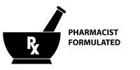
Taking a lesson learned from Ca$hvertising (thanks again @Raoul Duke) - I'm going to make a seal (like this but sleeker and more modern promoting that aspect. Something like
  • "Pharmacist Developed"
  • "Pharmacist Formulated"
  • "#1 Pharmacist-recommend preworkout"

And place it on ALL ad images. Probably throw it on the bottle label too.

Thoughts?

I'm a bit late to the game, but here's where you need to get your supplement bottle renders:

Supplement Bottle Mock-Up v3.0 - This is where you spend your $5.

Now, you just need an attractive label. It will cost you. Bad designers are a dime a dozen and are afraid to price on value because they suck, but good designers won't bat an eyelash at charging $350 or more for one or two revisions. I suggest sourcing a designer off of Dribbble - do a search query for 'supplement' and you'll get a glimpse of some of the most talented designers you've ever seen: Dribbble - Show and tell for designers

Contact these designers via their profile on Dribbble, explain your project, and see if you can get an estimate. Trust me, going the extra mile on designing the right label will go a long way for you.

For a well-designed and highly-successful supplement brand, I'd recommend taking a look at Old School Labs. I do a lot of conversion optimization work for e-commerce clients and as far as design/copy is concerned, these guys "get it." A fine mix of attractive design, persuasive copy, strong value propositions, social proof, user-generated content (customer photos), credibility, and valuable blog content.

Their product pages are solid too-- very focused on attacking the problem with their "solution" and addresses concerns/objections that a consumer might have when shopping for supplements.

Agree re: Old School Labs. I've used them as a case study throughout this process.

So would you recommend completely re-doing the label? That is one thing I did not have done on the cheap - technically it was free, but it was designed by a friend of mine who does that type of work for major national/international brands.
 

Scot

Salad Dressing Empire
EPIC CONTRIBUTOR
Read Fastlane!
Read Unscripted!
Summit Attendee
Speedway Pass
User Power
Value/Post Ratio
472%
Jul 10, 2016
2,975
14,055
Florida
Taking a lesson learned from Ca$hvertising (thanks again @Raoul Duke) - I'm going to make a seal (like this but sleeker and more modern promoting that aspect. Something like
  • "Pharmacist Developed"
  • "Pharmacist Formulated"
  • "#1 Pharmacist-recommend preworkout"

And place it on ALL ad images. Probably throw it on the bottle label too.

Thoughts?


Agree re: Old School Labs. I've used them as a case study throughout this process.

So would you recommend completely re-doing the label? That is one thing I did not have done on the cheap - technically it was free, but it was designed by a friend of mine who does that type of work for major national/international brands.

I like it! I think that’s such a huge advantage that you haven’t been promoting. There’s so much noise in the supp space, you have to stand out.

I would either go with pharmacist developed or formulated, the #1 recommended doesn’t hold the same weight IMO.
 

JoshM

Contributor
Read Fastlane!
Read Unscripted!
User Power
Value/Post Ratio
292%
Dec 12, 2017
12
35
35
Houston, TX
Taking a lesson learned from Ca$hvertising (thanks again @Raoul Duke) - I'm going to make a seal (like this but sleeker and more modern promoting that aspect. Something like
  • "Pharmacist Developed"
  • "Pharmacist Formulated"
  • "#1 Pharmacist-recommend preworkout"

And place it on ALL ad images. Probably throw it on the bottle label too.

Thoughts?


Agree re: Old School Labs. I've used them as a case study throughout this process.

So would you recommend completely re-doing the label? That is one thing I did not have done on the cheap - technically it was free, but it was designed by a friend of mine who does that type of work for major national/international brands.

You know, the supplement label isn't bad per-se, but I'm willing to bet that you could sell more if you invested a bit more into the packaging/label design. The actual copy on the label seems solid, from what I can see.

Aside from that, there are improvements that can be made to the website from a design perspective. Breaking up the content and using visual cues might help make that copy stand out and make the product even more attractive.

My brain is functioning today :clench:, so I might just send over a mockup to give you some ideas for how you can approach this.
 
Dislike ads? Remove them and support the forum: Subscribe to Fastlane Insiders.

Brewer07

Bronze Contributor
Speedway Pass
User Power
Value/Post Ratio
401%
Jun 24, 2017
90
361
33
Kentucky
I like it! I think that’s such a huge advantage that you haven’t been promoting. There’s so much noise in the supp space, you have to stand out.

I would either go with pharmacist developed or formulated, the #1 recommended doesn’t hold the same weight IMO.

Appreciate it! See attached file.

You know, the supplement label isn't bad per-se, but I'm willing to bet that you could sell more if you invested a bit more into the packaging/label design. The actual copy on the label seems solid, from what I can see.

Aside from that, there are improvements that can be made to the website from a design perspective. Breaking up the content and using visual cues might help make that copy stand out and make the product even more attractive.

My brain is functioning today :clench:, so I might just send over a mockup to give you some ideas for how you can approach this.

Man, I really appreciate that. Let me know what you come up with!
 

Attachments

  • PharmacistFormulated_Black.png
    PharmacistFormulated_Black.png
    5.8 KB · Views: 8

Brewer07

Bronze Contributor
Speedway Pass
User Power
Value/Post Ratio
401%
Jun 24, 2017
90
361
33
Kentucky
Lots of updates! Been very busy lately, hence the lack of feedback here.
  1. I mentioned the affiliate program making zero traction. Well...that changed lately. We now have several engaged and enthusiastic affiliates working with us. I've updated the website to include a "Meet Our Athletes" section.
  2. I added a "Find Our Retailer" section to the website as well. We got a deal with another gym that I think has a lot of potential. It hits on a market I never thought of going after, but a friend of mine uses the product for their workouts and has recommended it to members there. The owners tried our product, loved it, and are now stocking it.
  3. We are placing an order this week for our second manufacturing run of Focal Force :thumbsup:.
  4. We are still figuring out Facebook & Adwords advertising. The ads are improving - we're getting engagement (likes & comments), and CTRs aren't bad, but still lots of room to improve.
  5. We are struggling to convert sample orders into sales. This is my biggest source of frustration right now. December was a rough month due to holidays - people don't buy supplements for Christmas gifts. We had numerous customers say they would order come 2018 - but now we're getting silence. Many of our sample customers just straight-up don't respond to emails, which is incredibly frustrating. The ones who do respond love the product - but then I still can't get them to convert!
  6. Product pages are still not converting. I've re-written some copy:
    1. Headline:
      1. Previous: "Are you looking for a low caffeine preworkout"
      2. New (as of this AM): "Are you looking for amazing, intense workouts without side effects?"
    2. Copy directly below the headline:
      1. New (as of this AM):
        1. "IMAGINE THE BEST WORKOUT YOU'VE EVER HAD.
          The weights feel like feathers in your hands. Your mind is in the zone - nothing can distract you. You can literally feel the blood flowing through your veins. Your previous records stand no chance. You feel stronger and more capable than ever before. You feel like you could workout for days.

          What if you could achieve that feeling for every workout?

          That's what its like to use Focal Force Low Caffeine Pre-workout!

          Other pre-workouts load up on caffeine and skimp on other ingredients. Too much caffeine makes your heart race, makes your hands jittery, makes you crash before your workout is over, makes you lose sleep. It can also sabotage your long-term health. Adrenal fatigue sucks.

          What if there was a way to get awesome workouts, every time – without the crash? Without jitters? Without losing sleep?

          Enter Focal Force Low Caffeine Pre-Workout."
In summary: biggest sources of frustration - lack of conversions and struggle to bring in traffic.
Biggest recent wins: growth in engaged affiliates and potential retail leads.

As always, I really appreciate the advice and support from this forum. Let me know your thoughts!
 

Scot

Salad Dressing Empire
EPIC CONTRIBUTOR
Read Fastlane!
Read Unscripted!
Summit Attendee
Speedway Pass
User Power
Value/Post Ratio
472%
Jul 10, 2016
2,975
14,055
Florida
Appreciate it! See attached file.


Man, I really appreciate that. Let me know what you come up with!

Looks good, I like it!

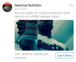
Btw I just got tagged with your IG ad, the one with your fiancé holding up two tubs of focal force. Noticed that no where on the ad copy does it mention Focal Force is preworkout.
 
Dislike ads? Remove them and support the forum: Subscribe to Fastlane Insiders.

Brewer07

Bronze Contributor
Speedway Pass
User Power
Value/Post Ratio
401%
Jun 24, 2017
90
361
33
Kentucky
Looks good, I like it!

Btw I just got tagged with your IG ad, the one with your fiancé holding up two tubs of focal force. Noticed that no where on the ad copy does it mention Focal Force is preworkout.

Good catch! Didn't realize the ads were showing differently on IG. Although those are retargeting ads, still good to remind people what the product is. Fixed!
 

JoshM

Contributor
Read Fastlane!
Read Unscripted!
User Power
Value/Post Ratio
292%
Dec 12, 2017
12
35
35
Houston, TX
Lots of updates! Been very busy lately, hence the lack of feedback here.
  1. I mentioned the affiliate program making zero traction. Well...that changed lately. We now have several engaged and enthusiastic affiliates working with us. I've updated the website to include a "Meet Our Athletes" section.
  2. I added a "Find Our Retailer" section to the website as well. We got a deal with another gym that I think has a lot of potential. It hits on a market I never thought of going after, but a friend of mine uses the product for their workouts and has recommended it to members there. The owners tried our product, loved it, and are now stocking it.
  3. We are placing an order this week for our second manufacturing run of Focal Force :thumbsup:.
  4. We are still figuring out Facebook & Adwords advertising. The ads are improving - we're getting engagement (likes & comments), and CTRs aren't bad, but still lots of room to improve.
  5. We are struggling to convert sample orders into sales. This is my biggest source of frustration right now. December was a rough month due to holidays - people don't buy supplements for Christmas gifts. We had numerous customers say they would order come 2018 - but now we're getting silence. Many of our sample customers just straight-up don't respond to emails, which is incredibly frustrating. The ones who do respond love the product - but then I still can't get them to convert!
  6. Product pages are still not converting. I've re-written some copy:
    1. Headline:
      1. Previous: "Are you looking for a low caffeine preworkout"
      2. New (as of this AM): "Are you looking for amazing, intense workouts without side effects?"
    2. Copy directly below the headline:
      1. New (as of this AM):
        1. "IMAGINE THE BEST WORKOUT YOU'VE EVER HAD.
          The weights feel like feathers in your hands. Your mind is in the zone - nothing can distract you. You can literally feel the blood flowing through your veins. Your previous records stand no chance. You feel stronger and more capable than ever before. You feel like you could workout for days.

          What if you could achieve that feeling for every workout?

          That's what its like to use Focal Force Low Caffeine Pre-workout!

          Other pre-workouts load up on caffeine and skimp on other ingredients. Too much caffeine makes your heart race, makes your hands jittery, makes you crash before your workout is over, makes you lose sleep. It can also sabotage your long-term health. Adrenal fatigue sucks.

          What if there was a way to get awesome workouts, every time – without the crash? Without jitters? Without losing sleep?

          Enter Focal Force Low Caffeine Pre-Workout."
In summary: biggest sources of frustration - lack of conversions and struggle to bring in traffic.
Biggest recent wins: growth in engaged affiliates and potential retail leads.

As always, I really appreciate the advice and support from this forum. Let me know your thoughts!

Really digging the copy changes... they seem to resonate a lot better!

Here's a few recommendations for the layout:

a3mc6s.jpg


  • Reduce the number of navigation menu items to only the most important
  • Group all products under the Supplements parent navigation item
  • Reduce the header image size to about half of what it is to pull the most important content above the fold (the "average area viewable by most devices without scrolling")
  • Make the primary CTA button a bit larger and add a color that contrasts (like red) to make the intended goal clear
  • You might also try experimenting with something like "Claim Your Free Sample" instead
  • Consider swapping the 'Message Us' area with a live chat software that lets you change your message/add an operator's photo (unless you get really good engagement with this, then I'd leave it)
 
Last edited:

Brewer07

Bronze Contributor
Speedway Pass
User Power
Value/Post Ratio
401%
Jun 24, 2017
90
361
33
Kentucky
Really digging the copy changes... they seem to resonate a lot better!

Here's a few recommendations for the layout:

a3mc6s.jpg


  • Reduce the number of navigation menu items to only the most important
  • Group all products under the Supplements parent navigation item
  • Reduce the header image size to about half of what it is to pull the most important content above the fold (the "average area viewable by most devices without scrolling")
  • Make the primary CTA button a bit larger and add a color that contrasts (like red) to make the intended goal clear
  • You might also try experimenting with something like "Claim Your Free Sample" instead
  • Consider swapping the 'Message Us' area with a live chat software that lets you change your message/add an operator's photo (unless you get really good engagement with this, then I'd leave it)

Hey Josh - really appreciate you taking the time to give your feedback!

Few questions
  1. Re: reducing menu items. I've been told a few times I need to do something to improve social proof, especially since I currently only sell one product. I figured adding menu sections for things like "Find a Retailer" and "Meet Our Athletes" would improve the social proof aspect by showing 1) we are stocked in retail locations and 2) real-life people are actively using our product. I've reduced this menu to 6 items - Home, Supplements, Meet Our Athletes, Find A Retailer, Our Story, and Blog. Do you think this is still too many?
  2. All products now grouped under "Supplements"
  3. I can reduce the header image size, but then it screws up the image on desktop - it either cuts out the product or cuts off the head of the model. Re-sizing makes the image look...odd. It looks fine on mobile. My traffic split is about 60/40 mobile/desktop.
  4. All buttons are supposed to be red (like the "subscribe" button) but CTA buttons appearing on images are white, for some reason. I have no idea why.
  5. Changed copy to "CLAIM YOUR FREE SAMPLE!" - lets see how it goes!
  6. Re: Message Us/live chat software. Do you have any free recommendations? I have Messenger installed on my phone and have the "typically responds instantly" badge on Facebook.

#3 and #4 can possibly be solved by contacting Shopify support. Let me see what I can do!
 
Dislike ads? Remove them and support the forum: Subscribe to Fastlane Insiders.

JoshM

Contributor
Read Fastlane!
Read Unscripted!
User Power
Value/Post Ratio
292%
Dec 12, 2017
12
35
35
Houston, TX
Hey Josh - really appreciate you taking the time to give your feedback!

Few questions
  1. Re: reducing menu items. I've been told a few times I need to do something to improve social proof, especially since I currently only sell one product. I figured adding menu sections for things like "Find a Retailer" and "Meet Our Athletes" would improve the social proof aspect by showing 1) we are stocked in retail locations and 2) real-life people are actively using our product. I've reduced this menu to 6 items - Home, Supplements, Meet Our Athletes, Find A Retailer, Our Story, and Blog. Do you think this is still too many?
  2. All products now grouped under "Supplements"
  3. I can reduce the header image size, but then it screws up the image on desktop - it either cuts out the product or cuts off the head of the model. Re-sizing makes the image look...odd. It looks fine on mobile. My traffic split is about 60/40 mobile/desktop.
  4. All buttons are supposed to be red (like the "subscribe" button) but CTA buttons appearing on images are white, for some reason. I have no idea why.
  5. Changed copy to "CLAIM YOUR FREE SAMPLE!" - lets see how it goes!
  6. Re: Message Us/live chat software. Do you have any free recommendations? I have Messenger installed on my phone and have the "typically responds instantly" badge on Facebook.

#3 and #4 can possibly be solved by contacting Shopify support. Let me see what I can do!


Looking good my friend!

  1. I'd nix the 'Home' button too. I've watched thousands of user session recordings (HotJar.com) on various e-commerce websites that I have worked on, and users seem to have an expectation that the logo brings them to the homepage. I believe it's safe to say that it's a best practice at this point, unless you are selling to a much older, less savvy crowd. Plus, the homepage is the absolute top of your funnel and the idea is to capture their attention and get them further into the funnel as quickly as possible. That should free up some room in the navigation.
  2. This looks solid as well. I'd recommend adding a sub-menu that presents those products when you hover over "Supplements." Shortens the number of steps a user has to take to get to your product pages.
  3. This is where having a developer may help-- you can change the background image size to cater to difference device breakpoints (mobile/tablet/desktop) so that it looks solid on each device. This can be done with CSS.
  4. For changing the button colors, this line in the theme.scss.css file (your theme's stylesheet):
    .hero__btn {
    background-color: #fff;
    color: #000;
    margin-top: 27.5px;​
    }
    Should be changed to:
    .hero__btn {
    background-color: #b8442a;
    color: #fff;
    margin-top: 27.5px;​
    }
  5. Looks good! Hopefully it gets a few more free sample conversions for you.
  6. I like Drift the best, followed by Chatra and Olark. All three should have a free tier.
  7. Additional Idea: Consider adding a "Free Samples" button in the navigation, now that you have extra room (assuming that you remove the "Home" button).
  8. Additional Idea: Add HotJar to your website so you can look at heatmaps and recordings. This will help you identify areas for improvement, website issues, and potential obstacles your shoppers face. You can also launch polls and surveys to get real, actionable feedback and insights from users/customers. It also has a free plan that should be suitable at this stage in the game.
 

Brewer07

Bronze Contributor
Speedway Pass
User Power
Value/Post Ratio
401%
Jun 24, 2017
90
361
33
Kentucky
Question: at what point do you consider raising prices?

Reason I ask:
Progenex is selling a product (Force) that is absolute shit if you wanna shoot straight, or vastly overpriced if you wanna be nice about it.

It's $59.95 for 30 servings - about $2 per serving, which is what we charge ($39.99 for 20 servings) for a VASTLY superior product (I'm not just saying that because I'm biased, compare the nutrition labels for their product vs. mine), AND we offer free shipping (Progenex charges $5).

But, Progenex is Progenex. A massive brand, with massive reach, with massive influence, and every popular Crossfit athlete on the planet promoting their products.

$39.99 plus free shipping is a steal compared to what Progenex charges, for an objectively better product. We are struggling as it is to get sales, so I'm hesitant to raise prices.

I'd appreciate insight, and can provide any additional information if needed.
 

Post New Topic

Please SEARCH before posting.
Please select the BEST category.

Post new topic

Guest post submissions offered HERE.

Latest Posts

New Topics

Fastlane Insiders

View the forum AD FREE.
Private, unindexed content
Detailed process/execution threads
Ideas needing execution, more!

Join Fastlane Insiders.

Top