JAJT
Legendary Contributor
FASTLANE INSIDER
EPIC CONTRIBUTOR
Read Fastlane!
Read Unscripted!
Summit Attendee
Speedway Pass
My first thought when I hit your link was "this looks like a cheap etsy shop."
Then I thought "oh, wait, I bet he linked us to a sub-page for an 'all items' search or something" but then I saw I was actually on your home page after all.
The website has zero personality and the items displayed seem really cheap when displayed like that. The first impression when a new visitor hits your page is "here's all the shit I have for sale".
There's no lifestyle photos to inspire emotion, no color to warm things up, no real information on who Jane Austen was, why your store exists, who you are appealing to, etc.
I'd honestly do some experimenting with other themes and throw some effort into warming things up a bit with some really impactful product/lifestyle photos. There's not even one photo of Jane Austen herself!
Check out some of the top shopify pages out there and compare them to your own - the top pages all have lots of life, emotion, draw, information, stories, lifestyle appeal, etc.
Some other notes:
- Your product photos aren't standardized. I clicked your candle photo and it took up maybe 1/8th of the page, then I clicked your bookmark photo and it took over the entire page full-screen. That's off-putting.
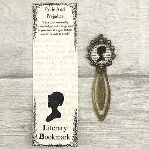
- Lots of your photos a really blurry. If the entire point of this bookmark you offer is the cool quote, why can I barely read it? This is the best zoom you offer for this product:
- Your "about" page is all about you. Why on earth would your customers care about you? You've been a fan since 13, opened a shop, and one day hope to own a first edition. Neat. This isn't a dating site - this is about your customers. Talk about why they should care about Jane Austen!
- Why does your coffee mug cost more than your jewelry?
- No social media presence listed, at all.
Don't misunderstand me - I'm not trying to be mean. This is the kind of brutal honesty I think you need to hear. The more I look at your site, the more issues I find with it. I think it needs a major overhaul.
Then I thought "oh, wait, I bet he linked us to a sub-page for an 'all items' search or something" but then I saw I was actually on your home page after all.
The website has zero personality and the items displayed seem really cheap when displayed like that. The first impression when a new visitor hits your page is "here's all the shit I have for sale".
There's no lifestyle photos to inspire emotion, no color to warm things up, no real information on who Jane Austen was, why your store exists, who you are appealing to, etc.
I'd honestly do some experimenting with other themes and throw some effort into warming things up a bit with some really impactful product/lifestyle photos. There's not even one photo of Jane Austen herself!
Check out some of the top shopify pages out there and compare them to your own - the top pages all have lots of life, emotion, draw, information, stories, lifestyle appeal, etc.
Some other notes:
- Your product photos aren't standardized. I clicked your candle photo and it took up maybe 1/8th of the page, then I clicked your bookmark photo and it took over the entire page full-screen. That's off-putting.
- Lots of your photos a really blurry. If the entire point of this bookmark you offer is the cool quote, why can I barely read it? This is the best zoom you offer for this product:
- Your "about" page is all about you. Why on earth would your customers care about you? You've been a fan since 13, opened a shop, and one day hope to own a first edition. Neat. This isn't a dating site - this is about your customers. Talk about why they should care about Jane Austen!
- Why does your coffee mug cost more than your jewelry?
- No social media presence listed, at all.
Don't misunderstand me - I'm not trying to be mean. This is the kind of brutal honesty I think you need to hear. The more I look at your site, the more issues I find with it. I think it needs a major overhaul.