The Entrepreneur Forum | Financial Freedom | Starting a Business | Motivation | Money | Success

Welcome to the only entrepreneur forum dedicated to building life-changing wealth.

Build a Fastlane business. Earn real financial freedom. Join free.

Join over 80,000 entrepreneurs who have rejected the paradigm of mediocrity and said "NO!" to underpaid jobs, ascetic frugality, and suffocating savings rituals— learn how to build a Fastlane business that pays both freedom and lifestyle affluence.

Free registration at the forum removes this block.

Troubleshoot SEO / Conversion

Lee Wright

Bronze Contributor
Speedway Pass
User Power
Value/Post Ratio
94%
Feb 28, 2018
115
108
55
Orange, NSW, Australia
OK so I've finally updated my website (PA System Hire Sydney) as recommended. Yes it's taken me 6 months. It was quite a bit of work to bring it up to speed. I had to:
-Change hosts (old was too slow)
-Change domains (.com to .com.au)
-Learn Wordpress
-Learn Visual Composer
-Learn a bit about responsive design
-Re-do all my photos (too small)
-Set up https
-Do 301 redirects from old pages (mobile & desktop sites)
-Read Steve Krugs book Don't Make Me Think Revisited as recommended.

Anyway I'm reasonably happy with it. It's been live for about a month. Compared to this time last year monthly traffic is up from 155 unique visits to 378 (140% increase) & bounce rate is down from 66% to 58% but my sales have dropped right off. Last January was $6K & this one looks like it will be about $2K. We have had terrible bush fires which has made a dent in the outdoor event scene but I'm still disappointed as I need to book about $8K just to get by.

Anyway I'd love to hear any feedback about the new site especially from those that were good enough to give me guidance back in July last year.

Cheers Lee.
 
Dislike ads? Remove them and support the forum: Subscribe to Fastlane Insiders.

Lee Wright

Bronze Contributor
Speedway Pass
User Power
Value/Post Ratio
94%
Feb 28, 2018
115
108
55
Orange, NSW, Australia
I'm not an expert, but here's my two cents looking at the page both from a digital marketer's perspective and the perspective of a potential customer who had just searched for a relevant term and landed on your site:

Design
  • Site looks like it was built 15 years ago. Updated
  • Carousel/Hero image is poorly done (text on top of image is pixelated and it looks like it was built in PowerPoint instead of Photoshop and then skewed vertically after the fact). This looks unprofessional. I would bounce before looking further. Updated
  • Design is crowded. Very little white space. Red, blue, and dark gray text makes the site feel busy and unfocused. It's hard to tell where to look. My eye is bouncing all over the place.Updated. Cleared out unnecessary text & went for higher contrast colours.
  • Font size is quite small. Uncomfortable, not easy to scan for relevant info. Larger font now
  • Header menu is distracting with the five square images in a row that don't align with the menu options. Removed the squares. Now have clickable hero banner & menu organised by equipment type & event type.
Copy
  • Grammar: Your main headline is a question that doesn't end with a question mark. Updated headline.
  • Capitalization: It's all caps. Now lower case
  • Readability: It's hard to read... quite a mouthful; not how people speak naturally. "WHY RISK DODGY SOUND WHEN YOU CAN HIRE A TOP BRAND PA SYSTEM DELIVERED & PROFESSIONALLY SET-UP FROM $395 OR WITH A SKILLED OPERATOR FROM $440*." Broken up into 3 sentences.
  • The two words that stand out the most are "dodgy" and "risk," which is what you'll be planting in your customers' minds about your own site, given the overall effect of the site. Now the standout words are "Superb" & "Top brand"
  • Sales messaging: It's hard to get a sense of what your message even is. The bullet-point copy on the various images of your hero image carousel is poor - no parallel construction, unclear meanings, unclear message updated but might need more work.
Call to Action
  • What is a person supposed to DO? There is no harmony between design and copy to guide the site visitor to the appropriate action. Where am I supposed to click? The first thing I see is "Download now" for your lead magnet. The second thing I see is "Read more" under the heading "On-time delivery & quality sound or it's free!" - sounds like a blog post, so I'm not going to click there. The third thing I see is the bold blue text link, "equipment," within the 2nd check mark, "Industry standard equipment from Bose" ... not sure that's where I want to go either. This is an experience that your customer shouldn't have to go through. Reverse engineer this. What is the #1 action that you want people to take when they hit this page? Where is that on the site? The #1 thing I'd like them to do is go to the relevant product or event page & say "I want package #3 - send me an invoice" but in reality I know a lot of them just want to pick up the phone & get advice on the best system for them. That's OK as my phone conversion rate is pretty high. So I've got "Call/Email/Text us today" button as well as buttons for each type of product.
Suggestions/Recommendations
  • Hire a good web developer and have them do a complete revamp of your site. Make sure it's someone who understands SEO, as your site has been online for a long time and that's why you're getting such favorable organic rankings for relevant keywords. A site redesign could either keep this SEO going or totally destroy it in one fell swoop. Vet your web designer thoroughly. I've seen this happen way too many times, and it's a shame. You've earned your ranking, and you shouldn't have to sacrifice it just to get a current website put up. I've taken a lot of care with this. Took a bit of a hit at first with rankings but they've come back now. Sub pages are not ranking as well despite high relevance on searches it still prefers to show home page.

  • A good web designer is going to have some templates for a high-converting site and will guide you through some of the exercises like how to create a happy synthesis between your copy, your design, and the most important CTA's. They will eliminate the distractions on the site, populate it with gorgeous images, and make it visually appealing and professional while offering a great user experience. Bought a template & had a designer customise it.
  • Put the same care into your copy that you're putting into your design.
  • I'm confident that you will get more business as soon as you begin to look like a trustworthy, reputable source and not an antiquated, out-of-touch company. Did a bit of work on credibility. Have been really pushing the Google reviews & a plugin now displays them direct from Google so customers can see a lot of very recent reviews. Also installed a plugin that displays the latest photos from our events specific to event type or product type.
That said, a 2.77% CTR and a 3.X % conversion rate isn't too bad.
I checked out your competitors' websites and they looked pretty rough, too, except for one of them (and it was super slow to load).
So you've got a lot going for you.

Hope this helps!
 

Lee Wright

Bronze Contributor
Speedway Pass
User Power
Value/Post Ratio
94%
Feb 28, 2018
115
108
55
Orange, NSW, Australia
I see it now. While it is better than previous, still IMHO needs a lot of work.

To start I would recommend reading the book "Don't Make Me Think" by Steve Krug.

https://www.amazon.com/dp/0321965515/?tag=tff-amazonparser-20

The spacing of your text makes it hard to read for one.

I would really simplify your message, especially on the home page.

Not sure what the Login button is for. The webpage doesn't go anywhere.

Bottom line you have too much going on still.

Hi lludwig,
I read "Dont' Make Me Think Revisited" I've probably got to do some more work implementing it but I've kept the ideas in mind so far. I will definitely do some user testing. New site is here PA System Hire Sydney
 

lludwig

Gold Contributor
FASTLANE INSIDER
Read Fastlane!
Read Unscripted!
Speedway Pass
User Power
Value/Post Ratio
274%
Aug 18, 2018
482
1,323
New York
OK so I've finally updated my website (PA System Hire Sydney) as recommended. Yes it's taken me 6 months. It was quite a bit of work to bring it up to speed. I had to:
-Change hosts (old was too slow)
-Change domains (.com to .com.au)
-Learn Wordpress
-Learn Visual Composer
-Learn a bit about responsive design
-Re-do all my photos (too small)
-Set up https
-Do 301 redirects from old pages (mobile & desktop sites)
-Read Steve Krugs book Don't Make Me Think Revisited as recommended.

Anyway I'm reasonably happy with it. It's been live for about a month. Compared to this time last year monthly traffic is up from 155 unique visits to 378 (140% increase) & bounce rate is down from 66% to 58% but my sales have dropped right off. Last January was $6K & this one looks like it will be about $2K. We have had terrible bush fires which has made a dent in the outdoor event scene but I'm still disappointed as I need to book about $8K just to get by.

Anyway I'd love to hear any feedback about the new site especially from those that were good enough to give me guidance back in July last year.

Cheers Lee.

Hi Lee congrats but also hope you are safe in Sydney.

It's an improvement.

Though let's stick to just the home page. There are still too many things going on. The goal of the home page is to introduce you to the prospect.

You have pricing, slider, testimonials and FAQS! Way too much on the home page you need to focus on introducing your brand.
 
Dislike ads? Remove them and support the forum: Subscribe to Fastlane Insiders.

Miketing

Bronze Contributor
Read Fastlane!
Speedway Pass
User Power
Value/Post Ratio
199%
May 7, 2014
137
273
OK so I've finally updated my website (PA System Hire Sydney) as recommended. Yes it's taken me 6 months. It was quite a bit of work to bring it up to speed. I had to:
-Change hosts (old was too slow)
-Change domains (.com to .com.au)
-Learn Wordpress
-Learn Visual Composer
-Learn a bit about responsive design
-Re-do all my photos (too small)
-Set up https
-Do 301 redirects from old pages (mobile & desktop sites)
-Read Steve Krugs book Don't Make Me Think Revisited as recommended.

Anyway I'm reasonably happy with it. It's been live for about a month. Compared to this time last year monthly traffic is up from 155 unique visits to 378 (140% increase) & bounce rate is down from 66% to 58% but my sales have dropped right off. Last January was $6K & this one looks like it will be about $2K. We have had terrible bush fires which has made a dent in the outdoor event scene but I'm still disappointed as I need to book about $8K just to get by.

Anyway I'd love to hear any feedback about the new site especially from those that were good enough to give me guidance back in July last year.

Cheers Lee.

So why exactly have your sales dropped off? You need to attribute these changes to specific parts of your funnel.

It's clearly not due to website traffic, so what is it? Conversion rate from visitors to leads? Closing rates? Do you rely on other lead sources?
 

Lee Wright

Bronze Contributor
Speedway Pass
User Power
Value/Post Ratio
94%
Feb 28, 2018
115
108
55
Orange, NSW, Australia
So why exactly have your sales dropped off? You need to attribute these changes to specific parts of your funnel.

It's clearly not due to website traffic, so what is it? Conversion rate from visitors to leads? Closing rates? Do you rely on other lead sources?
Thanks MrStoic You prompted me to do some more digging. It turns out that last January we had a big one off order that really distorted the figures. Perhaps the number of orders is a better indicator than total revenue. It looks like I'll have 20 orders for this Jan vs 10 for 2019 & 16 for 2018 so the number of orders is actually up.
 

Miketing

Bronze Contributor
Read Fastlane!
Speedway Pass
User Power
Value/Post Ratio
199%
May 7, 2014
137
273
Thanks MrStoic You prompted me to do some more digging. It turns out that last January we had a big one off order that really distorted the figures. Perhaps the number of orders is a better indicator than total revenue. It looks like I'll have 20 orders for this Jan vs 10 for 2019 & 16 for 2018 so the number of orders is actually up.

You really should be keeping a closer eye on this stuff man. The fastest route to burnout is lack of attribution. If you don't understand the root of your failures and successes, you'll never make consistent progress and you'll go insane with frustration and confusion!

Anyway, those numbers make a lot more sense, you actually doubled your total orders compared to this time last year then. I'm not sure everyone would agree with valuing total orders over revenue though

Where did the big one off order come from? Is there any way you can reach more of those type of clients?
 
Dislike ads? Remove them and support the forum: Subscribe to Fastlane Insiders.

Lee Wright

Bronze Contributor
Speedway Pass
User Power
Value/Post Ratio
94%
Feb 28, 2018
115
108
55
Orange, NSW, Australia
Hi Lee congrats but also hope you are safe in Sydney.

It's an improvement.

Though let's stick to just the home page. There are still too many things going on. The goal of the home page is to introduce you to the prospect.

You have pricing, slider, testimonials and FAQS! Way too much on the home page you need to focus on introducing your brand.
Thanks lludwig,
Yes you're probably right. I could simplify the home page even more. The FAQ & terms & conditions could definitely go somewhere else but I felt like the testimonials, slider & package example pics were still home page appropriate.

The testimonials I feel are really important for brand introduction & building credibility. In the past I've found that 70% of visitors looked at the testimonials (tracked on heat map). I guess they could go on the specific product pages instead though but it would be duplicated for every product page unless I filter them to that specific type of product/event.

The slider serves 3 functions:
1. A visual cue that we cater for your type of event
2. Credibility builder eg. one of the slides is us doing sound for our prime minister
3. Navigation - they can click on the slide to go straight to their event type

The pictures down the side (on desktop view)
1. Not everyone knows what "PA" (public address system) stands for so they're another visual cue to say "I'm in the right place & they have what I want."
2. The pricing serves to disqualify unsuitable prospects
3. Also a navigation aid

Thanks.
 

Lee Wright

Bronze Contributor
Speedway Pass
User Power
Value/Post Ratio
94%
Feb 28, 2018
115
108
55
Orange, NSW, Australia
You really should be keeping a closer eye on this stuff man. The fastest route to burnout is lack of attribution. If you don't understand the root of your failures and successes, you'll never make consistent progress and you'll go insane with frustration and confusion!

Anyway, those numbers make a lot more sense, you actually doubled your total orders compared to this time last year then. I'm not sure everyone would agree with valuing total orders over revenue though

Where did the big one off order come from? Is there any way you can reach more of those type of clients?
Thanks. Funny you should ask about that big order because out of the thousands of orders we've done that was the ultimate order. I often ask myself how we can get more orders like that. Basically Nigel Kennedy the famous violinist comes to Australia & books 4 x Bose L1 speakers for 3 weeks for his tour. We're the only company in Oz with 4 of them. A couple of hours to do the booking & they hand us $6K in advance. Totally professional crew & return our gear in mint condition. Wow. He booked the same back in 2017 as well. It's such a specialist thing though. I can't see how to replicate it & I can't tell you how many other long term hire quotes fall over. We've done bigger jobs but the hourly rate is maybe $100ph not $3K per hour!
 

lludwig

Gold Contributor
FASTLANE INSIDER
Read Fastlane!
Read Unscripted!
Speedway Pass
User Power
Value/Post Ratio
274%
Aug 18, 2018
482
1,323
New York
So why exactly have your sales dropped off? You need to attribute these changes to specific parts of your funnel.

It's clearly not due to website traffic, so what is it? Conversion rate from visitors to leads? Closing rates? Do you rely on other lead sources?

In addition, those monthly visitor stats aren't statically significant. You need much more traffic to say drop-offs in conversions are from something changing.
 
Dislike ads? Remove them and support the forum: Subscribe to Fastlane Insiders.

Kid

Gold Contributor
Speedway Pass
User Power
Value/Post Ratio
98%
Mar 1, 2016
1,736
1,707
First things first: if your website works, don't take advice about changing it *.

Me as non interested person, seen a bit of confusion.
Most sure thing i was about was SYDNEY PA HIRE.
I would totally not read the red headline - its too big chunk of text to read.
The thing i was mostly confident to read was the right side box with image
and DIY vs ready price.

What i would do is to work on headline to make it shorter and put it in one centered column along with centered "Sydney PA hire" on top of it and use two columns below.(your page seems to have 2 columns straight off the bat).

If your primary audiences are other businesses then i'd suggest using "Case studies" instead of "Testimonials". Read somewhere that most businesses look for case studies of offer or product as a main decision factor.
Testimonials are short and good for B2C but other businesses might want to read something long.

That's all for now.

* I once read about the website that was plain ugly. Designers ware calling owner telling him that they can improve it, make it pretty and what not.
The long story short is that this "ugly" page converted better then anything that other designers tried.
So a bit of cautionary tale.
 

Lee Wright

Bronze Contributor
Speedway Pass
User Power
Value/Post Ratio
94%
Feb 28, 2018
115
108
55
Orange, NSW, Australia
First things first: if your website works, don't take advice about changing it *.

Me as non interested person, seen a bit of confusion.
Most sure thing i was about was SYDNEY PA HIRE.
I would totally not read the red headline - its too big chunk of text to read.
The thing i was mostly confident to read was the right side box with image
and DIY vs ready price.

What i would do is to work on headline to make it shorter and put it in one centered column along with centered "Sydney PA hire" on top of it and use two columns below.(your page seems to have 2 columns straight off the bat).

If your primary audiences are other businesses then i'd suggest using "Case studies" instead of "Testimonials". Read somewhere that most businesses look for case studies of offer or product as a main decision factor.
Testimonials are short and good for B2C but other businesses might want to read something long.

That's all for now.

* I once read about the website that was plain ugly. Designers ware calling owner telling him that they can improve it, make it pretty and what not.
The long story short is that this "ugly" page converted better then anything that other designers tried.
So a bit of cautionary tale.
Thanks Kid. Yeah I did agonise over the 2 column design. The problem is that if I go single column at the top it wastes a lot of "above the fold" desktop real estate. When users see that right column they can immediately say "Ah OK they rent speakers & stuff & that's their price range".

As for the red sub heading. It's actually OK if they don't read it. The main purpose is for it to be the meta tag in the Google search results. An "elevator pitch" if you like. It's in the format <Benefit><Who For><Offer><Call to Action>.

Good point about "Case Studies" vs "Testimonials" for my B2B customers. I mostly do B2C but for my corporate page perhaps I should include a pic & more info before the testimonial & then call it a "Case Study".
 

Lee Wright

Bronze Contributor
Speedway Pass
User Power
Value/Post Ratio
94%
Feb 28, 2018
115
108
55
Orange, NSW, Australia
In addition, those monthly visitor stats aren't statically significant. You need much more traffic to say drop-offs in conversions are from something changing.
Good point about statistical significance. I was probably quick to judge. Also just an upate. I've had another 5 enquiries from the website so that's actually pretty good in terms of number of enquiries.
 
Dislike ads? Remove them and support the forum: Subscribe to Fastlane Insiders.

Kid

Gold Contributor
Speedway Pass
User Power
Value/Post Ratio
98%
Mar 1, 2016
1,736
1,707
When users see that right column they can immediately say "Ah OK they rent speakers & stuff & that's their price range".
That was exactly my first impression so it works good.
Probably if i were in decision mode (as opposed to pure information gathering)
i would remember that as a direct and clear offer.

It's actually OK if they don't read it.The main purpose is for it to be the meta tag in the Google search results
Oh :D then i get why its there.
 

lludwig

Gold Contributor
FASTLANE INSIDER
Read Fastlane!
Read Unscripted!
Speedway Pass
User Power
Value/Post Ratio
274%
Aug 18, 2018
482
1,323
New York
First things first: if your website works, don't take advice about changing it *.

Me as non interested person, seen a bit of confusion.
Most sure thing i was about was SYDNEY PA HIRE.
I would totally not read the red headline - its too big chunk of text to read.
The thing i was mostly confident to read was the right side box with image
and DIY vs ready price.

What i would do is to work on headline to make it shorter and put it in one centered column along with centered "Sydney PA hire" on top of it and use two columns below.(your page seems to have 2 columns straight off the bat).


* I once read about the website that was plain ugly. Designers ware calling owner telling him that they can improve it, make it pretty and what not.
The long story short is that this "ugly" page converted better then anything that other designers tried.
So a bit of cautionary tale.

ugly = not functional in my eyes. I'm not for a pretty design that's not functional.
 

Lee Wright

Bronze Contributor
Speedway Pass
User Power
Value/Post Ratio
94%
Feb 28, 2018
115
108
55
Orange, NSW, Australia
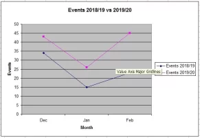
Here's a progress update on the results of my website upgrade that I undertook late 2019. Just to recap, earlier in 2019 I noticed that my organic search was really dropping off. I posted here & got some great advice telling me that my website sucked. Thanks to a bunch of people who gave me tips including @Bekit @Andy Black @RazorCut @Kid @lludwig @Tourmaline & @MrStoic886 Anyway I did a considerable upgrade finishing late 2019 (mobile friendly, https, new design, faster, reviews plugin etc). In January 2020 the total $ were down a bit from last year but when I dug deeper I found a large event in 2019 was skewing the results & that the number of events was likely a much better indicator of how the marketing was working rather than total $. It turned out the number of events were actually up 70% on the previous January which is especially significant considering we got hammered by the bushfires (Australia). Anyway moving forward to February the number of events were up 95% but also $ were up 40% up on Feb 2019. It was still partly hamster wheel work but I ended with $20K revenue & kept $8K after expenses. Considering we can live on $4K a month it was pretty sweet. In fact it was a godsend because as soon as Corona hit in March everything came to a screeching halt & this meant we had a bit of a cash buffer. March was shaping up nicely too before all of this. My next goal is to maintain the revenue but to automate things more once the pandemic is over. Anyway I hope this info is encouraging to others.

32497
 
Dislike ads? Remove them and support the forum: Subscribe to Fastlane Insiders.

Bekit

Legendary Contributor
FASTLANE INSIDER
EPIC CONTRIBUTOR
Read Fastlane!
Summit Attendee
Speedway Pass
User Power
Value/Post Ratio
493%
Aug 13, 2018
1,135
5,601
Here's a progress update on the results of my website upgrade that I undertook late 2019. Just to recap, earlier in 2019 I noticed that my organic search was really dropping off. I posted here & got some great advice telling me that my website sucked. Thanks to a bunch of people who gave me tips including @Bekit @Andy Black @RazorCut @Kid @lludwig @Tourmaline & @MrStoic886 Anyway I did a considerable upgrade finishing late 2019 (mobile friendly, https, new design, faster, reviews plugin etc). In January 2020 the total $ were down a bit from last year but when I dug deeper I found a large event in 2019 was skewing the results & that the number of events was likely a much better indicator of how the marketing was working rather than total $. It turned out the number of events were actually up 70% on the previous January which is especially significant considering we got hammered by the bushfires (Australia). Anyway moving forward to February the number of events were up 95% but also $ were up 40% up on Feb 2019. It was still partly hamster wheel work but I ended with $20K revenue & kept $8K after expenses. Considering we can live on $4K a month it was pretty sweet. In fact it was a godsend because as soon as Corona hit in March everything came to a screeching halt & this meant we had a bit of a cash buffer. March was shaping up nicely too before all of this. My next goal is to maintain the revenue but to automate things more once the pandemic is over. Anyway I hope this info is encouraging to others.

View attachment 32497
Great update! Thank you for sharing. I'm really happy to hear the good news that your updates made a difference. Hope you are staying safe and well during this crazy time.
 

Post New Topic

Please SEARCH before posting.
Please select the BEST category.

Post new topic

Guest post submissions offered HERE.

Latest Posts

New Topics

Fastlane Insiders

View the forum AD FREE.
Private, unindexed content
Detailed process/execution threads
Ideas needing execution, more!

Join Fastlane Insiders.

Top