What's new

Need opinions! Landing page feedback

Welcome to the only entrepreneur forum dedicated to building life-changing wealth.

Build a Fastlane business. Earn real financial freedom. Live your best life.

Tired of paying for dead communities hosted by absent gurus who don't have time for you?

Imagine having a multi-millionaire mentor by your side EVERY. SINGLE. DAY. Since 2007, MJ DeMarco has been a cornerstone of Fastlane, actively contributing on over 99% of days—99.92% to be exact! With more than 39,000 game-changing posts, he's dedicated to helping entrepreneurs achieve their freedom. Join a thriving community of over 90,000 members and access a vast library of over 1,000,000 posts from entrepreneurs around the globe.

Forum membership removes this block.
Still feels a bit sloppy, unrefined, to me.

Because you are dealing with memorial services, things need to look perfect.

Memorials, shrines, these are constructed with great care. So your page, offer, and product need to be exactly the same!

People don't want their dead pets associated with shoddy work.

BTW, this idea is freaking awesome. I was going to post an INE on pet memorialization services/products as we just had to deal with a pet death. After our beloved's passing, we used several different services, from cremation to getting a life-sized stuff animal of our doggy which was crafted based on a picture.
Thanks for the valuable feedback MJ!

There's an awful lot of room to scale (I honestly don't have the resources just yet). I have big plans for scaling.

Also, I'm worried about obsessively seeking perfection before the model is validated.

This could be considered "Phase 1" of PetPapers. Through scaling & access to additional resources, I could take this thing to new heights. But to do that, I feel I must start.

This isn't to say the service would be shoddy, it's functions nicely, but there's a lot of things I can do through scaling to increase the value skew further.

And yeah, pet memorial products are a nice niche. I was looking to provide something more than a Teddy bear or jewellery, something that provides a form of therapy in a personalised way
 
Squarespace doesn't do a great job at making "responsive" designs (meaning it changes sizes based on the user's device).

This is what it looks like on my big screen:
View attachment 61108


At first you were building an "opt-in" page (asking for name and email in exchange for a thing) which is dramatically different than a "landing page" which is to sell a product.

The page that you've created needs a LOT of love. I know you ignored my first post (probably because it came off as too direct and flippant) but please take a moment to contrast your current page with a winning template:

View attachment 61109

The structure of a sales pitch ONLINE is the same structure of a sales pitch in person.

"Here's what I've got for you, here's what it's going to do for you, here's how to get it."

You have a very visual product that evokes a lot of emotion. You just have to SHOW the product (with proper lighting you can just use your phone camera). Obviously this template is about teeth -- but don't be fooled. The structure is set up in a specific way.

All the pertinent information is "above the fold" (before they scroll).

There are "trust icons" such as visa, mastercard, etc... a disclaimer... "as seen on" (which you don't have so you can skip those for the moment)... then there are specific blocks of "FAB" statements (Feature, Advantage, Benefit) -- these are what's missing to SELL the product.

Testimonials are going to be a lifesaver for you so I'd suggest doing a few books for free to get those in there.

Remember, if you can just SHOW your product does what you say it does, you don't have to sell it.

Everything else is just answering questions/objections: "what's it made out of?" "is it a hardcover or softcover?" "are the pages nice and quality?" "how are the pictures?" etc. etc. etc.
Thanks Steve.

Squarespace definitely has an issue with this. I've tested it on 2 computers and adjusted, but the screenshot you took looks atrocious lol.

I got some great insights from your original response. My implementation is probably not reflective of that, but make no mistake- I appreciate every source of feedback.

I haven't launched yet, which is making me think. Should I launch & adjust as I go, or create something perfect? Its a tough game but I'm loving it!

Buy a strong template off Etsy or somewhere else. It's really inexpensive.

Or use a template from a reputable "internet marketing bro" type software (such as clickfunnels, kartra, gohighlevel).

You have a winning product.

It will sell.

Go all in.
 
Quick update.

Launched on Thursday, made my first sale rapidly by Friday night.

Since then, a lot of traffic has been driven from Meta. 48 link clicks on average with.... 0 conversions lol.

I've tweaked my site a bit, but will start following the template @Kung Fu Steve provided. I realised I've missed out on crucial information here. Website can be found here


Conversion rate is pretty awful & I imagine there's something wrong with my offer. My posts (especially on TikTok) blow up. (Okay, by "blow up" I mean maybe 100 likes).

Everybody loves the concept, but it's tough to turn this into "I love it enough for me to buy"

My first customer is filling out her form and seems to be enjoying the process. She's taking her time & uploading some photos which is great to see.
 
Last edited:
It still needs a lot of work.

When they hit the page - answer "am I in the right place" (based on what they clicked on to get there)
Headline - 2 seconds to get their attention. what you've got, what it's going to do for them
Subhead - emotional hook
Video - demonstrate the product with visuals. It's a visual product. this is mandatory.
CTA - Big clear button, image of what they get, how much it costs. Button.
Alleviate fears - guarantee below order button
Testimonials - social images of people receiving their thing
Bonuses - I'd offer a printed canvas of their pet or something to go along with it ("order now and receive a free canvas painting of your pet")

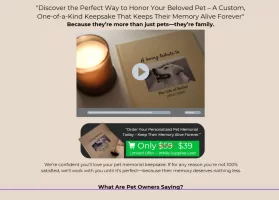
You're asking for a lot of money from a stranger. you need to sell a LOT harder. but your "above the fold" should look closer to this

Please use ChatGPT or Claude or whatever to help you build a basic branding guide (fonts, colors, design). You can fix your copy and continuously ask it "how can we make it better" to get something right.

That being said, you don't have NEAR enough traffic to get sales. The best in the world have a 3% conversion. The average around the world is less than 1%

If you make these changes, clean it up, add the testimonials, and do everything I'm telling you to do I'd venture to guess you could get up to 0.5% conversion to cold traffic. Next, you need to do the math to figure out "how many of the right people need to see this page in order for me to get X sales per day"


1734031733932.webp
 
It still needs a lot of work.

When they hit the page - answer "am I in the right place" (based on what they clicked on to get there)
Headline - 2 seconds to get their attention. what you've got, what it's going to do for them
Subhead - emotional hook
Video - demonstrate the product with visuals. It's a visual product. this is mandatory.
CTA - Big clear button, image of what they get, how much it costs. Button.
Alleviate fears - guarantee below order button
Testimonials - social images of people receiving their thing
Bonuses - I'd offer a printed canvas of their pet or something to go along with it ("order now and receive a free canvas painting of your pet")

You're asking for a lot of money from a stranger. you need to sell a LOT harder. but your "above the fold" should look closer to this

Please use ChatGPT or Claude or whatever to help you build a basic branding guide (fonts, colors, design). You can fix your copy and continuously ask it "how can we make it better" to get something right.

That being said, you don't have NEAR enough traffic to get sales. The best in the world have a 3% conversion. The average around the world is less than 1%

If you make these changes, clean it up, add the testimonials, and do everything I'm telling you to do I'd venture to guess you could get up to 0.5% conversion to cold traffic. Next, you need to do the math to figure out "how many of the right people need to see this page in order for me to get X sales per day"


View attachment 61644
Thank you for the time you put into this response, Steve!

Design is a hard one to wrap my head around, on one hand, I'd like to replicate Storyworth or Remento, then again- what I'm doing clearly isn't working!

I'm creating a duplicate website now on Squarespace. Everything is being reduced to zero and I'm gonna redesign, change copy etc.

Driving traffic is tough. Very tough. But hey, we're going down the lonely road in entrepreneurship, right. I'm expecting phantoms to bite my a$$, I didn't expect to get flatlined after my initial sale though, LOL!
 
Thank you for the time you put into this response, Steve!

Design is a hard one to wrap my head around, on one hand, I'd like to replicate Storyworth or Remento, then again- what I'm doing clearly isn't working!

If I can't steer you away from the god awful Squarespace, please look for designs on Etsy or Fiverr to get something halfway decent. The problem is designers don't understand marketing. and Marketers don't understand design. Go with marketing FIRST (because you need to sell your product).

That means all relevant info ABOVE THE FOLD. (The stupid 1900-pixel image everyone uses above the fold is the dumbest thing to happen to the internet in years). Make sure it's MOBILE FRIENDLY (most of your traffic will be mobile. Design for that first).

I hate Storyworth. Remento is okay except for the 800 pop-ups before I even know if I'm in the right place.


I'm creating a duplicate website now on Squarespace. Everything is being reduced to zero and I'm gonna redesign, change copy etc.

Gross. :rofl:

But let's see what you can do!


Driving traffic is tough. Very tough.

Not in your niche.

Create a Facebook
Create an Instagram
Create a TikTok

Post funny cat videos
Post silly dog videos

Have a link in all your bios to the landing page.

Create a Facebook Custom audience for 30-60 days anybody who likes your videos
Run a heart-string-pulling video ad about the momento books
Retarget anyone who visits the site

Traffic is insanely easy in your market.
Never say that again.


But hey, we're going down the lonely road in entrepreneurship, right.

Not lonely anymore. You're on the Fastlane.


I'm expecting phantoms to bite my a$$, I didn't expect to get flatlined after my initial sale though, LOL!

Weird metaphors. Don't ever use those again, either!

"I'm at the end of my rope!!!"

So set the damn rope down.

"I'm getting clotheslined!"

You're not a wrestler.

It might sound silly but metaphors create an emotion about something that doesn't exist. They're the wrong metaphors!

Focus on the page.

I'll send you a bunch of examples of book pages if you want but look at template from Clickfunnels, GoHighLevel, or whatever else.

You've got this.
 
The website is looking much better! And the copy helps me quickly understand what it is you're selling.

Only major thing is the video - currently it looks enormous on my desktop. I can't fit the video in a single window.
 
If I can't steer you away from the god awful Squarespace, please look for designs on Etsy or Fiverr to get something halfway decent. The problem is designers don't understand marketing. and Marketers don't understand design. Go with marketing FIRST (because you need to sell your product).

That means all relevant info ABOVE THE FOLD. (The stupid 1900-pixel image everyone uses above the fold is the dumbest thing to happen to the internet in years). Make sure it's MOBILE FRIENDLY (most of your traffic will be mobile. Design for that first).

I hate Storyworth. Remento is okay except for the 800 pop-ups before I even know if I'm in the right place.


Gross. :rofl:

But let's see what you can do!


Not in your niche.

Create a Facebook
Create an Instagram
Create a TikTok

Post funny cat videos
Post silly dog videos

Have a link in all your bios to the landing page.

Create a Facebook Custom audience for 30-60 days anybody who likes your videos
Run a heart-string-pulling video ad about the momento books
Retarget anyone who visits the site

Traffic is insanely easy in your market.
Never say that again.


Not lonely anymore. You're on the Fastlane.


Weird metaphors. Don't ever use those again, either!

"I'm at the end of my rope!!!"

So set the damn rope down.

"I'm getting clotheslined!"

You're not a wrestler.

It might sound silly but metaphors create an emotion about something that doesn't exist. They're the wrong metaphors!

Focus on the page.

I'll send you a bunch of examples of book pages if you want but look at template from Clickfunnels, GoHighLevel, or whatever else.

You've got this.
LOL! Appreciate the help man. And I appreciate the constructive criticism, it helps far more than you imagine
 
The website is looking much better! And the copy helps me quickly understand what it is you're selling.

Only major thing is the video - currently it looks enormous on my desktop. I can't fit the video in a single window.
Thank you man. You have also contributed absolute gold to my endeavour!
 
It's a good start. At least you start with something, but folks like me are still sitting on sidelines... Big Congratulations and pat on your back.

My 2 cents... Content is good ( although I am an outsider & I know little of this field)
The page is a bit too long and sections too far apart. By the time I got to second section. I zoomed what was on first page. Like some others said, a designer can help with that. In the interim, get either a top navigation or left / right hand navigation in there to scroll. Also get a previous/next page link or icon in there for scrolling.
HTH.

Cheers
ks-gk
Welcome to the forum kg-sk & thank you for giving me some valuable feedback.

I suggest you try something, anything. And always bias action.

Like MJ always says, you can only read so much about swimming before ya gotta jump in the pool !
 
Well done on your first sale.

You mentioned "My first customer is filling out her form and seems to be enjoying the process. She's taking her time & uploading some photos which is great to see."

This was my immediate thoughts, I would personally want to update some photos text etc and see what it looks like before I pull the trigger.

Do you have the online tool working already?

I'd be tempted, to make it free to customise it online, that would get the customer invested in this personal product they are building.

At the end they can have a few options potentially including a DIY print, standard and premium.

Potentially you can ask for their email to start or save their work & could even do that part semi manually to begin with to see if people are prepared to share their email to see what it would look like.
 

Welcome to an Entrepreneurial Revolution

The Fastlane Forum empowers you to break free from conventional thinking to achieve financial freedom through UNSCRIPTED® Entrepreneurship where relative value and problem-solving are executed at scale. Living Unscripted® isn’t just a business strategy—it’s a way of life.

Follow MJ DeMarco

Get The Books that Change Lives...

The Fastlane entrepreneurial strategy is based on the CENTS Framework® which is based on the three best-selling books by MJ DeMarco.

mj demarco books
Back
Top Bottom