Hi all,
For most eCommerce product's individual pages, the layout usually look like this:
#1
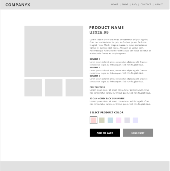
(click attachments below for full quality resolution)
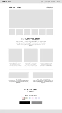
However, I was thinking of selling my product in more of a "story-telling" style, where I get the user to scroll down while I use beautiful photos and benefits/value copywriting to draw them in, and the Add to Cart button is at the bottom of the page, shown below:
#2

(click attachments below for full quality resolution)
Something like a sales pitch where you discuss the price and other logistics last.
However, because my website theme looks like #1 above, I would need to hire a developer to do some customisation to achieve #2. Is this worth it, or is a layout like #2 a bad idea since the Add to Cart button is at the bottom, it can destroy any kind of conversions.
Any opinion is highly appreciated.
For most eCommerce product's individual pages, the layout usually look like this:
#1
(click attachments below for full quality resolution)
However, I was thinking of selling my product in more of a "story-telling" style, where I get the user to scroll down while I use beautiful photos and benefits/value copywriting to draw them in, and the Add to Cart button is at the bottom of the page, shown below:
#2
(click attachments below for full quality resolution)
Something like a sales pitch where you discuss the price and other logistics last.
However, because my website theme looks like #1 above, I would need to hire a developer to do some customisation to achieve #2. Is this worth it, or is a layout like #2 a bad idea since the Add to Cart button is at the bottom, it can destroy any kind of conversions.
Any opinion is highly appreciated.
Dislike ads? Become a Fastlane member:
Subscribe today and surround yourself with winners and millionaire mentors, not those broke friends who only want to drink beer and play video games. :-)
Attachments

Membership Required: Upgrade to Expose Nearly 1,000,000 Posts
Ready to Unleash the Millionaire Entrepreneur in You?
Become a member of the Fastlane Forum, the private community founded by best-selling author and multi-millionaire entrepreneur MJ DeMarco. Since 2007, MJ DeMarco has poured his heart and soul into the Fastlane Forum, helping entrepreneurs reclaim their time, win their financial freedom, and live their best life.
With more than 40,000 posts packed with insights, strategies, and advice, you’re not just a member—you’re stepping into MJ’s inner-circle, a place where you’ll never be left alone.
Become a member and gain immediate access to...
- Active Community: Ever join a community only to find it DEAD? Not at Fastlane! As you can see from our home page, life-changing content is posted dozens of times daily.
- Exclusive Insights: Direct access to MJ DeMarco’s daily contributions and wisdom.
- Powerful Networking Opportunities: Connect with a diverse group of successful entrepreneurs who can offer mentorship, collaboration, and opportunities.
- Proven Strategies: Learn from the best in the business, with actionable advice and strategies that can accelerate your success.
"You are the average of the five people you surround yourself with the most..."
Who are you surrounding yourself with? Surround yourself with millionaire success. Join Fastlane today!
Join Today
