The Entrepreneur Forum | Financial Freedom | Starting a Business | Motivation | Money | Success

Welcome to the only entrepreneur forum dedicated to building life-changing wealth.

Build a Fastlane business. Earn real financial freedom. Join free.

Join over 90,000 entrepreneurs who have rejected the paradigm of mediocrity and said "NO!" to underpaid jobs, ascetic frugality, and suffocating savings rituals— learn how to build a Fastlane business that pays both freedom and lifestyle affluence.

Free registration at the forum removes this block.

Rate My Book Cover

MTF

Never give up
FASTLANE INSIDER
EPIC CONTRIBUTOR
Read Fastlane!
Read Unscripted!
Speedway Pass
User Power
Value/Post Ratio
456%
May 1, 2011
7,644
34,821
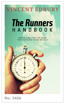
@Blaise84, it's a better cover, but it still looks amateurish. If you don't know how to design it from scratch, consider ordering a pre-made cover, for example from Go On Write. Sport Premade Book Covers.

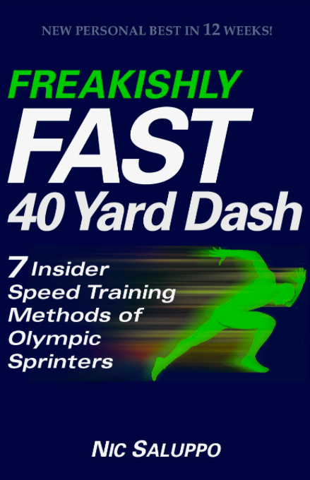
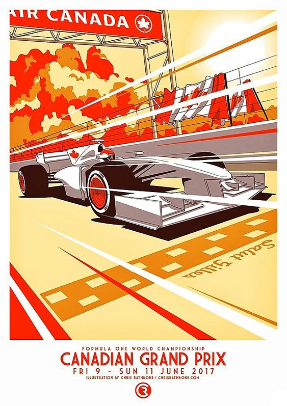
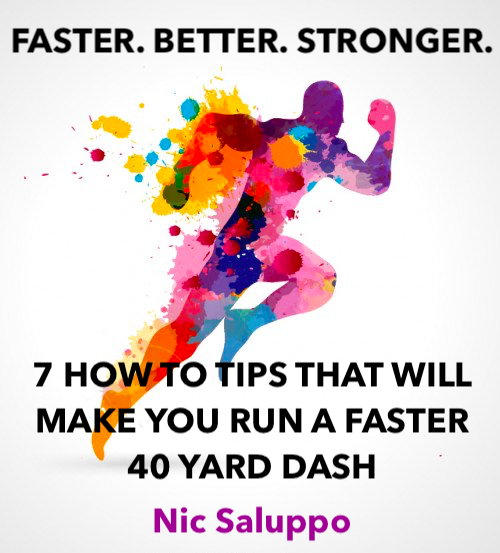
Here are a few of his pre-made covers that might be suitable for your book that are much, much better:
11873.jpg

11871.jpg

And my favorite one:
5406.jpg
 

Blaise84

Bronze Contributor
Read Fastlane!
Read Unscripted!
Speedway Pass
User Power
Value/Post Ratio
155%
Jul 8, 2017
150
232
39
Northeast Ohio
First, THANK YOU for your time.

I posted here several weeks ago with an awful, terrible book cover (see attachment below, or, see complete thread if interested: Book Cover-- What do you think of it?).

Nic Saluppo (1).png


Thankfully, everyone set me straight, and I now have a much better design (see attachment below).

Screen Shot 2017-12-07 at 8.51.11 PM.jpeg

The new cover design is leaps and bounds better than the first, but it's not quite complete.

What do you think this cover needs in order to be complete? How can I make it more concise, clear, noticeable, and attractive? What about it is problematic or ambiguous? What are your impressions when you see it?

Keep in mind that my target audience is high school and collegiate (DII, DIII, NAIA, JUCO) football players. If you're unfamiliar with the 40 yard dash, it's a test used to measure sprinting speed in football players.

I'm tagging a few of you who I've previously interacted with on this forum, but don't take that as me saying I don't want your feedback if you're not tagged. The more feedback, the better!
@ljb7
@Bdenner64
@MoreVolume
@MTF
@azsno
@LifeTransformer
@jasoncuellar123
@MJ DeMarco
@BrooklynHustle
@njsinko
@DronePilot
@Andy Black
@Carol Jones
@Arun Siva
@jon.a
 
Dislike ads? Remove them and support the forum: Subscribe to Fastlane Insiders.

Xeon

All Cars Kneel Before Pagani.
Read Fastlane!
Read Unscripted!
Speedway Pass
User Power
Value/Post Ratio
191%
Sep 3, 2017
2,432
4,638
Singapore
The new version is a lot better than the old version. In the old version, I can't even see the silhouette of the runner properly :rofl:
The new version has some issues and everyone else has really good points, so just to add a few:

1) Generally, cool colors like blues and greens aren't associated with speed, which is what your book is about : FREAKINGLY FAST
For a book like this which is also aimed at a younger audience, a color palette like red, orange, bits of yellow, white background and bold black font will make it "pop" (tbh, I really dislike the "make it pop" buzzword but....).

2) In design, to make something less static and boring, try to avoid too many horizontals and verticals. In your book design, everything is on a horizontal straight line. The words, the silhouette of the runner etc, it's all horizontals. You want to convey a sense of speed, so.....

3) Check out some of these inspiration:

7488708cb704245b8beb4ec00c2b257a--cool-poster-design-sport-poster-design.jpg

5825c152808eac441d5c2c988db9b35f.jpg

b31ee9befe885ce459eecec9e35a5db6.jpg

untitled-13.jpg

c745e8d202062f71c1cc68adef01aae4.jpg


Notice how in these images, you see a ton of diagonal lines and shapes. They all scream out speed and dynamism.
You don't have to make it as complex as these though, but you can use the same principles.
If you intend to hire a fiverr guy to do the job, you can show them these sort of stuff.

Speaking of fiverr, I've hired there quite a few times to test them out (for graphic designers) but for my case, their portfolio usually doesn't match the quality of the work though, so it's kind of a hit and miss, and I guess I'm a very fussy guy when it comes to this sort of thing lol

Good luck!
 
Dislike ads? Remove them and support the forum: Subscribe to Fastlane Insiders.

Niptuck MD

plutocrat-in-training
Read Rat-Race Escape!
Read Fastlane!
Read Unscripted!
Summit Attendee
Speedway Pass
User Power
Value/Post Ratio
164%
Aug 31, 2016
1,421
2,330
NORWAY - POLAND - WEST EUROPE
I like the title; however I think the cover (albeit simple and to the point) is something out of the 80's haha. Not necessarily a bad thing but it doesnt stand out to the other books or training aides regarding 40 yard dashes. If you were able to get a picture of a real football player (college athlete or generic one) at a combine (a little more official looking to the specific niche) that would set it off nicely IMHO.

since your niche is super specific (40 yard dash is solely unique to football mostly) i think half of the work is done for you. have you thought about incorporating a DVD or a private link to a private youtube channel or video to supplement your book?
 

B. Cole

In thine hand is power and might.
FASTLANE INSIDER
Read Fastlane!
Read Unscripted!
Speedway Pass
User Power
Value/Post Ratio
328%
Mar 5, 2017
595
1,953
42
East Coast
Thanks for your feedback! Can you say a little more about what specifically makes it look old, like it's from the 80s?

I agree, definitely 1980. It's the color, graphics and layout. Have you thought about a real picture of a runner in a glorious moment instead of an 8 bit green arcade guy? Plenty of inspiration in the world of sports marketing.


usain-bolt-sports-illustrated-cover.jpg

image.jpeg
 

MJ DeMarco

I followed the science; all I found was money.
Staff member
FASTLANE INSIDER
EPIC CONTRIBUTOR
Read Rat-Race Escape!
Read Fastlane!
Read Unscripted!
Summit Attendee
Speedway Pass
User Power
Value/Post Ratio
446%
Jul 23, 2007
38,241
170,651
Utah
The 2nd one is an improvement! But it still looks a bit underwhelming.

The first one is God-awful and looks like a MS Paint job.
 
Dislike ads? Remove them and support the forum: Subscribe to Fastlane Insiders.

Argue

Gold Contributor
Read Fastlane!
Read Unscripted!
Speedway Pass
User Power
Value/Post Ratio
385%
Oct 1, 2016
645
2,483
32
NYC
I might be late to this. But, I wanted to share my feedback.

ORIGINAL COVER

wWM7WVu.png


1. Better improvement from the first cover.

2. However, too much words going on. The structure is out of sync.

3. I dislike the book title. I'd personally remove the word freakishly.
I'd focus on making the title simpler.

4. Your target audience are football players. In my opinion, olympic sprinters causes confusion.
I say this because I want to target football players. When they read the cover, it should reflect football.
5. Instead, add "7 INSIDERS... methods from NFL Pros." :football:

6. I'd personally go away from navy and green. Instead use this complementary combo:
xVQC9qo.png


IDEA 1

u33vCCJ.png


1. A quick idea I created. Here to give you a visual idea what the next cover could look like.

2. I really believe a simpler title is key. Fast 40 is boring but you get the idea.

3. In one shot, sell to your reader with words what you can give them. We're here to sell to people, so it's crucial we get their attention.

4. My sub-head is not that convincing (wrote it super quick, no time) but hopefully you can get a better idea.

5. In my opinion, the focus on the next cover should be simple, eye-cacthing and convincing.

IDEA 2

gmUpfLD.png


1. Here's another idea you can consider.

2. Get an image of a runner and slap it in the middle. Maybe something fun like the watercolor above. Must have a white backdrop.

3. A simple title goes on top. Make sure it has the keyword(s) 40 yard dash and football.

4. I believe a simple sans-serif font is key. A modern one, too. Color should be black or white.

5. This cover is mediocre but emphasizes on the copy more. Here we want to use strong copy to sell and get readers. Again, I'm not in this niche so I just wrote something quick.

6. Moving forward, I suggest using football somewhere in the headlines, etc.

End Note:
Less is more. Hopefully some of this feedback can help you make a stronger, better cover.

Resources:
  • freepik.c/m
  • Apple preview/markup.
 

WJS

Bronze Contributor
Read Fastlane!
Read Unscripted!
Speedway Pass
User Power
Value/Post Ratio
342%
Dec 3, 2017
109
373
MY
I think you need to hire a copywriter to write your book title. It feels very wordy. It would really help if you could shorten it and make it more attention-grabbing. You should also use bright colours instead of dark colours, as dark colours are generally associated with steadiness, which would contradict with your theme.

Check out this image I found on google. It's not about sprinting but it does give off a speedy feeling, and the title is really memorable. Hope it helps!
 

Attachments

  • Sprint_for_Growth_Book.jpg
    Sprint_for_Growth_Book.jpg
    83.9 KB · Views: 5
Last edited:

Argue

Gold Contributor
Read Fastlane!
Read Unscripted!
Speedway Pass
User Power
Value/Post Ratio
385%
Oct 1, 2016
645
2,483
32
NYC
FAST 40

LEARN THE 7 TRICKS OLYMPIANS USE TO RUN LESS THAN 4.20 SECONDS

:clap:::clap:::clap::
 

Niptuck MD

plutocrat-in-training
Read Rat-Race Escape!
Read Fastlane!
Read Unscripted!
Summit Attendee
Speedway Pass
User Power
Value/Post Ratio
164%
Aug 31, 2016
1,421
2,330
NORWAY - POLAND - WEST EUROPE

Dan_Fastlane

Silver Contributor
Read Fastlane!
Read Unscripted!
Speedway Pass
User Power
Value/Post Ratio
170%
Jan 3, 2017
412
701
World Citizen

Dan_Fastlane

Silver Contributor
Read Fastlane!
Read Unscripted!
Speedway Pass
User Power
Value/Post Ratio
170%
Jan 3, 2017
412
701
World Citizen

WJS

Bronze Contributor
Read Fastlane!
Read Unscripted!
Speedway Pass
User Power
Value/Post Ratio
342%
Dec 3, 2017
109
373
MY
@WJS Good stuff. Thank you. I agree that it's too wordy. It's challenging to boil it down while still communicating what I'm trying to communicate...that football players can significantly improve their speed by adopting the training methods of Olympic sprinters.
@Blaise84 I thought about what you said and I did some searches and found out that John Ross is the current record holder at 4.22 seconds. Now I hardly know anything about this sport but maybe you can do something like this?

4.22 SECONDS!
Be the Next to Break the 40-Dash Yard Record

7 Speed Training Methods that Give You AMAZING Results!


INSERT PICTURE HERE


1) I made this title on the assumption that people who care about 40-dash yard would know about 4.22 seconds
2) I also removed the "Olympic Sprinter" to keep people focused on the 40-dash yard (imagine if you're reading an ad about cars and suddenly you see the word "shoes", wouldn't you lose focus and think about shoes instead?)

Just my 2 cents. Hope it helps =)


Attachments

  • Untitled.png
    Untitled.png
    113.7 KB · Views: 5

GMSI7D

Gold Contributor
Read Fastlane!
Read Unscripted!
Speedway Pass
Jan 27, 2016
992
2,041
47
Lyon, France
View attachment 17135

The new cover design is leaps and bounds better than the first, but it's not quite complete.

What do you think this cover needs in order to be complete? How can I make it more concise, clear, noticeable, and attractive? What about it is problematic or ambiguous? What are your impressions when you see it?

Keep in mind that my target audience is high school and collegiate (DII, DIII, NAIA, JUCO) football players. If you're unfamiliar with the 40 yard dash, it's a test used to measure sprinting speed in football players.

I'm tagging a few of you who I've previously interacted with on this forum, but don't take that as me saying I don't want your feedback if you're not tagged. The more feedback, the better!


the point is the true need of your clients

when they look at your cover, it should immediately talk to their need


they should picture themselves with a trophy or admiration or their wifes kissing them or whatever that is specific and primal

for example :

when i look at a chess book, i don't care about a pawn on a chessboard

chess tactics.jpg


i want to see the world champion with a beautiful girl kissing him or medals or power ideas . that kind of things

because that's my secret need and that makes me buy the shit

do you get the point ?


chess girl.jpg


champion chess.jpg
 
Last edited:

Mutant

Silver Contributor
Read Fastlane!
Read Unscripted!
Summit Attendee
Speedway Pass
User Power
Value/Post Ratio
347%
Jan 8, 2018
247
858
London
Hmm, how's about:

The FASTEST 40

How to train like an olympic sprinter to crush your competition on the football field.


or

... to crush your competition still training like footballers.

or

... to crush you competition just training for football.


or, to leave out the "how" to make it really short:


The FASTEST 40

7 ways to out train your competition


Makes me wanna read on to find out how! :)
 
Dislike ads? Remove them and support the forum: Subscribe to Fastlane Insiders.

The EL Maven

No longer life's passenger
Read Fastlane!
Read Unscripted!
Speedway Pass
User Power
Value/Post Ratio
319%
Dec 3, 2015
83
265
IMO, the new cover needs some red somewhere. If it were my cover, I'd play around with altering some text color on that cover.
 

Blaise84

Bronze Contributor
Read Fastlane!
Read Unscripted!
Speedway Pass
User Power
Value/Post Ratio
155%
Jul 8, 2017
150
232
39
Northeast Ohio
The new version is a lot better than the old version. In the old version, I can't even see the silhouette of the runner properly :rofl:
The new version has some issues and everyone else has really good points, so just to add a few:

1) Generally, cool colors like blues and greens aren't associated with speed, which is what your book is about : FREAKINGLY FAST
For a book like this which is also aimed at a younger audience, a color palette like red, orange, bits of yellow, white background and bold black font will make it "pop" (tbh, I really dislike the "make it pop" buzzword but....).

2) In design, to make something less static and boring, try to avoid too many horizontals and verticals. In your book design, everything is on a horizontal straight line. The words, the silhouette of the runner etc, it's all horizontals. You want to convey a sense of speed, so.....

3) Check out some of these inspiration:

7488708cb704245b8beb4ec00c2b257a--cool-poster-design-sport-poster-design.jpg

5825c152808eac441d5c2c988db9b35f.jpg

b31ee9befe885ce459eecec9e35a5db6.jpg

untitled-13.jpg

c745e8d202062f71c1cc68adef01aae4.jpg


Notice how in these images, you see a ton of diagonal lines and shapes. They all scream out speed and dynamism.
You don't have to make it as complex as these though, but you can use the same principles.
If you intend to hire a fiverr guy to do the job, you can show them these sort of stuff.

Speaking of fiverr, I've hired there quite a few times to test them out (for graphic designers) but for my case, their portfolio usually doesn't match the quality of the work though, so it's kind of a hit and miss, and I guess I'm a very fussy guy when it comes to this sort of thing lol

Good luck!

Now these are cool examples. They're energetic, yet simple enough to understand immediately. What's a bit disconcerting is that my 2nd cover was done by a designer, not by me (although he used my input).
 
Dislike ads? Remove them and support the forum: Subscribe to Fastlane Insiders.

Blaise84

Bronze Contributor
Read Fastlane!
Read Unscripted!
Speedway Pass
User Power
Value/Post Ratio
155%
Jul 8, 2017
150
232
39
Northeast Ohio
The 2nd one is an improvement! But it still looks a bit underwhelming.

The first one is God-awful and looks like a MS Paint job.

Waa-waaaa.

Honestly, I'm getting a bit razzled by how challenging coming up with a great book cover is. A designer created the 2nd one, not me (don't think I indicated that in the original post).

Not to say I'm going to quit. But sheesh. Creating a product ain't no joke.
 

stavedeve

Contributor
User Power
Value/Post Ratio
81%
Aug 27, 2017
32
26
40
Minneapaolis
I like the title; however I think the cover (albeit simple and to the point) is something out of the 80's haha. Not necessarily a bad thing but it doesnt stand out to the other books or training aides regarding 40 yard dashes. If you were able to get a picture of a real football player (college athlete or generic one) at a combine (a little more official looking to the specific niche) that would set it off nicely IMHO.

since your niche is super specific (40 yard dash is solely unique to football mostly) i think half of the work is done for you. have you thought about incorporating a DVD or a private link to a private youtube channel or video to supplement your book?
I like your point about the niche. Is this book targeting one sport? Football or track and field? Or Both? If it's one or another maybe incorporate that into the design. My other thought: is the book stritkly for the 40-yard dash?
First, THANK YOU for your time.

I posted here several weeks ago with an awful, terrible book cover (see attachment below, or, see complete thread if interested: Book Cover-- What do you think of it?).

View attachment 17134


Thankfully, everyone set me straight, and I now have a much better design (see attachment below).

View attachment 17135

The new cover design is leaps and bounds better than the first, but it's not quite complete.

What do you think this cover needs in order to be complete? How can I make it more concise, clear, noticeable, and attractive? What about it is problematic or ambiguous? What are your impressions when you see it?

Keep in mind that my target audience is high school and collegiate (DII, DIII, NAIA, JUCO) football players. If you're unfamiliar with the 40 yard dash, it's a test used to measure sprinting speed in football players.

I'm tagging a few of you who I've previously interacted with on this forum, but don't take that as me saying I don't want your feedback if you're not tagged. The more feedback, the better!
@ljb7
@Bdenner64
@MoreVolume
@MTF
@azsno
@LifeTransformer
@jasoncuellar123
@MJ DeMarco
@BrooklynHustle
@njsinko
@DronePilot
@Andy Black
@Carol Jones
@Arun Siva
@jon.a
 

Blaise84

Bronze Contributor
Read Fastlane!
Read Unscripted!
Speedway Pass
User Power
Value/Post Ratio
155%
Jul 8, 2017
150
232
39
Northeast Ohio
I like your point about the niche. Is this book targeting one sport? Football or track and field? Or Both? If it's one or another maybe incorporate that into the design. My other thought: is the book stritkly for the 40-yard dash?

It is specifically targeting the 40 yard dash. Not sure if you follow football much, but within the football industry, the 40 is a razzle dazzle event everybody talks about.
 

Niptuck MD

plutocrat-in-training
Read Rat-Race Escape!
Read Fastlane!
Read Unscripted!
Summit Attendee
Speedway Pass
User Power
Value/Post Ratio
164%
Aug 31, 2016
1,421
2,330
NORWAY - POLAND - WEST EUROPE
It is specifically targeting the 40 yard dash. Not sure if you follow football much, but within the football industry, the 40 is a razzle dazzle event everybody talks about.

Yes. unfortunately the 40 yard dash is the norm but i think it should be only used for defensive backs, linebackers, wide receivers and running backs. I believe shuttle runs and 20 yard sprints are more suitable for offensive and defensive lineman etc.

I remember when I played a 4.5 40 was considered Division 1-A caliber now its just the Norm: i ran a 4.59 back in 2005 and that is mid range now for a defensive lineman ; the game has evolved to unreal measures (good thing though)
 
Dislike ads? Remove them and support the forum: Subscribe to Fastlane Insiders.

Therob

New Contributor
User Power
Value/Post Ratio
100%
Dec 14, 2017
1
1
31
USA
I really like it. But would be nice to do some work with fonts and colors. Make it a bit more smooth or something. But actually it's great!
 

Dan_Fastlane

Silver Contributor
Read Fastlane!
Read Unscripted!
Speedway Pass
User Power
Value/Post Ratio
170%
Jan 3, 2017
412
701
World Citizen
Waa-waaaa.

Honestly, I'm getting a bit razzled by how challenging coming up with a great book cover is. A designer created the 2nd one, not me (don't think I indicated that in the original post).

Not to say I'm going to quit. But sheesh. Creating a product ain't no joke.


yes but thats the right way!! i just can say this is a part of CENTS , entry is one key ;)
 

LifeTransformer

Silver Contributor
Read Fastlane!
Speedway Pass
User Power
Value/Post Ratio
123%
Feb 20, 2015
558
684
That new cover is a huge improvement. It looks like it would be worth spending $ on

This! It looks a lot better. :)

There might still be room for improvement, but I wonder if you might be over-thinking it at this point.

Get it out there and see how it goes.
 
Dislike ads? Remove them and support the forum: Subscribe to Fastlane Insiders.

Blaise84

Bronze Contributor
Read Fastlane!
Read Unscripted!
Speedway Pass
User Power
Value/Post Ratio
155%
Jul 8, 2017
150
232
39
Northeast Ohio
This! It looks a lot better. :)

There might still be room for improvement, but I wonder if you might be over-thinking it at this point.

Get it out there and see how it goes.

I'm definitely over-thinking it. :playful: However, I also want it to be AWESOME. The best cover, ever. LOL.

I think you're spot on. I'm making a few more changes, then I'm going for it.

Your post was clutch. Thank you!
 

HackVenture

Digital Marketer
Read Fastlane!
Read Unscripted!
Summit Attendee
Speedway Pass
User Power
Value/Post Ratio
146%
Mar 11, 2011
345
502
Planet Earth
Haha I agree the second one is waaaay better than the first but there is still alot of space for improvement.

There are colors that just go better together if you want to be hands-on and google; blue and green are not one of them for sure.

I would suggest you hire it out though; with your existing cover, pretty sure a half-decent designer from fiverr or upwork could improve it to good-enough level and you can consider that part of the job DONE and move on. Tinkering by yourself always takes longer than necessary.
 
Dislike ads? Remove them and support the forum: Subscribe to Fastlane Insiders.

ruzara5

Bronze Contributor
Read Fastlane!
Read Unscripted!
Speedway Pass
User Power
Value/Post Ratio
104%
May 1, 2011
185
192
Currently in Washington State
cover needs in order to be complete?
Like the cover without the lightning strike feature. It is ordered in a way that it catches my attention. The 'green effect' is not a bad color. Just my first few seconds of observation. It explains the premise of the book. Makes me feel compelled that this has creds for the 40 with the 'olympic' word. Seven is a good number. Depending on the size of the ebook. Seven can be just what a person who needs help running the 40. "Freakishly" peaks my interest. Reminds me of training series to jump higher for basketball. The motion and position of the runner image symbol could be adjusted, or refined towards running at the viewer.
 

Post New Topic

Please SEARCH before posting.
Please select the BEST category.

Post new topic

Guest post submissions offered HERE.

Latest Posts

New Topics

Fastlane Insiders

View the forum AD FREE.
Private, unindexed content
Detailed process/execution threads
Ideas needing execution, more!

Join Fastlane Insiders.

Top