Hey Josh - really appreciate you taking the time to give your feedback!
Few questions
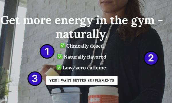
- Re: reducing menu items. I've been told a few times I need to do something to improve social proof, especially since I currently only sell one product. I figured adding menu sections for things like "Find a Retailer" and "Meet Our Athletes" would improve the social proof aspect by showing 1) we are stocked in retail locations and 2) real-life people are actively using our product. I've reduced this menu to 6 items - Home, Supplements, Meet Our Athletes, Find A Retailer, Our Story, and Blog. Do you think this is still too many?
- All products now grouped under "Supplements"
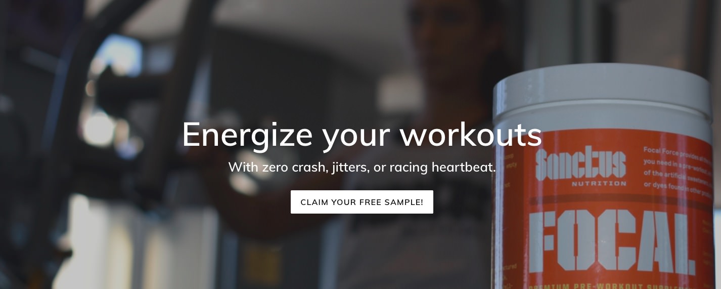
- I can reduce the header image size, but then it screws up the image on desktop - it either cuts out the product or cuts off the head of the model. Re-sizing makes the image look...odd. It looks fine on mobile. My traffic split is about 60/40 mobile/desktop.
- All buttons are supposed to be red (like the "subscribe" button) but CTA buttons appearing on images are white, for some reason. I have no idea why.
- Changed copy to "CLAIM YOUR FREE SAMPLE!" - lets see how it goes!
- Re: Message Us/live chat software. Do you have any free recommendations? I have Messenger installed on my phone and have the "typically responds instantly" badge on Facebook.
#3 and #4 can possibly be solved by contacting Shopify support. Let me see what I can do!
Looking good my friend!
- I'd nix the 'Home' button too. I've watched thousands of user session recordings (HotJar.com) on various e-commerce websites that I have worked on, and users seem to have an expectation that the logo brings them to the homepage. I believe it's safe to say that it's a best practice at this point, unless you are selling to a much older, less savvy crowd. Plus, the homepage is the absolute top of your funnel and the idea is to capture their attention and get them further into the funnel as quickly as possible. That should free up some room in the navigation.
- This looks solid as well. I'd recommend adding a sub-menu that presents those products when you hover over "Supplements." Shortens the number of steps a user has to take to get to your product pages.
- This is where having a developer may help-- you can change the background image size to cater to difference device breakpoints (mobile/tablet/desktop) so that it looks solid on each device. This can be done with CSS.
- For changing the button colors, this line in the theme.scss.css file (your theme's stylesheet):
.hero__btn {
background-color: #fff;}
color: #000;
margin-top: 27.5px;
Should be changed to:
.hero__btn {
background-color: #b8442a;}
color: #fff;
margin-top: 27.5px; - Looks good! Hopefully it gets a few more free sample conversions for you.
- I like Drift the best, followed by Chatra and Olark. All three should have a free tier.
- Additional Idea: Consider adding a "Free Samples" button in the navigation, now that you have extra room (assuming that you remove the "Home" button).
- Additional Idea: Add HotJar to your website so you can look at heatmaps and recordings. This will help you identify areas for improvement, website issues, and potential obstacles your shoppers face. You can also launch polls and surveys to get real, actionable feedback and insights from users/customers. It also has a free plan that should be suitable at this stage in the game.


")
") ) an inspiration to others, and this thread is also a really good progress read.
) an inspiration to others, and this thread is also a really good progress read.