theag
Legendary Contributor
FASTLANE INSIDER
EPIC CONTRIBUTOR
Read Fastlane!
Read Unscripted!
Speedway Pass
User Power
Value/Post Ratio
297%
- Jan 19, 2012
- 3,905
- 11,597
Here's what I meant Eskil:

SPONSORED: GiganticWebsites.com: We Build Sites with THOUSANDS of Unique and Genuinely Useful Articles
30% to 50% Fastlane-exclusive discounts on WordPress-powered websites with everything included: WordPress setup, design, keyword research, article creation and article publishing. Click HERE to claim.Join over 90,000 entrepreneurs who have rejected the paradigm of mediocrity and said "NO!" to underpaid jobs, ascetic frugality, and suffocating savings rituals— learn how to build a Fastlane business that pays both freedom and lifestyle affluence.
Free registration at the forum removes this block.Assuming equal marketing, what do you think would do better between a poor product with great packaging or a great product with poor packaging?


")


Hm, to be completely honest I don't like any of them, it looks unprofessional.
What I would improve:
- In each label you have 3 different background pictures. I would reduce that number, take out the noise. Use just one background, or at the most 2, but with a VERY smooth gradient.
- Change the font coloring, make it lighter and (again) smoother. Use the same color-set as in the background.
- Humans. Add a picture of a smiling elderly guy/gal?
When I look at them from the perspective of seeing them on the shelf at a store, I like A1 the most. C1 and B3 are my least favorite because I don't get the images on the bottom. What about A2 just like it is except replace the top with the A1 top? Also, what about some benefits in a list on the front somewhere?
Pretty cool Eskil. Keep it up!
")
Here's what I meant Eskil:
Since you're from Switzerland - is that pic from the Swiss alps? I remember driving through them many years ago and it was very beautiful.I like the bottom picture on B3 because I think "building blocks". C3 looks teh ghey (not that there's anything wrong with that).
That's not bad dude.
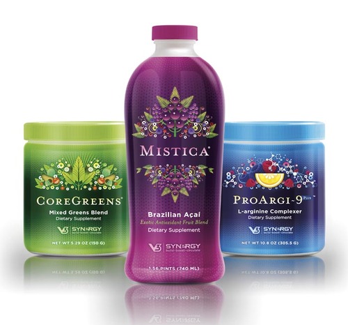
And yeah, its really beautiful, but I'm living here for 2 years now and never really had the time to go there to enjoy the views etc. Have to do that soon!What do current good selling supplements look like? I seem to remember solid colors with few graphics.

 .
.Yeah I know this isn't the ideal audience, and so this was just a preliminary test to weed out the duds.Need a bit wider audience to vote Eskil. Why not go to "target market" forums and do the same, if you haven't already done so, of course .
To be honest I'd drive some targeted traffic to split test all of them as well as the name, based on adds to cart to narrow it down. I do think that if the ingredients (and the result they purport to give) are in demand then the label is not the most important thing ATM - the name on the other hand, a bit more...
I also know that the product is more important than the label, but having been a marketer for so many years I know that visuals really do matter for sales and conversions.
Assuming equal marketing, what do you think would do better between a poor product with great packaging or a great product with poor packaging?
To stand out why not make the container different looking also. Those pictures that you posted all seem to be the same type of bottles with different colored labels, etc. Could you make it taller or round or square or L-shaped? Just a thought.
Yeah I have toyed with that idea, and it's something I might want to do down the road. But for starting out, I will probably just use the standard 225cc PET bottle.

Join Fastlane Insiders.