The Entrepreneur Forum | Financial Freedom | Starting a Business | Motivation | Money | Success
  • SPONSORED: GiganticWebsites.com: We Build Sites with THOUSANDS of Unique and Genuinely Useful Articles

    30% to 50% Fastlane-exclusive discounts on WordPress-powered websites with everything included: WordPress setup, design, keyword research, article creation and article publishing. Click HERE to claim.

Welcome to the only entrepreneur forum dedicated to building life-changing wealth.

Build a Fastlane business. Earn real financial freedom. Join free.

Join over 90,000 entrepreneurs who have rejected the paradigm of mediocrity and said "NO!" to underpaid jobs, ascetic frugality, and suffocating savings rituals— learn how to build a Fastlane business that pays both freedom and lifestyle affluence.

Free registration at the forum removes this block.

Need your help: Vote for my new supplement label design!

Which of these label designs do you like the best?

  • A1

    Votes: 6 17.6%
  • A2

    Votes: 5 14.7%
  • A3

    Votes: 8 23.5%
  • B1

    Votes: 2 5.9%
  • B2

    Votes: 11 32.4%
  • B3

    Votes: 3 8.8%
  • C1

    Votes: 2 5.9%
  • C2

    Votes: 7 20.6%
  • C3

    Votes: 3 8.8%

  • Total voters
    34

Eskil

Legendary Contributor
EPIC CONTRIBUTOR
Read Fastlane!
Read Unscripted!
Summit Attendee
Speedway Pass
User Power
Value/Post Ratio
418%
Jul 18, 2012
1,860
7,778
Scottsdale, AZ
Hey everyone,
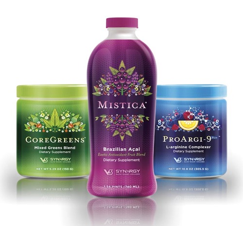
As I mentioned in my progress thread, I have created a set of label designs for my supplement - but I need to narrow down the choices for a market split test.

(It's important to note that these are the "base level" designs for the background. There will be more textual info on the label regarding contents, benefits, etc.)

These are the 9 contestants, and each row has a slightly different theme.
The top row is more colorful and vibrant
The middle row is more green-ish
The bottom row is more airy / light

I don't want to run a market split test with 9 choices, so I need your guys' help to vote for your favorite(s).
Please use the poll function in this thread, and make comments in here too as to why you like or don't like the different labels.

After I have some results here, I will take the most popular labels from this poll and split-test them in my target demographic. They're eventually the ones who will be buying the product, and label / bottle design matters in this business!

So...which one(s) of these would YOU be most likely to buy if you saw these on the shelf - based on looks alone??

Note: The poll is multiple choice, so if you can - I'd love to see your vote for one of each row. ;)

labeltest_A.jpg

labeltest_B.jpg

labeltest_C.jpg


Thanks guys!
 
Dislike ads? Remove them and support the forum: Subscribe to Fastlane Insiders.
Last edited by a moderator:

theag

Legendary Contributor
FASTLANE INSIDER
EPIC CONTRIBUTOR
Read Fastlane!
Read Unscripted!
Speedway Pass
User Power
Value/Post Ratio
297%
Jan 19, 2012
3,905
11,597
Hm, to be completely honest I don't like any of them, it looks unprofessional.

What I would improve:

- In each label you have 3 different background pictures. I would reduce that number, take out the noise. Use just one background, or at the most 2, but with a VERY smooth gradient.
- Change the font coloring, make it lighter and (again) smoother. Use the same color-set as in the background.
- Humans. Add a picture of a smiling elderly guy/gal?
 

wade1mil

Platinum Contributor
Read Fastlane!
Read Unscripted!
Speedway Pass
User Power
Value/Post Ratio
246%
Jun 29, 2011
1,811
4,464
When I look at them from the perspective of seeing them on the shelf at a store, I like A1 the most. C1 and B3 are my least favorite because I don't get the images on the bottom. What about A2 just like it is except replace the top with the A1 top? Also, what about some benefits in a list on the front somewhere?

Pretty cool Eskil. Keep it up!
 

Eskil

Legendary Contributor
EPIC CONTRIBUTOR
Read Fastlane!
Read Unscripted!
Summit Attendee
Speedway Pass
User Power
Value/Post Ratio
418%
Jul 18, 2012
1,860
7,778
Scottsdale, AZ
Hm, to be completely honest I don't like any of them, it looks unprofessional.

What I would improve:

- In each label you have 3 different background pictures. I would reduce that number, take out the noise. Use just one background, or at the most 2, but with a VERY smooth gradient.
- Change the font coloring, make it lighter and (again) smoother. Use the same color-set as in the background.
- Humans. Add a picture of a smiling elderly guy/gal?

Hey theag, I appreciate the input!
The bottom row only has two images, but I agree with you that the top too rows are probably too busy (but I wanted to create a bunch of different ones - for variety's sake, and because people's opinions are so different).

I made the font coloring black and white on purpose - for the sake of contrast and "popping out". I could try to make some variations with a smoother or lighter color though for my final test.

Yeah I played around with humans on there too - but I felt that it looked a bit cheesy (at least with the stock images I tried with), and it got a little cramped for space when I also wanted some element of nature and purity in there as well... However, I found some great stock images that will work much better on the sales page(s), and so the product will have more of a "human feel" online.
 
Dislike ads? Remove them and support the forum: Subscribe to Fastlane Insiders.

Amail

Gold Contributor
Read Fastlane!
Speedway Pass
User Power
Value/Post Ratio
117%
Apr 12, 2012
993
1,163
North San Diego County
I like the bottom picture on B3 because I think "building blocks". C3 looks teh ghey (not that there's anything wrong with that).
 

Eskil

Legendary Contributor
EPIC CONTRIBUTOR
Read Fastlane!
Read Unscripted!
Summit Attendee
Speedway Pass
User Power
Value/Post Ratio
418%
Jul 18, 2012
1,860
7,778
Scottsdale, AZ
When I look at them from the perspective of seeing them on the shelf at a store, I like A1 the most. C1 and B3 are my least favorite because I don't get the images on the bottom. What about A2 just like it is except replace the top with the A1 top? Also, what about some benefits in a list on the front somewhere?

Pretty cool Eskil. Keep it up!

Thanks wade!
It's so interesting to hear people's opinions when I show them these. Some people will hate what others love, and vice versa - but that just makes it extra exciting to see what a poll like this and a split test will bring out. I know I can't please everybody - but as long as I end up with something that the majority of people will probably like....then I'm good.:)

Yeah I had to edit my original post after you wrote because I had forgot to mention that these are only the "bare bones" background images- and that there WILL be benefits and some basic text on the front. :)
 
Dislike ads? Remove them and support the forum: Subscribe to Fastlane Insiders.

Eskil

Legendary Contributor
EPIC CONTRIBUTOR
Read Fastlane!
Read Unscripted!
Summit Attendee
Speedway Pass
User Power
Value/Post Ratio
418%
Jul 18, 2012
1,860
7,778
Scottsdale, AZ
Here's what I meant Eskil:

That's not bad dude. :) Since you're from Switzerland - is that pic from the Swiss alps? I remember driving through them many years ago and it was very beautiful.
 

Eskil

Legendary Contributor
EPIC CONTRIBUTOR
Read Fastlane!
Read Unscripted!
Summit Attendee
Speedway Pass
User Power
Value/Post Ratio
418%
Jul 18, 2012
1,860
7,778
Scottsdale, AZ
I like the bottom picture on B3 because I think "building blocks". C3 looks teh ghey (not that there's anything wrong with that).

Lol... thanks for the input man.
 

miked_d

Silver Contributor
Read Fastlane!
Speedway Pass
User Power
Value/Post Ratio
103%
Dec 25, 2008
561
576
Los Angeles
I am not your market but I don't like any of yours. I like theag's design.

What do current good selling supplements look like? I seem to remember solid colors with few graphics.
 
Dislike ads? Remove them and support the forum: Subscribe to Fastlane Insiders.

theag

Legendary Contributor
FASTLANE INSIDER
EPIC CONTRIBUTOR
Read Fastlane!
Read Unscripted!
Speedway Pass
User Power
Value/Post Ratio
297%
Jan 19, 2012
3,905
11,597
That's not bad dude. :) Since you're from Switzerland - is that pic from the Swiss alps? I remember driving through them many years ago and it was very beautiful.

Thanks! I just took a random pic from google images but after re-checking: yes thats actually a part of the Swiss alps ;) And yeah, its really beautiful, but I'm living here for 2 years now and never really had the time to go there to enjoy the views etc. Have to do that soon!
 

Eskil

Legendary Contributor
EPIC CONTRIBUTOR
Read Fastlane!
Read Unscripted!
Summit Attendee
Speedway Pass
User Power
Value/Post Ratio
418%
Jul 18, 2012
1,860
7,778
Scottsdale, AZ
What do current good selling supplements look like? I seem to remember solid colors with few graphics.

Most of everything out there is pretty bland and ugly. I wanted to create something that stands out and looks tempting. Interestingly enough, the females I have shown these too have all been "OMG! those are soo pretty!" and.. "Wow that's eyecandy" LOL but then again, I'm not a chick so I dunno - and my demographic is 50% male/female. :)

Here is what you see at your typical grocery store or Walmart vitamin shelf:
qfc01.jpg

walmart01.jpg
 

Brander

Bronze Contributor
Read Fastlane!
Read Unscripted!
Jun 3, 2011
607
208
Australia, USA, Europe
Need a bit wider audience to vote Eskil. Why not go to "target market" forums and do the same, if you haven't already done so, of course :).

To be honest I'd drive some targeted traffic to split test all of them as well as the name, based on adds to cart to narrow it down. I do think that if the ingredients (and the result they purport to give) are in demand then the label is not the most important thing ATM - the name on the other hand, a bit more...
 
Dislike ads? Remove them and support the forum: Subscribe to Fastlane Insiders.

Eskil

Legendary Contributor
EPIC CONTRIBUTOR
Read Fastlane!
Read Unscripted!
Summit Attendee
Speedway Pass
User Power
Value/Post Ratio
418%
Jul 18, 2012
1,860
7,778
Scottsdale, AZ
Need a bit wider audience to vote Eskil. Why not go to "target market" forums and do the same, if you haven't already done so, of course .
Yeah I know this isn't the ideal audience, and so this was just a preliminary test to weed out the duds.

To be honest I'd drive some targeted traffic to split test all of them as well as the name, based on adds to cart to narrow it down. I do think that if the ingredients (and the result they purport to give) are in demand then the label is not the most important thing ATM - the name on the other hand, a bit more...

I also know that the product is more important than the label, but having been a marketer for so many years I know that visuals really do matter for sales and conversions.
 

MJ DeMarco

I followed the science; all I found was money.
Staff member
FASTLANE INSIDER
EPIC CONTRIBUTOR
Read Rat-Race Escape!
Read Fastlane!
Read Unscripted!
Summit Attendee
Speedway Pass
User Power
Value/Post Ratio
446%
Jul 23, 2007
38,196
170,439
Utah
Sorry but gotta be honest: I'm not liking any of them.
 

wade1mil

Platinum Contributor
Read Fastlane!
Read Unscripted!
Speedway Pass
User Power
Value/Post Ratio
246%
Jun 29, 2011
1,811
4,464
I also know that the product is more important than the label, but having been a marketer for so many years I know that visuals really do matter for sales and conversions.

I'd love to hear more...

Assuming equal marketing, what do you think would do better between a poor product with great packaging or a great product with poor packaging?
 
Dislike ads? Remove them and support the forum: Subscribe to Fastlane Insiders.

Eskil

Legendary Contributor
EPIC CONTRIBUTOR
Read Fastlane!
Read Unscripted!
Summit Attendee
Speedway Pass
User Power
Value/Post Ratio
418%
Jul 18, 2012
1,860
7,778
Scottsdale, AZ
Assuming equal marketing, what do you think would do better between a poor product with great packaging or a great product with poor packaging?

It depends on the product and the market, but for low-cost items - packaging almost always wins out over product and lots of research has proved that. This is why big corporations go to great length to ensure their toothpastes, protein bars, laundry soaps, deodorants, kids' vitamins, cereal boxes, etc. etc. look their absolute best against the rest out there, even though competitors may have a better core product than them. Because they know that visuals matter so much - and that people will very often pick low-cost products based on looks alone.

However, the spendier the product, the more people make an effort to research the product and hear what others are saying before they make a decision - and packaging then matters less to them.
 

FastNAwesome

Gold Contributor
Read Fastlane!
Read Unscripted!
Speedway Pass
User Power
Value/Post Ratio
117%
May 23, 2011
1,118
1,304
A3, B2, C1 - I find these 3 designs most congruent and most professional, and I like them the most, chosen quite easily.

Now, of these 3, here's my view, purely my associations, which doesn't make them a fact:

A3 - I'm starting to like this one the most, because it has some drops, which indicates water (water = life), and also has some green (nature = health), and it also has some shiny colored light (light = magic = power = secret ingredient which makes you young beautiful or whatever (I've yet to read your blog post, will do)

B2 - water, nature, sun = all that's needed for a health supplement. Looks beautiful and is also vague enough so that anyone can make out of it what they want. But maybe because of vagueness it has the least power too. For all I can conclude from this design, it may as well be a bottled water.

C1 - inevitable water, and secret magic rocks = a blend of rare ingredients that will do wonders.

Ok, so seems A3 is my top favorite definitely.
 

Brander

Bronze Contributor
Read Fastlane!
Read Unscripted!
Jun 3, 2011
607
208
Australia, USA, Europe
Assuming equal marketing, what do you think would do better between a poor product with great packaging or a great product with poor packaging?

If the person doesn't know which product is better and is making his first purchase decision, then the product that alleviates all of his objections, is recommended more and is competitively priced. Unless they are buying on a whim (like at the checkout) then the label is not the most important thing. Very few if any people buy supplements without researching a bit, unless it's a commoditised product like a multivitamin that have been around for decades and most people perceive them to be all are pretty much the same. I could be wrong of course, as I have 0 clue about the supplement market - I have never sold in it, but I sure bought a lot from it :)
 
Dislike ads? Remove them and support the forum: Subscribe to Fastlane Insiders.

sal

Contributor
Read Fastlane!
User Power
Value/Post Ratio
100%
Apr 14, 2012
56
56
B1 looks like it could suit IF the case itself was white and not blue.
And it might just be personal preference but the text used seems a bit too 'hipster' for a supplement.
In for results :)
 

TK1

Silver Contributor
Speedway Pass
User Power
Value/Post Ratio
110%
Mar 31, 2011
626
686
Here are some designs I like - you can check out thedieline.com for more very nice packaging designs:

TheDieLine_Images_Small_Vanilla.jpg


PO_JUST_POUCH_PEACH_HR.jpg


PO_JUST_CTN_POUCH_APPLES_HR.jpg


PO_JUST_POUCH_TRIO_HR.jpg


PO_JUST_ALL_LINE_HR.jpg


06_16_11_tonic_3.jpg


07_13_11_rcup_2.jpg


v3products.jpg


6a00d8345250f069e2012876c97f29970c-550wi
 

nzerinto

Bronze Contributor
Read Fastlane!
Speedway Pass
User Power
Value/Post Ratio
91%
Aug 1, 2012
454
411
Toronto, Canada
Another vote for thedieline. You can get some awesome inspiration from the designs that are featured on the site.
 

458

Platinum Contributor
Read Fastlane!
Speedway Pass
User Power
Value/Post Ratio
343%
May 21, 2011
1,144
3,919
They all seem pretty cheesy to me.
 

DavidofMN

Bronze Contributor
Read Fastlane!
Speedway Pass
User Power
Value/Post Ratio
218%
Apr 19, 2011
211
460
Stillwater, MN
I didn't like any of them either. They look too "cheesy". I think that the name is hard to read too with the uneven text. To stand out why not make the container different looking also. Those pictures that you posted all seem to be the same type of bottles with different colored labels, etc. Could you make it taller or round or square or L-shaped? Just a thought.
 
Dislike ads? Remove them and support the forum: Subscribe to Fastlane Insiders.

Eskil

Legendary Contributor
EPIC CONTRIBUTOR
Read Fastlane!
Read Unscripted!
Summit Attendee
Speedway Pass
User Power
Value/Post Ratio
418%
Jul 18, 2012
1,860
7,778
Scottsdale, AZ
I just realized I posted a comment to all of this in the progress thread the other day - when I meant to say the following in here:

Well, I sure learned a few things after starting this thread...
1) What I like and what other people like can sometimes be vastly different, Lol...
2) Never assume that most people will like something you think will work just fine

Based on feedback here, I will make a couple of very different versions, more toned down, etc. Might even change my logo *gasp* since so few people seem to like it... (the toughest pill to swallow, but oh well, nbd).

But that being said - I will still run tests with some of these (and also against some new drafts I make) to my real market and see the response.

Thanks for all your input and votes!
 

Eskil

Legendary Contributor
EPIC CONTRIBUTOR
Read Fastlane!
Read Unscripted!
Summit Attendee
Speedway Pass
User Power
Value/Post Ratio
418%
Jul 18, 2012
1,860
7,778
Scottsdale, AZ
To stand out why not make the container different looking also. Those pictures that you posted all seem to be the same type of bottles with different colored labels, etc. Could you make it taller or round or square or L-shaped? Just a thought.

Yeah I have toyed with that idea, and it's something I might want to do down the road. But for starting out, I will probably just use the standard 225cc PET bottle.
 

DavidofMN

Bronze Contributor
Read Fastlane!
Speedway Pass
User Power
Value/Post Ratio
218%
Apr 19, 2011
211
460
Stillwater, MN
Yeah I have toyed with that idea, and it's something I might want to do down the road. But for starting out, I will probably just use the standard 225cc PET bottle.

But isn't that what everyone else who is starting out doing? Use the George Constanza method from Sienfeld and do the opposite.
I know it will cost more in the beginning but....
 
Dislike ads? Remove them and support the forum: Subscribe to Fastlane Insiders.

Eskil

Legendary Contributor
EPIC CONTRIBUTOR
Read Fastlane!
Read Unscripted!
Summit Attendee
Speedway Pass
User Power
Value/Post Ratio
418%
Jul 18, 2012
1,860
7,778
Scottsdale, AZ
But isn't that what everyone else who is starting out doing? Use the George Constanza method from Sienfeld and do the opposite.
I know it will cost more in the beginning but....

Hmm.. You have a point. :)
 

JasonR

Maverick
EPIC CONTRIBUTOR
Read Fastlane!
Read Unscripted!
Summit Attendee
Speedway Pass
User Power
Value/Post Ratio
544%
May 29, 2012
2,102
11,427
Las Vegas
I like the bottom three the best, but I think the images should be blended together. For example, the green wreath should be in the water itself instead of two images on top of each other. I hope that makes sense.
 

Post New Topic

Please SEARCH before posting.
Please select the BEST category.

Post new topic

Guest post submissions offered HERE.

New Topics

Fastlane Insiders

View the forum AD FREE.
Private, unindexed content
Detailed process/execution threads
Ideas needing execution, more!

Join Fastlane Insiders.

Top