The Entrepreneur Forum | Financial Freedom | Starting a Business | Motivation | Money | Success

Welcome to the only entrepreneur forum dedicated to building life-changing wealth.

Build a Fastlane business. Earn real financial freedom. Join free.

Join over 80,000 entrepreneurs who have rejected the paradigm of mediocrity and said "NO!" to underpaid jobs, ascetic frugality, and suffocating savings rituals— learn how to build a Fastlane business that pays both freedom and lifestyle affluence.

Free registration at the forum removes this block.

Advice on landing page?

Marketing, social media, advertising
Status
Not open for further replies.

Fersko

Contributor
User Power
Value/Post Ratio
70%
Nov 3, 2018
44
31
Hi Fastlaners,

I've put up a few campaigns to my landing page, click are coming through the ad. So that's not the problem. When the users are on my landing page, they don't click through to sign-up for the product. Tried already adjusting few things, unfortunately without much luck.

link removed (thread can be closed)

Does anyone know what's missing or any tips in general?

Kind regards,

Fersko
 
Dislike ads? Remove them and support the forum: Subscribe to Fastlane Insiders.
Last edited:

Roli

Platinum Contributor
Read Fastlane!
Read Unscripted!
Speedway Pass
User Power
Value/Post Ratio
160%
Jun 3, 2015
2,061
3,301
OK, first things first.

It would be good to get a look at your ad as well so that we can see if there is any fault there, anyhow, here are my first impressions.

The strap line at the top about learning the ins and outs of the world wide web, doesn't really make sense, it's too general a term and sounds clunky - plus I was only aware it was a link right at the end of reviewing the page.

Copy -
That first paragraph of copy needs work, I get the feeling from reading it English is not your first language, or it has been run through a translator program, you need to work on that and get it sounding better. Also take the line about "beer money" out, that will put a lot of people off before they've even started, why would someone go to all that effort to make pennies?

I don't like the second paragraph either, it's too clunky.

Solution: Get a copy writer to work on the text, make sure you have a clear message in mind, and get him/her to transform this message into engaging copy.

Layout -

The eye is first drawn to the 'what is life points?' paragraph, as I mention above, this is where you can lose people. Also is that copy congruent with your ad?

I don't like the design of the button and it is not a strong enough call to action, plus the text below it about 14+ and free, is unnecessary.

The rewards section is ok, however it could do with being centralised and the individual rewards could be made bigger.

The Preview section is confusing, you don't need the whole screen shot whereby you see AT&T the time and the battery bar.

Also below one of the screenshots it says 'get started', this looks like it is your button and it isn't.

Finally you shouldn't have to scroll back up to enrol in the program.

I'm not so sure you need a home page either, this is a landing page and should be focused on getting the user to sign up, plus the copy on the home page is terrible, again you need to hire a good copy writer to create something better for you.

Solutions:

Make font darker and use bigger text.

Put the what is Lifepoints paragraph at the top of the page and instruct the user to watch the video and to click on the button for free points and an immediate start.
(maybe even test where you only have the video and a few screenshots)

Change the copy of the button to read something like "Start earning now"

Put at least one more call to action button with the copy "Get your free bonus points now"

Use one clear screenshot and add a mobile download and desktop download buttons - use text to make clear that these buttons are the same as above and that the user will get their bonus points and will be taken through to the signup page.

Redesign footer, it looks clunky and perhaps doesn't need home or the last link.

-

Okay hope that helps, if you can, post your ad here as well, as it's important that the message in your ad aligns with what you find on the landing page.
 

Fersko

Contributor
User Power
Value/Post Ratio
70%
Nov 3, 2018
44
31
OK, first things first.

It would be good to get a look at your ad as well so that we can see if there is any fault there, anyhow, here are my first impressions.

The strap line at the top about learning the ins and outs of the world wide web, doesn't really make sense, it's too general a term and sounds clunky - plus I was only aware it was a link right at the end of reviewing the page.

Copy -
That first paragraph of copy needs work, I get the feeling from reading it English is not your first language, or it has been run through a translator program, you need to work on that and get it sounding better. Also take the line about "beer money" out, that will put a lot of people off before they've even started, why would someone go to all that effort to make pennies?

I don't like the second paragraph either, it's too clunky.

Solution: Get a copy writer to work on the text, make sure you have a clear message in mind, and get him/her to transform this message into engaging copy.

Layout -

The eye is first drawn to the 'what is life points?' paragraph, as I mention above, this is where you can lose people. Also is that copy congruent with your ad?

I don't like the design of the button and it is not a strong enough call to action, plus the text below it about 14+ and free, is unnecessary.

The rewards section is ok, however it could do with being centralised and the individual rewards could be made bigger.

The Preview section is confusing, you don't need the whole screen shot whereby you see AT&T the time and the battery bar.

Also below one of the screenshots it says 'get started', this looks like it is your button and it isn't.

Finally you shouldn't have to scroll back up to enrol in the program.

I'm not so sure you need a home page either, this is a landing page and should be focused on getting the user to sign up, plus the copy on the home page is terrible, again you need to hire a good copy writer to create something better for you.

Solutions:

Make font darker and use bigger text.

Put the what is Lifepoints paragraph at the top of the page and instruct the user to watch the video and to click on the button for free points and an immediate start.
(maybe even test where you only have the video and a few screenshots)

Change the copy of the button to read something like "Start earning now"

Put at least one more call to action button with the copy "Get your free bonus points now"

Use one clear screenshot and add a mobile download and desktop download buttons - use text to make clear that these buttons are the same as above and that the user will get their bonus points and will be taken through to the signup page.

Redesign footer, it looks clunky and perhaps doesn't need home or the last link.

-

Okay hope that helps, if you can, post your ad here as well, as it's important that the message in your ad aligns with what you find on the landing page.

Exactly the feedback I was hoping for, thanks for being honest and taking your time!

The reason there is a home button is for future expansion. I though it might be a good idea, to build a site with multiple "landing pages/blogs" to make it look more reliable. But as for now I understand it looks confusing.

About the beer money, I wanted to try an honest approach as obviously surveys won't make you hundreds of dollars a day. More and more people are getting aware of this I've noticed. I wan't to reach the people that are looking to buy something of $5. That don't want to bother using their own money.
Probably there is a better word choice for this, definitely going to look in copy-writing. As English is indeed not my premier language.

I'm kind of afraid to put the paragraph on top, because the first thing users will see is a chunk of text, with a video underneath it. On mobile devices this effect is a least 2 times harder. Won't this stop them of scrolling down?

Also, should I put the video on auto-play? Would probably be annoying, right?

Lastly, the ad I can't really share on here. Although I can tell you it's with the same approach, as I mentioned above.

Thanks again @Roli!
 

Roli

Platinum Contributor
Read Fastlane!
Read Unscripted!
Speedway Pass
User Power
Value/Post Ratio
160%
Jun 3, 2015
2,061
3,301
Exactly the feedback I was hoping for, thanks for being honest and taking your time!

No problem, glad to be of help :)

The reason there is a home button is for future expansion. I though it might be a good idea, to build a site with multiple "landing pages/blogs" to make it look more reliable.

This is fine, however people are used to landing on a page, and then going through to the offer.

Remember, the number one function of that page, is to get people to sign up to the offer, anything that distracts them from that is not good.

About the beer money, I wanted to try an honest approach as obviously surveys won't make you hundreds of dollars a day. More and more people are getting aware of this I've noticed. I wan't to reach the people that are looking to buy something of $5.

I understand, and it's not a bad approach, I just think you can find a better term that doesn't put a limiting thought into people's heads.

I'm kind of afraid to put the paragraph on top, because the first thing users will see is a chunk of text, with a video underneath it. On mobile devices this effect is a least 2 times harder. Won't this stop them of scrolling down?

The reason why I say this, is because even though the video is on top, it is not where the eye naturally falls, so don't be afraid to put one or two lines of text above the video, and make sure that there is an instruction to watch the 30 second video before signing up. Then you have a nice prominent button underneath.

Have a look at some colour theory websites, I personally would choose a shade of green for the button, as that is the colour of money!

Also, should I put the video on auto-play? Would probably be annoying, right?

It's not so much that it's annoying, it's just that autoplay can really slow down the site's loading time, so yes, leave it to the user to click play, which they will if you tell them to!

Lastly, the ad I can't really share on here. Although I can tell you it's with the same approach, as I mentioned above.

Understood. As long as the main line is reflected in the ad, for instance if your ad says something like Earn Extra Money Online, then the first line on top of the site above the video should be Earn Extra Money Online... or Watch How You Can Earn Extra Money Online

Good luck, and post back when you have fixed the issues and report on the results.

In the meantime you could do a lot worse than to check out @Andy Black's threads on adwords, everything I know about Google ads, I learned from him :)
 
Dislike ads? Remove them and support the forum: Subscribe to Fastlane Insiders.

rblitz

Bronze Contributor
Read Fastlane!
Speedway Pass
User Power
Value/Post Ratio
131%
Jul 11, 2013
147
193
Germany
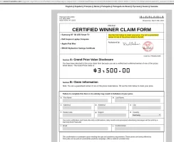
I wanted to post some thoughts about your page. The first time I clicked on the "Start earning now" button, I landed on a "YOU WON A SAMSUNG MOBILE PHONE" site... the second time I clicked on the button, I got on the page in the screenshot.

Is there something wrong with Bitly (your url shortener) or are these fraudulent sites on purpose?
 

Attachments

  • Selection_017.jpg
    Selection_017.jpg
    267.5 KB · Views: 7

Fersko

Contributor
User Power
Value/Post Ratio
70%
Nov 3, 2018
44
31
I wanted to post some thoughts about your page. The first time I clicked on the "Start earning now" button, I landed on a "YOU WON A SAMSUNG MOBILE PHONE" site... the second time I clicked on the button, I got on the page in the screenshot.

Is there something wrong with Bitly (your url shortener) or are these fraudulent sites on purpose?

That's normal as it is an US offer only, it automatically redirects you to an offer of your demography.

It's incrdibly slow, takes almost a minute to load fully.

Hmm, I don't have this issue.
 
Dislike ads? Remove them and support the forum: Subscribe to Fastlane Insiders.
Status
Not open for further replies.

Post New Topic

Please SEARCH before posting.
Please select the BEST category.

Post new topic

Guest post submissions offered HERE.

Latest Posts

New Topics

Fastlane Insiders

View the forum AD FREE.
Private, unindexed content
Detailed process/execution threads
Ideas needing execution, more!

Join Fastlane Insiders.

Top