Hi,
I like you workethic but I like to put in somewhat more time. To me the succes is in the details.
All the best,
Amro
You don't need a logo you need sales.
Dislike ads? Remove them and support the forum:
Subscribe to Fastlane Insiders.
SPONSORED: GiganticWebsites.com: We Build Sites with THOUSANDS of Unique and Genuinely Useful Articles
30% to 50% Fastlane-exclusive discounts on WordPress-powered websites with everything included: WordPress setup, design, keyword research, article creation and article publishing. Click HERE to claim.Join over 90,000 entrepreneurs who have rejected the paradigm of mediocrity and said "NO!" to underpaid jobs, ascetic frugality, and suffocating savings rituals— learn how to build a Fastlane business that pays both freedom and lifestyle affluence.
Free registration at the forum removes this block.Hi,
I like you workethic but I like to put in somewhat more time. To me the succes is in the details.
All the best,
Amro
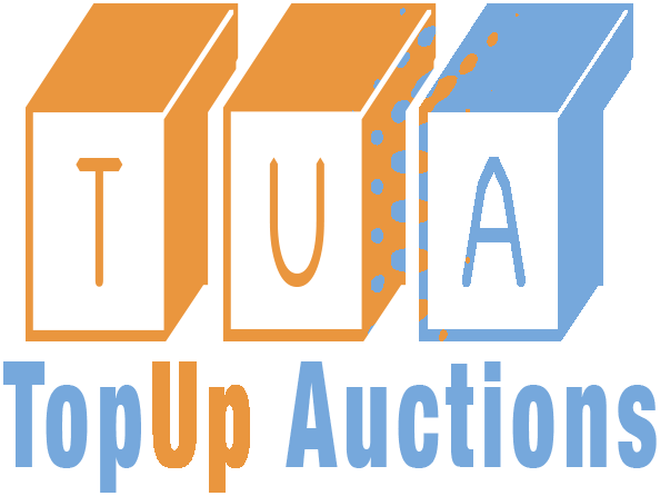


Hi friends,
What do you think of my new logo? I'm not yet done but want to give you an slight idea of what I'm doing and maybe you have some suggestions. Or give me probs!
View attachment 23240
Well well well, what do you think? The U will be shortenend on the left side so it fits below the roof of that T. And the right leg of that U will be an arrow.
And further the TopUp Auctions will be tranfered to the right side of the logo.
Well what do you think?
All the best,
Amro
I like it. I would say though that the background would need to be different, otherwise IMO there isn't enough contrast in the T & the A. Other than that, looks great!
I don't like the T. I like the A. The U is fine. Honestly, I don't think it flows that well. The colors are kind of off maybe it's the background but it's hard to look at on my screen. Try something with more contrast to the background like white or a vibrant color.
I read it as To Pup Auctions which is prolly not what you’re going for..
Looks weird.
Without making too much changes to the logo, I would:
1) Remove the drop shadow
2) Make the T a normal T without those cuts at the top of the T
3) Make the TU dark grey
4) Transfer the orange in the U to the A instead
5) The bottom right corner of the U looks awkward next to the bottom left corner of the A, so I would probably try doing a cut on the bottom right corner of the U do that the edge there is parallel to the slant of the bottom left corner of A. Basically, the area between U and A looks awkward now.
6) For the "topup auction" text, make the two lines at the sides end in flat edges (currently they're spiky). Or you could just remove the lines altogether, and add more space between each of the "topup auction" alphabets to give it a classier look if you're going for that.
Looks a bit busy, but certainly good enough to put to use right away. Keep it simple.

The T, U, and A all have different styles, and the "Topup" part has a 2008 font. I'd get rid of the shadow and background as well. I think you're heading in the right direction though.

T and U stands for one word, thts why you put it in the same color. Why did you put ut in different font?Hi,
Thank you @LPPC for the kind feedback. Something like this:
View attachment 23291
All the best,
Amro
Auction site logos are usually fun and friendly.Hi,
Thanks for all the feedback.
The background is just a placeholder for now. In the first place it will be one solid color but i'll review this after we have done the logo shape, size and coloring. Thanks for the feedback @ValueGenerator!
I asked the designer to show me the letter without the cuts since I want it to be as mainstream as possible. As for the background i'll try different colors later on! Thanks for the feedback @Thomas Baptiste!
Smart one. I allready told him to make the word: TopUp Auctions so this will be changed so it's more clearly. Thank you @Primeperiwinkle!
Can you please comment on your thorough feedback? Thanks @jasoncuellar123.
I must agree with a few points indeed!
1. I will try that to see how it looks. I like the 3D look to be honoust since it's something which isn't used much although I also want to make it as mainstream as possible and not to flashy. BUT it complements the value i'll deliver in terms of product and service.
2. Requested this to my designer.
3. Hmmmm, need to look into this one.
4. The reason why I want the U orange is because it breaks the coloring in three since they are three words and also the right side op the U will be an arrow like on the following image
View attachment 23258
5. I also noticed this and it will be changed indeed. Thanks.
6. I also didn't like the lines. The word will be TopUp Auctions where up will orange again.
Thanks for your valuable feedback @Dark Water.
What do you mean different styles? Are they different font types?
Thanks for the feedback @Will-v-the-World!
I must say in the beginning I didn't expect to much response but I just woke up and I'm gratefull for your time to give me your insights.
Thanks a bunch!
All the best,
Amro
4. The reason why I want the U orange is because it breaks the coloring in three since they are three words and also the right side op the U will be an arrow like on the following image
View attachment 23258
.jpg")
You used Angela on Fiverr?
quick question, what does your company do?
Honestly, this logo looks great! I would really have to see the whole site to really see if it blends with it, but I like the colors!Hi friends,
What do you think of my new logo? I'm not yet done but want to give you an slight idea of what I'm doing and maybe you have some suggestions. Or give me probs!
View attachment 23240
Well well well, what do you think? The U will be shortenend on the left side so it fits below the roof of that T. And the right leg of that U will be an arrow.
And further the TopUp Auctions will be tranfered to the right side of the logo.
Well what do you think?
All the best,
Amro
Do all professional companies have a logo? Yes.I see a lot of talk of logos and hey I do nt need sales I need this pimping boat....you need sales spending all this time on a logo is a waste of time.
There's a thread here somewhere called what do you need? Take a look.
I made these mistakes building a logo etc.
Hi friends,
What do you think of my new logo? I'm not yet done but want to give you an slight idea of what I'm doing and maybe you have some suggestions. Or give me probs!
View attachment 23240
Well well well, what do you think? The U will be shortenend on the left side so it fits below the roof of that T. And the right leg of that U will be an arrow.
And further the TopUp Auctions will be tranfered to the right side of the logo.
Well what do you think?
All the best,
Amro

Join Fastlane Insiders.
.jpg")