The Entrepreneur Forum | Financial Freedom | Starting a Business | Motivation | Money | Success

Welcome to the only entrepreneur forum dedicated to building life-changing wealth.

Build a Fastlane business. Earn real financial freedom. Join free.

Join over 90,000 entrepreneurs who have rejected the paradigm of mediocrity and said "NO!" to underpaid jobs, ascetic frugality, and suffocating savings rituals— learn how to build a Fastlane business that pays both freedom and lifestyle affluence.

Free registration at the forum removes this block.

Help me decide logo?

Which logo do you prefer?


  • Total voters
    12

CryptO

Gold Contributor
Read Fastlane!
Speedway Pass
User Power
Value/Post Ratio
101%
Apr 20, 2012
1,170
1,181
The Blockchain
Hi,

I was all commited with what I thought was a good logo. Then somebody goes and says, 'you really need to change your logo, how about this?' Now I cannot decide. I would really like some second opionions because if I change the logo now we are going to have to do some design revisions on the site because of the colour scheme. Although it will be easier to do now rather than later.

Please vote on which logo you prefer?

Thanks very much!!!

Current logo
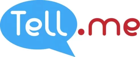
final-logo.jpg

Proposed logo (maybe if the speech bubble was changes to red instead of pink we could keep existing colour scheme?)
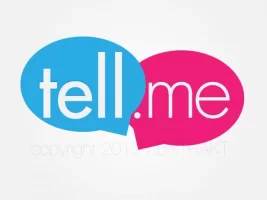
Tell.me logo propo.jpg
 
Dislike ads? Remove them and support the forum: Subscribe to Fastlane Insiders.

Pr7de

PARKED
User Power
Value/Post Ratio
0% - New User
May 18, 2012
23
0
I do not have any knowledge about logo designing, but the proposed one does look more attractive to me personally. Next to that I thought it might be easier to use the proposed logo because '.me' also has a background color and if you would want to put the logo on somewhere you have two baloons instead of a square in which you don't have boundaries around the '.me' part.

Sorry if it is hard to understand my explaination, I am trying my best to make it clear to you in English.
Hopefully my opinion is of use to you somewhat.
 

verial

Contributor
Read Fastlane!
User Power
Value/Post Ratio
30%
May 8, 2012
100
30
40
Taipei
What's the concept behind it? I have a professional logo designer friend who always gives the concept behind a logo he designs. I think this way you will stick with a logo for life, without second-guessing yourself.
 
Dislike ads? Remove them and support the forum: Subscribe to Fastlane Insiders.

joona

Contributor
User Power
Value/Post Ratio
29%
Dec 1, 2011
100
29
Budapest, Hungary
If your site is about conversation, dialogue and sharing, maybe the 2nd one would be more appropriate. It gives the perception of dialogue.

If it is about "this is how it is", then the first one.

(I did check your website, but to me it wasn't exactly clear what it is about)
 

CryptO

Gold Contributor
Read Fastlane!
Speedway Pass
User Power
Value/Post Ratio
101%
Apr 20, 2012
1,170
1,181
The Blockchain
If your site is about conversation, dialogue and sharing, maybe the 2nd one would be more appropriate. It gives the perception of dialogue.

If it is about "this is how it is", then the first one.

(I did check your website, but to me it wasn't exactly clear what it is about)

The site is a social question network, so conversation, dialogue and sharing plays a big part in what I want to acheive.

The general concencus seems to be the second logo - the new one!!!

If we do go with this new logo, then the design which is currently red white and blue will have to be changed to pink white and blue. Pink for my website, wtf!!! I didn't see that coming, but if it looks better and people prefer it then that is what it will have to be.

Very difficult to decide. I'll also have to try it out in red instead of pink and see what that does, not sure it will be as effective..... back to the drawing boards and for the logo we are launching in just over 2 weeks!

Thanks for the inputs.
 

CryptO

Gold Contributor
Read Fastlane!
Speedway Pass
User Power
Value/Post Ratio
101%
Apr 20, 2012
1,170
1,181
The Blockchain
a little pink will help attract the female demographics... too much will turn off the male demographics.

That was in tune with my thinking so this is where I am now. Somebody has even suggested trying blue an orange, like most movie posters because that is what attracts people!!! How many times will I have to change this to get it right!!!

tellmelogopng.jpg
 

mayana

Gold Contributor
Read Fastlane!
Speedway Pass
User Power
Value/Post Ratio
120%
Apr 26, 2011
984
1,183
Georgia, USA
That was in tune with my thinking so this is where I am now. Somebody has even suggested trying blue an orange, like most movie posters because that is what attracts people!!! How many times will I have to change this to get it right!!!

View attachment 3036


I agree with Patrick - the red and blue that is in your avatar right now looks great. When I see the pink one, I tend to feel that is more of a female-oriented site. I love the red and blue.
 
Dislike ads? Remove them and support the forum: Subscribe to Fastlane Insiders.

DreamPursuit

Say a little, do a lot
FASTLANE INSIDER
Read Fastlane!
Read Unscripted!
Speedway Pass
User Power
Value/Post Ratio
78%
May 18, 2010
125
97
South Carolina
The pink and blue has too much of a feminine feel to it. The new red and blue one is just right. Keep up the good work!
 

esprintguy

PARKED
User Power
Value/Post Ratio
0% - New User
Mar 8, 2012
12
0
The second logo is better. It has better typography. But I'm not so sure with the concept. It would help us critique if we know the idea behind the logo.
 
Dislike ads? Remove them and support the forum: Subscribe to Fastlane Insiders.

CryptO

Gold Contributor
Read Fastlane!
Speedway Pass
User Power
Value/Post Ratio
101%
Apr 20, 2012
1,170
1,181
The Blockchain
The second logo is better. It has better typography. But I'm not so sure with the concept. It would help us critique if we know the idea behind the logo.

Been looking at the thread title for hours and didn't realise it was my thread :)

Communitiy Driven Question and Answer site - You ask questions about anything you like and people respond.

Very early stages atm!
 

longlivemedia

PARKED
User Power
Value/Post Ratio
0% - New User
Mar 8, 2012
15
0
40
Houston, TX
Well, for atm, that seems to be a pretty good logo concept. I admire the concept of connection-slash-Venn diagram art. I'm really up for the second logo. Nice one :)
 

Post New Topic

Please SEARCH before posting.
Please select the BEST category.

Post new topic

Guest post submissions offered HERE.

Latest Posts

New Topics

Fastlane Insiders

View the forum AD FREE.
Private, unindexed content
Detailed process/execution threads
Ideas needing execution, more!

Join Fastlane Insiders.

Top