I was playing around with Google Trends to see what stuff are trending, and I randomly typed in things that come across my mind.
Then I typed 'donut' and got this graph:
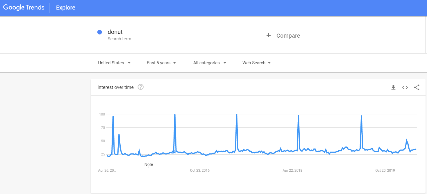
In terms of the graph pattern, this is the most consistent one I've come across on G-Trends. Heck, even the interval of the spikes are the same!
The graph is from 2015 - present, location is in the US. The high spikes are all dated May - Jun.
Does this mean people over there eat donuts most when summer comes?
This is strange, because I thought donuts are non-seasonal and people eat it all year round? Why May / June? What gives?
Then I typed 'donut' and got this graph:
In terms of the graph pattern, this is the most consistent one I've come across on G-Trends. Heck, even the interval of the spikes are the same!
The graph is from 2015 - present, location is in the US. The high spikes are all dated May - Jun.
Does this mean people over there eat donuts most when summer comes?
This is strange, because I thought donuts are non-seasonal and people eat it all year round? Why May / June? What gives?
Dislike ads? Become a Fastlane member:
Subscribe today and surround yourself with winners and millionaire mentors, not those broke friends who only want to drink beer and play video games. :-)
Membership Required: Upgrade to Expose Nearly 1,000,000 Posts
Ready to Unleash the Millionaire Entrepreneur in You?
Become a member of the Fastlane Forum, the private community founded by best-selling author and multi-millionaire entrepreneur MJ DeMarco. Since 2007, MJ DeMarco has poured his heart and soul into the Fastlane Forum, helping entrepreneurs reclaim their time, win their financial freedom, and live their best life.
With more than 40,000 posts packed with insights, strategies, and advice, you’re not just a member—you’re stepping into MJ’s inner-circle, a place where you’ll never be left alone.
Become a member and gain immediate access to...
- Active Community: Ever join a community only to find it DEAD? Not at Fastlane! As you can see from our home page, life-changing content is posted dozens of times daily.
- Exclusive Insights: Direct access to MJ DeMarco’s daily contributions and wisdom.
- Powerful Networking Opportunities: Connect with a diverse group of successful entrepreneurs who can offer mentorship, collaboration, and opportunities.
- Proven Strategies: Learn from the best in the business, with actionable advice and strategies that can accelerate your success.
"You are the average of the five people you surround yourself with the most..."
Who are you surrounding yourself with? Surround yourself with millionaire success. Join Fastlane today!
Join Today
")

