flowyak
New Contributor
That website is clean and respects the basic rules of design, but it's extremely basic.
As part of my agency's hiring process, tens of portfolios like that every single week. They are boring and don't require true design knowledge nor eye. They have no personality.
In all honesty, I could teach a complete newbie to do something on that level in a matter of hours.
These are some truly well-designed websites:
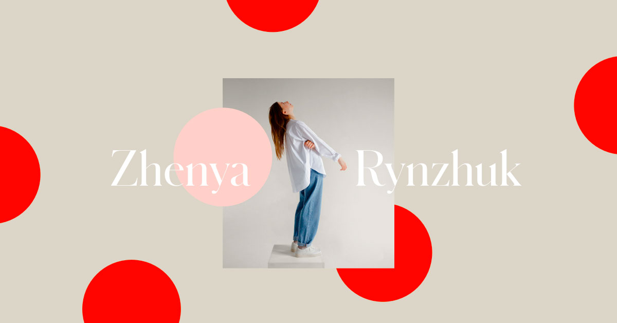
 zhenyary.com
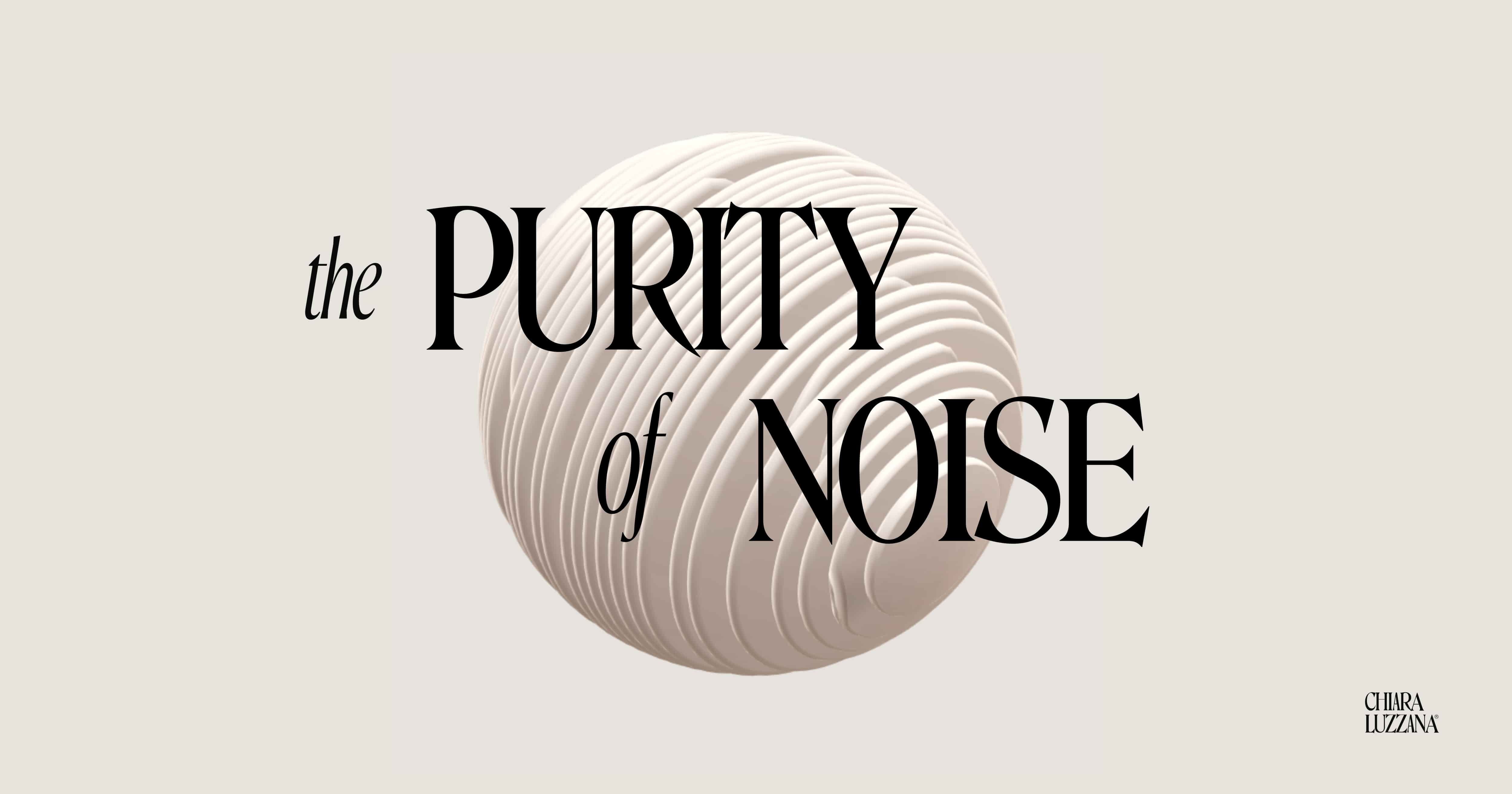
 chiaraluzzana.com
 clmt.paris
Marvin Schwaibold and Marvin Schwaibold
clmt.paris
Marvin Schwaibold and Marvin Schwaibold
Talking about the blog post...first of all from 2009 to 2020 it changed a lot. Second, it doesn't look modern or cutting edge. It looks like a blog post that respects visual hierarchy.
And blog posts design is clearly inspired by books which haven't changed in centuries. If you take books published after Gutenberg's printing press (mid-15th century), you will see that the only difference is in the fonts.
So having a blog post that still looks good after ten years in not exactly an accomplishment (by the way the first draft looks pretty bad for today's standards).
If it didn't make sense from a promotional perspective, I would think that you are Trent Walton.
As part of my agency's hiring process, tens of portfolios like that every single week. They are boring and don't require true design knowledge nor eye. They have no personality.
In all honesty, I could teach a complete newbie to do something on that level in a matter of hours.
These are some truly well-designed websites:
Zhenya Rynzhuk
Portfolio of Zhenya Rynzhuk, award-winning art director. Areas of expertise include Product & Visual design, Mobile & Web projects, Branding, Typography, and Animations.
Chiara Luzzana — Sound Designer
Chiara Luzzana is an award-winning Sound Designer focused on Sound Design, Music Composition, Sound Branding, Soundtrack and Audio Installations collaborating with companies and agencies all over the world.
Coming Soon - Clmt. ⏤ Photography
clmt.paris
Talking about the blog post...first of all from 2009 to 2020 it changed a lot. Second, it doesn't look modern or cutting edge. It looks like a blog post that respects visual hierarchy.
And blog posts design is clearly inspired by books which haven't changed in centuries. If you take books published after Gutenberg's printing press (mid-15th century), you will see that the only difference is in the fonts.
So having a blog post that still looks good after ten years in not exactly an accomplishment (by the way the first draft looks pretty bad for today's standards).
If it didn't make sense from a promotional perspective, I would think that you are Trent Walton.
Dislike ads? Remove them and support the forum:
Subscribe to Fastlane Insiders.
