The Entrepreneur Forum | Financial Freedom | Starting a Business | Motivation | Money | Success

Welcome to the only entrepreneur forum dedicated to building life-changing wealth.

Build a Fastlane business. Earn real financial freedom. Join free.

Join over 80,000 entrepreneurs who have rejected the paradigm of mediocrity and said "NO!" to underpaid jobs, ascetic frugality, and suffocating savings rituals— learn how to build a Fastlane business that pays both freedom and lifestyle affluence.

Free registration at the forum removes this block.

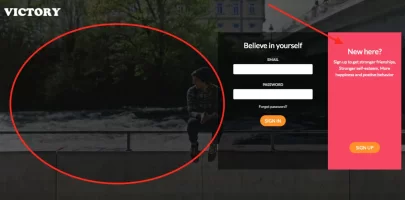
Can you guys critique or give me feedback on my homepage please?

Gaiervy

New Contributor
User Power
Value/Post Ratio
37%
Dec 19, 2016
19
7
27
Do you think I've given the customer enough value with this? I only focused on expressing the benefits that will give my customer value The site isn't live yet so things will change.

Don't hold back please, tell me everything you think.

Website
 
Dislike ads? Remove them and support the forum: Subscribe to Fastlane Insiders.

AdamMaxum

a worthy successor indeed
FASTLANE INSIDER
Read Fastlane!
Read Unscripted!
Speedway Pass
User Power
Value/Post Ratio
116%
Apr 30, 2011
397
459
NY
it's okay

I would start by showing the sign up box vs the sign in since i suspect you have no members.

there are some minor changes here and there with the layout I might tweak.

I didn't really read anything but nothing grabbed my attention. I don't know what this is or why I would sign up. So best advice, make that way more clear and then drive some traffic to the page and test it out.
 

Gaiervy

New Contributor
User Power
Value/Post Ratio
37%
Dec 19, 2016
19
7
27
it's okay

I would start by showing the sign up box vs the sign in since i suspect you have no members.

there are some minor changes here and there with the layout I might tweak.

I didn't really read anything but nothing grabbed my attention. I don't know what this is or why I would sign up. So best advice, make that way more clear and then drive some traffic to the page and test it out.

Thank you for replying. The site description is further expanded at the bottom. Do you think I should put it in the top?
 

Gaiervy

New Contributor
User Power
Value/Post Ratio
37%
Dec 19, 2016
19
7
27
it's okay

I would start by showing the sign up box vs the sign in since i suspect you have no members.

there are some minor changes here and there with the layout I might tweak.

I didn't really read anything but nothing grabbed my attention. I don't know what this is or why I would sign up. So best advice, make that way more clear and then drive some traffic to the page and test it out.


Nevermind, I took your advice and emailed my programmer on what to do next. Thank you.
 
Dislike ads? Remove them and support the forum: Subscribe to Fastlane Insiders.

WealthChaser

Contributor
Read Unscripted!
Speedway Pass
User Power
Value/Post Ratio
188%
Jun 7, 2017
48
90
32
Indiana
Do you think I've given the customer enough value with this? I only focused on expressing the benefits that will give my customer value The site isn't live yet so things will change.

Don't hold back please, tell me everything you think.

Website
It's a good bootstrap landing page. I would center the forms in the middle of the page to draw the eye of the user. I would also enhance my call to actions. Not "You will learn more about yourself", instead: "Crush personal boundaries and expand yourself unlike before...". Something like that?

Also I am unsure what is going on with the color scheme ;)

Good luck sir!

Edit: Oh and get rid of the use of "I" on the page unless you plan on doing all of the work yourself (Personalized) . You are selling your product, not you as an individual.
 

DavidK

Contributor
Read Fastlane!
Read Unscripted!
Speedway Pass
User Power
Value/Post Ratio
171%
May 23, 2017
51
87
36
Hurricane, UT
@Gaiervy

I noticed spelling and punctuation mistakes, make sure all those are fixed eventually. After reading through the page I still don't understand exactly what it is and I don't think most people will read through so much just to figure out what you are offering.
 

Equilibrium

Bronze Contributor
Read Fastlane!
Read Unscripted!
Speedway Pass
User Power
Value/Post Ratio
152%
Jun 14, 2015
174
265
The site isn't live yet so things will change.
Do not seek validation, seek success. get that site up and running.
and because you are requiring usernames and passwords, you need SSL. This site is insecure. Call hostgator and ask about SSL Cert.
You are also using /projects/victory instead of the main domain.
 
Dislike ads? Remove them and support the forum: Subscribe to Fastlane Insiders.

Gaiervy

New Contributor
User Power
Value/Post Ratio
37%
Dec 19, 2016
19
7
27
Do not seek validation, seek success. get that site up and running.
and because you are requiring usernames and passwords, you need SSL. This site is insecure. Call hostgator and ask about SSL Cert.
You are also using /projects/victory instead of the main domain.

Thank you
 

Gaiervy

New Contributor
User Power
Value/Post Ratio
37%
Dec 19, 2016
19
7
27
@Gaiervy

I noticed spelling and punctuation mistakes, make sure all those are fixed eventually. After reading through the page I still don't understand exactly what it is and I don't think most people will read through so much just to figure out what you are offering.

Thank you
 

MJ DeMarco

I followed the science; all I found was money.
Staff member
FASTLANE INSIDER
EPIC CONTRIBUTOR
Read Rat-Race Escape!
Read Fastlane!
Read Unscripted!
Summit Attendee
Speedway Pass
User Power
Value/Post Ratio
446%
Jul 23, 2007
38,162
170,254
Utah
You have 3.2 seconds to tell me exactly what you're website will do for me.

You didn't get there.

Most of the page is wasted real estate.

Screen Shot 2017-12-18 at 1.48.22 PM.png

I spent about 12 seconds on it, and I'm still not entirely sure.

And the spelling errors don't help.
 
Dislike ads? Remove them and support the forum: Subscribe to Fastlane Insiders.

lowtek

Legendary Contributor
FASTLANE INSIDER
EPIC CONTRIBUTOR
Read Fastlane!
Summit Attendee
Speedway Pass
User Power
Value/Post Ratio
332%
Oct 3, 2015
2,163
7,186
42
Phoenix, AZ
it's a work in progress.

1) don't center your capture form on the right side. People scan pages in an F shape

2) lern too speel

3) small detail - title the page something other than website

4) there is no indication what any of this is for. Needs to be immediately obvious

5) you use the words "psychological studies" way too many times - you really should cite your sources also. Otherwise you're a bullshit artist, just like the people who run psych studies.

6) in the pricing, why the hell is the free plan on the right? nobody does it this way

7) read most of the page, no idea what you're selling.
 

wade1mil

Platinum Contributor
Read Fastlane!
Read Unscripted!
Speedway Pass
User Power
Value/Post Ratio
246%
Jun 29, 2011
1,810
4,459
I don't know what your website's purpose until I scroll down. "MAKE BETTER FRIENDS WITH RANDOM PEOPLE" - or something like it - should be at the top.
 
Dislike ads? Remove them and support the forum: Subscribe to Fastlane Insiders.

Beatingtheodds

Contributor
User Power
Value/Post Ratio
162%
Oct 24, 2017
26
42
31
England
Disclaimer - I'm not an expert, but the initial copy seems to be focusing on facts (logic). Whereas people tend to purchase based on emotions. Science may help the logical human, but we're rarely logical.

Also - Are the premium benefits based on the customers pain points ? (out of curiosity).

One final point - I repeat, I am not an expert but why does it matter what your promise to them is ? Are you an authority ? Do you have something special about you ? I don't mean this negatively as i like the website, i only ask as it could be wasted space that you could use on something like social proof (Testimonials, Videos etc) or more benefits etc. OFC you'd need to test this.

Keep making progress Gaiervy :cool::):)
 

Gaiervy

New Contributor
User Power
Value/Post Ratio
37%
Dec 19, 2016
19
7
27
it's a work in progress.

1) don't center your capture form on the right side. People scan pages in an F shape

2) lern too speel

3) small detail - title the page something other than website

4) there is no indication what any of this is for. Needs to be immediately obvious

5) you use the words "psychological studies" way too many times - you really should cite your sources also. Otherwise you're a bullshit artist, just like the people who run psych studies.

6) in the pricing, why the hell is the free plan on the right? nobody does it this way

7) read most of the page, no idea what you're selling.

Thank you.
 

Gaiervy

New Contributor
User Power
Value/Post Ratio
37%
Dec 19, 2016
19
7
27
Disclaimer - I'm not an expert, but the initial copy seems to be focusing on facts (logic). Whereas people tend to purchase based on emotions. Science may help the logical human, but we're rarely logical.

Also - Are the premium benefits based on the customers pain points ? (out of curiosity).

One final point - I repeat, I am not an expert but why does it matter what your promise to them is ? Are you an authority ? Do you have something special about you ? I don't mean this negatively as i like the website, i only ask as it could be wasted space that you could use on something like social proof (Testimonials, Videos etc) or more benefits etc. OFC you'd need to test this.

Keep making progress Gaiervy :cool::):)

Thank you. Theirs nothing special about me, I just wanted to give them the added benefit that I will be actively reading their feedback and adjusting based on it.
 

Gaiervy

New Contributor
User Power
Value/Post Ratio
37%
Dec 19, 2016
19
7
27
I appreciate the feedback everyone. I will be adjusting the site further.
 

jms0717

Contributor
Read Fastlane!
User Power
Value/Post Ratio
135%
Oct 31, 2017
23
31
29
San Angelo, TX
Need spell/grammar check.
Timeline looks weird. Center numbers and make them bigger or get rid of them altogether and put pictures on the number side.
Need a title tag and favicon
More padding between check/lock icon and text on list of join perks
Less padding on bottom of list for continuity with sides.
More bottom margin on “My promise to you” text area (or top margin on next section)
The List looks weird. It doesn’t feel like it should be numbered. Maybe try the more popular icons?
Footer links broken
Also, same as others, no idea what you're selling.
 
Dislike ads? Remove them and support the forum: Subscribe to Fastlane Insiders.

Gaiervy

New Contributor
User Power
Value/Post Ratio
37%
Dec 19, 2016
19
7
27
Need spell/grammar check.
Timeline looks weird. Center numbers and make them bigger or get rid of them altogether and put pictures on the number side.
Need a title tag and favicon
More padding between check/lock icon and text on list of join perks
Less padding on bottom of list for continuity with sides.
More bottom margin on “My promise to you” text area (or top margin on next section)
The List looks weird. It doesn’t feel like it should be numbered. Maybe try the more popular icons?
Footer links broken
Also, same as others, no idea what you're selling.

Thank you
 

Post New Topic

Please SEARCH before posting.
Please select the BEST category.

Post new topic

Guest post submissions offered HERE.

New Topics

Fastlane Insiders

View the forum AD FREE.
Private, unindexed content
Detailed process/execution threads
Ideas needing execution, more!

Join Fastlane Insiders.

Top