Lately I see a lot of talks about web development, web design and websites in general, so I think it will be useful for fastlaners to get a glimpse of how it's approached on a major scale ($25k+ projects), making use of best practices of 2016-2017.
What experience do I have to speak on this subject?
Behind my back 2 pre-ipo projects (off the ground), 18 national-scale companies, 140+ businesses total. I've been on both sides - working with a company to get things done the right way and working as a contractor to make things right.
High Concepts:
- How not to flush money down the drain.
- How to get a website that makes a difference.
Pre-Production.
We consider every effort before development starts - a pre-production stage.
The most silly decision is to dive into production right away. It will result in thousands of dollars of expenses as the best possible outcome. Usually it results in having a brick-website for years without knowing what's wrong, even though it may seem professional and could be done by a top100 design studio.
Truth is, web design studios are just design studios. Not many of them understand how marketing and psychology are applied to design, despite claiming that they do understand that. We've worked with many of UX designers who lack any cognitive psychology knowledge, making their work on serious projects for serious brands a quite questionable experience.
Not many studios/specialists will actually step into our shoes and make decisions that are good for us. Even less of them will tell us if we actually need something to be implemented on our website or it's just a fancy feature to justify a $25k cost of works.
This brings us to our first step:
What do we need and why?
There are plenty of circumstances in which you don't need a website at all. Two major factors not to invest in one:
a) If we don't have enough money to cover all work that is required towards a website.
i.e. if our website has expensive design, but cheap copywriting and bad consumer targeting > bad marketing towards our prospects - our website will be a brick. There is no point in having a website that makes the visitor go wow on entrance only to leave unsatisfied 1 minute later, with empty cart / crossing our company off their list.
b) If our prospects dwell somewhere else other than internet and it's more rational to invest in local marketing, forming personal connections, using other medium than our own website, etcetera.
While second one is easy: we can just contact a studio/specialist that charges 3-4 times more than what we have and book a free/paid consultation. Often it will result in a short but quite informative conversation with a competent specialist who will speak his mind regarding needs of our business, without trying to sell anything but quality impression. Will we manage to get this kind of information within our free consultation or not depends on how well we play a role of a clueless customer (use game theory here).
The first one requires budget allocation and here we should keep in mind that what we see coming is probably a surface of the iceberg.
2 days ago I talked with a representative of an internet provider company and he said that they have everything covered, thinking that $30k is enough to pay for their website with everything on it, but they didn't realize that they will also need to get their wi-fi routers patched, get a new package for it with new documentation, get a new anrdoid/ios app, run a new physical advertising campaign, clear whole cities from their previous advertising campaign, run their customer support through advanced training and manage to get in touch with every client they've recently acquired - that was way off their estimations and not just they cannot afford it, they cannot even manage this amount of work right now. Today I got a call from their executive and they arranged a meeting with me regarding a subject that has nothing to do with their website.
The problem is, being an internet provider company is not different than owning a photography studio, food restaurant or car dealership - expenses are always unexpected.
To get things right we need to take our time and book consultations with specialists - each consultation on pre-production stage saves fortune on a production stage. One 300-500$ consultation during pre-pro can solve problems before they even occur during production, so we won't need to run with our back on fire and pay to a specialist to cancel his vacation, get on a plane and solve our *unexpected* (wow) problems for 2-3x price. This is not even the worst outcome, usually problems occur and never end up solved, because it turns out to be too expensive, leading to fatal results.
I've seen at least a couple of companies get out of business because of that, one is getting out right now, after being a leading company for at least 8 years, and there is nothing they can do about it, it's just way too late. Whole city is buried under their advertising which nobody cares about anymore.
Consultations, of course, can cost less than that, you can even manage to get them for free if you know right people and have good relationships with them. The most common mistake I see (especially on TFLF) is when people don't ask for advice from people who know better than they do, only to return later and tell how they failed at something.
Always do your homework and never try to save money on things that will actually save you from wasting even more money.
Once we know what we are up to, we can proceed to budget allocation.
Production Overview.
Tricky things to consider:
1) Professional photography, alone, costs hundreds of dollars, it can cost thousands as well. It should be done under a guidance of your web designer, otherwise your website will suffer in visual quality. Significantly.
If your business is an e-store, even if you sell somebody else's brands - you need your own photography to distinguish you from other sellers. Superior photography means a superior, more profitable business. If you think that it doesn't matter much - go and catch up your potential customer, who at this time types in his credit card info on another website.
Regarding stock photos - most of the times they cost even more than if you would pay for your own photography, involving a lot of color correction, hours of searching for right photos and trying to make them work together with what you try to deliver on your website.
If your photos don't form an impression you want your visitor to have - these photos are waste of space, waste of time and waste of opportunity.
Photos are usually taken before any design is done. In 2016 design is small and heavily relies on photography, video and full-scale visuals. In 2017 it will be even more of real-world elements accentuated by web graphics.
Also, many of expensive websites that relied on complex 3D visuals could be 2x less expensive and more effective if they would make use of right implementation of video and photography. I'm currently in a process of shopping for a phone with encryption and one company I consider has a pretty expensive website that utilizes complex 3D visuals for no reason. This is literally how thousands of dollars can be wasted on something that doesn't work for your business. Always consider simple solutions before anything else.
2) Intelligent Design:
If you see a web design company that has some verical text looking inwards to the center of screen - it's time to push the X button, because if something like this is done on your website - that's exactly what your visitor will do.

Intelligent designer asks: "How intuitive is this?".
Bad designer asks: "Doesn't it look cool?".
Intelligent designer asks: "What impression will our targeted visitor have?".
Bad designer asks: "Will it impress fellow designers and get me likes on a web awards website?"
Intelligent designer asks: "How this font will fit with copywriting style of this brand?".
Bad designer is probably more busy deciding between Proxima Nova and Gotham, because it's the only two fonts that look good on your page and he has no clue about perceptional psychology of typography.
I'm currently looking over many of $30k+ websites and some of them have black text over black images, gold buttons over light photography and etc. If something like this would be done on your website, your visitor would quickly punish you for that. Either by having a bad impression or by pressing X button, depending on degree of annoyance.
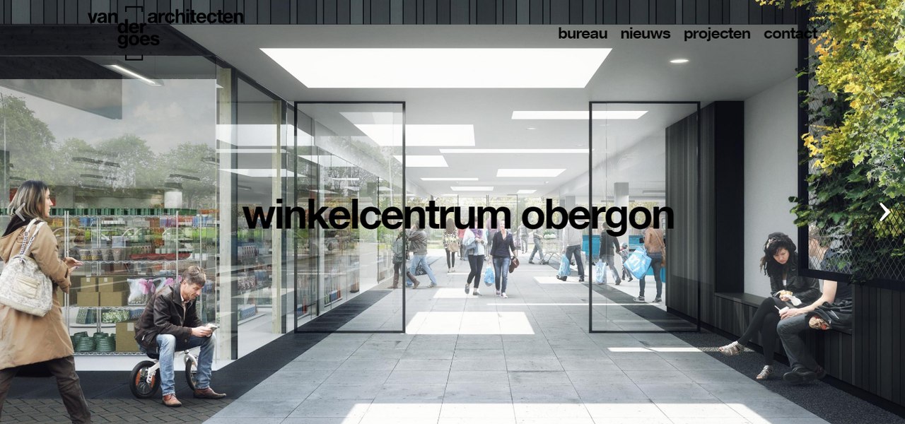
What a great readability (other slides are not much better).
3) Typography:
Typography is expensive. Someone who knows how to apply this typography is even more expensive.
Running A/B(/C/D) tests means 2x/3x/4x expenses on typography.
If you think that it doesn't matter - try to explain it to a visitor who starts reading a title on your page written in font that doesn't impress him, without proper kerning and equalization (when letters have visiually non-similar space areas between them and glyphs visually differ in x-height), so he doesn't hold on to actually try to understand what you meant there, then quits after first paragraph, because your text is academic, but the typeface it's typed in is not formal enough.
This is how your fonts can affect your readers:
http://riotindustries.com/words/the-secret-lives-of-fonts/
http://opinionator.blogs.nytimes.com/2012/08/08/hear-all-ye-people-hearken-o-earth/
Here's a couple of screenshots (open in new tab for original quality):


Which one looks more formal to you?
One font is clearly way more casual, it invites you to write, I think it's the very reason why it's been used by the most serious online publishing platform in the world. And this is why I was using their platform to write all my drafts previously.
But while this font is good to write in, it doesn't make a source seem trust-worthy enough to actually read the text, which I can also confirm looking at platform statistics.
The second one is an academic one, it's actually Georgia and from research we conducted in 2013 at VSU, it's perceived as the most easy to read and 3d most trust-worthy after ITC Baskerville and Monotype's Plantin. Charter, the first font discussed above, was 19th most trust-worthy, after many sans-serif typefaces like Avenir and Gotham (surprise).
There is a thing people argue about for years: readability. One group says that sans-serif typography has better readability on web, the other one swears by serif fonts. I also have my personal opinion on that, but I prefer to put a more important thing first:
- The more readable typography is the one that makes your reader want to read more not by its aesthetics and ease on eyes, but by its psychological impact on a reader. Baskerville is one of the hardest fonts to read on the web, but it's so academic that I'd prefer reading 500 pages in any Baskerville cut than 50 pages in Open Sans on some serious topic. It just requires more effort to take Open Sans academic-degree seriously than it takes to read Baskerville.
If your font doesn't make right impression on your audience - it doesn't matter how technically readable it is. Psychological factor is incomparably more important than a technical one.
It doesn't matter if your typography is set in Fibonacci Ratio if your reader quits after first paragraph.
A few days ago I opened a website of our fellow TFLF member and his typography wasn't inviting to read the content. This is how quickly "looks cheap" impression is formed under regular circumstances. If you seriously count on your copywriting - make sure your typography is serious enough to keep up with your words. Otherwise your copywriting efforts will be wasted for nothing.
4) Lean, quality code.
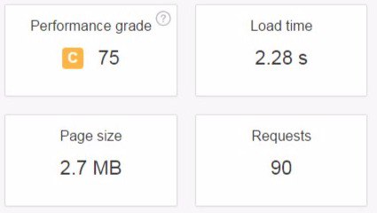
Clean, lean, quality code means a lot. I'm currently on another $30k+ website that has 11 different styles of buttons. Not only it makes a website look like a colorwheel and not a representation of a business, but it also means more lines of code. Add more animated elements, image styles, unnecessary fancy stuff - and your styles.css is 100kb more than it could be.
And as you see I'm not talking about some actually bad coding, when website loads 25-50 different files worth megabytes on home page only.
Lean, quality website code will always be more effective, will take less time to write and will be faster to load. A lot of things written in javascript can actually be done with pure css, which means a working website vs brick-page if your visitor has javascript disabled. It also means less expenses on developer work in future and faster website in general, because javascript solutions are weighty.

The above is the reason why your website takes twice as long to load. If your website doesn't use http/2 - it waits until the connection is made for each file. If your visitor is located nearby your server - it doesn't seem that bad (it still is), but when you're located in US and your visitor is located in AU - your website will load literally forever.
Another thing about quality code is accesibility. Do you know blind people?
I do. They use internet to buy stuff, read stuff and use stuff.
But blind people don't use it like you do, they can't see what you see on the screen, instead they rely on virtual assistant to read the structure of a website and its content.
What if your website has semantically bad code? What if your code neglects best practices and makes it impossible for virtual assistant to present it in a way easy to understand for a blind person?
It means your blind visitor goes somewhere else and you lose a visitor, a customer or a client.
Here's what it looks like, a blind person explains things in very details so you can hear the process yourself:
Of course if a developer doesn't have a clue or doesn't care about any of that, which is a common case, you'll have a trouble time with your website. It may seem not much of a serious problem, but altogether it means a gauranteed loss of a dedicated audience, i.e. you lose money and lose opportunity to appear more worthy than your competition. Be it messy design caused by messy code, accessibility or speed, which we'll talk about next:
5) Speed.
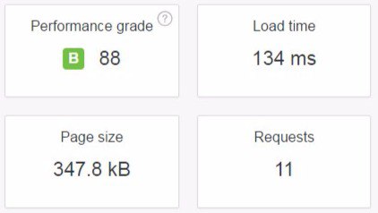
Recently I was optimizing our own website, and getting rid of unnecessary stylistic decisions meant a difference between 260ms+ and <170ms of loading time. It might seem just numbers, but for our visitor it may be a difference between "immediately" and "fast". It can also mean difference between having the wow effect and not having the wow effect.
Ask yourself "how immediately is it?". Enough may be not enough.
Website loading speed is the very first opportunity for you to win your customer/client.
Good impression of your website means good impression of your business.
If you want to have a Wordpress website, prepare to have even more trouble time trying to get your website to load faster, because Wordpress or any other php CMS itself is a mess.
If you need an e-store and want it to be loading fast - you'll have even more of a trouble time there.
If it takes longer than 1 second to load and it's not making use of caching, don't be surprised if your visitor will leave your website after Page 4, because a product that he would actually want to buy is on Page 17.
While caching partially solves the problem, you need to keep in mind that when your visitor opens your website for the first time, there is nothing cached yet, and that's when you form your first impression.
If your website is php-based, it should have a static front page, from which you have to post-initialize all scripts and styles that are not required for your website's above-the-fold section.
If your website has 5 slides, it's rational to pre-load only the first slide and post-download others.
Your developer has to know it, if he doesn't - get a better developer.
Guess which website looks more 2017:
Will continue later.
If you have questions - feel free to ask.
What experience do I have to speak on this subject?
Behind my back 2 pre-ipo projects (off the ground), 18 national-scale companies, 140+ businesses total. I've been on both sides - working with a company to get things done the right way and working as a contractor to make things right.
High Concepts:
- How not to flush money down the drain.
- How to get a website that makes a difference.
Pre-Production.
We consider every effort before development starts - a pre-production stage.
The most silly decision is to dive into production right away. It will result in thousands of dollars of expenses as the best possible outcome. Usually it results in having a brick-website for years without knowing what's wrong, even though it may seem professional and could be done by a top100 design studio.
Truth is, web design studios are just design studios. Not many of them understand how marketing and psychology are applied to design, despite claiming that they do understand that. We've worked with many of UX designers who lack any cognitive psychology knowledge, making their work on serious projects for serious brands a quite questionable experience.
Not many studios/specialists will actually step into our shoes and make decisions that are good for us. Even less of them will tell us if we actually need something to be implemented on our website or it's just a fancy feature to justify a $25k cost of works.
This brings us to our first step:
What do we need and why?
There are plenty of circumstances in which you don't need a website at all. Two major factors not to invest in one:
a) If we don't have enough money to cover all work that is required towards a website.
i.e. if our website has expensive design, but cheap copywriting and bad consumer targeting > bad marketing towards our prospects - our website will be a brick. There is no point in having a website that makes the visitor go wow on entrance only to leave unsatisfied 1 minute later, with empty cart / crossing our company off their list.
b) If our prospects dwell somewhere else other than internet and it's more rational to invest in local marketing, forming personal connections, using other medium than our own website, etcetera.
While second one is easy: we can just contact a studio/specialist that charges 3-4 times more than what we have and book a free/paid consultation. Often it will result in a short but quite informative conversation with a competent specialist who will speak his mind regarding needs of our business, without trying to sell anything but quality impression. Will we manage to get this kind of information within our free consultation or not depends on how well we play a role of a clueless customer (use game theory here).
The first one requires budget allocation and here we should keep in mind that what we see coming is probably a surface of the iceberg.
2 days ago I talked with a representative of an internet provider company and he said that they have everything covered, thinking that $30k is enough to pay for their website with everything on it, but they didn't realize that they will also need to get their wi-fi routers patched, get a new package for it with new documentation, get a new anrdoid/ios app, run a new physical advertising campaign, clear whole cities from their previous advertising campaign, run their customer support through advanced training and manage to get in touch with every client they've recently acquired - that was way off their estimations and not just they cannot afford it, they cannot even manage this amount of work right now. Today I got a call from their executive and they arranged a meeting with me regarding a subject that has nothing to do with their website.
The problem is, being an internet provider company is not different than owning a photography studio, food restaurant or car dealership - expenses are always unexpected.
To get things right we need to take our time and book consultations with specialists - each consultation on pre-production stage saves fortune on a production stage. One 300-500$ consultation during pre-pro can solve problems before they even occur during production, so we won't need to run with our back on fire and pay to a specialist to cancel his vacation, get on a plane and solve our *unexpected* (wow) problems for 2-3x price. This is not even the worst outcome, usually problems occur and never end up solved, because it turns out to be too expensive, leading to fatal results.
I've seen at least a couple of companies get out of business because of that, one is getting out right now, after being a leading company for at least 8 years, and there is nothing they can do about it, it's just way too late. Whole city is buried under their advertising which nobody cares about anymore.
Consultations, of course, can cost less than that, you can even manage to get them for free if you know right people and have good relationships with them. The most common mistake I see (especially on TFLF) is when people don't ask for advice from people who know better than they do, only to return later and tell how they failed at something.
Always do your homework and never try to save money on things that will actually save you from wasting even more money.
Once we know what we are up to, we can proceed to budget allocation.
Production Overview.
Tricky things to consider:
1) Professional photography, alone, costs hundreds of dollars, it can cost thousands as well. It should be done under a guidance of your web designer, otherwise your website will suffer in visual quality. Significantly.
If your business is an e-store, even if you sell somebody else's brands - you need your own photography to distinguish you from other sellers. Superior photography means a superior, more profitable business. If you think that it doesn't matter much - go and catch up your potential customer, who at this time types in his credit card info on another website.
Regarding stock photos - most of the times they cost even more than if you would pay for your own photography, involving a lot of color correction, hours of searching for right photos and trying to make them work together with what you try to deliver on your website.
If your photos don't form an impression you want your visitor to have - these photos are waste of space, waste of time and waste of opportunity.
Photos are usually taken before any design is done. In 2016 design is small and heavily relies on photography, video and full-scale visuals. In 2017 it will be even more of real-world elements accentuated by web graphics.
Also, many of expensive websites that relied on complex 3D visuals could be 2x less expensive and more effective if they would make use of right implementation of video and photography. I'm currently in a process of shopping for a phone with encryption and one company I consider has a pretty expensive website that utilizes complex 3D visuals for no reason. This is literally how thousands of dollars can be wasted on something that doesn't work for your business. Always consider simple solutions before anything else.
2) Intelligent Design:
If you see a web design company that has some verical text looking inwards to the center of screen - it's time to push the X button, because if something like this is done on your website - that's exactly what your visitor will do.
Intelligent designer asks: "How intuitive is this?".
Bad designer asks: "Doesn't it look cool?".
Intelligent designer asks: "What impression will our targeted visitor have?".
Bad designer asks: "Will it impress fellow designers and get me likes on a web awards website?"
Intelligent designer asks: "How this font will fit with copywriting style of this brand?".
Bad designer is probably more busy deciding between Proxima Nova and Gotham, because it's the only two fonts that look good on your page and he has no clue about perceptional psychology of typography.
I'm currently looking over many of $30k+ websites and some of them have black text over black images, gold buttons over light photography and etc. If something like this would be done on your website, your visitor would quickly punish you for that. Either by having a bad impression or by pressing X button, depending on degree of annoyance.
What a great readability (other slides are not much better).
3) Typography:
Typography is expensive. Someone who knows how to apply this typography is even more expensive.
Running A/B(/C/D) tests means 2x/3x/4x expenses on typography.
If you think that it doesn't matter - try to explain it to a visitor who starts reading a title on your page written in font that doesn't impress him, without proper kerning and equalization (when letters have visiually non-similar space areas between them and glyphs visually differ in x-height), so he doesn't hold on to actually try to understand what you meant there, then quits after first paragraph, because your text is academic, but the typeface it's typed in is not formal enough.
This is how your fonts can affect your readers:
http://riotindustries.com/words/the-secret-lives-of-fonts/
http://opinionator.blogs.nytimes.com/2012/08/08/hear-all-ye-people-hearken-o-earth/
Here's a couple of screenshots (open in new tab for original quality):
Which one looks more formal to you?
One font is clearly way more casual, it invites you to write, I think it's the very reason why it's been used by the most serious online publishing platform in the world. And this is why I was using their platform to write all my drafts previously.
But while this font is good to write in, it doesn't make a source seem trust-worthy enough to actually read the text, which I can also confirm looking at platform statistics.
The second one is an academic one, it's actually Georgia and from research we conducted in 2013 at VSU, it's perceived as the most easy to read and 3d most trust-worthy after ITC Baskerville and Monotype's Plantin. Charter, the first font discussed above, was 19th most trust-worthy, after many sans-serif typefaces like Avenir and Gotham (surprise).
There is a thing people argue about for years: readability. One group says that sans-serif typography has better readability on web, the other one swears by serif fonts. I also have my personal opinion on that, but I prefer to put a more important thing first:
- The more readable typography is the one that makes your reader want to read more not by its aesthetics and ease on eyes, but by its psychological impact on a reader. Baskerville is one of the hardest fonts to read on the web, but it's so academic that I'd prefer reading 500 pages in any Baskerville cut than 50 pages in Open Sans on some serious topic. It just requires more effort to take Open Sans academic-degree seriously than it takes to read Baskerville.
If your font doesn't make right impression on your audience - it doesn't matter how technically readable it is. Psychological factor is incomparably more important than a technical one.
It doesn't matter if your typography is set in Fibonacci Ratio if your reader quits after first paragraph.
A few days ago I opened a website of our fellow TFLF member and his typography wasn't inviting to read the content. This is how quickly "looks cheap" impression is formed under regular circumstances. If you seriously count on your copywriting - make sure your typography is serious enough to keep up with your words. Otherwise your copywriting efforts will be wasted for nothing.
4) Lean, quality code.
Clean, lean, quality code means a lot. I'm currently on another $30k+ website that has 11 different styles of buttons. Not only it makes a website look like a colorwheel and not a representation of a business, but it also means more lines of code. Add more animated elements, image styles, unnecessary fancy stuff - and your styles.css is 100kb more than it could be.
And as you see I'm not talking about some actually bad coding, when website loads 25-50 different files worth megabytes on home page only.
Lean, quality website code will always be more effective, will take less time to write and will be faster to load. A lot of things written in javascript can actually be done with pure css, which means a working website vs brick-page if your visitor has javascript disabled. It also means less expenses on developer work in future and faster website in general, because javascript solutions are weighty.
The above is the reason why your website takes twice as long to load. If your website doesn't use http/2 - it waits until the connection is made for each file. If your visitor is located nearby your server - it doesn't seem that bad (it still is), but when you're located in US and your visitor is located in AU - your website will load literally forever.
Another thing about quality code is accesibility. Do you know blind people?
I do. They use internet to buy stuff, read stuff and use stuff.
But blind people don't use it like you do, they can't see what you see on the screen, instead they rely on virtual assistant to read the structure of a website and its content.
What if your website has semantically bad code? What if your code neglects best practices and makes it impossible for virtual assistant to present it in a way easy to understand for a blind person?
It means your blind visitor goes somewhere else and you lose a visitor, a customer or a client.
Here's what it looks like, a blind person explains things in very details so you can hear the process yourself:
5) Speed.
Recently I was optimizing our own website, and getting rid of unnecessary stylistic decisions meant a difference between 260ms+ and <170ms of loading time. It might seem just numbers, but for our visitor it may be a difference between "immediately" and "fast". It can also mean difference between having the wow effect and not having the wow effect.
Ask yourself "how immediately is it?". Enough may be not enough.
Website loading speed is the very first opportunity for you to win your customer/client.
Good impression of your website means good impression of your business.
If you want to have a Wordpress website, prepare to have even more trouble time trying to get your website to load faster, because Wordpress or any other php CMS itself is a mess.
If you need an e-store and want it to be loading fast - you'll have even more of a trouble time there.
If it takes longer than 1 second to load and it's not making use of caching, don't be surprised if your visitor will leave your website after Page 4, because a product that he would actually want to buy is on Page 17.
While caching partially solves the problem, you need to keep in mind that when your visitor opens your website for the first time, there is nothing cached yet, and that's when you form your first impression.
If your website is php-based, it should have a static front page, from which you have to post-initialize all scripts and styles that are not required for your website's above-the-fold section.
If your website has 5 slides, it's rational to pre-load only the first slide and post-download others.
Your developer has to know it, if he doesn't - get a better developer.
Guess which website looks more 2017:
Will continue later.
If you have questions - feel free to ask.
Dislike ads? Become a Fastlane member:
Subscribe today and surround yourself with winners and millionaire mentors, not those broke friends who only want to drink beer and play video games. :-)
Last edited:
Membership Required: Upgrade to Expose Nearly 1,000,000 Posts
Ready to Unleash the Millionaire Entrepreneur in You?
Become a member of the Fastlane Forum, the private community founded by best-selling author and multi-millionaire entrepreneur MJ DeMarco. Since 2007, MJ DeMarco has poured his heart and soul into the Fastlane Forum, helping entrepreneurs reclaim their time, win their financial freedom, and live their best life.
With more than 39,000 posts packed with insights, strategies, and advice, you’re not just a member—you’re stepping into MJ’s inner-circle, a place where you’ll never be left alone.
Become a member and gain immediate access to...
- Active Community: Ever join a community only to find it DEAD? Not at Fastlane! As you can see from our home page, life-changing content is posted dozens of times daily.
- Exclusive Insights: Direct access to MJ DeMarco’s daily contributions and wisdom.
- Powerful Networking Opportunities: Connect with a diverse group of successful entrepreneurs who can offer mentorship, collaboration, and opportunities.
- Proven Strategies: Learn from the best in the business, with actionable advice and strategies that can accelerate your success.
"You are the average of the five people you surround yourself with the most..."
Who are you surrounding yourself with? Surround yourself with millionaire success. Join Fastlane today!
Join Today
