Hey there...I'm going to jump on the thread. I looked at your website and immediately saw that you had a gif or short video of you saying "Thank you for using outflash..." But the point of this website is to recruit people who are NOT using outflash, so I don't get this. I was honestly expecting from this video a demonstration of what it looks like using outflash. If you could show a clear, quick 1 minute video on how outflash is used and how easy and helpful it is, it will convert a lot more people and it will eliminate the need for the very long explanation down below.
Your page should honestly be a landing page that asks the question:
"Are you a freelancer, executive assistant, lawyer, or anyone else tasked with sending out mass messages every day and are tired with how long it takes to get it done? Emailing is disruptive, time-consuming, and gets in the way of working on the things you really want to work on? Well, OutFlash can help. See the demo on the right to see what I mean!"
Then have two buttons that say "Start my free trial & get e-mailing in minutes!" and "Learn More." That could then take them to another page where you can go in further detail about how this Outflash works.
I'd also encourage you to reach out to the two people who were using Outflash and ask why they left and what they loved about it. Getting feedback from your customers is important so when you make a pivot...you're making a MEANINGFUL pivot. I'd hate for you to waste any more time on tweaking your website until you figure out what's really wrong with your service and marking efforts. See this youtube video by James Jani on Instagram's beginning to see what I mean. I started it from the relevant time stamp so you can get it and get out:
View: https://youtu.be/bglIiiGj8Bs
Finally, besides freelancers, lawyers are a perfect target audience. I say this because I am a former lawyer and when I used to work in the law firm, I constantly complained to my secretary and my husband about how I would literally spend all day responding to emails and sending out emails to multiple people. And guess which e-mail platform my entire firm used: Outlook! I hated that part of my job because it was extremely disruptive to my work: writing motions, doing research, ect. Having to stop to write an email to multiple people, making sure I had the right email, and crafting the email just right to opposing counsels while SIMULTANEOUSLY trying to draft a motion was so interruptive to my free flow of thought and would consequently, take me 30-minutes to pick up where I left off with my writing. This resulted in me either ending the day early to go home to work to focus or pushing email assignments on my secretary because I couldn't bother lol. I completely got why it would be helpful to use outflash and didn't really care about the words below. If I saw the demo, that would have been enough for me to click start free trial or learn more.
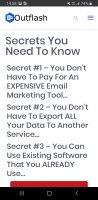
The pop up, please get rid of it. If I had just been a random person who stumbled on your site looking for email help, that pop up would have turned me off. I would have left immediately because I was still learning what your biz was about and how you can help me (and I had only been on your site for maybe 2 seconds) and that giant board popped into my face. I was also not clear on what you were offering me but it was quite apparent that you wanted my email address. My thought was "I get enough emails, no thank-you."
If you are insistent on using a pop-up, then use it on the learn more page and only pop up after the person has been on your site for at least 5 minutes. At this point, you can assume that these visitors are interested in your services. A helpful offering that I would probably exchange for my e-mail address is "10 outlook productivity hacks to make you more productive at work." Something like that.
Also, please work on simplifying your message. If your service is very quick, then explaining it should be relatively quick too. Just think of canva.com. Great example! They offer a free trial and paid services but they don't get into the details of that. They just say in a nutshell on their landing page (I'm paraphrasing), we'll help you make designs! The person gets started, they make their design, they fall in love, and move on to the paid version if interested.
I hope that was helpful! And keep up the good work!
Your page should honestly be a landing page that asks the question:
"Are you a freelancer, executive assistant, lawyer, or anyone else tasked with sending out mass messages every day and are tired with how long it takes to get it done? Emailing is disruptive, time-consuming, and gets in the way of working on the things you really want to work on? Well, OutFlash can help. See the demo on the right to see what I mean!"
Then have two buttons that say "Start my free trial & get e-mailing in minutes!" and "Learn More." That could then take them to another page where you can go in further detail about how this Outflash works.
I'd also encourage you to reach out to the two people who were using Outflash and ask why they left and what they loved about it. Getting feedback from your customers is important so when you make a pivot...you're making a MEANINGFUL pivot. I'd hate for you to waste any more time on tweaking your website until you figure out what's really wrong with your service and marking efforts. See this youtube video by James Jani on Instagram's beginning to see what I mean. I started it from the relevant time stamp so you can get it and get out:
Finally, besides freelancers, lawyers are a perfect target audience. I say this because I am a former lawyer and when I used to work in the law firm, I constantly complained to my secretary and my husband about how I would literally spend all day responding to emails and sending out emails to multiple people. And guess which e-mail platform my entire firm used: Outlook! I hated that part of my job because it was extremely disruptive to my work: writing motions, doing research, ect. Having to stop to write an email to multiple people, making sure I had the right email, and crafting the email just right to opposing counsels while SIMULTANEOUSLY trying to draft a motion was so interruptive to my free flow of thought and would consequently, take me 30-minutes to pick up where I left off with my writing. This resulted in me either ending the day early to go home to work to focus or pushing email assignments on my secretary because I couldn't bother lol. I completely got why it would be helpful to use outflash and didn't really care about the words below. If I saw the demo, that would have been enough for me to click start free trial or learn more.
The pop up, please get rid of it. If I had just been a random person who stumbled on your site looking for email help, that pop up would have turned me off. I would have left immediately because I was still learning what your biz was about and how you can help me (and I had only been on your site for maybe 2 seconds) and that giant board popped into my face. I was also not clear on what you were offering me but it was quite apparent that you wanted my email address. My thought was "I get enough emails, no thank-you."
If you are insistent on using a pop-up, then use it on the learn more page and only pop up after the person has been on your site for at least 5 minutes. At this point, you can assume that these visitors are interested in your services. A helpful offering that I would probably exchange for my e-mail address is "10 outlook productivity hacks to make you more productive at work." Something like that.
Also, please work on simplifying your message. If your service is very quick, then explaining it should be relatively quick too. Just think of canva.com. Great example! They offer a free trial and paid services but they don't get into the details of that. They just say in a nutshell on their landing page (I'm paraphrasing), we'll help you make designs! The person gets started, they make their design, they fall in love, and move on to the paid version if interested.
I hope that was helpful! And keep up the good work!
Last edited: