The Entrepreneur Forum | Financial Freedom | Starting a Business | Motivation | Money | Success

Welcome to the only entrepreneur forum dedicated to building life-changing wealth.

Build a Fastlane business. Earn real financial freedom. Join free.

Join over 80,000 entrepreneurs who have rejected the paradigm of mediocrity and said "NO!" to underpaid jobs, ascetic frugality, and suffocating savings rituals— learn how to build a Fastlane business that pays both freedom and lifestyle affluence.

Free registration at the forum removes this block.

Troubleshoot SEO / Conversion

Bekit

Legendary Contributor
FASTLANE INSIDER
EPIC CONTRIBUTOR
Read Fastlane!
Summit Attendee
Speedway Pass
User Power
Value/Post Ratio
492%
Aug 13, 2018
1,143
5,625
Hi people,
I have a nagging suspicion that my website should be doing much better than it is but I don’t know how to find out:

...I’d love some feedback if there’s any SEM experts. The site is www.sydneypahire.com

Thanks Lee
I'm not an expert, but here's my two cents looking at the page both from a digital marketer's perspective and the perspective of a potential customer who had just searched for a relevant term and landed on your site:

Design
  • Site looks like it was built 15 years ago.
  • Carousel/Hero image is poorly done (text on top of image is pixelated and it looks like it was built in PowerPoint instead of Photoshop and then skewed vertically after the fact). This looks unprofessional. I would bounce before looking further.
  • Design is crowded. Very little white space. Red, blue, and dark gray text makes the site feel busy and unfocused. It's hard to tell where to look. My eye is bouncing all over the place.
  • Font size is quite small. Uncomfortable, not easy to scan for relevant info.
  • Header menu is distracting with the five square images in a row that don't align with the menu options.
Copy
  • Grammar: Your main headline is a question that doesn't end with a question mark.
  • Capitalization: It's all caps.
  • Readability: It's hard to read... quite a mouthful; not how people speak naturally. "WHY RISK DODGY SOUND WHEN YOU CAN HIRE A TOP BRAND PA SYSTEM DELIVERED & PROFESSIONALLY SET-UP FROM $395 OR WITH A SKILLED OPERATOR FROM $440*."
  • The two words that stand out the most are "dodgy" and "risk," which is what you'll be planting in your customers' minds about your own site, given the overall effect of the site.
  • Sales messaging: It's hard to get a sense of what your message even is. The bullet-point copy on the various images of your hero image carousel is poor - no parallel construction, unclear meanings, unclear message
Call to Action
  • What is a person supposed to DO? There is no harmony between design and copy to guide the site visitor to the appropriate action. Where am I supposed to click? The first thing I see is "Download now" for your lead magnet. The second thing I see is "Read more" under the heading "On-time delivery & quality sound or it's free!" - sounds like a blog post, so I'm not going to click there. The third thing I see is the bold blue text link, "equipment," within the 2nd check mark, "Industry standard equipment from Bose" ... not sure that's where I want to go either. This is an experience that your customer shouldn't have to go through. Reverse engineer this. What is the #1 action that you want people to take when they hit this page? Where is that on the site?
Suggestions/Recommendations
  • Hire a good web developer and have them do a complete revamp of your site. Make sure it's someone who understands SEO, as your site has been online for a long time and that's why you're getting such favorable organic rankings for relevant keywords. A site redesign could either keep this SEO going or totally destroy it in one fell swoop. Vet your web designer thoroughly. I've seen this happen way too many times, and it's a shame. You've earned your ranking, and you shouldn't have to sacrifice it just to get a current website put up.
  • A good web designer is going to have some templates for a high-converting site and will guide you through some of the exercises like how to create a happy synthesis between your copy, your design, and the most important CTA's. They will eliminate the distractions on the site, populate it with gorgeous images, and make it visually appealing and professional while offering a great user experience.
  • Put the same care into your copy that you're putting into your design.
  • I'm confident that you will get more business as soon as you begin to look like a trustworthy, reputable source and not an antiquated, out-of-touch company.
That said, a 2.77% CTR and a 3.X % conversion rate isn't too bad.
I checked out your competitors' websites and they looked pretty rough, too, except for one of them (and it was super slow to load).
So you've got a lot going for you.

Hope this helps!
 

Bekit

Legendary Contributor
FASTLANE INSIDER
EPIC CONTRIBUTOR
Read Fastlane!
Summit Attendee
Speedway Pass
User Power
Value/Post Ratio
492%
Aug 13, 2018
1,143
5,625
I've been playing with paid search during the last year both AdWords & Facebook but I can't seem to get the numbers to work. For a lot of jobs I work on a 25% commission & a typical job is $400 so I've got a $100 gross profit. I can't seem get paid search below $2 a click. If my conversion rate is 3% that's a $66 of my $100 profit gone which is not worth doing given all the job management.

Since you've got the #1 organic position, if the economics of paid ads don't work for you, I'd look at these ways to try to get the site to do a better job at converting organic visitors. (Copy is my specialty; I spoke about design above, but that's about as far as I can go to suggest improvements. Here are some copy-oriented items you can consider)...

1. Rewrite your title tags and meta descriptions into more human-friendly language that's still keyword optimized. Note that the keywords in your Title Tag matter for your site's ranking, but keywords in your Meta Description do NOT matter towards ranking. The meta description should be your "elevator pitch" or value proposition in a nutshell, as the more clicks it drives for you, the better your page will continue to rank. Because CTR is a ranking factor. Example:
Before:
TT: Sydney PA Hire
Meta: Don't risk dodgy sound. Hire top brand PA's delivered, professionally set-up & tuned from $440. Sydney wide. Weddings, bands, community, corporate.​
After:
TT: Hire PA Equipment in Sydney from $500 (I raised your price haha)
Meta: Enjoy spectacular sound for your wedding, band performance, community event, or corporate gathering. Top brands plus professional setup. Talk to us today.​

2. Identify the #1 action that you want people to take when they land on your page.
  • Since you say, "Once a customer makes an enquiry my conversion rate is 80%," let's define this to be the #1 action. We want the customer to make an enquiry.
  • Make this more specific. Do they call you on the phone? fill out a form? What?
  • Also - think through all the details of what gets your current customers to that point. Start asking people who enquire. "Hey, how'd you end up deciding to call me?" Find out the process or the path that they took, and look for patterns. Did they come through your website? Did they see a specific statement that activated their trust and triggered them to call? You want to KEEP what is working and do more of those things so that new visitors to the site who are strangers to you will have the best chance of following the same path.)
3. Now back up one step from #2. In order for the customer to decide to make an enquiry, what needs to happen? They need to know, like, and trust you. So your copy needs to accomplish that for them.

4. Help people get to know you. Who are you? How long have you been in business? What's special about you? This is typically your "about page" content. Make sure that this content is NOT dry corporate-speak. Looking at your current about page, there's nothing about this that stands out. It tells what you do, but doesn't show who you are. Look at this from a hospitality standpoint. How would you greet a new friend and let them start to get to know you? Your website visitors are strangers when they first hit the page. How can you open the door with a warm welcome and a wide smile, invite them in, and make them feel at home?

5. Help people to like you. What's there to like? What do you stand for? Are you giving something away? (Gifts are a great shortcut to getting people to like you.) Are you faster? Higher quality? Better equipment? What are the things that define you? What are your non-negotiable minimums where you draw the line and won't compromise? Where do you see other people cutting corners and hiding that from the customer, but charging them big money anyway? Can you establish yourself as the person who is on their side?

6. Help people to trust you. Display trust badges on your site. You have a huge list of testimonials on the site, and that's awesome, but the design totally causes them to be lost. Highlight the social proof. The BBB ranking. Your Yelp ranking. Prominent community members who have used you. Whatever. Anything that shows you to be a trustworthy source to do business.

7. Coordinate #4, 5, and 6 in some tight, snappy copy that takes your customer by the hand and helps them to travel along an enjoyable journey towards the thing that they want. (What is the thing that they want? Make this specific. What they want is not just "to hire a great PA system." What they want is the transformation that amazing audio will accomplish for their event. Sell the transformation, the outcome. Put a lot of thought into this. Make it all about THEM, what THEY'RE getting, not about YOU and what YOU offer. Keep their eyes focused on the most awesome outcome... the smiling guests, the people who compliment them afterward, the great feeling that everyone has, etc. People hire a PA system at events for a reason. Tap into the most vivid, visceral, exhilarating parts of that reason. "So Grandma can hear the bridesmaid's toast." "Your parties are known for setting the highest bar in the industry." "The life of the party is in the music," etc.)

8. Ask the customer to do the #1 action, and make it really easy and obvious for them to do it. Create a big, clickable button, or list your phone number in a big obvious place. Use literal, direct words to point out the thing that they're supposed to do. "Pick up your phone and dial now" or "To get started, click here and fill out this quick and easy form, and we'll get back to you within 24 hours."

9. Overcome objections. Think through the most realistic objections that people will have at this point. They've just been asked to take action and contact you. Maybe they thought seriously about doing it. But something is holding them back. What's that thing? (Examples):
  • Well, I want to get some other quotes first." (Talk about how your prices stack up against competitors. If they're lower than everyone else's, say so. If they're higher, talk about the reasons. Set their criteria for the minimum standard they'll accept by telling them all about the issues & problems that they'll experience by going with someone who uses sub-par equipment or methods. "You don't want that fuzzy static interrupting your event, do you?")
  • "Well, I don't know if I can risk it." (Write a great guarantee that makes it clear that you're transferring all of the risk off their shoulders and onto yourself. Make it over-the-top amazing so that it's a no-brainer to work with you.)
  • "Well, I'm not ready to actually talk to anyone yet." (Talk about what happens when they call. Make it feel really safe. They're not going to get on the phone with some high-pressure salesperson. They're just going to have a conversation. And the conversation is going to be all about THEM. Their needs. How they can get what they want. Whether or not it's by working with you. Not every customer is a good fit. Maybe you can point them in the right direction of the resources they really need. Show that you care about their best interests and are a source of expertise to shortcut their journey towards accomplishing their goals.)
What's holding YOUR customers back? A good way to handle this is in an FAQ section.

10. Ask for the desired action again. At the bottom of the page, they shouldn't have to scroll up to get back to the button or the form or whatever.

Hope at least some of this is helpful to you! I wish you all the best for getting loads more business.
 
Last edited:

Lee Wright

Bronze Contributor
Speedway Pass
User Power
Value/Post Ratio
94%
Feb 28, 2018
115
108
55
Orange, NSW, Australia
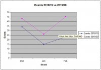
Here's a progress update on the results of my website upgrade that I undertook late 2019. Just to recap, earlier in 2019 I noticed that my organic search was really dropping off. I posted here & got some great advice telling me that my website sucked. Thanks to a bunch of people who gave me tips including @Bekit @Andy Black @RazorCut @Kid @lludwig @Tourmaline & @MrStoic886 Anyway I did a considerable upgrade finishing late 2019 (mobile friendly, https, new design, faster, reviews plugin etc). In January 2020 the total $ were down a bit from last year but when I dug deeper I found a large event in 2019 was skewing the results & that the number of events was likely a much better indicator of how the marketing was working rather than total $. It turned out the number of events were actually up 70% on the previous January which is especially significant considering we got hammered by the bushfires (Australia). Anyway moving forward to February the number of events were up 95% but also $ were up 40% up on Feb 2019. It was still partly hamster wheel work but I ended with $20K revenue & kept $8K after expenses. Considering we can live on $4K a month it was pretty sweet. In fact it was a godsend because as soon as Corona hit in March everything came to a screeching halt & this meant we had a bit of a cash buffer. March was shaping up nicely too before all of this. My next goal is to maintain the revenue but to automate things more once the pandemic is over. Anyway I hope this info is encouraging to others.

32497
 
Dislike ads? Remove them and support the forum: Subscribe to Fastlane Insiders.

Lee Wright

Bronze Contributor
Speedway Pass
User Power
Value/Post Ratio
94%
Feb 28, 2018
115
108
55
Orange, NSW, Australia
Hi people,
I have a nagging suspicion that my website should be doing much better than it is but I don’t know how to find out:

(1) How well it should be doing
(2) What the problems are (if any)

The result is that I don’t know what to work on.

Here are some possible things:
-Search term targeting
-Meta description under the results
-Landing page usability
-Landing page style
-Sales copy
-Offers
-Testimonials (social proof)
-Product demos(proof of process)
-Guarantees
-Site is currently a .com but in Australia it should be a .com.au not sure if that’s affecting results or not.

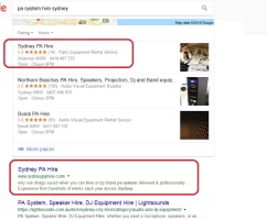
The reason for my suspicion is that my business is based in a city of 4 million people. My site comes up #1 for highy relevant search terms like “PA System Hire Sydney” or “Wireless Microphone Hire” etc yet my turnover from new customers is only perhaps $50K a year. I’m sure the market for the type of events we do would be in the order of several hundred million. I don’t have recent stats but in the past the #1 in the Google search results gets an impressive 40% of the traffic. I know that doesn’t mean 40% of the market by a long shot because it only applies to the search terms where that company is #1 which is relatively few out of all search terms but still I feel it should be more significant. Another reason I’m suspicious is that my competitors which are ranked below me are much bigger although I suspect they rely of paid search of which I don’t do any. Here's the search results:
pa_hire_search.png

Once a customer makes an enquiry my conversion rate is 80% so I’m sure the problem isn’t lead conversion.

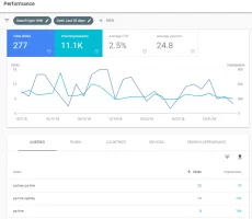
According to Analytics my CTR is 2.5% giving me 277 clicks a month. That doesn’t seem disastrous. I only get about 10 new customers a month though which is only 3.6% conversion. I would have expected more.

upload_2018-11-6_14-31-7.png

I’d love some feedback if there’s any SEM experts. The site is www.sydneypahire.com

Thanks Lee
 
Dislike ads? Remove them and support the forum: Subscribe to Fastlane Insiders.

RazorCut

Legendary Contributor
EPIC CONTRIBUTOR
Read Fastlane!
Read Unscripted!
Summit Attendee
Speedway Pass
User Power
Value/Post Ratio
358%
May 3, 2014
2,032
7,269
Marbella, Spain
Another reason I’m suspicious is that my competitors which are ranked below me are much bigger although I suspect they rely of paid search of which I don’t do any.

This begs the question why you are not doing paid search?

Do the numbers. See what price your keywords will cost you and what your average profit is per customer and see what that relates to with your average 3.6% conversion rate. In your field I would expect a healthy return. You could possibly be doubling your income by tomorrow.

Then you could invest that money is a kick arse new Website taking advantage of the fact that @Bekit has very generously done an excellent critique for you.

Don't use the fear of dropping in the organic rankings stop you from launching a better Website. The one you have at the moment is holding you back.
 

Bekit

Legendary Contributor
FASTLANE INSIDER
EPIC CONTRIBUTOR
Read Fastlane!
Summit Attendee
Speedway Pass
User Power
Value/Post Ratio
492%
Aug 13, 2018
1,143
5,625
Here's a progress update on the results of my website upgrade that I undertook late 2019. Just to recap, earlier in 2019 I noticed that my organic search was really dropping off. I posted here & got some great advice telling me that my website sucked. Thanks to a bunch of people who gave me tips including @Bekit @Andy Black @RazorCut @Kid @lludwig @Tourmaline & @MrStoic886 Anyway I did a considerable upgrade finishing late 2019 (mobile friendly, https, new design, faster, reviews plugin etc). In January 2020 the total $ were down a bit from last year but when I dug deeper I found a large event in 2019 was skewing the results & that the number of events was likely a much better indicator of how the marketing was working rather than total $. It turned out the number of events were actually up 70% on the previous January which is especially significant considering we got hammered by the bushfires (Australia). Anyway moving forward to February the number of events were up 95% but also $ were up 40% up on Feb 2019. It was still partly hamster wheel work but I ended with $20K revenue & kept $8K after expenses. Considering we can live on $4K a month it was pretty sweet. In fact it was a godsend because as soon as Corona hit in March everything came to a screeching halt & this meant we had a bit of a cash buffer. March was shaping up nicely too before all of this. My next goal is to maintain the revenue but to automate things more once the pandemic is over. Anyway I hope this info is encouraging to others.

View attachment 32497
Great update! Thank you for sharing. I'm really happy to hear the good news that your updates made a difference. Hope you are staying safe and well during this crazy time.
 

Lee Wright

Bronze Contributor
Speedway Pass
User Power
Value/Post Ratio
94%
Feb 28, 2018
115
108
55
Orange, NSW, Australia
I'm not an expert, but here's my two cents looking at the page both from a digital marketer's perspective and the perspective of a potential customer who had just searched for a relevant term and landed on your site:

Design
  • Site looks like it was built 15 years ago.
  • Carousel/Hero image is poorly done (text on top of image is pixelated and it looks like it was built in PowerPoint instead of Photoshop and then skewed vertically after the fact). This looks unprofessional. I would bounce before looking further.
  • Design is crowded. Very little white space. Red, blue, and dark gray text makes the site feel busy and unfocused. It's hard to tell where to look. My eye is bouncing all over the place.
  • Font size is quite small. Uncomfortable, not easy to scan for relevant info.
  • Header menu is distracting with the five square images in a row that don't align with the menu options.
Copy
  • Grammar: Your main headline is a question that doesn't end with a question mark.
  • Capitalization: It's all caps.
  • Readability: It's hard to read... quite a mouthful; not how people speak naturally. "WHY RISK DODGY SOUND WHEN YOU CAN HIRE A TOP BRAND PA SYSTEM DELIVERED & PROFESSIONALLY SET-UP FROM $395 OR WITH A SKILLED OPERATOR FROM $440*."
  • The two words that stand out the most are "dodgy" and "risk," which is what you'll be planting in your customers' minds about your own site, given the overall effect of the site.
  • Sales messaging: It's hard to get a sense of what your message even is. The bullet-point copy on the various images of your hero image carousel is poor - no parallel construction, unclear meanings, unclear message
Call to Action
  • What is a person supposed to DO? There is no harmony between design and copy to guide the site visitor to the appropriate action. Where am I supposed to click? The first thing I see is "Download now" for your lead magnet. The second thing I see is "Read more" under the heading "On-time delivery & quality sound or it's free!" - sounds like a blog post, so I'm not going to click there. The third thing I see is the bold blue text link, "equipment," within the 2nd check mark, "Industry standard equipment from Bose" ... not sure that's where I want to go either. This is an experience that your customer shouldn't have to go through. Reverse engineer this. What is the #1 action that you want people to take when they hit this page? Where is that on the site?
Suggestions/Recommendations
  • Hire a good web developer and have them do a complete revamp of your site. Make sure it's someone who understands SEO, as your site has been online for a long time and that's why you're getting such favorable organic rankings for relevant keywords. A site redesign could either keep this SEO going or totally destroy it in one fell swoop. Vet your web designer thoroughly. I've seen this happen way too many times, and it's a shame. You've earned your ranking, and you shouldn't have to sacrifice it just to get a current website put up.
  • A good web designer is going to have some templates for a high-converting site and will guide you through some of the exercises like how to create a happy synthesis between your copy, your design, and the most important CTA's. They will eliminate the distractions on the site, populate it with gorgeous images, and make it visually appealing and professional while offering a great user experience.
  • Put the same care into your copy that you're putting into your design.
  • I'm confident that you will get more business as soon as you begin to look like a trustworthy, reputable source and not an antiquated, out-of-touch company.
That said, a 2.77% CTR and a 3.X % conversion rate isn't too bad.
I checked out your competitors' websites and they looked pretty rough, too, except for one of them (and it was super slow to load).
So you've got a lot going for you.

Hope this helps!
Thanks Bekit. I really appreciate the detailed analysis. Lots of good actionable stuff here.
 
Dislike ads? Remove them and support the forum: Subscribe to Fastlane Insiders.

RazorCut

Legendary Contributor
EPIC CONTRIBUTOR
Read Fastlane!
Read Unscripted!
Summit Attendee
Speedway Pass
User Power
Value/Post Ratio
358%
May 3, 2014
2,032
7,269
Marbella, Spain
@Bekit wow! Talk about providing value. I think Lee owes you a bottle of fizz at the very least.

Great stuff. :clap:::clap:::clap::
 
Dislike ads? Remove them and support the forum: Subscribe to Fastlane Insiders.

Lee Wright

Bronze Contributor
Speedway Pass
User Power
Value/Post Ratio
94%
Feb 28, 2018
115
108
55
Orange, NSW, Australia
Since you've got the #1 organic position, if the economics of paid ads don't work for you, I'd look at these ways to try to get the site to do a better job at converting organic visitors. (Copy is my specialty; I spoke about design above, but that's about as far as I can go to suggest improvements. Here are some copy-oriented items you can consider)...

1. Rewrite your title tags and meta descriptions into more human-friendly language that's still keyword optimized. Note that the keywords in your Title Tag matter for your site's ranking, but keywords in your Meta Description do NOT matter towards ranking. The meta description should be your "elevator pitch" or value proposition in a nutshell, as the more clicks it drives for you, the better your page will continue to rank. Because CTR is a ranking factor. Example:
Before:
TT: Sydney PA Hire
Meta: Don't risk dodgy sound. Hire top brand PA's delivered, professionally set-up & tuned from $440. Sydney wide. Weddings, bands, community, corporate.​
After:
TT: Hire PA Equipment in Sydney from $500 (I raised your price haha)
Meta: Enjoy spectacular sound for your wedding, band performance, community event, or corporate gathering. Top brands plus professional setup. Talk to us today.​

2. Identify the #1 action that you want people to take when they land on your page.
  • Since you say, "Once a customer makes an enquiry my conversion rate is 80%," let's define this to be the #1 action. We want the customer to make an enquiry.
  • Make this more specific. Do they call you on the phone? fill out a form? What?
  • Also - think through all the details of what gets your current customers to that point. Start asking people who enquire. "Hey, how'd you end up deciding to call me?" Find out the process or the path that they took, and look for patterns. Did they come through your website? Did they see a specific statement that activated their trust and triggered them to call? You want to KEEP what is working and do more of those things so that new visitors to the site who are strangers to you will have the best chance of following the same path.)
3. Now back up one step from #2. In order for the customer to decide to make an enquiry, what needs to happen? They need to know, like, and trust you. So your copy needs to accomplish that for them.

4. Help people get to know you. Who are you? How long have you been in business? What's special about you? This is typically your "about page" content. Make sure that this content is NOT dry corporate-speak. Looking at your current about page, there's nothing about this that stands out. It tells what you do, but doesn't show who you are. Look at this from a hospitality standpoint. How would you greet a new friend and let them start to get to know you? Your website visitors are strangers when they first hit the page. How can you open the door with a warm welcome and a wide smile, invite them in, and make them feel at home?

5. Help people to like you. What's there to like? What do you stand for? Are you giving something away? (Gifts are a great shortcut to getting people to like you.) Are you faster? Higher quality? Better equipment? What are the things that define you? What are your non-negotiable minimums where you draw the line and won't compromise? Where do you see other people cutting corners and hiding that from the customer, but charging them big money anyway? Can you establish yourself as the person who is on their side?

6. Help people to trust you. Display trust badges on your site. You have a huge list of testimonials on the site, and that's awesome, but the design totally causes them to be lost. Highlight the social proof. The BBB ranking. Your Yelp ranking. Prominent community members who have used you. Whatever. Anything that shows you to be a trustworthy source to do business.

7. Coordinate #4, 5, and 6 in some tight, snappy copy that takes your customer by the hand and helps them to travel along an enjoyable journey towards the thing that they want. (What is the thing that they want? Make this specific. What they want is not just "to hire a great PA system." What they want is the transformation that amazing audio will accomplish for their event. Sell the transformation, the outcome. Put a lot of thought into this. Make it all about THEM, what THEY'RE getting, not about YOU and what YOU offer. Keep their eyes focused on the most awesome outcome... the smiling guests, the people who compliment them afterward, the great feeling that everyone has, etc. People hire a PA system at events for a reason. Tap into the most vivid, visceral, exhilarating parts of that reason. "So Grandma can hear the bridesmaid's toast." "Your parties are known for setting the highest bar in the industry." "The life of the party is in the music," etc.)

8. Ask the customer to do the #1 action, and make it really easy and obvious for them to do it. Create a big, clickable button, or list your phone number in a big obvious place. Use literal, direct words to point out the thing that they're supposed to do. "Pick up your phone and dial now" or "To get started, click here and fill out this quick and easy form, and we'll get back to you within 24 hours."

9. Overcome objections. Think through the most realistic objections that people will have at this point. They've just been asked to take action and contact you. Maybe they thought seriously about doing it. But something is holding them back. What's that thing? (Examples):
  • Well, I want to get some other quotes first." (Talk about how your prices stack up against competitors. If they're lower than everyone else's, say so. If they're higher, talk about the reasons. Set their criteria for the minimum standard they'll accept by telling them all about the issues & problems that they'll experience by going with someone who uses sub-par equipment or methods. "You don't want that fuzzy static interrupting your event, do you?")
  • "Well, I don't know if I can risk it." (Write a great guarantee that makes it clear that you're transferring all of the risk off their shoulders and onto yourself. Make it over-the-top amazing so that it's a no-brainer to work with you.)
  • "Well, I'm not ready to actually talk to anyone yet." (Talk about what happens when they call. Make it feel really safe. They're not going to get on the phone with some high-pressure salesperson. They're just going to have a conversation. And the conversation is going to be all about THEM. Their needs. How they can get what they want. Whether or not it's by working with you. Not every customer is a good fit. Maybe you can point them in the right direction of the resources they really need. Show that you care about their best interests and are a source of expertise to shortcut their journey towards accomplishing their goals.)
What's holding YOUR customers back? A good way to handle this is in an FAQ section.

10. Ask for the desired action again. At the bottom of the page, they shouldn't have to scroll up to get back to the button or the form or whatever.

Hope at least some of this is helpful to you! I wish you all the best for getting loads more business.
Thanks Bekit. Even more specific actionable advice.
 

lydialeads

Contributor
Read Fastlane!
User Power
Value/Post Ratio
286%
May 29, 2019
21
60
I'm not an expert, but...
You sure sound like one though. I learned so much here! Wow! Such great value in this thread. My fave advice here is: "focus on others without expecting anything in return." :fire:

Always good to be reminded of why we do what we do. Currently reading Unscripted and as MJ says, the word "money" should be erased from our vocabulary. "Vow to never utter the word again. As a producer, start thinking of "money" as value-vouchers--a store of perceived value produced, communicated, and delivered to the world."

How blessed we are to gain this rich insight! :bulb:
 

Lee Wright

Bronze Contributor
Speedway Pass
User Power
Value/Post Ratio
94%
Feb 28, 2018
115
108
55
Orange, NSW, Australia
Hi Bekit. I finally managed to update my site based on your excellent advice. It's now fully responsive in Wordpress & also https. Let me know what you think. I've mainly worked on the design aspects. Next job is to work more on the sales copy.
Here's the link to the new site:

Site looks like it was built 15 years ago.

New design done

Carousel/Hero image is poorly done (text on top of image is pixelated and it looks like it was built in PowerPoint instead of Photoshop and then skewed vertically after the fact). This looks unprofessional. I would bounce before looking further.

Carousel fixed. (1 x blurry pic is our Prime Minister so I'll keep)

Design is crowded. Very little white space. Red, blue, and dark gray text makes the site feel busy and unfocused. It's hard to tell where to look. My eye is bouncing all over the place.

Simplified design. Got rid of unnecessary text.

Font size is quite small. Uncomfortable, not easy to scan for relevant info.

Increased font size & page width to suit newer high res monitors (80% of my traffic is desktop)

Header menu is distracting with the five square images in a row that don't align with the menu options.

Got rid of the header images.

Copy
Grammar: Your main headline is a question that doesn't end with a question mark.

Fixed

Capitalization: It's all caps.

Fixed

Readability: It's hard to read... quite a mouthful; not how people speak naturally. "WHY RISK DODGY SOUND WHEN YOU CAN HIRE A TOP BRAND PA SYSTEM DELIVERED & PROFESSIONALLY SET-UP FROM $395 OR WITH A SKILLED OPERATOR FROM $440*."

Broken it up, lower case & punctuation.

The two words that stand out the most are "dodgy" and "risk," which is what you'll be planting in your customers' minds about your own site, given the overall effect of the site.

Updated

Sales messaging: It's hard to get a sense of what your message even is. The bullet-point copy on the various images of your hero image carousel is poor - no parallel construction, unclear meanings, unclear message

Redone.

Call to Action

What is a person supposed to DO? There is no harmony between design and copy to guide the site visitor to the appropriate action. Where am I supposed to click? The first thing I see is "Download now" for your lead magnet. The second thing I see is "Read more" under the heading "On-time delivery & quality sound or it's free!" - sounds like a blog post, so I'm not going to click there. The third thing I see is the bold blue text link, "equipment," within the 2nd check mark, "Industry standard equipment from Bose" ... not sure that's where I want to go either. This is an experience that your customer shouldn't have to go through. Reverse engineer this. What is the #1 action that you want people to take when they hit this page? Where is that on the site?

Yes I see what you mean. I've thought about this one but there's not one single path that a user should take. It depends on the type of user & their point in the buying cycle. I can identify 4 types/stages of users:

1. Searching by equipment type (Eg. "I need speakers"):

- Select from the equipment menu dropdown., the slideshow, the sidebar offers or the icons.

2. Searching by event type (E.g. Wedding or Corporate event)

- Select from the event menu dropdown., the slideshow, the sidebar offers or the icons.

3. Wants a fast quote & our suggestion (E.g. The boss says "get us 3 quotes".)

- At this stage they just need contact details which are on the header.

4. Likes the quote/offer & wants to verify that we're trustworthy/capable.

- Would read all the homepage sales copy, testimonials etc.


Suggestions/Recommendations

Hire a good web developer and have them do a complete revamp of your site. Make sure it's someone who understands SEO, as your site has been online for a long time and that's why you're getting such favorable organic rankings for relevant keywords. A site redesign could either keep this SEO going or totally destroy it in one fell swoop. Vet your web designer thoroughly. I've seen this happen way too many times, and it's a shame. You've earned your ranking, and you shouldn't have to sacrifice it just to get a current website put up.

Still need to check SEO before going live.

A good web designer is going to have some templates for a high-converting site and will guide you through some of the exercises like how to create a happy synthesis between your copy, your design, and the most important CTA's. They will eliminate the distractions on the site, populate it with gorgeous images, and make it visually appealing and professional while offering a great user experience.

I didn't use a template but reviewed a lot of major local companies & got ideas from them. The images are not "gorgeous" but they are authentic.

Put the same care into your copy that you're putting into your design.

Got to do a bit more work on the copy - that's the next step.

I'm confident that you will get more business as soon as you begin to look like a trustworthy, reputable source and not an antiquated, out-of-touch company.


Last edited:

Tourmaline

Gold Contributor
Read Fastlane!
Read Unscripted!
Summit Attendee
Speedway Pass
User Power
Value/Post Ratio
121%
Jun 4, 2019
898
1,083
Texas

Lee Wright

Bronze Contributor
Speedway Pass
User Power
Value/Post Ratio
94%
Feb 28, 2018
115
108
55
Orange, NSW, Australia
I see it now. While it is better than previous, still IMHO needs a lot of work.

To start I would recommend reading the book "Don't Make Me Think" by Steve Krug.


The spacing of your text makes it hard to read for one.

I would really simplify your message, especially on the home page.

Not sure what the Login button is for. The webpage doesn't go anywhere.

Bottom line you have too much going on still.
Thanks. I've bought the book. Reading it now.
 

aishley

New Contributor
User Power
Value/Post Ratio
64%
Jul 1, 2019
11
7
Since you've got the #1 organic position, if the economics of paid ads don't work for you, I'd look at these ways to try to get the site to do a better job at converting organic visitors. (Copy is my specialty; I spoke about design above, but that's about as far as I can go to suggest improvements. Here are some copy-oriented items you can consider)...

1. Rewrite your title tags and meta descriptions into more human-friendly language that's still keyword optimized. Note that the keywords in your Title Tag matter for your site's ranking, but keywords in your Meta Description do NOT matter towards ranking. The meta description should be your "elevator pitch" or value proposition in a nutshell, as the more clicks it drives for you, the better your page will continue to rank. Because CTR is a ranking factor. Example:
Before:
TT: Sydney PA Hire​
Meta: Don't risk dodgy sound. Hire top brand PA's delivered, professionally set-up & tuned from $440. Sydney wide. Weddings, bands, community, corporate.​
After:
TT: Hire PA Equipment in Sydney from $500 (I raised your price haha)
Meta: Enjoy spectacular sound for your wedding, band performance, community event, or corporate gathering. Top brands plus professional setup. Talk to us today.​

2. Identify the #1 action that you want people to take when they land on your page.
  • Since you say, "Once a customer makes an enquiry my conversion rate is 80%," let's define this to be the #1 action. We want the customer to make an enquiry.
  • Make this more specific. Do they call you on the phone? fill out a form? What?
  • Also - think through all the details of what gets your current customers to that point. Start asking people who enquire. "Hey, how'd you end up deciding to call me?" Find out the process or the path that they took, and look for patterns. Did they come through your website? Did they see a specific statement that activated their trust and triggered them to call? You want to KEEP what is working and do more of those things so that new visitors to the site who are strangers to you will have the best chance of following the same path.)
3. Now back up one step from #2. In order for the customer to decide to make an enquiry, what needs to happen? They need to know, like, and trust you. So your copy needs to accomplish that for them.

4. Help people get to know you. Who are you? How long have you been in business? What's special about you? This is typically your "about page" content. Make sure that this content is NOT dry corporate-speak. Looking at your current about page, there's nothing about this that stands out. It tells what you do, but doesn't show who you are. Look at this from a hospitality standpoint. How would you greet a new friend and let them start to get to know you? Your website visitors are strangers when they first hit the page. How can you open the door with a warm welcome and a wide smile, invite them in, and make them feel at home?

5. Help people to like you. What's there to like? What do you stand for? Are you giving something away? (Gifts are a great shortcut to getting people to like you.) Are you faster? Higher quality? Better equipment? What are the things that define you? What are your non-negotiable minimums where you draw the line and won't compromise? Where do you see other people cutting corners and hiding that from the customer, but charging them big money anyway? Can you establish yourself as the person who is on their side?

6. Help people to trust you. Display trust badges on your site. You have a huge list of testimonials on the site, and that's awesome, but the design totally causes them to be lost. Highlight the social proof. The BBB ranking. Your Yelp ranking. Prominent community members who have used you. Whatever. Anything that shows you to be a trustworthy source to do business.

7. Coordinate #4, 5, and 6 in some tight, snappy copy that takes your customer by the hand and helps them to travel along an enjoyable journey towards the thing that they want. (What is the thing that they want? Make this specific. What they want is not just "to hire a great PA system." What they want is the transformation that amazing audio will accomplish for their event. Sell the transformation, the outcome. Put a lot of thought into this. Make it all about THEM, what THEY'RE getting, not about YOU and what YOU offer. Keep their eyes focused on the most awesome outcome... the smiling guests, the people who compliment them afterward, the great feeling that everyone has, etc. People hire a PA system at events for a reason. Tap into the most vivid, visceral, exhilarating parts of that reason. "So Grandma can hear the bridesmaid's toast." "Your parties are known for setting the highest bar in the industry." "The life of the party is in the music," etc.)

8. Ask the customer to do the #1 action, and make it really easy and obvious for them to do it. Create a big, clickable button, or list your phone number in a big obvious place. Use literal, direct words to point out the thing that they're supposed to do. "Pick up your phone and dial now" or "To get started, click here and fill out this quick and easy form, and we'll get back to you within 24 hours."

9. Overcome objections. Think through the most realistic objections that people will have at this point. They've just been asked to take action and contact you. Maybe they thought seriously about doing it. But something is holding them back. What's that thing? (Examples):
  • Well, I want to get some other quotes first." (Talk about how your prices stack up against competitors. If they're lower than everyone else's, say so. If they're higher, talk about the reasons. Set their criteria for the minimum standard they'll accept by telling them all about the issues & problems that they'll experience by going with someone who uses sub-par equipment or methods. "You don't want that fuzzy static interrupting your event, do you?")
  • "Well, I don't know if I can risk it." (Write a great guarantee that makes it clear that you're transferring all of the risk off their shoulders and onto yourself. Make it over-the-top amazing so that it's a no-brainer to work with you.)
  • "Well, I'm not ready to actually talk to anyone yet." (Talk about what happens when they call. Make it feel really safe. They're not going to get on the phone with some high-pressure salesperson. They're just going to have a conversation. And the conversation is going to be all about THEM. Their needs. How they can get what they want. Whether or not it's by working with you. Not every customer is a good fit. Maybe you can point them in the right direction of the resources they really need. Show that you care about their best interests and are a source of expertise to shortcut their journey towards accomplishing their goals.)
What's holding YOUR customers back? A good way to handle this is in an FAQ section.

10. Ask for the desired action again. At the bottom of the page, they shouldn't have to scroll up to get back to the button or the form or whatever.

Hope at least some of this is helpful to you! I wish you all the best for getting loads more business.
Good suggestion, this is gonna help.
 
Dislike ads? Remove them and support the forum: Subscribe to Fastlane Insiders.

Lee Wright

Bronze Contributor
Speedway Pass
User Power
Value/Post Ratio
94%
Feb 28, 2018
115
108
55
Orange, NSW, Australia
I'm not an expert, but here's my two cents looking at the page both from a digital marketer's perspective and the perspective of a potential customer who had just searched for a relevant term and landed on your site:

Design
  • Site looks like it was built 15 years ago. Updated
  • Carousel/Hero image is poorly done (text on top of image is pixelated and it looks like it was built in PowerPoint instead of Photoshop and then skewed vertically after the fact). This looks unprofessional. I would bounce before looking further. Updated
  • Design is crowded. Very little white space. Red, blue, and dark gray text makes the site feel busy and unfocused. It's hard to tell where to look. My eye is bouncing all over the place.Updated. Cleared out unnecessary text & went for higher contrast colours.
  • Font size is quite small. Uncomfortable, not easy to scan for relevant info. Larger font now
  • Header menu is distracting with the five square images in a row that don't align with the menu options. Removed the squares. Now have clickable hero banner & menu organised by equipment type & event type.
Copy
  • Grammar: Your main headline is a question that doesn't end with a question mark. Updated headline.
  • Capitalization: It's all caps. Now lower case
  • Readability: It's hard to read... quite a mouthful; not how people speak naturally. "WHY RISK DODGY SOUND WHEN YOU CAN HIRE A TOP BRAND PA SYSTEM DELIVERED & PROFESSIONALLY SET-UP FROM $395 OR WITH A SKILLED OPERATOR FROM $440*." Broken up into 3 sentences.
  • The two words that stand out the most are "dodgy" and "risk," which is what you'll be planting in your customers' minds about your own site, given the overall effect of the site. Now the standout words are "Superb" & "Top brand"
  • Sales messaging: It's hard to get a sense of what your message even is. The bullet-point copy on the various images of your hero image carousel is poor - no parallel construction, unclear meanings, unclear message updated but might need more work.
Call to Action
  • What is a person supposed to DO? There is no harmony between design and copy to guide the site visitor to the appropriate action. Where am I supposed to click? The first thing I see is "Download now" for your lead magnet. The second thing I see is "Read more" under the heading "On-time delivery & quality sound or it's free!" - sounds like a blog post, so I'm not going to click there. The third thing I see is the bold blue text link, "equipment," within the 2nd check mark, "Industry standard equipment from Bose" ... not sure that's where I want to go either. This is an experience that your customer shouldn't have to go through. Reverse engineer this. What is the #1 action that you want people to take when they hit this page? Where is that on the site? The #1 thing I'd like them to do is go to the relevant product or event page & say "I want package #3 - send me an invoice" but in reality I know a lot of them just want to pick up the phone & get advice on the best system for them. That's OK as my phone conversion rate is pretty high. So I've got "Call/Email/Text us today" button as well as buttons for each type of product.
Suggestions/Recommendations
  • Hire a good web developer and have them do a complete revamp of your site. Make sure it's someone who understands SEO, as your site has been online for a long time and that's why you're getting such favorable organic rankings for relevant keywords. A site redesign could either keep this SEO going or totally destroy it in one fell swoop. Vet your web designer thoroughly. I've seen this happen way too many times, and it's a shame. You've earned your ranking, and you shouldn't have to sacrifice it just to get a current website put up. I've taken a lot of care with this. Took a bit of a hit at first with rankings but they've come back now. Sub pages are not ranking as well despite high relevance on searches it still prefers to show home page.

  • A good web designer is going to have some templates for a high-converting site and will guide you through some of the exercises like how to create a happy synthesis between your copy, your design, and the most important CTA's. They will eliminate the distractions on the site, populate it with gorgeous images, and make it visually appealing and professional while offering a great user experience. Bought a template & had a designer customise it.
  • Put the same care into your copy that you're putting into your design.
  • I'm confident that you will get more business as soon as you begin to look like a trustworthy, reputable source and not an antiquated, out-of-touch company. Did a bit of work on credibility. Have been really pushing the Google reviews & a plugin now displays them direct from Google so customers can see a lot of very recent reviews. Also installed a plugin that displays the latest photos from our events specific to event type or product type.
That said, a 2.77% CTR and a 3.X % conversion rate isn't too bad.
I checked out your competitors' websites and they looked pretty rough, too, except for one of them (and it was super slow to load).
So you've got a lot going for you.

Hope this helps!
 

Lee Wright

Bronze Contributor
Speedway Pass
User Power
Value/Post Ratio
94%
Feb 28, 2018
115
108
55
Orange, NSW, Australia
So why exactly have your sales dropped off? You need to attribute these changes to specific parts of your funnel.

It's clearly not due to website traffic, so what is it? Conversion rate from visitors to leads? Closing rates? Do you rely on other lead sources?
Thanks MrStoic You prompted me to do some more digging. It turns out that last January we had a big one off order that really distorted the figures. Perhaps the number of orders is a better indicator than total revenue. It looks like I'll have 20 orders for this Jan vs 10 for 2019 & 16 for 2018 so the number of orders is actually up.
 

Miketing

Bronze Contributor
Read Fastlane!
Speedway Pass
User Power
Value/Post Ratio
199%
May 7, 2014
137
273
Thanks MrStoic You prompted me to do some more digging. It turns out that last January we had a big one off order that really distorted the figures. Perhaps the number of orders is a better indicator than total revenue. It looks like I'll have 20 orders for this Jan vs 10 for 2019 & 16 for 2018 so the number of orders is actually up.

You really should be keeping a closer eye on this stuff man. The fastest route to burnout is lack of attribution. If you don't understand the root of your failures and successes, you'll never make consistent progress and you'll go insane with frustration and confusion!

Anyway, those numbers make a lot more sense, you actually doubled your total orders compared to this time last year then. I'm not sure everyone would agree with valuing total orders over revenue though

Where did the big one off order come from? Is there any way you can reach more of those type of clients?
 
Dislike ads? Remove them and support the forum: Subscribe to Fastlane Insiders.

Lee Wright

Bronze Contributor
Speedway Pass
User Power
Value/Post Ratio
94%
Feb 28, 2018
115
108
55
Orange, NSW, Australia
First things first: if your website works, don't take advice about changing it *.

Me as non interested person, seen a bit of confusion.
Most sure thing i was about was SYDNEY PA HIRE.
I would totally not read the red headline - its too big chunk of text to read.
The thing i was mostly confident to read was the right side box with image
and DIY vs ready price.

What i would do is to work on headline to make it shorter and put it in one centered column along with centered "Sydney PA hire" on top of it and use two columns below.(your page seems to have 2 columns straight off the bat).

If your primary audiences are other businesses then i'd suggest using "Case studies" instead of "Testimonials". Read somewhere that most businesses look for case studies of offer or product as a main decision factor.
Testimonials are short and good for B2C but other businesses might want to read something long.

That's all for now.

* I once read about the website that was plain ugly. Designers ware calling owner telling him that they can improve it, make it pretty and what not.
The long story short is that this "ugly" page converted better then anything that other designers tried.
So a bit of cautionary tale.
Thanks Kid. Yeah I did agonise over the 2 column design. The problem is that if I go single column at the top it wastes a lot of "above the fold" desktop real estate. When users see that right column they can immediately say "Ah OK they rent speakers & stuff & that's their price range".

As for the red sub heading. It's actually OK if they don't read it. The main purpose is for it to be the meta tag in the Google search results. An "elevator pitch" if you like. It's in the format <Benefit><Who For><Offer><Call to Action>.

Good point about "Case Studies" vs "Testimonials" for my B2B customers. I mostly do B2C but for my corporate page perhaps I should include a pic & more info before the testimonial & then call it a "Case Study".
 

lludwig

Gold Contributor
FASTLANE INSIDER
Read Fastlane!
Read Unscripted!
Speedway Pass
User Power
Value/Post Ratio
274%
Aug 18, 2018
482
1,323
New York
First things first: if your website works, don't take advice about changing it *.

Me as non interested person, seen a bit of confusion.
Most sure thing i was about was SYDNEY PA HIRE.
I would totally not read the red headline - its too big chunk of text to read.
The thing i was mostly confident to read was the right side box with image
and DIY vs ready price.

What i would do is to work on headline to make it shorter and put it in one centered column along with centered "Sydney PA hire" on top of it and use two columns below.(your page seems to have 2 columns straight off the bat).


* I once read about the website that was plain ugly. Designers ware calling owner telling him that they can improve it, make it pretty and what not.
The long story short is that this "ugly" page converted better then anything that other designers tried.
So a bit of cautionary tale.

ugly = not functional in my eyes. I'm not for a pretty design that's not functional.
 

Lee Wright

Bronze Contributor
Speedway Pass
User Power
Value/Post Ratio
94%
Feb 28, 2018
115
108
55
Orange, NSW, Australia
This begs the question why you are not doing paid search?

Do the numbers. See what price your keywords will cost you and what your average profit is per customer and see what that relates to with your average 3.6% conversion rate. In your field I would expect a healthy return. You could possibly be doubling your income by tomorrow.

Then you could invest that money is a kick arse new Website taking advantage of the fact that @Bekit has very generously done an excellent critique for you.

Don't use the fear of dropping in the organic rankings stop you from launching a better Website. The one you have at the moment is holding you back.
Thanks Razorcut. It's a fair enough question. I've been playing with paid search during the last year both AdWords & Facebook but I can't seem to get the numbers to work. For a lot of jobs I work on a 25% commission & a typical job is $400 so I've got a $100 gross profit. I can't seem get paid search below $2 a click. If my conversion rate is 3% that's a $66 of my $100 profit gone which is not worth doing given all the job management.
 

Tourmaline

Gold Contributor
Read Fastlane!
Read Unscripted!
Summit Attendee
Speedway Pass
User Power
Value/Post Ratio
121%
Jun 4, 2019
898
1,083
Texas
I'm not an expert, but here's my two cents looking at the page both from a digital marketer's perspective and the perspective of a potential customer who had just searched for a relevant term and landed on your site:

Design
  • Site looks like it was built 15 years ago.
  • Carousel/Hero image is poorly done (text on top of image is pixelated and it looks like it was built in PowerPoint instead of Photoshop and then skewed vertically after the fact). This looks unprofessional. I would bounce before looking further.
  • Design is crowded. Very little white space. Red, blue, and dark gray text makes the site feel busy and unfocused. It's hard to tell where to look. My eye is bouncing all over the place.
  • Font size is quite small. Uncomfortable, not easy to scan for relevant info.
  • Header menu is distracting with the five square images in a row that don't align with the menu options.
Copy
  • Grammar: Your main headline is a question that doesn't end with a question mark.
  • Capitalization: It's all caps.
  • Readability: It's hard to read... quite a mouthful; not how people speak naturally. "WHY RISK DODGY SOUND WHEN YOU CAN HIRE A TOP BRAND PA SYSTEM DELIVERED & PROFESSIONALLY SET-UP FROM $395 OR WITH A SKILLED OPERATOR FROM $440*."
  • The two words that stand out the most are "dodgy" and "risk," which is what you'll be planting in your customers' minds about your own site, given the overall effect of the site.
  • Sales messaging: It's hard to get a sense of what your message even is. The bullet-point copy on the various images of your hero image carousel is poor - no parallel construction, unclear meanings, unclear message
Call to Action
  • What is a person supposed to DO? There is no harmony between design and copy to guide the site visitor to the appropriate action. Where am I supposed to click? The first thing I see is "Download now" for your lead magnet. The second thing I see is "Read more" under the heading "On-time delivery & quality sound or it's free!" - sounds like a blog post, so I'm not going to click there. The third thing I see is the bold blue text link, "equipment," within the 2nd check mark, "Industry standard equipment from Bose" ... not sure that's where I want to go either. This is an experience that your customer shouldn't have to go through. Reverse engineer this. What is the #1 action that you want people to take when they hit this page? Where is that on the site?
Suggestions/Recommendations
  • Hire a good web developer and have them do a complete revamp of your site. Make sure it's someone who understands SEO, as your site has been online for a long time and that's why you're getting such favorable organic rankings for relevant keywords. A site redesign could either keep this SEO going or totally destroy it in one fell swoop. Vet your web designer thoroughly. I've seen this happen way too many times, and it's a shame. You've earned your ranking, and you shouldn't have to sacrifice it just to get a current website put up.
  • A good web designer is going to have some templates for a high-converting site and will guide you through some of the exercises like how to create a happy synthesis between your copy, your design, and the most important CTA's. They will eliminate the distractions on the site, populate it with gorgeous images, and make it visually appealing and professional while offering a great user experience.
  • Put the same care into your copy that you're putting into your design.
  • I'm confident that you will get more business as soon as you begin to look like a trustworthy, reputable source and not an antiquated, out-of-touch company.
That said, a 2.77% CTR and a 3.X % conversion rate isn't too bad.
I checked out your competitors' websites and they looked pretty rough, too, except for one of them (and it was super slow to load).
So you've got a lot going for you.

Hope this helps!
This list is so good, I'm surprised to see the site does not appear to have changed many months later. Even the caps is still there!!
 
Dislike ads? Remove them and support the forum: Subscribe to Fastlane Insiders.

Lee Wright

Bronze Contributor
Speedway Pass
User Power
Value/Post Ratio
94%
Feb 28, 2018
115
108
55
Orange, NSW, Australia
This list is so good, I'm surprised to see the site does not appear to have changed many months later. Even the caps is still there!!
You're quite right. To my great shame I haven't implemented this awesome advice yet. I have been working on an updated design. It's just taking ages to do. Re-reading this has spurred me on!
 

Tourmaline

Gold Contributor
Read Fastlane!
Read Unscripted!
Summit Attendee
Speedway Pass
User Power
Value/Post Ratio
121%
Jun 4, 2019
898
1,083
Texas
With 1 hour you can: fix the caps, change the font colors, rewrite the heading as advised, fix grammar, add a call to action statement

4 hours if you're really slow.

I realize you're probably busy....but...just being real. :innocent: :halo:
 
Dislike ads? Remove them and support the forum: Subscribe to Fastlane Insiders.

lludwig

Gold Contributor
FASTLANE INSIDER
Read Fastlane!
Read Unscripted!
Speedway Pass
User Power
Value/Post Ratio
274%
Aug 18, 2018
482
1,323
New York
I'll hold my comments until the new site is live.

If you aren't doing paid traffic yet, I would ask why not?!?
 
Dislike ads? Remove them and support the forum: Subscribe to Fastlane Insiders.

lludwig

Gold Contributor
FASTLANE INSIDER
Read Fastlane!
Read Unscripted!
Speedway Pass
User Power
Value/Post Ratio
274%
Aug 18, 2018
482
1,323
New York
Hi Bekit. I finally managed to update my site based on your excellent advice. It's now fully responsive in Wordpress & also https. Let me know what you think. I've mainly worked on the design aspects. Next job is to work more on the sales copy.

Is the new site live??? If so, you need a big CTA button on every page that more or less says "Book Now"
 

Lee Wright

Bronze Contributor
Speedway Pass
User Power
Value/Post Ratio
94%
Feb 28, 2018
115
108
55
Orange, NSW, Australia
I'll hold my comments until the new site is live.

If you aren't doing paid traffic yet, I would ask why not?!?
Hi lludwig. That's a good question. A lot of my work is based on a 25% commission & I can't seem to get paid traffic for less than about 10% & I can't run on 15% gross profit. If the website updates boost conversion then it may then be economic to send traffic via paid ads.
 

Lee Wright

Bronze Contributor
Speedway Pass
User Power
Value/Post Ratio
94%
Feb 28, 2018
115
108
55
Orange, NSW, Australia

Post New Topic

Please SEARCH before posting.
Please select the BEST category.

Post new topic

Guest post submissions offered HERE.

New Topics

Fastlane Insiders

View the forum AD FREE.
Private, unindexed content
Detailed process/execution threads
Ideas needing execution, more!

Join Fastlane Insiders.

Top