The Entrepreneur Forum | Financial Freedom | Starting a Business | Motivation | Money | Success

Welcome to the only entrepreneur forum dedicated to building life-changing wealth.

Build a Fastlane business. Earn real financial freedom. Join free.

Join over 80,000 entrepreneurs who have rejected the paradigm of mediocrity and said "NO!" to underpaid jobs, ascetic frugality, and suffocating savings rituals— learn how to build a Fastlane business that pays both freedom and lifestyle affluence.

Free registration at the forum removes this block.

New Year = New Thread.

A detailed account of a Fastlane process...

LifeTransformer

Silver Contributor
Read Fastlane!
Speedway Pass
User Power
Value/Post Ratio
123%
Feb 20, 2015
558
684
New Year, New Forum, New Book by MJ, New President of the USA! (maybe should have left that one off for some of you), new everything!

So, with that in mind, it's time for a new progress thread. (Little bit late getting round to it, but to heck with it!)

You may have seen some previous fauxgress threads from me, but this is not going to be one of them.

Overzealous ambitions have been tamed.
Shiny new object syndrome has been banished.
And, most importantly, I've finally got a handle on where the hell I want to go (makes a BIG difference).

So let's get this on the road, not with much progress, but with a statement of intent.

Me and @AndrewNC have been plotting in the deep dark corners of the forum (actually it's just the PM system) a plan. That plan? For me to make him the best book cover I've ever designed, and for the both of us to each publish a new book on Valentine's Day.

Both of the book covers are done, and both books are in pre-order mode. I'll post them in here at a later date for you to have a look at.

That's it for now. The deadline has been made public, all that matters now is hitting it.

If you want to ask any questions? Refrain for now please. Ask me no questions, and I won't tell you no lies.

Until next time...
 
Dislike ads? Remove them and support the forum: Subscribe to Fastlane Insiders.
LifeTransformer

Silver Contributor
Read Fastlane!
Speedway Pass
User Power
Value/Post Ratio
123%
Feb 20, 2015
558
684
Time for an update:

It is only 1 week until my book and @AndrewNC's come out. I've finished my manuscript, edited it, and even got my first pre-order.

I'd love some opinions and feedback on the cover designs below. As you may know, I previously started a thread here offering to do some book cover designs for experience. @MJ DeMarco , @Vigilante and others provided some very valuable feedback on the work I had done up to that point, and I kept going. (funnily enough, one of the designs I posted in that thread that wasn't very well received has since sold).

I also got to talking with a guy on Twitter and offered to do him a book cover too.

Here are the 3 covers:

BirthOfASalesman(HQ) (533x800).jpg notamillion(copyp) (533x800).jpg RedWine5(fin)FINAL (533x800).jpg

Any feedback would be greatly appreciated! I think I'm getting better with every design, but there's still more room for improvement.
 

Vigilante

Legendary Contributor
Staff member
FASTLANE INSIDER
EPIC CONTRIBUTOR
Read Fastlane!
Read Unscripted!
Summit Attendee
Speedway Pass
User Power
Value/Post Ratio
596%
Oct 31, 2011
11,116
66,267
Gulf Coast
Time for an update:

It is only 1 week until my book and @AndrewNC's come out. I've finished my manuscript, edited it, and even got my first pre-order.

I'd love some opinions and feedback on the cover designs below. As you may know, I previously started a thread here offering to do some book cover designs for experience. @MJ DeMarco , @Vigilante and others provided some very valuable feedback on the work I had done up to that point, and I kept going. (funnily enough, one of the designs I posted in that thread that wasn't very well received has since sold).

I also got to talking with a guy on Twitter and offered to do him a book cover too.

Here are the 3 covers:

View attachment 14108 View attachment 14110 View attachment 14111

Any feedback would be greatly appreciated! I think I'm getting better with every design, but there's still more room for improvement.

MUCH better.
 

StompingAcorns

Silver Contributor
FASTLANE INSIDER
Read Fastlane!
Read Unscripted!
Summit Attendee
Speedway Pass
User Power
Value/Post Ratio
269%
Dec 11, 2015
239
643
Southeastern U.S.
I'd love some opinions and feedback on the cover designs below.
Grats on your progress! Here's my $.02 feedback. Overall, I liked all 3 designs - good layout, good visual impact, and professional - so all comments from here are pretty much nitpicking.
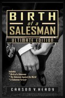
  • Salesman - I can see some pixelation in the title text. Pixelation makes it look a bit on the homemade side - but probably only for those of us sensitive to it. Good contrast between text and background. Nice picture, although it will appeal to men and not to women.
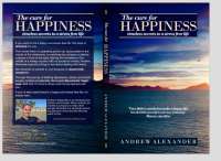
  • Happiness - a tiny bit of pixelation on the word Happiness. The birds are a nice addition to add some life to the landscape, but the circle configuration of the 3 birds looks contrived. The picture choice on Happiness is a bit interesting. It captures both happiness and darkness - people who strive for happiness are usually feeling dark. So maybe that's a good thing, in that the readers might relate to it. But if you want to evoke a feeling of pure joy, then I would choose another landscape that still has that peaceful element without the dark element, e.g., a sunrise with more light in it and not so many dark clouds.
  • Red - my least favorite, but mainly because I didn't care for the entirely red glass. Why not use a picture of a nice wine glass with red wine it it? It wasn't until I'd read the subtitle that I got what this was about. The gray name plate clashes just a bit with the yellow toned background. The overall look is clean, but also maybe a little too simplistic - mainly because of the glass.
I hope this is what you were looking for in terms of feedback. Good luck!
 
Dislike ads? Remove them and support the forum: Subscribe to Fastlane Insiders.

LifeTransformer

Silver Contributor
Read Fastlane!
Speedway Pass
User Power
Value/Post Ratio
123%
Feb 20, 2015
558
684
MUCH better.

Thank you! :)

Grats on your progress! Here's my $.02 feedback. Overall, I liked all 3 designs - good layout, good visual impact, and professional - so all comments from here are pretty much nitpicking.
  • Salesman - I can see some pixelation in the title text. Pixelation makes it look a bit on the homemade side - but probably only for those of us sensitive to it. Good contrast between text and background. Nice picture, although it will appeal to men and not to women.
  • Happiness - a tiny bit of pixelation on the word Happiness. The birds are a nice addition to add some life to the landscape, but the circle configuration of the 3 birds looks contrived. The picture choice on Happiness is a bit interesting. It captures both happiness and darkness - people who strive for happiness are usually feeling dark. So maybe that's a good thing, in that the readers might relate to it. But if you want to evoke a feeling of pure joy, then I would choose another landscape that still has that peaceful element without the dark element, e.g., a sunrise with more light in it and not so many dark clouds.
  • Red - my least favorite, but mainly because I didn't care for the entirely red glass. Why not use a picture of a nice wine glass with red wine it it? It wasn't until I'd read the subtitle that I got what this was about. The gray name plate clashes just a bit with the yellow toned background. The overall look is clean, but also maybe a little too simplistic - mainly because of the glass.
I hope this is what you were looking for in terms of feedback. Good luck!

This is awesome feedback! Thanks for taking the time to write it out.

On the pixelation, that might just be where I've resized them to fit in the thread better. I'm not seeing that on the full sized images at all, and I'm usually like you in being able to spot that when others may not. I'll double check the full sized images to make absolutely sure though.

  • Salesman is geared towards men, so I'm not worried about that image. ;-) I like the contrast there too.
  • Very interesting points on Happiness! I think @AndrewNC will agree with me that having darkness and calmness in the image can only be a good thing. That sky is actually taken from a different photo to the main image on the cover. Great point on the birds too, I added them as a little something extra and toned them down to make it look more natural. A more random pattern could have been better though you're absolutely right!
  • Red is also my least favourite of the 3. I've done so many iterations of it too. If I can find a good picture of a real glass of red I'll give that a try in its place and see what it looks like. I also think the text on that one still isn't quite right. The nameplate I might change back to an earlier version that just had that part cut out with the background color.
Thanks again for the help!
 

AndrewNC

Limitless
Read Fastlane!
Read Unscripted!
Speedway Pass
User Power
Value/Post Ratio
433%
Nov 14, 2011
2,486
10,752
landscape that still has that peaceful element without the dark element, e.g., a sunrise with more light in it and not so many dark clouds.

Thank you for the feedback.

I took @LifeTransformer 's design to design the print cover myself.

When I uploaded it to amazon, the darkness was too much so I took off the gradient filter to lighten it up a little. The pixelation is definitely coming from the upload here.


Screen Shot 2017-02-10 at 9.09.39 PM.png
 

Post New Topic

Please SEARCH before posting.
Please select the BEST category.

Post new topic

Guest post submissions offered HERE.

New Topics

Fastlane Insiders

View the forum AD FREE.
Private, unindexed content
Detailed process/execution threads
Ideas needing execution, more!

Join Fastlane Insiders.

Top