The Entrepreneur Forum | Financial Freedom | Starting a Business | Motivation | Money | Success

Welcome to the only entrepreneur forum dedicated to building life-changing wealth.

Build a Fastlane business. Earn real financial freedom. Join free.

Join over 80,000 entrepreneurs who have rejected the paradigm of mediocrity and said "NO!" to underpaid jobs, ascetic frugality, and suffocating savings rituals— learn how to build a Fastlane business that pays both freedom and lifestyle affluence.

Free registration at the forum removes this block.

My first piece of copy, critiques welcome

A detailed account of a Fastlane process...
D

Deleted50669

Guest
All,

I've been reading like a fiend to learn both about my target industries and to gain awareness about the copywriting process. I was never illusioned that copywriting would be an easy pursuit, and I am still humbled by the difficulty of the art.

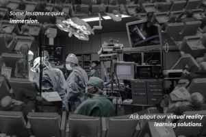
What I've attached is my first attempt at some practice copy. I am very interested in the evolution of the virtual reality industry, and its specific potential to transform healthcare and education. I would be gracious if people more knowledgeable in copy would rip it in half and provide some critique so I can understand where I'm weak.

The scenario: This ad is intended to communicate to med school educators that virtual reality can drastically improve their ability to teach surgical competencies.

Thanks in advance to anyone who takes the time to review / provide feedback.

- Cheers
 
Dislike ads? Remove them and support the forum: Subscribe to Fastlane Insiders.

Attachments

  • Sample 1 _ Healthcare.jpg
    Sample 1 _ Healthcare.jpg
    162.6 KB · Views: 69

AndrewNC

Limitless
Read Fastlane!
Read Unscripted!
Speedway Pass
User Power
Value/Post Ratio
433%
Nov 14, 2011
2,486
10,752
I mean at first I was about to shy away from this opportunity to read through your sales copy.

I immediately thought it was going to be one of those long-form sales letters that would take up 20 minutes of my time, and I almost didn't click on the attachment to check out your sales copy.

But then, I did, and boy was I in for a surprise...

What was the surprise that I got? You have to click on his attachment to see.
 

Azure

Perpetual Motion
Read Fastlane!
Read Unscripted!
Speedway Pass
User Power
Value/Post Ratio
189%
Mar 12, 2016
439
829
32
I mean at first I was about to shy away from this opportunity to read through your sales copy.

I immediately thought it was going to be one of those long-form sales letters that would take up 20 minutes of my time, and I almost didn't click on the attachment to check out your sales copy.

But then, I did, and boy was I in for a surprise...

What was the surprise that I got? You have to click on his attachment to see.

10/10

You baited me right in.
 
D

Deleted50669

Guest
I mean at first I was about to shy away from this opportunity to read through your sales copy.

I immediately thought it was going to be one of those long-form sales letters that would take up 20 minutes of my time, and I almost didn't click on the attachment to check out your sales copy.

But then, I did, and boy was I in for a surprise...

What was the surprise that I got? You have to click on his attachment to see.

When a novice meets a master, the earth shakes.
 
Dislike ads? Remove them and support the forum: Subscribe to Fastlane Insiders.

AndrewNC

Limitless
Read Fastlane!
Read Unscripted!
Speedway Pass
User Power
Value/Post Ratio
433%
Nov 14, 2011
2,486
10,752
Serious Answer:

Presentation Secrets of Steve Jobs - It's a book that someone wrote which goes along with what you're doing here - he put less text on his powerpoint presentations and the image evoked the emotions he was going for.

Where's the Call to Action? For the ones who see it, would it benefit you to put the phone number or website on there?
 

TheMatt

Contributor
User Power
Value/Post Ratio
417%
Sep 7, 2017
6
25
44
Rome, Italy
A few thoughts that you may find useful.

First: Is this a flyer, a poster, an online ad or landing page? The medium should inform your decisions in terms of copy and images.

And regarding the background image: It's slightly chaotic. If the topic is virtual reality, I'd find an image that reflects that more closely.

The copy: I feel it's a little too vague. You might be aiming to pique their interest, but I'm afraid you could be leaving them confused. Most of the time, less truly is less.

The goal of good copywriting is to attract attention, inform and convert (get leads via signups, inbound calls, or make a sale, etc.).

Be more explicit. "Some lessons require immersion" hints towards virtual reality, but for those who know little to nothing about it, it could sound a little meaningless. 'Some' lessons? Which? Most importantly: Where's the benefit?

The CTA: "Ask about our virtual reality learning solutions" might work well, depending on the scenario, but as AndrewNC pointed out, you should provide a phone number, an email address, something (this largely depends on the medium). The goal of a CTA is to tell the reader what to do next, clearly and simply. As well as offer an incentive, when possible.

I might go for something like this (bear in mind that I know nothing of the topic, so this is just a rough sketch):


Virtual reality. Real academic benefits.

Hyperrealistic surgical procedure simulations. Accurate 3D models. Immersive experience.

Teach your students surgical competencies with our proven Virtual Reality solutions.

Contact us at -----@------ for a detailed brochure.​
 
Last edited:
D

Deleted50669

Guest
A few thoughts that you may find useful.

First: Is this a flyer, a poster, an online ad or landing page? The medium should inform your decisions in terms of copy and images.

And regarding the background image: It's slightly chaotic. If the topic is virtual reality, I'd find an image that reflects that more closely.

The copy: I feel it's a little too vague. You might be aiming to pique their interest, but I'm afraid you could be leaving them confused. Most of the time, less truly is less.

The goal of good copywriting is to attract attention, inform and convert (get leads via signups, inbound calls, or make a sale, etc.).

Be more explicit. "Some lessons require immersion" hints towards virtual reality, but for those who know little to nothing about it, it could sound a little meaningless. 'Some' lessons? Which? Most importantly: Where's the benefit?

The CTA: "Ask about our virtual reality learning solutions" might work well, depending on the scenario, but as AndrewNC pointed out, you should provide a phone number, an email address, something (this largely depends on the medium). The goal of a CTA is to tell the reader what to do next, clearly and simply. As well as offer an incentive, when possible.

I might go for something like this (bear in mind that I know nothing of the topic, so this is just a rough sketch):


Virtual reality. Real academic benefits.

Hyperrealistic surgical procedure simulations. Accurate 3D models. Immersive experience.

Teach your students surgical competencies with our proven Virtual Reality solutions.

Contact us at -----@------ for a detailed brochure.​

Thank you for this detailed critique. It seems like a tough balance to strike between brevity and clarity. I will keep these tips / examples in mind going forward.
 
Dislike ads? Remove them and support the forum: Subscribe to Fastlane Insiders.

sparechange

Platinum Contributor
Speedway Pass
User Power
Value/Post Ratio
161%
Nov 11, 2016
2,804
4,504
Canada (Vancouver)
I absolutely hate how you have text in opposing corners, IMO it should be near the top to bottom dead in the middle, that's my worthless canadian 5 cents, love the idea of selling vr
 

I Am I Said

Bronze Contributor
Read Fastlane!
Read Unscripted!
Speedway Pass
User Power
Value/Post Ratio
118%
Sep 14, 2017
126
149
Canada
It took me a second to get it - but only a second, and only because:
  • I'm not a med school educator
  • The color is very similar between the OR and the auditorium, so it took most of that second to realize there was an auditorium.
Otherwise, wow.

I agree there needs to be a C2A as someone mentioned.

But I was suddenly flooded with the idea of being in school wearing goggles that had me floating above an ongoing procedure, holding my breath waiting to see what came next or what would squirt out when the yellow tube was punctured. I could imagine this being a very powerful tool without having ever thought about this VR application before.
 
D

Deleted50669

Guest
It took me a second to get it - but only a second, and only because:
  • I'm not a med school educator
  • The color is very similar between the OR and the auditorium, so it took most of that second to realize there was an auditorium.
Otherwise, wow.

I agree there needs to be a C2A as someone mentioned.

But I was suddenly flooded with the idea of being in school wearing goggles that had me floating above an ongoing procedure, holding my breath waiting to see what came next or what would squirt out when the yellow tube was punctured. I could imagine this being a very powerful tool without having ever thought about this VR application before.

I’m glad to hear it didn’t 100% miss the mark. The above feedback is instructive. Continuing to practice with these quality elements in mind.

Thank for the reply.
 
Dislike ads? Remove them and support the forum: Subscribe to Fastlane Insiders.

MJ DeMarco

I followed the science; all I found was money.
Staff member
FASTLANE INSIDER
EPIC CONTRIBUTOR
Read Rat-Race Escape!
Read Fastlane!
Read Unscripted!
Summit Attendee
Speedway Pass
User Power
Value/Post Ratio
446%
Jul 23, 2007
38,174
170,304
Utah
I think the copy is simple and eloquent.

The picture however is what needs improvement.

The contrast between the two needs to be more distinct. Right now it looks too sloppy. Looks like one is B/W the other color -- but the distinction isn't easily seen, so maybe increase the contrast or experiment with some different filters?
 
D

Deleted50669

Guest
I think the copy is simple and eloquent.

The picture however is what needs improvement.

The contrast between the two needs to be more distinct. Right now it looks too sloppy. Looks like one is B/W the other color -- but the distinction isn't easily seen, so maybe increase the contrast or experiment with some different filters?

Thank you for the feedback MJ, I’ll give it a whirl.
 

Post New Topic

Please SEARCH before posting.
Please select the BEST category.

Post new topic

Guest post submissions offered HERE.

New Topics

Fastlane Insiders

View the forum AD FREE.
Private, unindexed content
Detailed process/execution threads
Ideas needing execution, more!

Join Fastlane Insiders.

Top