The Entrepreneur Forum | Financial Freedom | Starting a Business | Motivation | Money | Success

Welcome to the only entrepreneur forum dedicated to building life-changing wealth.

Build a Fastlane business. Earn real financial freedom. Join free.

Join over 80,000 entrepreneurs who have rejected the paradigm of mediocrity and said "NO!" to underpaid jobs, ascetic frugality, and suffocating savings rituals— learn how to build a Fastlane business that pays both freedom and lifestyle affluence.

Free registration at the forum removes this block.

Landing Page Teardown Thread

DaRK9

Gold Contributor
Read Fastlane!
Speedway Pass
User Power
Value/Post Ratio
213%
May 23, 2014
767
1,634
I noticed people are making a lot of new threads to rate their landing pages. Hopefully we can condense them and maybe start a productive thread.

TOOLS / GUIDES
http://www.digitalmarketer.com/landing-page-optimization-conversion/
http://blog.hubspot.com/marketing/landing-page-checklist

WEB CAPTURE TOOL (Chrome)


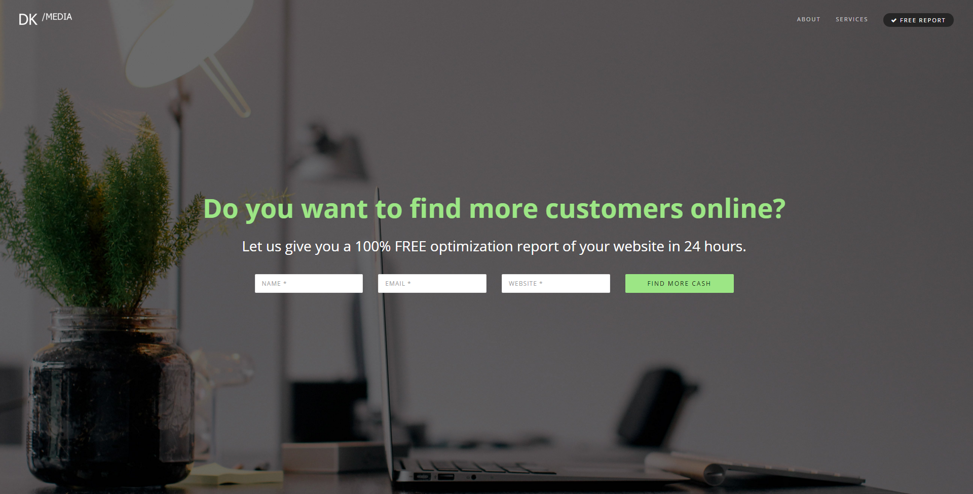
I'll go first. This is one for my web consulting work.

Target: Business owners
Offer: Free site audit.

Need to add: Social proof, trust signals, possibly a link to an infographic detailing what a poor site looks like vs an optimized one.

Possible Issues: Audit might be a stop word.

zv926X1.png


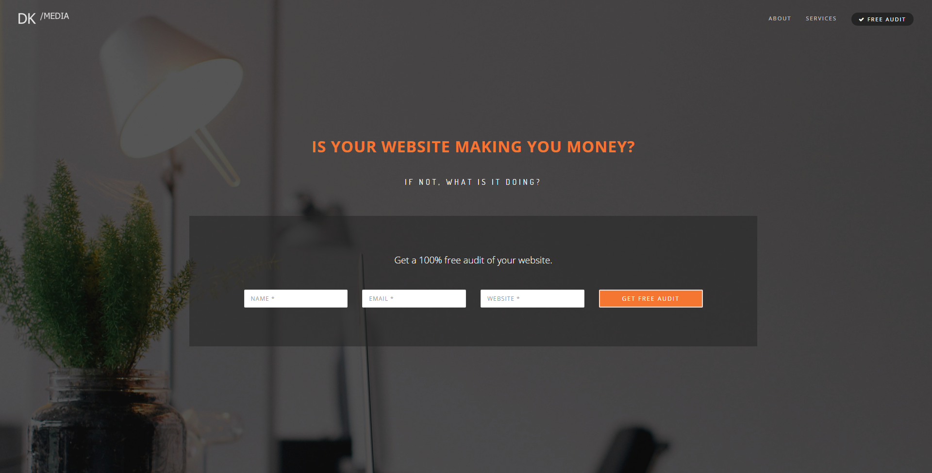
Feel free to rip it apart and add your tools and tips.
 
Dislike ads? Remove them and support the forum: Subscribe to Fastlane Insiders.
Last edited:

Lavi Fletcher

Bronze Contributor
Speedway Pass
User Power
Value/Post Ratio
149%
Jun 2, 2015
73
109
26
Sydney
I think one reason why many people ask forums for feedback on landing pages is because it'll be coming from random people who have no obligation to do so.

What I mean by this is that, when a random person looks at the landing page, they're able to just give their very first thoughts much like a potential customer who is not looking for mistakes or inefficiencies.

Furthermore, do you have a website with a landing page that is making you money so that you can speak from experience (not trying to talk shit or anything soz if it appears like that) and know exactly what to do without consulting guides you've found on Google? Because I think the person asking for feedback for their landing page could do that too.

I understand that the minimalist, clean font and sick stock photo background is the go to for landing pages, but it might not be the end all be all.


In regards to actually giving feedback on your landing page, the font under the headline text is hard to read easily so use a light version of the headline font or change it to another font entirely like Montserrat (https://www.google.com/fonts/specimen/Montserrat).
 

SlowlaneJay

Silver Contributor
Read Fastlane!
Speedway Pass
User Power
Value/Post Ratio
273%
Oct 25, 2014
270
738
Bogotá, Colombia
I noticed people are making a lot of new threads to rate their landing pages. Hopefully we can condense them and maybe start a productive thread.

Great idea!

Possible Issues: Audit might be a stop word.

Not just that, but audit is the feature, not the benefit. I would write it more along the lines of "Free audit: learn exactly how much money you're leaving on the table", or "Free audit: get a 63-page report with personalized instructions for a more profitable site."

Not saying those are good, but the idea is to emphasize the benefits of an audit. Why do I need one?
 

Gsuz

If you want the crown, you gotta take it
Read Fastlane!
Speedway Pass
User Power
Value/Post Ratio
242%
Jul 3, 2012
454
1,099
Two main principles I follow when creating landing pages:

Removing as much friction as possible and getting the person to say "Yes" in their head as much as possible.

The two questions, at least in my head, don't lead to me submitting my info.

Is your website making you money?
  • Path A: Yes, it does.
  • Path B: No, it doesn't.
If not, what is it doing?
  • Path A: Well, it makes money? Why would I need an audit?
  • Path B: It's not making money. Why would an audit change that?
Then comes the lead gen form. At this point I don't know why, how, where, what an audit is and why I need it.

Here's what I would do:

Appeal to their greed. Every business owner wants to make more money, right?

Do you want to make more money from your website?

Tired of expensive agencies that don't produce any results?

Let us show you for FREE how much money you're leaving on the table with your un-optimized website.

Then show them the various ways your audit will benefit them.
 
Dislike ads? Remove them and support the forum: Subscribe to Fastlane Insiders.

DaRK9

Gold Contributor
Read Fastlane!
Speedway Pass
User Power
Value/Post Ratio
213%
May 23, 2014
767
1,634
Do you have a website with a landing page that is making you money so that you can speak from experience
Several. The guides are more for people starting out. Good to know. I think it might be the letter spacing.
Not just that, but audit is the feature, not the benefit. I would write it more along the lines of "Free audit: learn exactly how much money you're leaving on the table", or "Free audit: get a 63-page report with personalized instructions for a more profitable site."

Not saying those are good, but the idea is to emphasize the benefits of an audit. Why do I need one?
Good point. I'm working on a small report with past results and comparisons. I'm going to add that once it's done so they can read about it while the report is being made. That way the desire/need is being built up while they wait.
Two main principles I follow when creating landing pages:

Removing as much friction as possible and getting the person to say "Yes" in their head as much as possible.

The two questions, at least in my head, don't lead to me submitting my info.

Is your website making you money?
  • Path A: Yes, it does.
  • Path B: No, it doesn't.
If not, what is it doing?
  • Path A: Well, it makes money? Why would I need an audit?
  • Path B: It's not making money. Why would an audit change that?
Then comes the lead gen form. At this point I don't know why, how, where, what an audit is and why I need it.

Here's what I would do:

Appeal to their greed. Every business owner wants to make more money, right?

Do you want to make more money from your website?

Tired of expensive agencies that don't produce any results?

Let us show you for FREE how much money you're leaving on the table with your un-optimized website.

Then show them the various ways your audit will benefit them.
Good stuff. The next page shows them how most people will go to a competitor's site if they don't immediately find what they are looking for. I need to show that pain on the first page.

BTW this is for local brick and mortar businesses. I've had success so far by sending reports to people that have inquired about my services and want to take it to the next level. I'm trying to take my script that I use in person and apply it online, but I see where the message gets lost online.

Awesome tips guys!

Made a few edits.
fM0sURI.png
 
Last edited:

DaRK9

Gold Contributor
Read Fastlane!
Speedway Pass
User Power
Value/Post Ratio
213%
May 23, 2014
767
1,634
I'd say to much text and too much reading is necessary @DrkSide ...and the blue background kills any desire I have to read it.

I much prefer the first version!
Yeah, it felt really Twitter-ish. Also people get here from an email I send, so it's not 100% cold ad traffic.
 
Dislike ads? Remove them and support the forum: Subscribe to Fastlane Insiders.

Andy Black

Help people. Get paid. Help more people.
Staff member
FASTLANE INSIDER
EPIC CONTRIBUTOR
Read Fastlane!
Speedway Pass
User Power
Value/Post Ratio
369%
May 20, 2014
18,679
69,015
Ireland
I have two points...


Point 1:

I totally agree with @Gsuz, especially on the point about getting them to say "Yes!"

By default, my landing page asks if the visitor is looking for what they're already searching for.


For example:

They search on Google for "emergency plumbers dublin".

My default ad headline says "Dublin Emergency Plumber".
(Pretty clever copy eh?)

My default landing page headline says: "Looking for an Emergency Plumber in Dublin?"
(Give me top marks for copywriting!)


Why does this work?

1) Because I know what they are looking for (aka want/need)

2) Because I make sure my ad is relevant.

3) Because I make sure that the first thing they see on the page tells them they are in the right place.


To this day, I'm still gob-smacked at how badly people do this... especially for local lead gen.

But that's our opportunity right? :)


Point 2:

This is probably the single biggest mistake I see people make with landing pages, and I'm going to try and save you from ever making this mistake again, whilst simultaneously giving you a massive advantage over your competitors.

I see this mistake made over, and over, and over, and over, and over, and over, and over, again...

Businesses even show me their "testing wall" displaying all the landing pages they've used, the dates the tests ran, the % conversion rates for each landing page, and the winning landing page picked to go through to the next test.

They proudly show me how the winner from the previous split-test is used in the next split-test.

How they've scientifically increased their landing page conversion rate from 1.1% to 2.5% over the course of 5 months.

I just look at them and open my mouth... nothing comes out, then I shut it again with a sigh.


.

.

.


So what's this One Simple Trick To Improve Your Landing Page Conversion Rate?
(Sorry @SinisterLex ... I couldn't resist.)


.

.

.


Are you still reading?


.

.

.


(This is going to mess with your eyebrows.)


.

.

.

The single biggest mistake people make with landing pages is:

Thinking that landing pages convert!


WTF? Is that it?!

Yep, you heard me...

Your landing page does NOT have a conversion rate.

If you even utter the phrase "landing page conversion rate", then I know you don't "get" it yet.

Why?

Because it's NOT the landing page that converts. It just sits there, doing jack sh*t...


Your landing pages don't convert, your visitors convert!


(** I originally wrote a quick note about this oh so common school-boy error here.)


You show me your Emergency Dublin Plumber landing page.

You proudly declare "This landing page converts at 30% Andy!"

I give you a (mental) slap and tell you that what you really mean is:

People who visit this page convert into enquiries-for-an-emergency-plumber-in-Dublin ... at 30%.

I explain that if I sent people searching for a Caribbean Cruise to your landing page, then you've NO chance of getting 30% of them to enquire about your emergency plumber service.

More like 0%.


Sh*t. Does that mean our landing page has suddenly stopped converting?

There's something up with our landing page guys!

Maybe we'd better roll back to the previous landing page?

Panic! Panic!


Err, no. We've just got people visiting now with a different "search intent" (or just a plain old different "intent" if they didn't do a search - I know, I know... there are apparently other sources of visitors than paid search, and I hear they can work too).


So what's the got to do with this thread where @DaRK9 wants to create a treasure trove of landing page conversion tips? (A good idea me thinks too.)

Well...

Because your visitors convert it's super important to know why your visitor arrived at your landing page.

Did they click on an ad? Did they click on a link at the bottom of your email?

What were they doing before they saw the ad?

What headline was in the email that enticed them to open it?

What did you promise them in the ad?

What did you promise them in the email?

Were they on Google doing a search for fun ("caribbeen cruises")?

Were they on Google doing a search NOT for fun ("divorce lawyers edinburgh")?

Did you target homeowners who like cats who were on Facebook?

What expectation do they have when they visit your landing page?

Will their experience match that expectation?


One of the (many) reasons why I like paid search is that I can see my ads in situ, against all the competing ads.

I can then click on everyone's ads and see how they match their visitor expectation with their visitor experience (saying a silent apology each time for forcing each advertiser to cough up cash to Google when I've no intention of purchasing).

I can then get ideas from landing pages that are getting paid visitors and (you'd hope!) are converting those visitors into leads or sales.

I can then create a swipe file to study and/or show my client.


Here's an example:
(Originally posted on the inside here):


Search Term - Ad - Landing Page Review for "gadget insurance" (UK)

Below is a review of a competitive online search term.

I do this type of analysis for clients, and for myself when I'm reviewing the competitive landscape.

Many of the landing pages are bleeding awful, and these guys should know better.


Andy


DDdcC7V.png


mgAP7fH.png


dqpMaJ9.png


sYAE1Xg.png


5E8lk6L.png


dmSZUL1.png


ypIOVr2.png


wntAjKa.png


QJGrurH.png


VhYMWo5.png


G0ooMYl.png


OVJmqp2.png


5apzZvp.png


OATgsv5.png


2zFbvYO.png


4jn8fY9.png
 
Last edited by a moderator:

DaRK9

Gold Contributor
Read Fastlane!
Speedway Pass
User Power
Value/Post Ratio
213%
May 23, 2014
767
1,634
Awesome stuff as always @Andy Black . We can always count on you!

Live one ATM. A link to this site is being sent via email to business owners after an initial script. No cold traffic.

Not many web designers follow-up or use any marketing other than cold calling and WoM for clients. I've found that a combination of letters, emails and calls works best in this case. This is just another avenue.
xfsNzSs.png
 

SlowlaneJay

Silver Contributor
Read Fastlane!
Speedway Pass
User Power
Value/Post Ratio
273%
Oct 25, 2014
270
738
Bogotá, Colombia
I really, really, really wanted to see this thread take off. Every few days we have a new critique request. Any thoughts on how to push more folks to this thread instead of creating new ones?

In the mean time, maybe I'll just bump the thread every time a new one pops up :D

________________

Got some time to kill?
— Want to establish credibility with the Fastlane community? —

If you know a thing or two about conversion, design, copywriting, or psychology this is your chance! Say hello to this golden opportunity to score some easy "likes" and get that rep bank full of sweet, sweet forum money. Mmmmmmm.

Plus, you'll be helping out other entrepreneurs who, with a little hustle and gumption, may become powerful people one day. The kind of folks you'd love to have on your side when YOU need a little help.

So what do you say? Ready to make someone's day?

___________


aYGxz5Q.jpg


24 HOUR SATISFACTION GUARANTEE
Visit JUST ONE of the above threads and give your honest opinions on the landing page. I GUARANTEE you'll make AT LEAST $5 forum dollars (OR MORE!) within 24 hours of posting. Prove me a liar, and I'll personally send you $100 of my own rep. That's $100 forum dollars just for saying "Hey nice site, but your logo sucks." Come on…
 
Dislike ads? Remove them and support the forum: Subscribe to Fastlane Insiders.
Last edited by a moderator:

juan917

Silver Contributor
Read Fastlane!
Speedway Pass
User Power
Value/Post Ratio
181%
Jul 27, 2015
471
852
32
What are you ultimately selling? And what's the URL for your site?
 
Last edited:

100k

Gold Contributor
Read Fastlane!
Speedway Pass
User Power
Value/Post Ratio
149%
Oct 20, 2012
1,529
2,284
Why isn't your website converting?

Get a $150 audit for FREE and find out how you can increase your conversion rate today!

call to action: (Get Free Audit Now!)
 

Johnny1975

Contributor
User Power
Value/Post Ratio
29%
Dec 21, 2015
89
26
48
Hi, I have a landing page which looks fine to me but my subscriber rate is terrible. Right now I have 1 subscriber. I've been using google adwords for some time now and I think my campaign is ok, and I'm getting plenty of impressions and a click rate of 2-6% (it's closer to 2% at the moment). I also think my ad is pretty good, so I think the problem is my landing page.

I think I've done lots of things right (i.e. keep it simple, no links, no distractions, keep the copy relevant, clear call to action, etc), and I've read a lot of advice for how to do a landing page and I've followed it all to the best of my knowledge. But I'm stuck and I wouldn't be surprised if there's something major that needs improving, something that I've missed, so another pair of eyes would probably help me see what that might be.

* They sign up
* I send them the freebie
* They then get a few more emails (more PDF freebies)
* Eventually I pitch them my product, which is a guitar course for beginners (the freebies are all from the course)

This is how it looks at the time of posting this (there's a link to the page below this image) :

landing page.jpg


Here's the link : http://johnnymontoya.wix.com/howtotuneyourguitar (I know I need a domain)

 
Dislike ads? Remove them and support the forum: Subscribe to Fastlane Insiders.
Last edited by a moderator:

Supa

Came for the $. Stayed for the Ice Cream.
Read Fastlane!
Speedway Pass
User Power
Value/Post Ratio
289%
May 27, 2015
968
2,798
32
Germany
Hi, I have a landing page which looks fine to me but my subscriber rate is terrible. Right now I have 1 subscriber. I've been using google adwords for some time now and I think my campaign is ok, and I'm getting plenty of impressions and a click rate of 2-6% (it's closer to 2% at the moment). I also think my ad is pretty good, so I think the problem is my landing page.

I think I've done lots of things right (i.e. keep it simple, no links, no distractions, keep the copy relevant, clear call to action, etc), and I've read a lot of advice for how to do a landing page and I've followed it all to the best of my knowledge. But I'm stuck and I wouldn't be surprised if there's something major that needs improving, something that I've missed, so another pair of eyes would probably help me see what that might be.

* They sign up
* I send them the freebie
* They then get a few more emails (more PDF freebies)
* Eventually I pitch them my product, which is a guitar course for beginners (the freebies are all from the course)

This is how it looks at the time of posting this (there's a link to the page below this image) :

View attachment 11276


Here's the link : http://johnnymontoya.wix.com/howtotuneyourguitar (I know I need a domain)

First off: yes you need a domain. I would be turned off by a free wix.com website. I didn't like that you use so many colors, makes it a bit hard to read it and another turn off for me. I recommend choosing one or two colors and stay in that color scheme. Overall it looks kinda cheap and like you did it in 5 minutes. That's my honest opinion on it, since that's a tear down thread.

EDIT: have a look at the landing pages on http://land-book.com/ and you may get some good ideas.
 
Last edited by a moderator:

Kasper

Contributor
Read Fastlane!
User Power
Value/Post Ratio
136%
Dec 4, 2015
28
38
Copenhagen, Denmark
@Johnny1975 Here is some tough love;).. Agree with Supa... Clean it up 2 max 3 colours. Buy a better picture online if you havent got a better one... maybe black & white. What is it really your product does? To me 6 mins is a long time for tuning my guitar, but I am no expert. I use an Iphone app, and it works great, and takes 2 mins. I would consider to offer people to learn to tune their guitar with no instruments/ apps. Something like; "Learn to tune a guitar like a pro" next line: In less than 6 minutes you will never again need a "guitar tuner" (I am not sure what it is called).
Cut out the beginners guide stuff... Just say: "Learn the secret now!"

I would keep it at that, dont tell them that your technique is easy or the "wobbly sound"... I hope you can use it!
 

Johnny1975

Contributor
User Power
Value/Post Ratio
29%
Dec 21, 2015
89
26
48
First off: yes you need a domain. I would be turned off by a free wix.com website. I didn't like that you use so many colors, makes it a bit hard to read it and another turn off for me. I recommend choosing one or two colors and stay in that color scheme. Overall it looks kinda cheap and like you did it in 5 minutes. That's my honest opinion on it, since that's a tear down thread.

EDIT: have a look at the landing pages on http://land-book.com/ and you may get some good ideas.

Ok, so there's too many colours, I agree. Is there a particular text colour that should dominate? Should all the text be in the same colour? Or would it be ok to have the headline in a different colour? Is the font appropriate? What about the background photo? Is that ok?
 
Dislike ads? Remove them and support the forum: Subscribe to Fastlane Insiders.

Johnny1975

Contributor
User Power
Value/Post Ratio
29%
Dec 21, 2015
89
26
48
@Johnny1975 Here is some tough love;).. Agree with Supa... Clean it up 2 max 3 colours. Buy a better picture online if you havent got a better one... maybe black & white. What is it really your product does? To me 6 mins is a long time for tuning my guitar, but I am no expert. I use an Iphone app, and it works great, and takes 2 mins. I would consider to offer people to learn to tune their guitar with no instruments/ apps. Something like; "Learn to tune a guitar like a pro" next line: In less than 6 minutes you will never again need a "guitar tuner" (I am not sure what it is called).
Cut out the beginners guide stuff... Just say: "Learn the secret now!"

I would keep it at that, dont tell them that your technique is easy or the "wobbly sound"... I hope you can use it!

The Beginner's Guide To Tuning Your Guitar is the name of the freebie. You don't think it's necessary to mention it? The product (freebie) tells them a method to tuning their guitar. What's wrong with the photo? The reason why I mentioned 6 minutes is to give them something specific. I suppose I could say "tune your guitar without having to have excellent hearing" or something like that.
 

Andy Black

Help people. Get paid. Help more people.
Staff member
FASTLANE INSIDER
EPIC CONTRIBUTOR
Read Fastlane!
Speedway Pass
User Power
Value/Post Ratio
369%
May 20, 2014
18,679
69,015
Ireland
Hi, I have a landing page which looks fine to me but my subscriber rate is terrible. Right now I have 1 subscriber. I've been using google adwords for some time now and I think my campaign is ok, and I'm getting plenty of impressions and a click rate of 2-6% (it's closer to 2% at the moment). I also think my ad is pretty good, so I think the problem is my landing page.

I think I've done lots of things right (i.e. keep it simple, no links, no distractions, keep the copy relevant, clear call to action, etc), and I've read a lot of advice for how to do a landing page and I've followed it all to the best of my knowledge. But I'm stuck and I wouldn't be surprised if there's something major that needs improving, something that I've missed, so another pair of eyes would probably help me see what that might be.

* They sign up
* I send them the freebie
* They then get a few more emails (more PDF freebies)
* Eventually I pitch them my product, which is a guitar course for beginners (the freebies are all from the course)

This is how it looks at the time of posting this (there's a link to the page below this image) :

View attachment 11276


Here's the link : http://johnnymontoya.wix.com/howtotuneyourguitar (I know I need a domain)

For AdWords, you have to get the "Search Term -> Ad -> Landing Page" unit to work properly.

These posts might help:

And the post I created in this thread already:


Questions to ask yourself:
  • What's the search term that people typed into Google?
    (You need to understand the difference between search terms and keywords btw. Read this post.)

  • What does your ad copy promise?

  • Are visitors finding what they expect on your landing page?
  • What if you created your landing page in black-and-white and with no photo?
    • What headline would you use?
    • Could you use a question that they respond "Yes!" to?
    • Can it be a "Want to ... ?" question?
    • Can it be a "Looking for ... ?" question?
 
Last edited by a moderator:

Supa

Came for the $. Stayed for the Ice Cream.
Read Fastlane!
Speedway Pass
User Power
Value/Post Ratio
289%
May 27, 2015
968
2,798
32
Germany
Ok, so there's too many colours, I agree. Is there a particular text colour that should dominate? Should all the text be in the same colour? Or would it be ok to have the headline in a different colour? Is the font appropriate? What about the background photo? Is that ok?

Your text color shouldn't interfere with your background color, I'm a fan of simply white text color on dark background and black text color on light backgrounds. The font looks a bit cheap too in my opinion, there are so many nice fonts out there, just choose one that everybody can read on their browsers.

For the background photo, it looks like you did it in your room on yourself. Check out some free stock photo sites like pisabay or pexels for awesome free to use photos. You can put a blurr effect on them to make it easier to read the text but that depends on how it looks.
 
Dislike ads? Remove them and support the forum: Subscribe to Fastlane Insiders.

Johnny1975

Contributor
User Power
Value/Post Ratio
29%
Dec 21, 2015
89
26
48
Here it is so far. I've made a list of every suggestion and made as many changes as possible. The only one left to do is Andy's suggestion to turn the headline into a question. I'll get around to it as soon as I've thought of the right question to ask. Here's what I've changed, based on what people have said :

* There's less colours overall
* The background is now clean
* Light text on dark background
* I changed the font from Georgia to Kepler (I looked up a list of professional fonts, and out of the ones available on wix, I chose Kepler)
* I removed "Beginner's Guide....." (although I'm not sure why this would make it better)
* I removed "wobbling sound" (and I'm embarrassed that I ever mentioned it)

I also took off the video, because I'm not sure if it would make any sense, as it does not clearly demonstrate the method of tuning, at least without the visitor reading the freebie. It would confuse people. It's actually part of the freebie anyway. I only included it originally because I heard that video is good to use in landing pages.

It contains these keyphrases :

How to tune a guitar.....tuning a guitar.....how to tune your guitar.....tune your guitar.....which I'm going to have as separate ad groups, as per Andy's advice.

Landing page 2.jpg


Should I change the colour of the CTA button? I read somewhere that red is good, but pink was the closest available. I think it looks a bit weird. Or should I replace the button with the opt in form itself?
 
Dislike ads? Remove them and support the forum: Subscribe to Fastlane Insiders.
Last edited:

Kasper

Contributor
Read Fastlane!
User Power
Value/Post Ratio
136%
Dec 4, 2015
28
38
Copenhagen, Denmark
Do you have plenty of traffic to the landing page? If so, maybe just wait a while and see if it works better than before… you have already changed a lot. It seems you are a good listener, and took the advice from the knowledgable guys AndyBlack and Supa into account, now just do some A/B testing…. and enjoy the process ;)
 

Johnny1975

Contributor
User Power
Value/Post Ratio
29%
Dec 21, 2015
89
26
48
Do you have plenty of traffic to the landing page? If so, maybe just wait a while and see if it works better than before… you have already changed a lot. It seems you are a good listener, and took the advice from the knowledgable guys AndyBlack and Supa into account, now just do some A/B testing…. and enjoy the process ;)

Well in the last few days I've had 1032 impressions and 27 clicks. That's a CTR of 2.62%. And no subscribers. But of course after my changes I don't know what will happen next. I can't do A/B testing because I didn't save the old version. But I'll remember for next time.

I've now created 4 ad groups, each having 1 keyword, all exact matches, and all going to the same exact ad wording and landing page.

As a percentage, how much better do you think my landing page is now compared to how it was before?
 

DaRK9

Gold Contributor
Read Fastlane!
Speedway Pass
User Power
Value/Post Ratio
213%
May 23, 2014
767
1,634
Why isn't your website converting?

Get a $150 audit for FREE and find out how you can increase your conversion rate today!

call to action: (Get Free Audit Now!)
Targeting small biz owners. Most don't know wtf conversion rates are.

Been extremely busy. Had success with the page so far. Remember it's being sent to a list, not AdWord traffic. Switching to a sales team instead of DM for leads.
 
Dislike ads? Remove them and support the forum: Subscribe to Fastlane Insiders.

prof

Contributor
Read Fastlane!
User Power
Value/Post Ratio
132%
May 21, 2015
34
45
38
Chiang Mai
Should I change the colour of the CTA button? I read somewhere that red is good, but pink was the closest available. I think it looks a bit weird. Or should I replace the button with the opt in form itself?

When you split-test landing pages you should be comparing completely different concepts / styles to identify what works best with your audience until you find a winner. At this stage, split-testing button colours is too granular.

I'm afraid I'm going to have to agree with a previous comment that your existing landing page looks a bit amateur. Ask yourself - in somebody else's shoes - would you give your email address to this page?

The other thing s exactly how you are targeting this traffic with Adwords.

What is the user expecting when they arrive at your landing page?

For example there's a huge difference between somebody who is searching for "how do I tune my guitar" and "electronic guitar tuners". One is looking to solve a problem, the other is likely actually looking for a specific kind of product. Google will happily suggest you bid on both.

But in this being a landing page teardown thread I think there are some more integral problems with your landing page as it stands it now:

1) What you're offering isn't clear enough.

You have a picture of someone supposedly tuning a guitar - but so what?

What is that showing me? What are you actually offering? Is it an eBook guide or a video guide, or... ? Show me!

Break down 3/4 benefits of your guide into bullet points. Sell it to me!

If I'm going to give you my email then I want to know exactly what I'm getting. My email address is valuable. Is what you're offering worth the trade?

2) There is a huge disconnect between somebody clicking the CTA and arriving at the opt-in.

I find myself on a black page with a pink button and am interested. I click the button.

Next I land on some random looking grey page asking for my email address to subscribe. There's no continuity or flow. I don't trust it.

Put the opt-in on the landing page itself OR use a light-box which pops up on-page for and asks for an email when somebody clicks the CTA.

Trying to build a page from scratch is commendable but if you're new to design you might want to look at a service like Unbounce which has proven templates you can work form so you can produce professional looking variations quickly and easily until you find something that works.
 

Johnny1975

Contributor
User Power
Value/Post Ratio
29%
Dec 21, 2015
89
26
48
Ok i've added bullet points with benefits, and explained that it's a 6 page free pdf. As soon as I figure out how to put the opt in form on the page, i'll do that. http://johnnymontoya.wix.com/howtotuneaguitar

My one and only keyword is : [how to tune a guitar] (exact match). I have a few others, each with their own ad group, but they're all paused. The keyword that I'm using is by far the most searched.

Right now I've got 33 impressions and 5 clicks, which is a CTR of about 15% (is that good?) But no subscribers. Bear in mind that I've been making lots of changes, so I have actually had more clicks, but google resets everything when I make a change.

I'm sure there's a few more things I need to improve, but what baffles me is, why is nobody at all subscribing? I mean, I would think at least a few people would have subscribed by now. It's not like my landing page is terrible. In fact I think I've done a lot of things right, and my ad is very good I think :

How To Tune A Guitar
Easy Step By Step Method
Download Your 6 Page Free PDF
wix.com/HowToTuneAGuitar

My photo is relevant, the look of the page is tidy and simple, it's absolutely clear what I'm offering, and there are no visual distractions or links. My keyword appears in the headline of the ad, and twice in the landing page. And the keyword is the one that people were searching for the most, and clicking on the most.

The irony is that way before I made all these changes, I got 1 subscriber, but now that I've made so many improvements in my ad and landing page, I've had none. How can it be that a landing page that has been improved so much gets no subscribers?

My daily budget varies. Sometimes I set it at £1.43 ($2.13), sometimes at £2.86 ($4.26), and the most that I've set it at is £4.29 ($6.39). If I wasn't poor i'd set it higher. Maybe this is why I''ve not had enough clicks to result in a subscriber yet. But right now it's hard to tell if that's the reason, or if it's because there's something fundamentally wrong with my ad / campaign / landing page. But from what I've been reading, a CTR of 15% is way above reasonable.
 
Last edited:

Johnny1975

Contributor
User Power
Value/Post Ratio
29%
Dec 21, 2015
89
26
48
I did an experiment, I raised my daily budget to £30 ($44.61).

Result :

Impressions : 504
Clicks : 69
CTR : 13.69%

Subscribers : 1
Conversion rate : 1.45%

Cost : £32.41


I've now paused everything, because as it stands this isn't going to work. The product that I want to eventually pitch will be $97 (£65.24).

I think my ad is pretty good (see my last post above), and although my landing page isn't perfect I don't think it's that bad. But obviously I'm not doing something right.

I need help!

http://johnnymontoya.wix.com/howtotuneaguitar
 
Dislike ads? Remove them and support the forum: Subscribe to Fastlane Insiders.

Supa

Came for the $. Stayed for the Ice Cream.
Read Fastlane!
Speedway Pass
User Power
Value/Post Ratio
289%
May 27, 2015
968
2,798
32
Germany
I did an experiment, I raised my daily budget to £30 ($44.61).

Result :

Impressions : 504
Clicks : 69
CTR : 13.69%

Subscribers : 1
Conversion rate : 1.45%

Cost : £32.41


I've now paused everything, because as it stands this isn't going to work. The product that I want to eventually pitch will be $97 (£65.24).

I think my ad is pretty good (see my last post above), and although my landing page isn't perfect I don't think it's that bad. But obviously I'm not doing something right.

I need help!

http://johnnymontoya.wix.com/howtotuneaguitar

To me it still looks too unprofessional, why not use the example image that @Kasper made? That looks a lot more professional. And please get rid of that wix.com site and register your own domain. Or at least pay for wix so there is not their ads all over it.
 

Kasper

Contributor
Read Fastlane!
User Power
Value/Post Ratio
136%
Dec 4, 2015
28
38
Copenhagen, Denmark
To me it still looks too unprofessional, why not use the example image that @Kasper made? That looks a lot more professional. And please get rid of that wix.com site and register your own domain. Or at least pay for wix so there is not their ads all over it.

I must agree with Supa, and I would have suggested opening up your budget for the day... I do not understand why it does not work, if your conversion is worth 97 and it costs you 33, that must be pretty ok. But I am not sure of your business model. Are you giving away a free product to get a lead list? Because then you must also consider how well your lead list is converting... and that will push your conversion cost further up.

Maybe consider not being number 1 for your exact keyword. It is ok to get a lower CTR in change for getting people into the page, that have actually read your add. But no lower than number 3.

Another tip for your Adwords account: Never delete anything, and never change your current keywords, ads or the likes. I ALWAYS test against my old ads. So, build another ad, and leave it up there. It will automatically compete against the old ad, and if your new ad is converting better it will win the a/b test. Then optimize again... and so on... Same with keywords, just pause it if it does not work. That way you can always go back and see if you tried a keyword and if it did or did not work well.

In many cases it makes it easier for me to name my campaign "KEYWORDS" and the group is named the keyword name (how to tune a guitar).

In regards to conversions, if I where you, I would try to get people to BUY the product now... give a money back guarantee, but make sure you can track your exact conversion rate. (if I am right assuming that you are just trying to get people to subscribe and later buy the product).

You are definately letting people leave your website by not registering the domain. Everything that would make a potential buyer uneasy (like a weird domain name, will definately make people uneasy, and not likely to sign up.) See it like a sif, and close all the holes...

Try and see what will happen if you change the wording:"Just fill in your email, and I'll send you your guide right away!" to: "fill in your email to recieve the guide right away!"

And last... 15% CTR is an ok CTR for an exact word match.

Looks like you are getting there... keep pushing!!!
 

Post New Topic

Please SEARCH before posting.
Please select the BEST category.

Post new topic

Guest post submissions offered HERE.

New Topics

Fastlane Insiders

View the forum AD FREE.
Private, unindexed content
Detailed process/execution threads
Ideas needing execution, more!

Join Fastlane Insiders.

Top