The Entrepreneur Forum | Financial Freedom | Starting a Business | Motivation | Money | Success
  • SPONSORED: GiganticWebsites.com: We Build Sites with THOUSANDS of Unique and Genuinely Useful Articles

    30% to 50% Fastlane-exclusive discounts on WordPress-powered websites with everything included: WordPress setup, design, keyword research, article creation and article publishing. Click HERE to claim.

Welcome to the only entrepreneur forum dedicated to building life-changing wealth.

Build a Fastlane business. Earn real financial freedom. Join free.

Join over 90,000 entrepreneurs who have rejected the paradigm of mediocrity and said "NO!" to underpaid jobs, ascetic frugality, and suffocating savings rituals— learn how to build a Fastlane business that pays both freedom and lifestyle affluence.

Free registration at the forum removes this block.

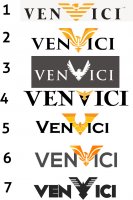
Initial Logo Concepts

Y.B.

Bronze Contributor
Read Fastlane!
Speedway Pass
User Power
Value/Post Ratio
93%
Feb 7, 2014
491
455
39
Ok folks, which one do you like best?

This is for an athletic apparel company (yoga, crossfit and will also include accessories like yoga mats, supplements, etc..)
 
Dislike ads? Remove them and support the forum: Subscribe to Fastlane Insiders.
Attachments

  • logos.jpg
    logos.jpg
    241.2 KB · Views: 63

Mr.B

Silver Contributor
Read Fastlane!
Speedway Pass
User Power
Value/Post Ratio
207%
Nov 8, 2014
377
780
Australia
I like number three the best (although I think the bird should be the same height as the text).
 

BeDoHave

Contributor
Read Fastlane!
User Power
Value/Post Ratio
154%
Aug 6, 2014
26
40
26
I really like number 3 and number 7 (especially number 7).

All the others look very corporate and boring and I personally wouldn't associate them with an athletic brand.
 

Y.B.

Bronze Contributor
Read Fastlane!
Speedway Pass
User Power
Value/Post Ratio
93%
Feb 7, 2014
491
455
39
I posted this on FB and got a lot of great feedback. It seems the majority like #3 with a few caveats:
1. Not everyone likes the eagle
2. Not everyone sees the eagle as being "V"

Here is another one where the font looks a little more sporty
 
Dislike ads? Remove them and support the forum: Subscribe to Fastlane Insiders.

Attachments

  • font.jpg
    font.jpg
    33.4 KB · Views: 27

BeDoHave

Contributor
Read Fastlane!
User Power
Value/Post Ratio
154%
Aug 6, 2014
26
40
26
Looks like I made the same mistake in not knowing the bird was a V.

I like the bird. Why not have a normal V and have the bird centred above the text?
 

NoLackey

Bronze Contributor
Speedway Pass
User Power
Value/Post Ratio
149%
Jan 1, 2014
72
107
I like #3 the best, but I think you might want to consider a new style.

The logo style doesn't scream athletics to me at all. I looked at the logos before reading and I thought it was some type of financial company; at least something to do with corporate business.
 

Y.B.

Bronze Contributor
Read Fastlane!
Speedway Pass
User Power
Value/Post Ratio
93%
Feb 7, 2014
491
455
39
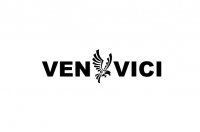
Sorry, let me specify...the name of the brand is "Venvici"

I will play around with some of those concepts. Stay tuned
 
Dislike ads? Remove them and support the forum: Subscribe to Fastlane Insiders.
Y.B.

Bronze Contributor
Read Fastlane!
Speedway Pass
User Power
Value/Post Ratio
93%
Feb 7, 2014
491
455
39
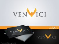
What would make this look more like a sports apparel brand...different font? different image instead of the eagle?
 

Y.B.

Bronze Contributor
Read Fastlane!
Speedway Pass
User Power
Value/Post Ratio
93%
Feb 7, 2014
491
455
39
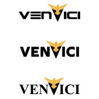
A few more designs. Which ones work best?
 

Attachments

  • 3.jpg
    3.jpg
    65.7 KB · Views: 21
  • 5.jpg
    5.jpg
    28.7 KB · Views: 19
  • 6.jpg
    6.jpg
    9.9 KB · Views: 19
  • 7.jpg
    7.jpg
    152.3 KB · Views: 19
  • 7a.jpg
    7a.jpg
    29.1 KB · Views: 19
  • 1.jpg
    1.jpg
    9.8 KB · Views: 20
  • 2.jpg
    2.jpg
    41.9 KB · Views: 20

Silverhawk851

Platinum Contributor
Speedway Pass
User Power
Value/Post Ratio
482%
Sep 22, 2012
861
4,154
Toronto/Traveling
3 or 4 in the first post, or 2.jpg in the 2nd post.

I always have a tough time when images are embedded as characters.
The goal is to simplify for the customer, really only have a limited attention span and won't bother figuring out what it is, no matter how aesthetically-pleasing the design is.
 
Dislike ads? Remove them and support the forum: Subscribe to Fastlane Insiders.
MJ DeMarco

I followed the science; all I found was money.
Staff member
FASTLANE INSIDER
EPIC CONTRIBUTOR
Read Rat-Race Escape!
Read Fastlane!
Read Unscripted!
Summit Attendee
Speedway Pass
User Power
Value/Post Ratio
446%
Jul 23, 2007
38,196
170,437
Utah
Like the #3 eagle emblem, but not the logo, or the font style. As another mentioned, it seems more like a financial company vs a fitness biz. And yes, no one will figure out that the eagle also doubles as a V. Good luck.
 

Y.B.

Bronze Contributor
Read Fastlane!
Speedway Pass
User Power
Value/Post Ratio
93%
Feb 7, 2014
491
455
39
Thanks MJ. I made some updates to the designs/fonts so hopefully that fixes both of those issues. They are posted above.
 

BlokeInProgress

Business Building Warrior
FASTLANE INSIDER
Read Fastlane!
Read Unscripted!
Speedway Pass
User Power
Value/Post Ratio
118%
Feb 6, 2014
464
547
Australia
I'm going with 2.jpg on your second post.
 
Dislike ads? Remove them and support the forum: Subscribe to Fastlane Insiders.
Supercar

Silver Contributor
Read Fastlane!
Read Unscripted!
Summit Attendee
Speedway Pass
User Power
Value/Post Ratio
188%
Mar 14, 2012
273
512
Michigan, Arizona
I like 2 and 6. Other square looking eagles look somewhat tyrannical. I also love the large black/orange eagle that you have in two of your later logos, but it seems to be more directed at and appealing to women.

And no, I do not see a "V" in the eagles. There are two Vs in your name. The first one is spelled out clearly but the second one nobody will notice.
 
Last edited:

Hussein_Eid

New Contributor
User Power
Value/Post Ratio
33%
Dec 26, 2014
3
1
The safer one number 3. But actually no one very boring. If back to me I will power the bird(phoenix) I will make him borning with big flame the colour brighty background black and hold to words by equivalent way. Emagine it on clothing and equipment brilliant [emoji4]. Good luck
 

DennisD

Mini Media Mogul
Read Fastlane!
Speedway Pass
User Power
Value/Post Ratio
216%
Jun 16, 2012
1,488
3,208
36
Bali, Indonesia
The logo style doesn't scream athletics to me at all. I looked at the logos before reading and I thought it was some type of financial company; at least something to do with corporate business.

This.
That being said, the golden eagle in #2 would be perfect... for luxury brand.
 
Dislike ads? Remove them and support the forum: Subscribe to Fastlane Insiders.

WeMoE

Contributor
Read Fastlane!
User Power
Value/Post Ratio
64%
Oct 21, 2014
45
29
45
Minneapolis, MN
I like 7 on your second post, however, I would of never linked the logo to fitness. From a branding standpoint, I would incorporate something that screams fitness.
 

Post New Topic

Please SEARCH before posting.
Please select the BEST category.

Post new topic

Guest post submissions offered HERE.

Latest Posts

New Topics

Fastlane Insiders

View the forum AD FREE.
Private, unindexed content
Detailed process/execution threads
Ideas needing execution, more!

Join Fastlane Insiders.

Top