The Entrepreneur Forum | Financial Freedom | Starting a Business | Motivation | Money | Success

Welcome to the only entrepreneur forum dedicated to building life-changing wealth.

Build a Fastlane business. Earn real financial freedom. Join free.

Join over 80,000 entrepreneurs who have rejected the paradigm of mediocrity and said "NO!" to underpaid jobs, ascetic frugality, and suffocating savings rituals— learn how to build a Fastlane business that pays both freedom and lifestyle affluence.

Free registration at the forum removes this block.
U

User62861

Guest
Don’t want to be rude, just honest, but the only good thing about this logo is Fastright font.

PROBLEMS: The logo is too generic and it’s overused all over the Interenet. There are many other issues... it’s not good for resizing (it will look like a mess in small size and many details will disappear). If you can't see details, why even use it? This is the reason logo has to be as simple as possible. This logo can't be used as a Instagram profile icon, can't work as a fav icon, isn't unique (I guess every company wants to stand out)...

Judging by that mockup, the logo was made by Fiverr or similar site designer. 95% of time you will get cheap service which will result in a bad product or even worse, stolen one.

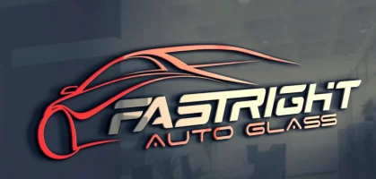
Name is FastRIGHT and the car is designed like it's going left...

I know everybody don't have a budget for a good and custom logo design, but it's better to just use font and type the company name than this.

Some of my clients had financial issues and it took them a lot of time because they went for ''the better'' cheap offer at the first.

Few tips: your logo doesn't have to tell what your company does (Nike and Apple don't have a shoe or mobile phone in the logo). Logo has to work on all platforms, be unique and weird enough so people can remember it and recognize your brand by it.

Take all this as my advice to help you not end up with something that will make you additional problems and make you look ''cheap''.
 

Underdog2018

New Contributor
User Power
Value/Post Ratio
180%
Feb 15, 2019
5
9
I've been reading this forum for some time and this is my first post here.

I'll start online store soon. Selling small car gadgets. I need to decide on a logo. I was thinking something like the picture below. What do you guys think? Is this style good?
Untitled.png
 
Dislike ads? Remove them and support the forum: Subscribe to Fastlane Insiders.

Xeon

All Cars Kneel Before Pagani.
Read Fastlane!
Read Unscripted!
Speedway Pass
User Power
Value/Post Ratio
191%
Sep 3, 2017
2,432
4,638
Singapore
Too fiverr-ish lol. IMO, it actually looks better without the car symbol.
 
D

Deleted50669

Guest
In my opinion simple is better. The logo you've included gives the prospective customer a lot too look at; arguably too much. Consider the real purpose of a logo: communicate brand and value. The more simple the logo, the more clear your brand and value. If I were in your shoes I would take the font used for "Glass" and use that as the global font with no 3d graphics. A few of my favorite logos are Slack and StackOverflow. Very clean and simple, though memorable and distinct.
 
D

Deleted50669

Guest
That font is also overused and it's pretty well known because of that ''A''. That can be solved by making a new custom A.

This could be a temporary solution, but it should be changed as soon as possible, because anyone can download the same font and act like it's part of your company.

Instagram had this issues and it had to be solved before they were bought by Facebook.

Brand new Slack logo that has came out a month ago is great. The old one had so much colors they just had to change it. They had issues like using that logo on backgrounds. It was difficult to find a background that would fit with all different colors in the logo.
Yea, the legality around fonts is strange but significant. I'm integrating Google Fonts for all facets of my app because they are under the OFL license.
 

ProcessPro

Bronze Contributor
Speedway Pass
User Power
Value/Post Ratio
122%
Apr 26, 2018
380
462
I'd advise that you don't stress over the logo too much (as I was). Get a great but simple design as others have suggested, but bear in mind that what's even more important is the quality of your business itself and the experience you create for your customers as they do business with you...that experience is what will eventually be associated with your logo and the thoughts and feelings that will spring up when customers see your logo. I think a logo starts out meaningless but becomes meaningful/powerful over time in that way.
 

B. Cole

In thine hand is power and might.
FASTLANE INSIDER
Read Fastlane!
Read Unscripted!
Speedway Pass
User Power
Value/Post Ratio
328%
Mar 5, 2017
595
1,953
42
East Coast
Am I the only one who likes it?

I think it looks dope.

I like it too, but @Logomet is right - my logo was similar - shadowed, detailed, beautiful. But none of that matters, and it’s a hard thing to get out of your head. He put it to me like this - shrink it to 1cm x 1cm, like an IG icon. If you can’t make it out, it sucks in doing what it’s supposed to do.
 
Dislike ads? Remove them and support the forum: Subscribe to Fastlane Insiders.

Walter Hay

Legendary Contributor
EPIC CONTRIBUTOR
Speedway Pass
User Power
Value/Post Ratio
401%
Sep 13, 2014
3,318
13,319
World citizen
My importing business sold many thousands of labels of various types, and a big problem we encountered was logos that were impossible to reproduce in some of our label types.

If a logo can't fit, can't be identifiable, can't be exactly reproduced, can't have the chosen colors on any possible label medium, it fails.

Those who have my labeling book will know about metal labels. Of the various types of metal labels, some have very exacting requirements for reproducing the logo.

Many times we received artwork that was very clever, and sometimes beautiful, but it was impossible to reproduce and still look exactly like the way it appeared in the large format provided.

The problem was that the logo designer was displaying his/her graphic arts ability rather than producing a design that served the real purpose of producing a memorable, recognizable image.

Don't forget that a logo is not simply an identity, it can be a powerful emotional magnet.

Apple ..... The bite conveys the ideas of rebellion, non-conformity, or independence.
Nike ...... The tick says "Just do it." The idea is that you are capable, you are a doer, nothing can stop you.

My advice is to take CONTROL of your design. You have come up with the concept, don't let a cheap design mill churn out a generic version of what they think will look clever.

Walter
 
Dislike ads? Remove them and support the forum: Subscribe to Fastlane Insiders.

Underdog2018

New Contributor
User Power
Value/Post Ratio
180%
Feb 15, 2019
5
9
Don’t want to be rude, just honest, but the only good thing about this logo is Fastright font.

PROBLEMS: The logo is too generic and it’s overused all over the Interenet. There are many other issues... it’s not good for resizing (it will look like a mess in small size and many details will disappear). If you can't see details, why even use it? This is the reason logo has to be as simple as possible. This logo can't be used as a Instagram profile icon, can't work as a fav icon, isn't unique (I guess every company wants to stand out)...

Judging by that mockup, the logo was made by Fiverr or similar site designer. 95% of time you will get cheap service which will result in a bad product or even worse, stolen one.

Name is FastRIGHT and the car is designed like it's going left...

I know everybody don't have a budget for a good and custom logo design, but it's better to just use font and type the company name than this.

Some of my clients had financial issues and it took them a lot of time because they went for ''the better'' cheap offer at the first.

Few tips: your logo doesn't have to tell what your company does (Nike and Apple don't have a shoe or mobile phone in the logo). Logo has to work on all platforms, be unique and weird enough so people can remember it and recognize your brand by it.

Take all this as my advice to help you not end up with something that will make you additional problems and make you look ''cheap''.
I've never looked at logo in that way. I totally see what you're trying to say. Wow, thanks for the advices!

I've just checked your website over your profile, you have some great work there!

Can I ask you, how much do you charge for a logo design?
 
Dislike ads? Remove them and support the forum: Subscribe to Fastlane Insiders.

Underdog2018

New Contributor
User Power
Value/Post Ratio
180%
Feb 15, 2019
5
9
Thanks, really appreciate it!

There many things that come with a logo design (logo concepts, revisions, files, delivery time, etc.) so it's impossible to give exact price. Size of the company also affects logo price, because a bit bigger companies need logo guidelines and other stuff too.

Roughly your budget should be between $500 and $1k. A client should always state their budget so I can send offer in terms of logo concepts, revisions, files, delivery time, etc. for that price.

My advice to you, decide whats your max budget and find a designer you really like. Be sure to talk with him, ask many question. Don't go for a pretty image, go for a logo that works.

If you want to talk with me, feel free to email me all your questions: infoblooform@gmail.com
Ok, thank you.

I will contact you later today with more details. Would like to hear some of your logo ideas for my business.
 

MJ DeMarco

I followed the science; all I found was money.
Staff member
FASTLANE INSIDER
EPIC CONTRIBUTOR
Read Rat-Race Escape!
Read Fastlane!
Read Unscripted!
Summit Attendee
Speedway Pass
User Power
Value/Post Ratio
446%
Jul 23, 2007
38,185
170,378
Utah

Fastlane Liam

Silver Contributor
Read Fastlane!
Speedway Pass
User Power
Value/Post Ratio
148%
Feb 10, 2018
407
604
27
United Kingdom
Yes, its okay looks good enough. Now get on with it, stop pissing about on logo fonts and other timewasting but feel good activities. Not saying this to be an a$$, its just because I used to do that. Fail fast, learn faster my friend and you'll reach success years sooner.
 

Fastlane Liam

Silver Contributor
Read Fastlane!
Speedway Pass
User Power
Value/Post Ratio
148%
Feb 10, 2018
407
604
27
United Kingdom
It's hard to succeed when you use stolen and bad design as the face of your brand. The same goes for website design, ad designs, etc. It's hard to gain people's trust if you look bad. There are temporary cheaper solutions, but bad and stolen design made by 14 year old kid isn't one of them.
No disputing that. That wasn't my point - you were listing all these requirements and complaints about a $5 logo, if you want a higher quality logo, pay higher quality prices.
 
Dislike ads? Remove them and support the forum: Subscribe to Fastlane Insiders.

Thomas Baptiste

Guide Yourself!
Read Fastlane!
Speedway Pass
User Power
Value/Post Ratio
161%
Jun 8, 2018
163
263
Commonwealth of Dominica
Man this logo looks fine to me. I honestly think you guys are complicating it. Everyone has their opinion on what purpose a logo should serve, but in the eyes of the average consumer it consciously doesn't really matter that much.

First thing I saw when I looked at it was a car and instantly thought dealership/ associated supplies. There you have it, job done. Now make some sales.
 

Thomas Baptiste

Guide Yourself!
Read Fastlane!
Speedway Pass
User Power
Value/Post Ratio
161%
Jun 8, 2018
163
263
Commonwealth of Dominica
Now try to use that design as a fav icon, or print it in small size on tshirt (left side of the chest), etc. ...you will find issues, you wont be able to use it correctly....losing brand awareness and consistency.

Logo design isn't what customer likes. Have you ever seen a big brand asking for an opinion of their customers when they redesign logo? No!

If you want ot really build quality brand, it's much more than: ''There you have it, job done. Now make some sales.''

Why use something generic that everyone using because they think like you?

Is your goal to blend in or stand out from your competitors?

Changing logo later after your print it all over the place will cost you small fortune, why not doing it the right way at the start.

Big companies don't spend big money on branding because they don't know where to throw the money.

I could write you all day, just don't have time. Personally I've never bought anything from a bad looking website and brand, they look cheap/generic and I don't trust them. I believe I'm not alone on this one.

I don't disagree, but I think you're missing the point of what I'm saying. Google's logo is a good example. They have many variations. The standard full word 'Google', then there's the single 'G' in the same font and color scheme that they use for their apps. There are ways to go about it.

For example the car could be put on a shirt, favicon, i.e.(smaller places), and words used on the website or other places where text will be easily deciphered. It's all about perspective and being smart about using the logo.

The point I'm making is the logo isn't the entire brand by itself. It's your choice to not support or buy from a company with poor designs. Others will happily hand over their money because it provides values to them and could care less about the font or color scheme used.
 
U

User62861

Guest
My importing business sold many thousands of labels of various types, and a big problem we encountered was logos that were impossible to reproduce in some of our label types.

If a logo can't fit, can't be identifiable, can't be exactly reproduced, can't have the chosen colors on any possible label medium, it fails.

Those who have my labeling book will know about metal labels. Of the various types of metal labels, some have very exacting requirements for reproducing the logo.

Many times we received artwork that was very clever, and sometimes beautiful, but it was impossible to reproduce and still look exactly like the way it appeared in the large format provided.

The problem was that the logo designer was displaying his/her graphic arts ability rather than producing a design that served the real purpose of producing a memorable, recognizable image.

Don't forget that a logo is not simply an identity, it can be a powerful emotional magnet.

Apple ..... The bite conveys the ideas of rebellion, non-conformity, or independence.
Nike ...... The tick says "Just do it." The idea is that you are capable, you are a doer, nothing can stop you.

My advice is to take CONTROL of your design. You have come up with the concept, don't let a cheap design mill churn out a generic version of what they think will look clever.

Walter
Very good points Walter.

People/companies lose so much time and money on redesign because they went for a cheap option which they tought was a great deal.
 
Dislike ads? Remove them and support the forum: Subscribe to Fastlane Insiders.
U

User62861

Guest
I've never looked at logo in that way. I totally see what you're trying to say. Wow, thanks for the advices!

I've just checked your website over your profile, you have some great work there!

Can I ask you, how much do you charge for a logo design?
Thanks, really appreciate it!

There many things that come with a logo design (logo concepts, revisions, files, delivery time, etc.) so it's impossible to give exact price. Size of the company also affects logo price, because a bit bigger companies need logo guidelines and other stuff too.

Roughly your budget should be between $500 and $1k. A client should always state their budget so I can send offer in terms of logo concepts, revisions, files, delivery time, etc. for that price.

My advice to you, decide whats your max budget and find a designer you really like. Be sure to talk with him, ask many question. Don't go for a pretty image, go for a logo that works.

If you want to talk with me, feel free to email me all your questions: infoblooform@gmail.com
 
U

User62861

Guest
Why do all Fiverr logos have that same grey background? It just turns me off.
Because it's easier for them to sell it to inexperienced clients.

They mask it that way.

Logo should always be presented on white background and mockups that represent real-life usage.

If you're making a logo for transport company, put the logo on a truck for example.
 
Dislike ads? Remove them and support the forum: Subscribe to Fastlane Insiders.

Underdog2018

New Contributor
User Power
Value/Post Ratio
180%
Feb 15, 2019
5
9
In my opinion simple is better. The logo you've included gives the prospective customer a lot too look at; arguably too much. Consider the real purpose of a logo: communicate brand and value. The more simple the logo, the more clear your brand and value. If I were in your shoes I would take the font used for "Glass" and use that as the global font with no 3d graphics. A few of my favorite logos are Slack and StackOverflow. Very clean and simple, though memorable and distinct.
Yeah, after reading @Logomet comments I prefer that simple approach too.
 
Dislike ads? Remove them and support the forum: Subscribe to Fastlane Insiders.
U

User62861

Guest
In my opinion simple is better. The logo you've included gives the prospective customer a lot too look at; arguably too much. Consider the real purpose of a logo: communicate brand and value. The more simple the logo, the more clear your brand and value. If I were in your shoes I would take the font used for "Glass" and use that as the global font with no 3d graphics. A few of my favorite logos are Slack and StackOverflow. Very clean and simple, though memorable and distinct.
That font is also overused and it's pretty well known because of that ''A''. That can be solved by making a new custom A.

This could be a temporary solution, but it should be changed as soon as possible, because anyone can download the same font and act like it's part of your company.

Instagram had this issues and it had to be solved before they were bought by Facebook.

Brand new Slack logo that has came out a month ago is great. The old one had so much colors they just had to change it. They had issues like using that logo on backgrounds. It was difficult to find a background that would fit with all different colors in the logo.
 
D

Deleted50669

Guest
People should be careful with fonts!

But using font (that anyone can download and use for free) as your permanent logo design can be tricky.

If Instagram haven't changed their old logotype, today I could download that font and use it for some application logo and make it as I'm part of Instagram brand.

Any serious company, small or big, should avoid this as soon as possible.
My take on it is if my app makes money the proprietary font will be funded with the revenue, else there will be no justification for that investment.
 
U

User62861

Guest
I agree with keeping the logo image simple.

I like the Fastright name and how it looks, sounds good.

I remember reading that all the popular brands have an image that remains the same even when it is just reduced to a black and white silhouette.

Also I notice that most of the popular brands have a logo or a version of there logo that fits and fills neatly in a square or circle.

Recent observation I made in a rare for me mall visit, is that all the stores that looked busy just had single word name brands. Of course this would be mainly looking at women's fashion brands but was an observation non the less..
You did a very good observation!

Short name is always better option. Thats way The Facebook became just Facebook.

But when I see some businesses with like 4 words + tagline...the only thing thats missing is an image of the owner smiling haha
 
U

User62861

Guest
No, I like it too. I'd give it a A.
Unfortunately, thats not the purpose of the logo. First 2 and main things are, it has to work and has to be appropriate.

People dont have to like it at the first, but be sure they will over time when it grows with the business.
 

Fastlane Liam

Silver Contributor
Read Fastlane!
Speedway Pass
User Power
Value/Post Ratio
148%
Feb 10, 2018
407
604
27
United Kingdom
Because it's easier for them to sell it to inexperienced clients.

They mask it that way.

Logo should always be presented on white background and mockups that represent real-life usage.

If you're making a logo for transport company, put the logo on a truck for example.
I mean it is only $5
 
Dislike ads? Remove them and support the forum: Subscribe to Fastlane Insiders.
U

User62861

Guest
I mean it is only $5
It's hard to succeed when you use stolen and bad design as the face of your brand. The same goes for website design, ad designs, etc. It's hard to gain people's trust if you look bad. There are temporary cheaper solutions, but bad and stolen design made by 14 year old kid isn't one of them.
 
U

User62861

Guest
Man this logo looks fine to me. I honestly think you guys are complicating it. Everyone has their opinion on what purpose a logo should serve, but in the eyes of the average consumer it consciously doesn't really matter that much.

First thing I saw when I looked at it was a car and instantly thought dealership/ associated supplies. There you have it, job done. Now make some sales.
Now try to use that design as a fav icon, or print it in small size on tshirt (left side of the chest), etc. ...you will find issues, you wont be able to use it correctly....losing brand awareness and consistency.

Logo design isn't what customer likes. Have you ever seen a big brand asking for an opinion of their customers when they redesign logo? No!

If you want ot really build quality brand, it's much more than: ''There you have it, job done. Now make some sales.''

Why use something generic that everyone using because they think like you?

Is your goal to blend in or stand out from your competitors?

Changing logo later after your print it all over the place will cost you small fortune, why not doing it the right way at the start.

Big companies don't spend big money on branding because they don't know where to throw the money.

I could write you all day, just don't have time. Personally I've never bought anything from a bad looking website and brand, they look cheap/generic and I don't trust them. I believe I'm not alone on this one.
 
U

User62861

Guest
I don't disagree, but I think you're missing the point of what I'm saying. Google's logo is a good example. They have many variations. The standard full word 'Google', then there's the single 'G' in the same font and color scheme that they use for their apps. There are ways to go about it.

For example the car could be put on a shirt, favicon, i.e.(smaller places), and words used on the website or other places where text will be easily deciphered. It's all about perspective and being smart about using the logo.

The point I'm making is the logo isn't the entire brand by itself. It's your choice to not support or buy from a company with poor designs. Others will happily hand over their money because it provides values to them and could care less about the font or color scheme used.
The logo is waaaay overused and thats enough to remove it as a potential candidate for a company’s logo.

Othere problems are still there, someone can fix it, others can try live with it.

I always say, if you think you are doing great witha a bad logo or branding, imagine how much you can achieve with the good one.

People often say how they dont have money for a $1k logo, while they write that on their newest iPhone which costs even more. In the end, its all how bad you want something.
 

Johnny boy

Legendary Contributor
EPIC CONTRIBUTOR
Speedway Pass
User Power
Value/Post Ratio
629%
May 9, 2017
2,985
18,778
27
Washington State
What matters more than “logo” is logo usage.

You’re going to be online. You need a version that fits on a website header well.

You need a version that fits into an Instagram or Facebook profile icon.

So on and so forth. Anything that gets your logo has to look “right”.

This full logo would look great as a 3D sign to hang in the reception area of an office.

I’d recommend just the “fastright” part to be your logo. The site should be the part that says “we sell auto glass” not the logo. Usually including the “auto glass” part is for putting on a truck or a sign so people know what you do when driving by. Unfortunately it’s creeped it’s way into web logo design.

I took a look at your site and all I can say is:

Man, let me help you.

Your logo is like 3% of the part of your business that actually gets customers.

What’s your marketing plan? You guys offer mobile service? Where?... I didn’t see any locations listed. (Finally noticed “Corpus Christi” after 5 minutes)

Everything is oddly contrasted. Red and yellow is for fast food restaurants.

“Step 3: your done”......

The mobile menu drop down menu background is off-white..that’s fine..don’t make the mobile menu drop down text white though...

So you’ll be selling car gadgets, how are you going to find customers?

I’d find every single car blog or car Instagram page (tons of them), and negotiate an affiliate deal. Set up a coupon code for them to use and pay them on what they sell to their audience. Less negative cash flow problems. Do you have distributors, customer service, systems to handle orders?

Reach out if you need some help with any of this. Web design, marketing and systems. Let’s make a serious plan for you.
 

Post New Topic

Please SEARCH before posting.
Please select the BEST category.

Post new topic

Guest post submissions offered HERE.

New Topics

Fastlane Insiders

View the forum AD FREE.
Private, unindexed content
Detailed process/execution threads
Ideas needing execution, more!

Join Fastlane Insiders.

Top