The Entrepreneur Forum | Financial Freedom | Starting a Business | Motivation | Money | Success

Welcome to the only entrepreneur forum dedicated to building life-changing wealth.

Build a Fastlane business. Earn real financial freedom. Join free.

Join over 80,000 entrepreneurs who have rejected the paradigm of mediocrity and said "NO!" to underpaid jobs, ascetic frugality, and suffocating savings rituals— learn how to build a Fastlane business that pays both freedom and lifestyle affluence.

Free registration at the forum removes this block.

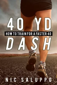
Book Cover-- What do you think of it?

Blaise84

Bronze Contributor
Read Fastlane!
Read Unscripted!
Speedway Pass
User Power
Value/Post Ratio
154%
Jul 8, 2017
150
231
39
Northeast Ohio
I'm working on a tight budget, so I'm developing my own e-book covers instead of having a graphic designer make them.

My goal is that athletes and parents of athletes alike will feel excitement when seeing the cover.

I'm definitely willing to make big changes to the covers, as I'm more interested in something that causes a positive response from the market over my own personal preferences. So, what do you think:
1) keep the same basic concept, but alter it, or
2) go with a completely different direction?

My goal is to make the final cover BETTER, especially in area of creating excitement when viewing the cover. So, if you really want to help, please not only state what you dislike about the cover(s), but provide a recommendation for a potential alteration or solution that will fix the aspect(s) you dislike. THANK YOU!
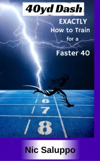
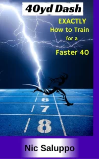
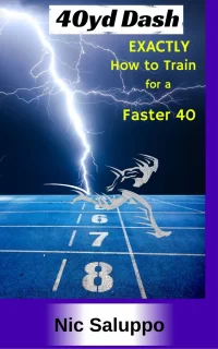
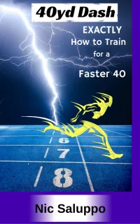
Cover.04.pngCover.01.pngCover.02.pngCover.03.png
 
Dislike ads? Remove them and support the forum: Subscribe to Fastlane Insiders.

ljb7

Bronze Contributor
Read Fastlane!
Speedway Pass
User Power
Value/Post Ratio
196%
Jun 7, 2014
184
361
No, no, no. I respect you wanting to do the design work yourself (and you can definitely do this yourself!) but this is way off base. It feels like it was made back in the 90's.

Start by finding inspiration from other book & ebooks in the sport industry. See who's who in this industry and have a look at what they're doing and what's working.
 

Blaise84

Bronze Contributor
Read Fastlane!
Read Unscripted!
Speedway Pass
User Power
Value/Post Ratio
154%
Jul 8, 2017
150
231
39
Northeast Ohio
No, no, no. I respect you wanting to do the design work yourself (and you can definitely do this yourself!) but this is way off base. It feels like it was made back in the 90's.

Start by finding inspiration from other book & ebooks in the sport industry. See who's who in this industry and have a look at what they're doing and what's working.

@ljb7, I'd like to specifically thank you for providing helpful feedback. I'm a newbie to Fastlane theory, but I'm sincere about wanting to make a change in my life, and about adding value to the lives of others. So, your useful feedback is appreciated.

Every other cover in this industry has a picture of an athlete sprinting, typically in the drive phase, but sometimes in the upright running phase. In my industry, weight lifting books have a photo of a weight lifter. Stretching books have a photo of someone with a stretching band. Agility books have a photo of an athelte going through cones. Ect. I think I could do something more unique and energy-provoking. I went with the lightning because I thought it would bring up energetic feelings.

I made that with Pixlr and Canva. It seems like you know your way around graphic design-- any tips about how to make it look a bit more modern looking on a budget?
 
Dislike ads? Remove them and support the forum: Subscribe to Fastlane Insiders.

BD64

Silver Contributor
FASTLANE INSIDER
Read Rat-Race Escape!
Read Fastlane!
Read Unscripted!
Summit Attendee
Speedway Pass
User Power
Value/Post Ratio
218%
Jul 26, 2017
384
839
27
Denver, CO
There is too much going on at once, I feel like my attention is being dragged to every corner of the page all at once.

My advice would be to keep is simple. Have a blanket background picture, get rid of the extra elements like the boxes around "40yd. dash" and for your name. Make the text more uniform and only focus on 1 or 2 things that really stand out. Right now everything seems to vying for my attention, and none of it really looks good while doing it.

Also, you said you wanted to design it yourself which is fine and all. But in all honesty it might be more worth your time to spend $20 and get something that is of professional quality. There are a guys who would do a good job for really cheap on Fiverr. If your cover is lacking then your sales are also going to take a large hit as well. Think about how the way something looks plays a role in your own buying decisions, your book is no different to others.
 

ChickenHawk

Legendary Contributor
EPIC CONTRIBUTOR
Read Fastlane!
Read Unscripted!
Speedway Pass
User Power
Value/Post Ratio
468%
Aug 16, 2012
1,281
5,991
Butt in Chair
I agree with others. It doesn't look like the kind of book covers you see on Amazon these days. My advice would be to browse the top books in your Amazon category and take a similar approach to what they did. (Without copying, of course.)

To me, the main issue is the text. Even if you used the same image, taking a more traditional approach to the title and author name would make a huge difference. If you're successful design-wise, your final book cover will look very similar to what traditional publishers are putting out -- without all the expense. :)

Good luck!
 

Supa

Came for the $. Stayed for the Ice Cream.
Read Fastlane!
Speedway Pass
User Power
Value/Post Ratio
289%
May 27, 2015
967
2,795
32
Germany
Maybe just the blue background with the white runner would look good.

No purple border.
No lightning.

And the title written in a simple font with the subtitle in a smaller size beneath, the author name similarly at the bottom.

Maybe give it that simpler design like I desribed and see what it looks like.

I like the blue background image (without the lightning!) and the runner on it. Use that without all the other stuff. Just my opinion.
 
Dislike ads? Remove them and support the forum: Subscribe to Fastlane Insiders.

MoreVolume

Bronze Contributor
Read Fastlane!
Speedway Pass
User Power
Value/Post Ratio
153%
Oct 6, 2016
316
484
NC
I like the idea. Id suggest adding a stopwatch with 4.44 on the display, since a 4.4 is the idea time
The text definitely needs to be in a better font. Maybe place the title in a text box at the top so it looks more professional.


I know you said your budget is tight, but you could probably get the look that you want for under $10 if you use Fiverr
(I say this respectively) You don't display the graphic design skills to create something that looks professional. Presentation is key, and it IS possible to get something professional for very cheap

btw can i get a free copy? :D
The fastest I ran in my prime was a 4.7 :(
 

minivanman

Platinum Contributor
Speedway Pass
User Power
Value/Post Ratio
265%
Mar 16, 2017
1,722
4,562
54
DFW
You might be amazed at how well legible text sells. I'd say make your focus on the text and not the picture. When buying a book do you want to know what the title is or do you buy it for the picture on the front?
 

MTF

Never give up
FASTLANE INSIDER
EPIC CONTRIBUTOR
Read Fastlane!
Read Unscripted!
Speedway Pass
User Power
Value/Post Ratio
455%
May 1, 2011
7,560
34,430
I'm working on a tight budget, so I'm developing my own e-book covers instead of having a graphic designer make them.

Said every self-published author struggling to sell a copy. Unless you're a graphic designer, the last thing on which you should save money is your book cover.

If you don't have money, earn it with a freelance gig or sell something you no longer use and invest it in your cover. It's a waste of your time and energy to try to design something yourself. An amateur cover is pretty much a guarantee that your book will never take off.
 
Dislike ads? Remove them and support the forum: Subscribe to Fastlane Insiders.

AgainstAllOdds

Legendary Contributor
EPIC CONTRIBUTOR
Read Fastlane!
Speedway Pass
User Power
Value/Post Ratio
647%
Dec 26, 2014
2,274
14,724
32
Chicago, IL
Said every self-published author struggling to sell a copy. Unless you're a graphic designer, the last thing on which you should save money is your book cover.

@Blaise84 If there's anyone you should listen to on this topic, it's @MTF.

/end thread
 

azsno

Contributor
Read Fastlane!
Read Unscripted!
Speedway Pass
User Power
Value/Post Ratio
142%
Sep 14, 2017
57
81
Durham, NC
I'm working on a tight budget, so I'm developing my own e-book covers instead of having a graphic designer make them.

My goal is that athletes and parents of athletes alike will feel excitement when seeing the cover.

I'm definitely willing to make big changes to the covers, as I'm more interested in something that causes a positive response from the market over my own personal preferences. So, what do you think:
1) keep the same basic concept, but alter it, or
2) go with a completely different direction?

My goal is to make the final cover BETTER, especially in area of creating excitement when viewing the cover. So, if you really want to help, please not only state what you dislike about the cover(s), but provide a recommendation for a potential alteration or solution that will fix the aspect(s) you dislike. THANK YOU!


View attachment 16668View attachment 16665View attachment 16666View attachment 16667

I think a white cover, with title in a different font, and your figure, or whatever logo you want to use would be sufficient. It really looks like a copy and past cover, and I wouldn't buy it...even if you were the fastest runner in the world. Also, is there is something you can add as a qualifier?
 

TonyStark

I'm not dead yet
Read Fastlane!
Read Unscripted!
Speedway Pass
User Power
Value/Post Ratio
191%
Jul 20, 2015
2,278
4,359
31
Austin, Texas
Who’s your market?
Certainly 40 year old’s won’t be reading this. You’re looking at middle schooler’s, high school athletes, and college students.

You want to put a big, athletic male on that cover taking off from some starting blocks.
 

LifeTransformer

Silver Contributor
Read Fastlane!
Speedway Pass
User Power
Value/Post Ratio
123%
Feb 20, 2015
558
684
Here are some questions (they might sound mean, but they're not meant to be):
  1. How much time did you spend on that?
  2. Was it worth it? (I.E. Could you have spent some $ and focused on something else?)
  3. Do you think people will pay for something with a cover like that?
  4. How many sales will a poor design cost you?
  5. Why is the word "exactly" in the title? It doesn't sound right.
Here's something I put together in 15 minutes:

40yd-dash.jpg

It's not perfect (15 minutes never is), but that will grab attention and it looks better quality.

I don't do book covers anymore, but feel free to copy that and/or improve it.

Image source: Free Image on Pixabay - Jogging, Run, Sport, Jog, Sporty
 
Dislike ads? Remove them and support the forum: Subscribe to Fastlane Insiders.

azsno

Contributor
Read Fastlane!
Read Unscripted!
Speedway Pass
User Power
Value/Post Ratio
142%
Sep 14, 2017
57
81
Durham, NC
Who’s your market?
Certainly 40 year old’s won’t be reading this. You’re looking at middle schooler’s, high school athletes, and college students.

You want to put a big, athletic male on that cover taking off from some starting blocks.

I'm 40...and I'd read it if there was a qualifier. Middle aged athletes are the ones who actually spend money to get better and faster...not the middle school kid who would rather spend money on a video game than a book about running.
 

MJ DeMarco

I followed the science; all I found was money.
Staff member
FASTLANE INSIDER
EPIC CONTRIBUTOR
Read Rat-Race Escape!
Read Fastlane!
Read Unscripted!
Summit Attendee
Speedway Pass
User Power
Value/Post Ratio
445%
Jul 23, 2007
38,082
169,504
Utah
Horrible.

Not only does it look "homemade" it looks it was done on a free graphics program like MS Paint.

Don't go cheap on the foundation to your house. It's capable of sinking the entire project.
 

MJ DeMarco

I followed the science; all I found was money.
Staff member
FASTLANE INSIDER
EPIC CONTRIBUTOR
Read Rat-Race Escape!
Read Fastlane!
Read Unscripted!
Summit Attendee
Speedway Pass
User Power
Value/Post Ratio
445%
Jul 23, 2007
38,082
169,504
Utah

Even those are pretty bad which means the author with the best cover will have an advantage.

Why not go bold and just use a running man icon?

Title it:

40 In 4 (a 40 yard dash in the 4s, sub 5 seconds is considered great.)
Blow out your 40 yard dash into the 4s.
running_cm-.jpg
 

Blaise84

Bronze Contributor
Read Fastlane!
Read Unscripted!
Speedway Pass
User Power
Value/Post Ratio
154%
Jul 8, 2017
150
231
39
Northeast Ohio
I think a white cover, with title in a different font, and your figure, or whatever logo you want to use would be sufficient. It really looks like a copy and past cover, and I wouldn't buy it...even if you were the fastest runner in the world. Also, is there is something you can add as a qualifier?

Here are some questions (they might sound mean, but they're not meant to be):
  1. How much time did you spend on that?
  2. Was it worth it? (I.E. Could you have spent some $ and focused on something else?)
  3. Do you think people will pay for something with a cover like that?
  4. How many sales will a poor design cost you?
  5. Why is the word "exactly" in the title? It doesn't sound right.
Here's something I put together in 15 minutes:

View attachment 16676

It's not perfect (15 minutes never is), but that will grab attention and it looks better quality.

I don't do book covers anymore, but feel free to copy that and/or improve it.

Image source: Free Image on Pixabay - Jogging, Run, Sport, Jog, Sporty

Horrible.

Not only does it look "homemade" it looks it was done on a free graphics program like MS Paint.

Don't go cheap on the foundation to your house. It's capable of sinking the entire project.

LOL. Point taken. It sucks!

I put these up on Facebook, and a long lost friend of mine who works in graphic design messaged me and offered to help out. So, we're meeting this week to work on a professional design. Also, I was actually unaware of what Fiverr is. Now that I know, I definitely would have gone there FIRST instead of trying to make these myself.

Let me say this: If I have a book cover with typical picture of an athlete sprinting, it will be a "me too" cover. Most athletic development books have the same cover-- someone running, weight lifting, ect. I'd like something that doesn't blend in. That's why I went with the lightning. Now, I understand that in this case the lightning sucked in that it didn't have the effect I was shooting for, BUT, I still think I'm on the right track when I say I'd like to have something that is unique, and evokes energized feelings. Am I totally off base here with wanting to go with something unique that isn't a "me too" cover?
 

Blaise84

Bronze Contributor
Read Fastlane!
Read Unscripted!
Speedway Pass
User Power
Value/Post Ratio
154%
Jul 8, 2017
150
231
39
Northeast Ohio
There is too much going on at once, I feel like my attention is being dragged to every corner of the page all at once.

My advice would be to keep is simple. Have a blanket background picture, get rid of the extra elements like the boxes around "40yd. dash" and for your name. Make the text more uniform and only focus on 1 or 2 things that really stand out. Right now everything seems to vying for my attention, and none of it really looks good while doing it.

Also, you said you wanted to design it yourself which is fine and all. But in all honesty it might be more worth your time to spend $20 and get something that is of professional quality. There are a guys who would do a good job for really cheap on Fiverr. If your cover is lacking then your sales are also going to take a large hit as well. Think about how the way something looks plays a role in your own buying decisions, your book is no different to others.

I like the idea. Id suggest adding a stopwatch with 4.44 on the display, since a 4.4 is the idea time
The text definitely needs to be in a better font. Maybe place the title in a text box at the top so it looks more professional.


I know you said your budget is tight, but you could probably get the look that you want for under $10 if you use Fiverr
(I say this respectively) You don't display the graphic design skills to create something that looks professional. Presentation is key, and it IS possible to get something professional for very cheap

btw can i get a free copy? :D
The fastest I ran in my prime was a 4.7 :(

This is actually the first time I've become aware of what Fiverr is. Now that I know, I will definitely use it.

Lol I might have a promotional copy for you. 4.7...it's really all relative depending on your sport/position. A lineman running 4.7 is great, but a wide receiver running a 4.7 could afford to be faster. What was your sport/position?
 
Dislike ads? Remove them and support the forum: Subscribe to Fastlane Insiders.
D

Deleted50669

Guest
LOL. Point taken. It sucks!

I put these up on Facebook, and a long lost friend of mine who works in graphic design messaged me and offered to help out. So, we're meeting this week to work on a professional design. Also, I was actually unaware of what Fiverr is. Now that I know, I definitely would have gone there FIRST instead of trying to make these myself.

Let me say this: If I have a book cover with typical picture of an athlete sprinting, it will be a "me too" cover. Most athletic development books have the same cover-- someone running, weight lifting, ect. I'd like something that doesn't blend in. That's why I went with the lightning. Now, I understand that in this case the lightning sucked in that it didn't have the effect I was shooting for, BUT, I still think I'm on the right track when I say I'd like to have something that is unique, and evokes energized feelings. Am I totally off base here with wanting to go with something unique that isn't a "me too" cover?

I think me too in moderation might be a healthy approach. People get on a bandwagon if it sells, so there’s no reason not to do the same. That said, you are probably right in saying that there has to be a few subtle elements of differentiation. What unique elements of your book position it as the superior option? Reflect those on the cover. I get what you’re trying to do with the lightning, but while it conveys high energy it also conveys ambiguity and overcomplicates the value proposition. I think the logo MJ suggested was hinting at a minimalist design, which may help you stand out from the busier covers.

But, I’m not an author so take ^ with a grain of salt.
 

Blaise84

Bronze Contributor
Read Fastlane!
Read Unscripted!
Speedway Pass
User Power
Value/Post Ratio
154%
Jul 8, 2017
150
231
39
Northeast Ohio
How fast is your 40?

Currently, or in my prime?
Current: 4.4. I've been out of collegiate athletics for 11 years, and I no longer train 3 hours per day like I did then.
Prime: Going against competitors who ran 4.3 was a walk in the park.
 

Blaise84

Bronze Contributor
Read Fastlane!
Read Unscripted!
Speedway Pass
User Power
Value/Post Ratio
154%
Jul 8, 2017
150
231
39
Northeast Ohio
Even those are pretty bad which means the author with the best cover will have an advantage.

Why not go bold and just use a running man icon?

Title it:

40 In 4 (a 40 yard dash in the 4s, sub 5 seconds is considered great.)
Blow out your 40 yard dash into the 4s.
running_cm-.jpg
So, your thought process here is that the focus is on the title and subtitle, as opposed to the picture. The reason this would be considered "bold" is because it clears away all the photos and extra distractions, just focusing on the words in the title and subtitle. Does that accurately describe your thought process? Wanted to clarify here so I can contrast it to my own thought process and grow my entrepreneurial mindset.
 
Dislike ads? Remove them and support the forum: Subscribe to Fastlane Insiders.

BrooklynHustle

Gold Contributor
Read Fastlane!
Read Unscripted!
Speedway Pass
User Power
Value/Post Ratio
207%
Apr 3, 2014
735
1,524
40
DMV
I'm working on a tight budget, so I'm developing my own e-book covers instead of having a graphic designer make them.

My goal is that athletes and parents of athletes alike will feel excitement when seeing the cover.

I'm definitely willing to make big changes to the covers, as I'm more interested in something that causes a positive response from the market over my own personal preferences. So, what do you think:
1) keep the same basic concept, but alter it, or
2) go with a completely different direction?

My goal is to make the final cover BETTER, especially in area of creating excitement when viewing the cover. So, if you really want to help, please not only state what you dislike about the cover(s), but provide a recommendation for a potential alteration or solution that will fix the aspect(s) you dislike. THANK YOU!


View attachment 16668View attachment 16665View attachment 16666View attachment 16667
I would find a way to get my hands on $50-$100 to get something quality done on upwork

Pretty sure you can make that happen. Get a cover that will represent your work well
 

Blaise84

Bronze Contributor
Read Fastlane!
Read Unscripted!
Speedway Pass
User Power
Value/Post Ratio
154%
Jul 8, 2017
150
231
39
Northeast Ohio
Why is the word "exactly" in the title? It doesn't sound right.

I used the word "EXACTLY" because most books on this topic are vague and filled with fluff. They outline general training methods, but the athlete or coach is left guessing at how to APPLY the training protocols. Athletes are left with a list of interesting training protocols with these other resources, but when it comes to the details that make all the difference in the world, such as sets, reps, rest periods, days off, amount of weight, number of intervals, regeneration weeks, ect, they are left in the blue. I want them to know that this isn't going to be vague, filled with fluff, and you won't need a degree in exercise science to understand how to apply it. It's all outlined for you, in clear, exact terms. Thoughts? Maybe something like "The All-Inclusive Speed Development Book." I'm just spitballing here. But something that communicates, "Listen, most programs are vague. They get you excited with neat training concepts, then leave you hanging when it comes to actually applying the concepts in a way that makes sense. This book gives ALL THE DETAILS. So, if you want to learn how to sprint faster from a coach who knows how Olympic 100m gold medalists train, then this is your book."

I'm 40...and I'd read it if there was a qualifier.

As far as a qualifier goes, do you mean something like, "A Faster 40 When You're Over 30," ect, or did you mean something else? The way I'm understanding what you said is that you're looking for something on there that signifies who specifically the program is for. Forgive me, I've listened to both books twice on Audible, but I'm still a huge newbie when it comes to entrepreneurial lingo, so please correct me here.

By the way, which sports do you play?

For the record, I do plan to market it toward high school and collegiate athletes (however, now I'm wondering if there is an untapped market for middle aged athletes!). Their training methods are like my original book cover in this thread...they suck. Most athletes at this level are using bodybuilding training methods, and don't realize they can be SO MUCH faster and jump so much higher if they were clued in to how world-class sprinters train. It's more about training the central nervous system than about isolating muscle groups. Yet, athletes across the nation are tearing workouts out of fitness and bodybuilding magazines, which train muscle groups, not nervous system movements. I think I'm off on a tangent.

This 40yd dash program for high school and college athletes is just the first one I'm putting out there.
 

TonyStark

I'm not dead yet
Read Fastlane!
Read Unscripted!
Speedway Pass
User Power
Value/Post Ratio
191%
Jul 20, 2015
2,278
4,359
31
Austin, Texas
I'm 40...and I'd read it if there was a qualifier. Middle aged athletes are the ones who actually spend money to get better and faster...not the middle school kid who would rather spend money on a video game than a book about running.
You’d be surprised. Here in Texas, everyone is running 40 yard dashes in middle school because of football.
 
Dislike ads? Remove them and support the forum: Subscribe to Fastlane Insiders.

Post New Topic

Please SEARCH before posting.
Please select the BEST category.

Post new topic

Guest post submissions offered HERE.

Latest Posts

New Topics

Fastlane Insiders

View the forum AD FREE.
Private, unindexed content
Detailed process/execution threads
Ideas needing execution, more!

Join Fastlane Insiders.

Top