Here's what I would change. You don't need to test it because I have:
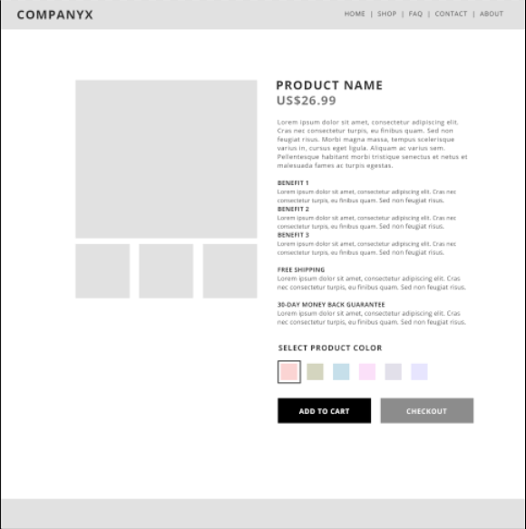
1 - Way too much text. I'd use bullet points but if you need that text for product specs then put it on a separate tab.
2 - The gap between the title and the 'Add To Cart' is too big. It has to be 'above the fold'.
3 - Change every call to action from black to green or orange. It's proven to increase conversions.
4 - If it's a product page you only need to answer a few key points. Put yourself in the prospect's shoes...
"What's it made from?"
"How big is it?"
"Does it come with batteries?"
"How long does shipping take?"
"Is there a 30 day returns policy?"
Think of all the questions you've had as an online customer. It's the same process. All I do now is sell off e-comms and help others optimize their pages too.
Good luck.
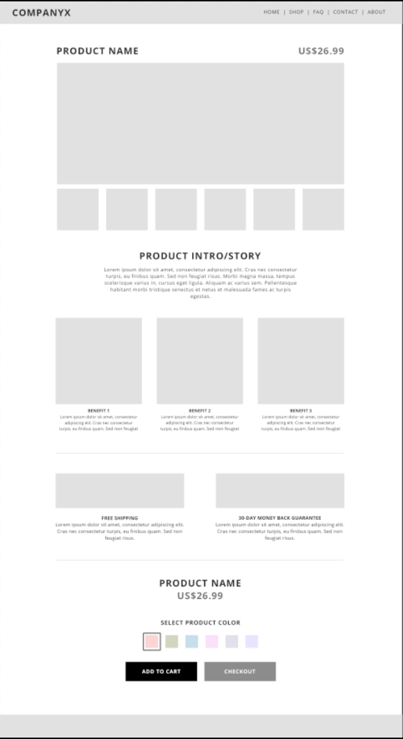