The Entrepreneur Forum | Financial Freedom | Starting a Business | Motivation | Money | Success

Welcome to the only entrepreneur forum dedicated to building life-changing wealth.

Build a Fastlane business. Earn real financial freedom. Join free.

Join over 80,000 entrepreneurs who have rejected the paradigm of mediocrity and said "NO!" to underpaid jobs, ascetic frugality, and suffocating savings rituals— learn how to build a Fastlane business that pays both freedom and lifestyle affluence.

Free registration at the forum removes this block.

Feedback on Cover Design? (Adult Coloring Book)

HAL

Contributor
Speedway Pass
User Power
Value/Post Ratio
203%
Jul 23, 2015
30
61
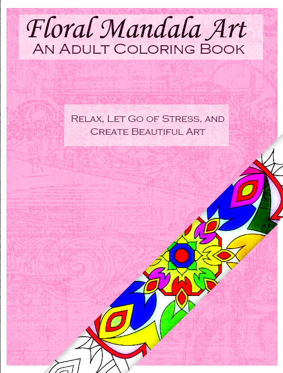
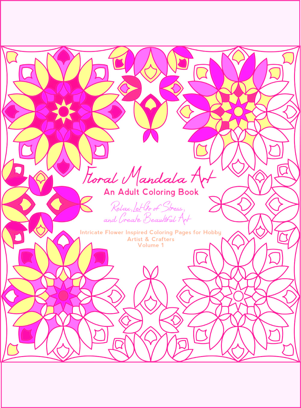
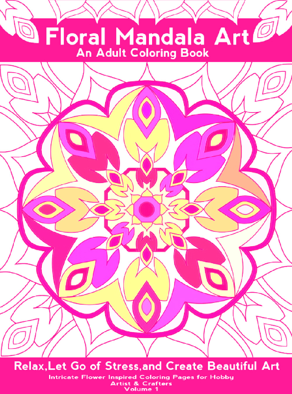
The color scheme just doesn't look that pleasing to the eye at all -- kind of reminds me of early versions of MS Paint where you had like 16 different choices of colors.

I often go here for some inspiration of color schemes: http://www.colorschemer.com/schemes/

Something like this looks so much better to my eye: http://s2.favim.com/orig/141009/abstract-floral-flower-mandala-Favim.com-2137432.jpg
 
Dislike ads? Remove them and support the forum: Subscribe to Fastlane Insiders.

EPerceptions

Bronze Contributor
Speedway Pass
User Power
Value/Post Ratio
135%
Jun 6, 2013
128
173
Virginia/Arizona
Colors are off. The pink is bright on some screens and peach on others. Blue is sometimes purple. Getting that fixed.

The black is most professional but the artwork doesn't match the book theme and contents. Currently evenly divided between pink and blue with women preferring the pink so far.
 

DennisD

Mini Media Mogul
Read Fastlane!
Speedway Pass
User Power
Value/Post Ratio
216%
Jun 16, 2012
1,488
3,208
36
Bali, Indonesia
I don't like any of em as-is.
I think you're getting caught up in details and not addressing how busy/visually confusing they are.
You gotta UNIFY that shiz yo.
Do something closer to this:

Me03Ohh.jpg

AnstsAx.jpg

H1B5lCd.jpg


Less distractions, less noise, more salez
 

EPerceptions

Bronze Contributor
Speedway Pass
User Power
Value/Post Ratio
135%
Jun 6, 2013
128
173
Virginia/Arizona
Dennis that last one isn't bad but none of those are very appealing it in line with competitors. I may just have to burn a few isbns for split testing
 
Dislike ads? Remove them and support the forum: Subscribe to Fastlane Insiders.

LifeTransformer

Silver Contributor
Read Fastlane!
Speedway Pass
User Power
Value/Post Ratio
123%
Feb 20, 2015
558
684
I think the problem (apart from the cover design factors; I.E. does it look professional) is making the coloring look authentic.

I really do like that black one I mentioned above, but it looks like someone used the fill tool on something to color it, not by hand.

Maybe, print that cover out, color it in with something, scan it and upload it as the cover.
 

Selena

New Contributor
Read Fastlane!
User Power
Value/Post Ratio
50%
Aug 26, 2015
4
2
37
Chicago, Il
The design can be apply only for a very inexpensive book. If you going to charge someone for this more then couple bucks it should be more professional. I believe that some designer will help with it. Honestly, even if you will change the colors and fonts it won't help. Don't spend time.
 

Imgal

Gold Contributor
Read Fastlane!
Read Unscripted!
Speedway Pass
User Power
Value/Post Ratio
329%
Aug 9, 2015
486
1,599
@EPerceptions - I prefer the second of the two revisions. The first feels like it has too much going on and I'm not sure where I should end up looking. It's also hard to read the subtitle element with that particular font. The second is much stronger, but the black feels quite harsh in contrast. I definitely agree with @LifeTransformer about giving it more of a hand coloured look.

The cover of "Millie Marotta's Animal Kingdom - A Colouring Book Adventure", which is currently #1 in the UK does it really well. The positioning of the titling to the top left with the white space around it really draws the eye in so people know what it is and who is it by, and then takes the eye on a journey as you move right to see the designs which literally have you wanting to turn the page and learn more / see the designs. Maybe you could try something like that and reducing the size of the design and offset it? Also maybe as @Selena mentions if you're going to higher end pricing perhaps move away from the more bolder colours for the elements you fill in and go for more subtle colours.

Loving watching the journey. Can't wait to see what the split tests show when you launch!
 
Dislike ads? Remove them and support the forum: Subscribe to Fastlane Insiders.

Attachments

  • 61kwwM0nLQL._SX496_BO1,204,203,200_.jpg
    61kwwM0nLQL._SX496_BO1,204,203,200_.jpg
    107 KB · Views: 18

EPerceptions

Bronze Contributor
Speedway Pass
User Power
Value/Post Ratio
135%
Jun 6, 2013
128
173
Virginia/Arizona
@EPerceptions - I prefer the second of the two revisions. The first feels like it has too much going on and I'm not sure where I should end up looking. It's also hard to read the subtitle element with that particular font. The second is much stronger, but the black feels quite harsh in contrast. I definitely agree with @LifeTransformer about giving it more of a hand coloured look.

The cover of "Millie Marotta's Animal Kingdom - A Colouring Book Adventure", which is currently #1 in the UK does it really well. The positioning of the titling to the top left with the white space around it really draws the eye in so people know what it is and who is it by, and then takes the eye on a journey as you move right to see the designs which literally have you wanting to turn the page and learn more / see the designs. Maybe you could try something like that and reducing the size of the design and offset it? Also maybe as @Selena mentions if you're going to higher end pricing perhaps move away from the more bolder colours for the elements you fill in and go for more subtle colours.

Loving watching the journey. Can't wait to see what the split tests show when you launch!

Beautiful example thank you. All of you have been super helpful.

Admittedly I am torn. I don't like fiddling endlessly. These designs are much better than anything I can do and scrapping them puts me back another week or two while also bloating the budget.

I'm leaning towards pushing this out and experimenting with different cover approaches over the next several books. Once I've found a winner then I can release updated versions of the losers. Opinions?
 

EPerceptions

Bronze Contributor
Speedway Pass
User Power
Value/Post Ratio
135%
Jun 6, 2013
128
173
Virginia/Arizona
I think the problem (apart from the cover design factors; I.E. does it look professional) is making the coloring look authentic.

I really do like that black one I mentioned above, but it looks like someone used the fill tool on something to color it, not by hand.

Maybe, print that cover out, color it in with something, scan it and upload it as the cover.

I like the black one too but no one else seems to yet. The drawings are wrong for this particular book though, and the black should probably be an actual color instead.
 
Dislike ads? Remove them and support the forum: Subscribe to Fastlane Insiders.

mtb_fanatic

Contributor
Read Fastlane!
Read Unscripted!
User Power
Value/Post Ratio
125%
Jul 1, 2015
32
40
This is what I would do:
  1. Print out your designs
  2. Have family/friends get together and color half of these
  3. Take photography of gathering happening
  4. This will be the cover of your book
I think you have way to much text on the cover and the colors do not match. My eyes are stressed from the bright colors looking at the cover. Try going pastel colors. Check out https://color.adobe.com/relax-color-theme-55205/ for some color scheme inspirations.

@Imgal has the right idea of looking at what others are coming up with and make a slight change to it.
I mocked up my own version of the cover design.
 

Attachments

  • adult-coloring-book.jpg
    adult-coloring-book.jpg
    681 KB · Views: 16

LifeTransformer

Silver Contributor
Read Fastlane!
Speedway Pass
User Power
Value/Post Ratio
123%
Feb 20, 2015
558
684
I like the black one too but no one else seems to yet. The drawings are wrong for this particular book though, and the black should probably be an actual color instead.

Weird lol. I don't like any of the colored ones myself.

I like the one mentioned above too, that looks very well put together.
 

EPerceptions

Bronze Contributor
Speedway Pass
User Power
Value/Post Ratio
135%
Jun 6, 2013
128
173
Virginia/Arizona
This is what I would do:
  1. Print out your designs
  2. Have family/friends get together and color half of these
  3. Take photography of gathering happening
  4. This will be the cover of your book
I think you have way to much text on the cover and the colors do not match. My eyes are stressed from the bright colors looking at the cover. Try going pastel colors. Check out https://color.adobe.com/relax-color-theme-55205/ for some color scheme inspirations.

@Imgal has the right idea of looking at what others are coming up with and make a slight change to it.
I mocked up my own version of the cover design.

Rep++ because I forgot the default was 10. Your version definitely gives me a lot to think about.
 
Dislike ads? Remove them and support the forum: Subscribe to Fastlane Insiders.

LifeTransformer

Silver Contributor
Read Fastlane!
Speedway Pass
User Power
Value/Post Ratio
123%
Feb 20, 2015
558
684

LynnD5000

Contributor
Read Fastlane!
Speedway Pass
User Power
Value/Post Ratio
108%
Aug 22, 2015
59
64
65
Idaho

Bellini

Gold Contributor
Read Fastlane!
Read Unscripted!
Speedway Pass
User Power
Value/Post Ratio
299%
Mar 26, 2015
464
1,387
Dallas, TX
Yup, proof that our individual opinions aren't to be held in the highest regard versus a market opinion. I had no clue. Kinda reminds me how many of the Star Wars actors thought the movie sucked before it was released. The market felt otherwise.

@MJ DeMarco - I had no clue either, ha.

Don't want to derail the thread, but I had to laugh at your Star Wars comment. I remember reading about the actors thoughts on the movie. Star Wars was a big deal at our house! I grew up surrounded by Star Wars figurines because my brother was obsessed with it. I remember walking into his room one night and tripping over a Lightsaber. ha.

Do you know how hard it is to have a serious conversation with someone when a life-size Stormtrooper helmet is staring you in the face? :)


Anyway, back to cover design..


@EPerceptions - your work looks great.
 
Last edited:

Christiano

Contributor
Speedway Pass
User Power
Value/Post Ratio
196%
Sep 3, 2015
47
92
Dallas
Being in sales and marketing, couldn't help but jump in. Your target market shows to be primarily women so might I suggest the following:
-target your visual appeal to women (font, text choices) such as:
--> fonts: Font - adine-kirnberg.regular.png or Font - janda-cheerful-script.regular.png
--> colors: blues, greens and purples, then pinks (http://desktoppub.about.com/od/choosingcolors/f/womencolors.htm)
-identify your demographic (women, ages 22 to 32)
-demonstrate your target demographic using it on the cover (picture of woman between ages of above drawing with another photo looking down at graphic
-make it off center using the rule of thirds for photography so that it looks more dynamic
-make the photo looking down at the graphic partially colored using a combination of the above colors mentioned above

Enjoy.
 

LateStarter

Gold Contributor
FASTLANE INSIDER
Read Fastlane!
Read Unscripted!
Summit Attendee
Speedway Pass
User Power
Value/Post Ratio
206%
Jan 26, 2015
637
1,312
49
Toronto, Canada
If it were me...and I'm not your target audience mind you... I'd make the art the background for the cover typography rather than a center piece.

I'd take the angle of making the full cover a photo-realistic example of the art. I mean, something 'really' impressive that makes you question if it's a picture or coloring. While this example isn't floral, maybe something like this.

upload_2015-9-4_9-25-9.png

I apologize for the crappy typography...I don't have many fonts on my work PC... But try to draw people in with what they can create with your book rather than the plain black and white outlines. Inspire people. Make it pop and get people's attention.

Just my 2 cents to add to the $1.50 so far.
 
Dislike ads? Remove them and support the forum: Subscribe to Fastlane Insiders.

Post New Topic

Please SEARCH before posting.
Please select the BEST category.

Post new topic

Guest post submissions offered HERE.

New Topics

Fastlane Insiders

View the forum AD FREE.
Private, unindexed content
Detailed process/execution threads
Ideas needing execution, more!

Join Fastlane Insiders.

Top